Renderings have been revealed for the upcoming mixed-use project at 415 N Sangamon Street in the West Loop. Shown to area locals during a public meeting held last night, plans for the tower have remained relatively the same with the images offering a first look at its solar panel-lined exterior. News on the proposal broke last September, replacing a vacant lot and incorporate the adjacent on-site building. Developer Fortem Voluntas Partners led by Joy Jordan, an ex-Sterling Bay leasing agent, is partnering with local firm Eckenhoff Saunders and Miller Hull on its design.
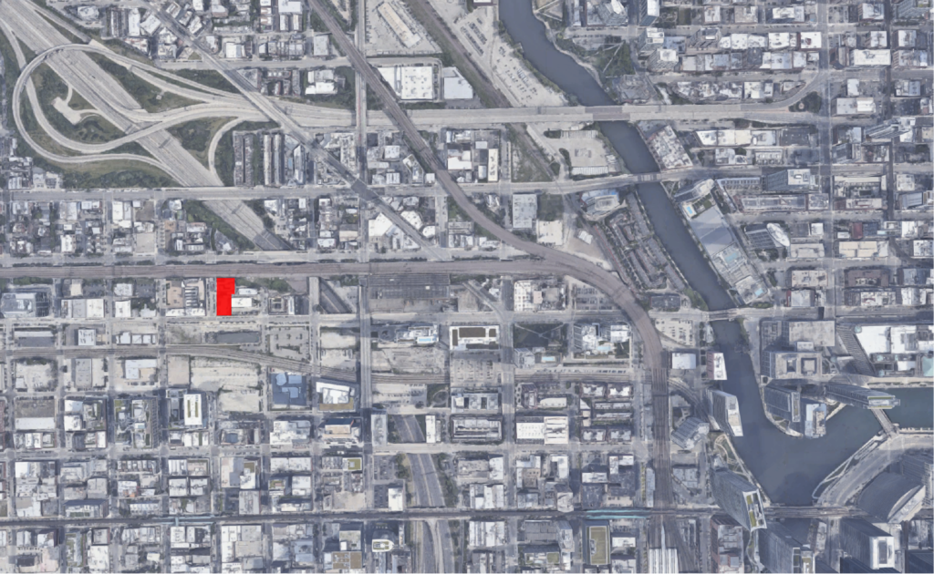
Site context map of 415 N Sangamon Street via Google Maps
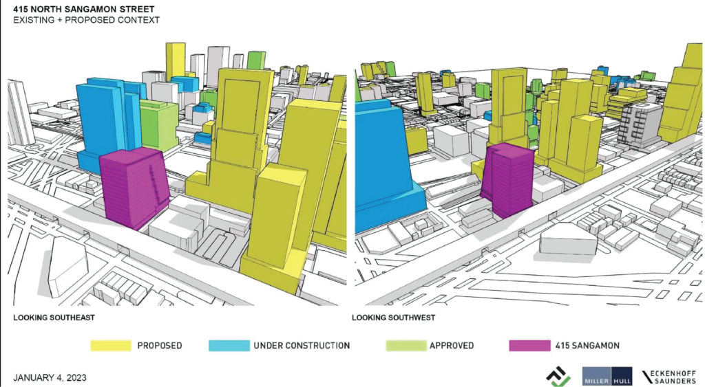
Site context of 415 N Sangamon Street by Eckenhoff Saunders via BVictor1 on Sksyscraperpage
Located on the corner of N Sangamon Street and W Kinzie Street, across the street from the upcoming Guinness Brewhouse, the tower will bring predominantly office space to the quickly growing neighborhood. On the ground floor the project proposes the preservation of the facade of the aforementioned two-story masonry-clad building and its signature red doors, which will lead into a large anchor tenant retail space and entry lobby. It will be flanked by two new brick faux-facades of a similar scale before the structure sets back for a small plaza.
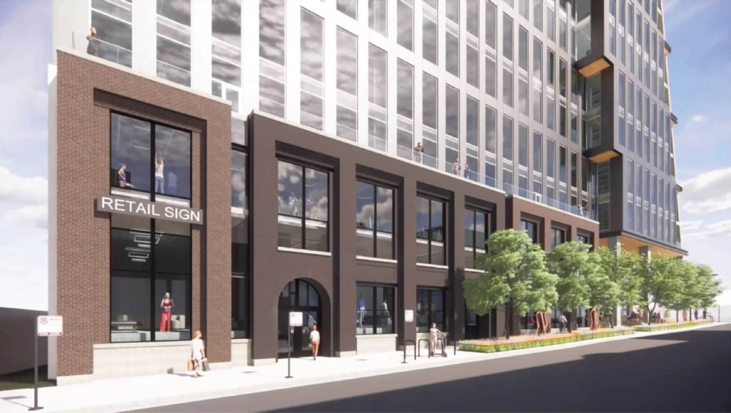
Base rendering of 415 N Sangamon Street by Eckenhoff Saunders via BVictor1 on Sksyscraperpage
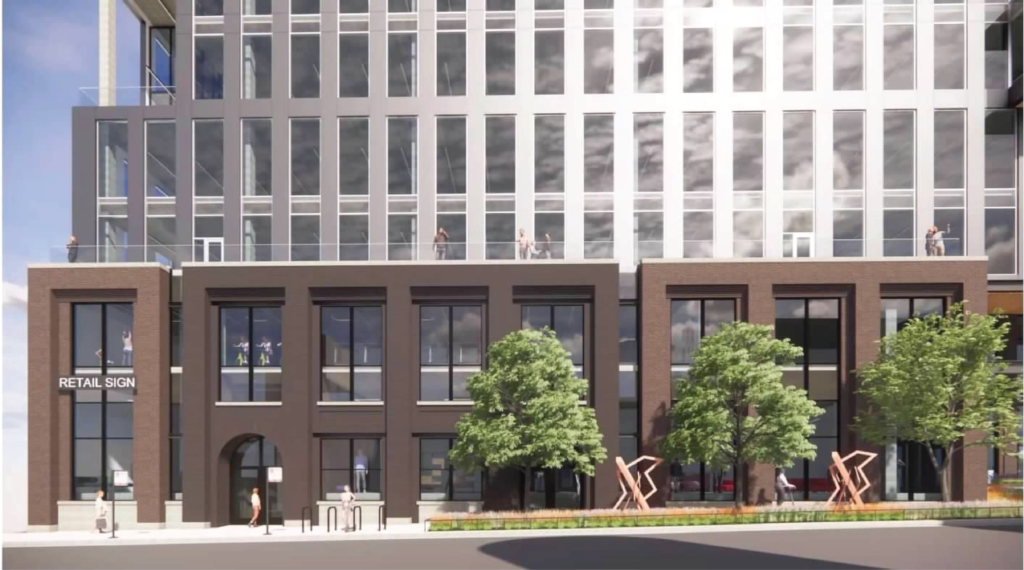
Base rendering of 415 N Sangamon Street by Eckenhoff Saunders via BVictor1 on Sksyscraperpage
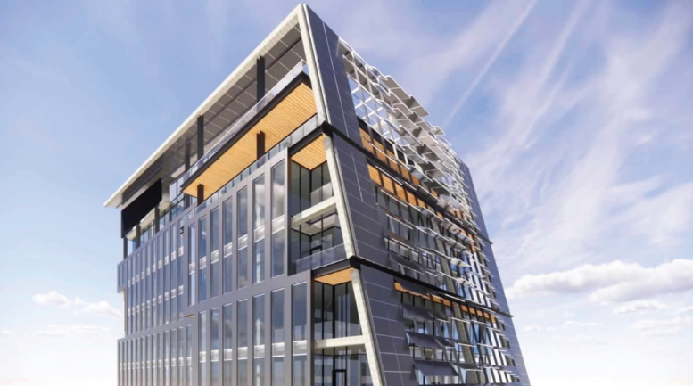
The rest of the ground floor will hold an additional retail space fronting Kinzie Street with plenty of covered outdoor seating. Below will be a 20-vehicle parking garage on a lower level accessed via the lower level alley. Rising above will be the rest of the 17-story, 260-foot-tall tower offering office floor plates ranging from 22,000 square feet at the base to 17,000 square feet at the top as the form slants inward as it rises. The slant will allow for the installation of articulated solar panels that will line the facade, providing shading for tenants and power to the building.
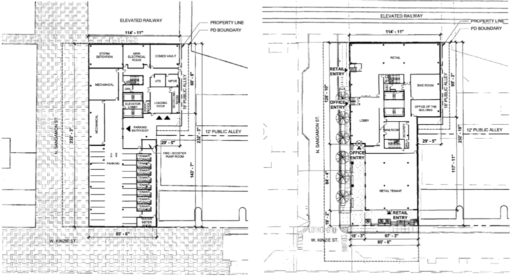
Lower (left) and first (right) floor plans of 415 N Sangamon Street by Eckenhoff Saunders Architects
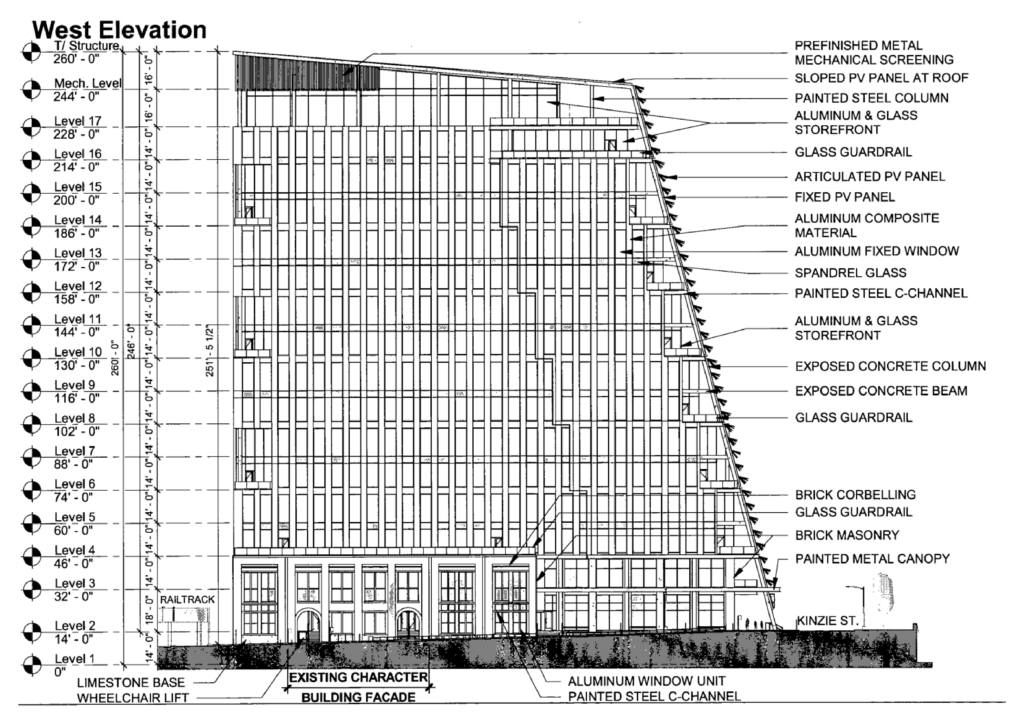
Elevation of 415 N Sangamon Street by Eckenhoff Saunders Architects
From what can be seen in the renderings, the panels will be installed at varying angles depending on their location, giving the building a dynamic look. The rest of the tower will be clad in gray aluminum panels with floor-to-ceiling windows and wood paneling on the underside of overhangs as an accent. The form will also allow for terraces at various levels for users to enjoy during the work day, we can also assume that there will be a comprehensive array of amenities including conference spaces, lounges, fitness room, and more.
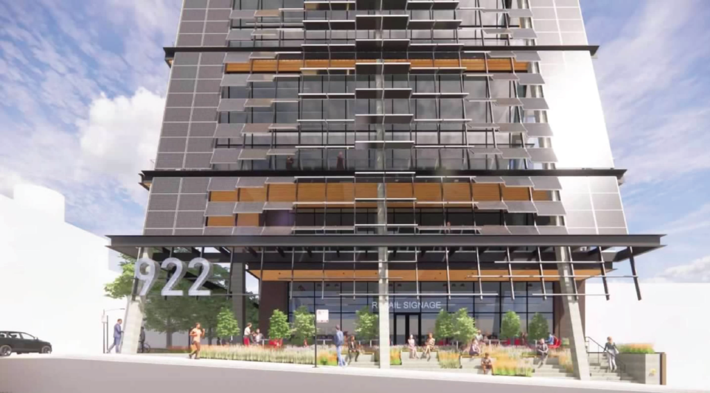
Slanted facade base rendering of 415 N Sangamon Street by Eckenhoff Saunders via BVictor1 on Sksyscraperpage
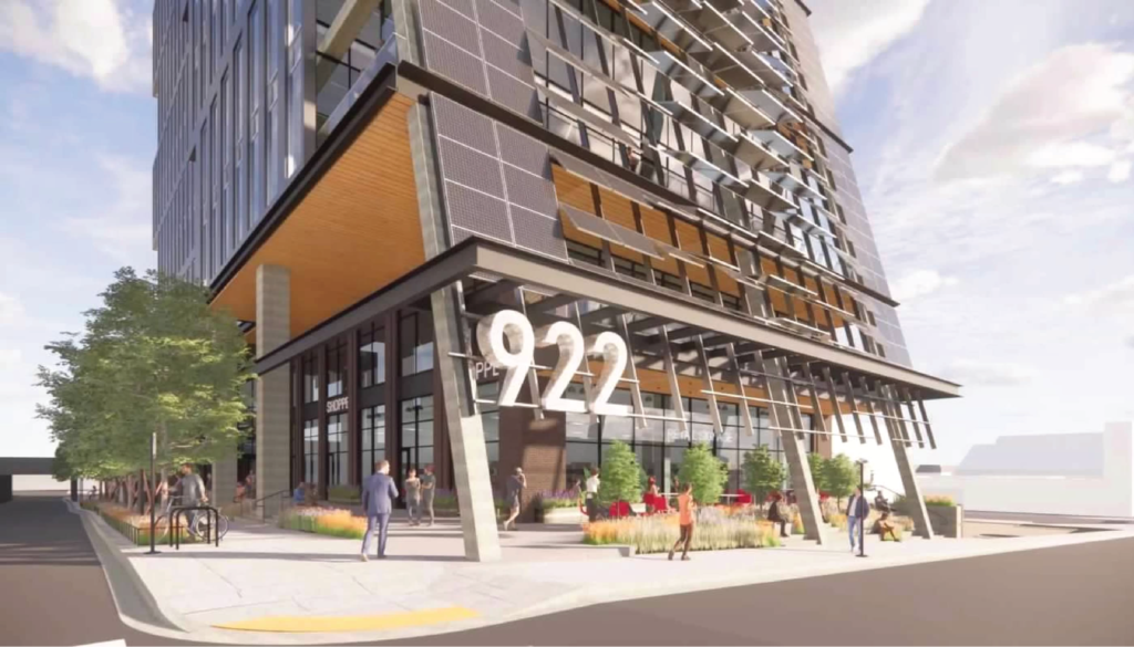
Slanted facade base rendering of 415 N Sangamon Street by Eckenhoff Saunders via BVictor1 on Sksyscraperpage
One of the more exciting elements will be the multi-level outdoor terraces on the upper floors, with the largest being on the top offering an expansive recreational space partially covered by the building’s facade as it continues on the roof to complete the massing. Currently no anchor tenant has been announced as the structure will bring 267,200 square feet of space to the neighborhood.
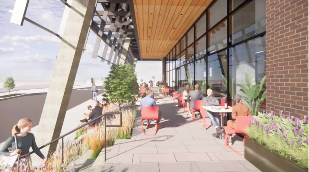
Base rendering of 415 N Sangamon Street by Eckenhoff Saunders via BVictor1 on Sksyscraperpage
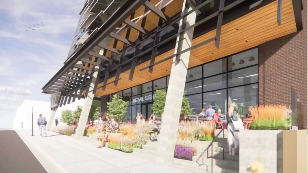
Base rendering of 415 N Sangamon Street by Eckenhoff Saunders via BVictor1 on Sksyscraperpage
Commuters will be able to access various transit options including bus service for CTA Routes 8, 56, and 65 as well as the CTA Blue Line at Grand station and the CTA Green and Pink Lines at Morgan station all within a 10-minute walk. The developers are currently seeking a rezoning of the site although its application was deferred from September’s City Council meeting. At the moment no construction timeline has been finalized, though once started we can expect an 18 to 24 month completion timeline based on similar projects.
Subscribe to YIMBY’s daily e-mail
![]()
Follow YIMBYgram for real-time photo updates
Like YIMBY on Facebook
Follow YIMBY’s Twitter for the latest in YIMBYnews

This is fresh and dope!!!
Such a cool building. Interesting shape, bold silhouette, reasonable parking, and reuses an old building. Checks all the boxes!
Looks good . No ugly podium !
IMO, many more buildings like this is what Chicago needs, rather than supertalls which somtimes suck the life out the street level because the entire base is made up of elevators. It’s a minor quibble, but I wish they were going to keep the existing red fenestration on the arched doorways and paint it black (with some replacement doors salvaged from another old building).
Hmmmm – now that I have read all the text as well as looked at all the pictures – maybe they will keep the arched entrances intact. The text says yes, but the renderings look like standard-issue aluminum frame entrances. So, maybe it’s pretty much perfect!
Why is it always presented as false choice between “buildings like this” or supertalls being better? Supertalls are appropriate for certain sites that present a prime chance for maximum visibility, height and density and high-rises are better for sites that need more fine-grained development.
Also supertalls can be designed to engage with the street and without massive podiums. It’s just a matter of skill and priority.
I think because the majority of people who comment here seem to have a fixation on supertalls, and if it isn’t supertall, it sucks and they feel like it makes Chicago an inferior city. I don’t happen to share this view at all – we need lots of different building heights and intensities of use.
I agree with both of you. It’s not a pissing contest and worms-eye view is better than birds-eye view, but skyscraper designers need to be more like China and develop fine-grain detail at the pedestrian level the way smaller buildings do
100% agree on the fine-grained…it’s the details that matter at the street level, and the architecture of the building as a close secondary concern. After all, buildings are for humans and if they’re not really interesting and functional for humans (they don’t enter a building at the top, they enter at the sidewalk), then it’s better if it wasn’t there at all.
I’m not engaging in a “pissing contest”, but I think supertall comparisons can sometimes be just that. And that ship has sailed, to China and the Persian Gulf. There, supertalls have grown to the point that they don’t make economic sense unless there is a big enough pool of super-rich to pay break-even rent. There are only so many super rich people, and they seem to pick one city per continent to invade. Aesthetically, supertalls don’t do much for the urban core (where I think everything should be “fine grained”). They throw everything else out of scale, and they are so big that they really need wind-swept, empty modernist plaza to show them off properly. They also cost so much that rent generating space has to be maximized, and the space that engages the general public is reduced as much as possible. So sure, if it’s feasible financially, let’s put up a few supertalls (one has been approved near the Tribune Tower, I think). Supertalls = Streeterville, more modest buildings = Fulton Market. The only supertall I have ever seen that did the streetscape right is the Empire State Building, and that was 92 years ago.
For a modern example look at The Brooklyn Tower. It seamlessly fits into its’ surroundings and is no more imposing at street-level than a well integrated mid-rise.
Even with it being over 1,000′ it quite literally has the footprint of a standard 5-8 story wedged-shaped building you’d expect at a six-way intersection in Chicago.
For a large office tower I’d say One Vanderbilt does the street-level experience justice as well. It’s not the supertalls at fault, it’s the architects/developers that should be held accountable.
Supertalls have their place for creating peaks, adding depth, inspiring/captivating the public’s imagination and displaying a sense of achievement while also placemaking. Look at Chicago’s skyline before and after Vista and the results are obvious.
If a FEW supertalls are scattered in a skyline, they might add depth and peaks (or they might just overwhelm everything around it). I just don’t think supertalls are that useful for making a city livable. Dubai looks great from out in the desert, but doesn’t strike me as much of a city.
The Brooklyn Tower is a great example. 1 Chicago is an example that shows what not to do. Half of the part of the building that interacts with the street is dedicated to cars, not people. Half of it is dead space. This building should have been 100% with retail wrapping all 4 sides of the building. And to make it very vibrant, it should have directly interacted with the Chicago redline station, making it an integrated transit hub.
I know, I was agreeing with you that a lot of people just care about height. Sheesh
Zaptron – didn’t mean to sound like I’m attacking anyone, just bloviating a bit. I think this text thread is a really interesting discussion. Hoping others agree.
Also you’re wrong about Chinese supertalls. Most of them are not residential but a mix of hotel, office, residential, and retail. THAT’S how they’re able to pencil out the numbers. In America, we somehow only stupidly build one tower for one purpose. Getting an office and residential space in one tower is like unheard of here.
Exactly right, just because there’s 1 or two mega retail slots in a building’s bottom floor doesn’t really make it great mixed use. Great, vibrant mixed use is exactly what you said.
Love it for some many reasons. More of this throughout the city is needed. Hopefully, this can get started soon.
Unfortunately, this is another dead project. Too bad, this would’ve been a great one.
It looks like the current glass to metal ratio will give this buildings some presence which is refreshing. The windows appear to be a little recessed so perhaps some depth will be perceivable as well. Either way it’s nice to see something other than floor-to-ceiling glass with ultra-thin vertical fins and spandrels. Hopefully it isn’t dumbed down after the Committee on Design nitpicks it to death.
Hey UnionMade! the building developers will not be submitting to the CoD and instead go straight to the Plan Commission I believe in an usual move for the area.
Oh that’s great, thanks for the info. The Committee on Design seems to take issue with any and every design element that makes something unique.
So nice and refreshingly new look! Sterling Bay buildings are so boring and “safe”. More if this please
The Thompson Center? A Thompson Center at 50% less Arc Width?
I’m not the only one seeing that, right?
Finally something cool!
Love love love, I only wish it were taller.
Looks great. Just wish it was residential rather than commercial. But still plenty going up in the area so I guess it is what it is