Construction continues to climb for a new wellness facility located at 2933 W Division Street in Humboldt Park as the inner core structure has now reached its full height. This initiative commenced in January when the foundational permit was approved. Recent visuals depict brisk advancement in foundational stages. This glassy curved structure by JGMA will stand where a vacant plot and a duplex once were.
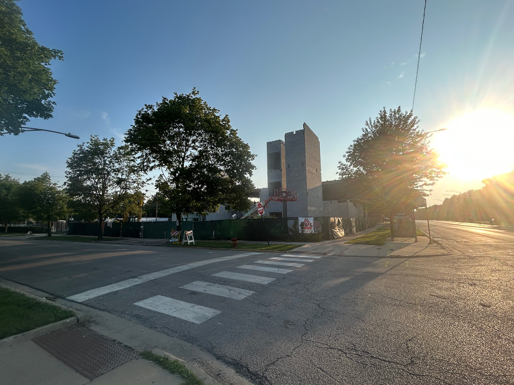
2933 W Division Street. Photo by Jack Crawford
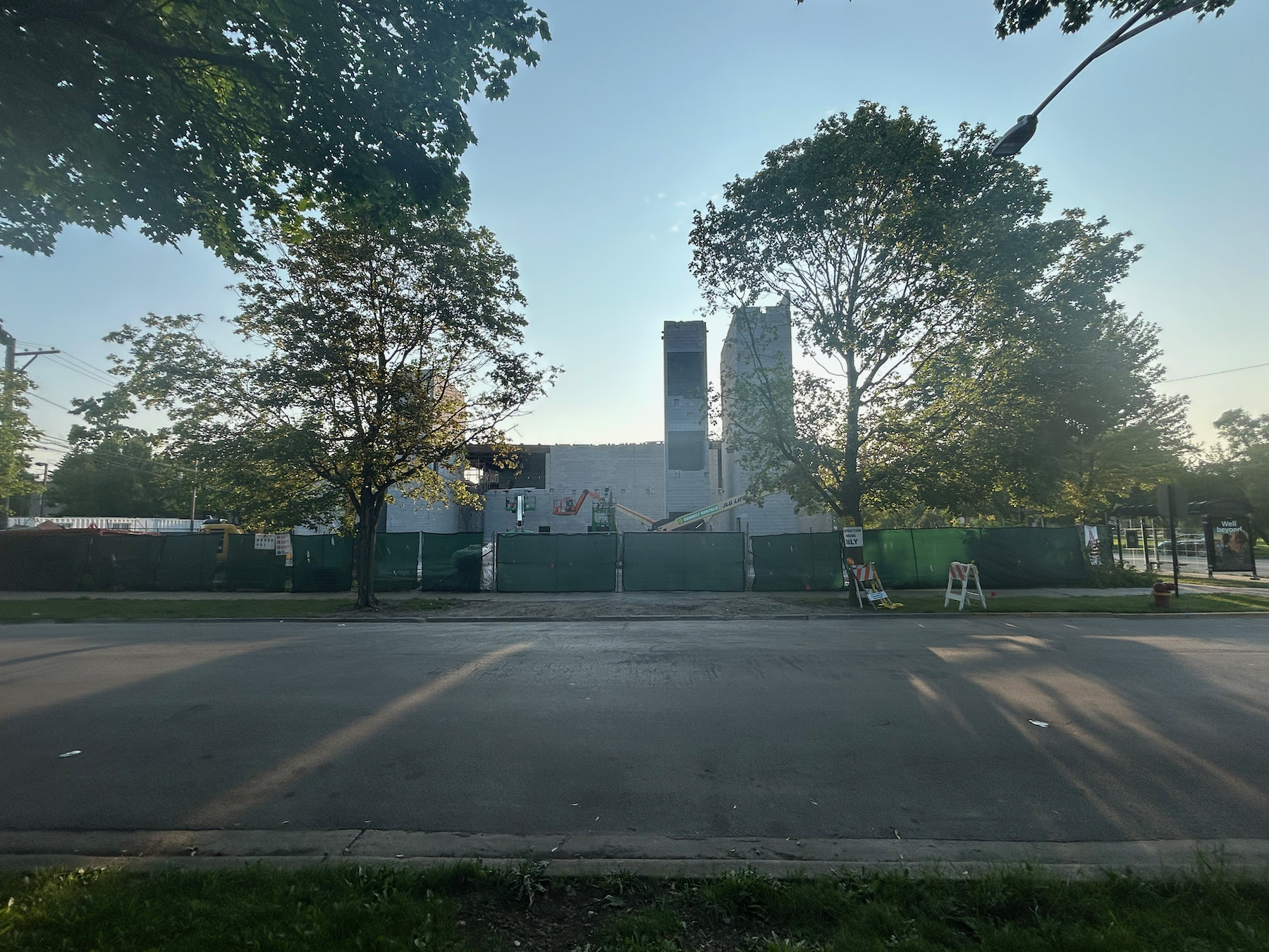
2933 W Division Street. Photo by Jack Crawford
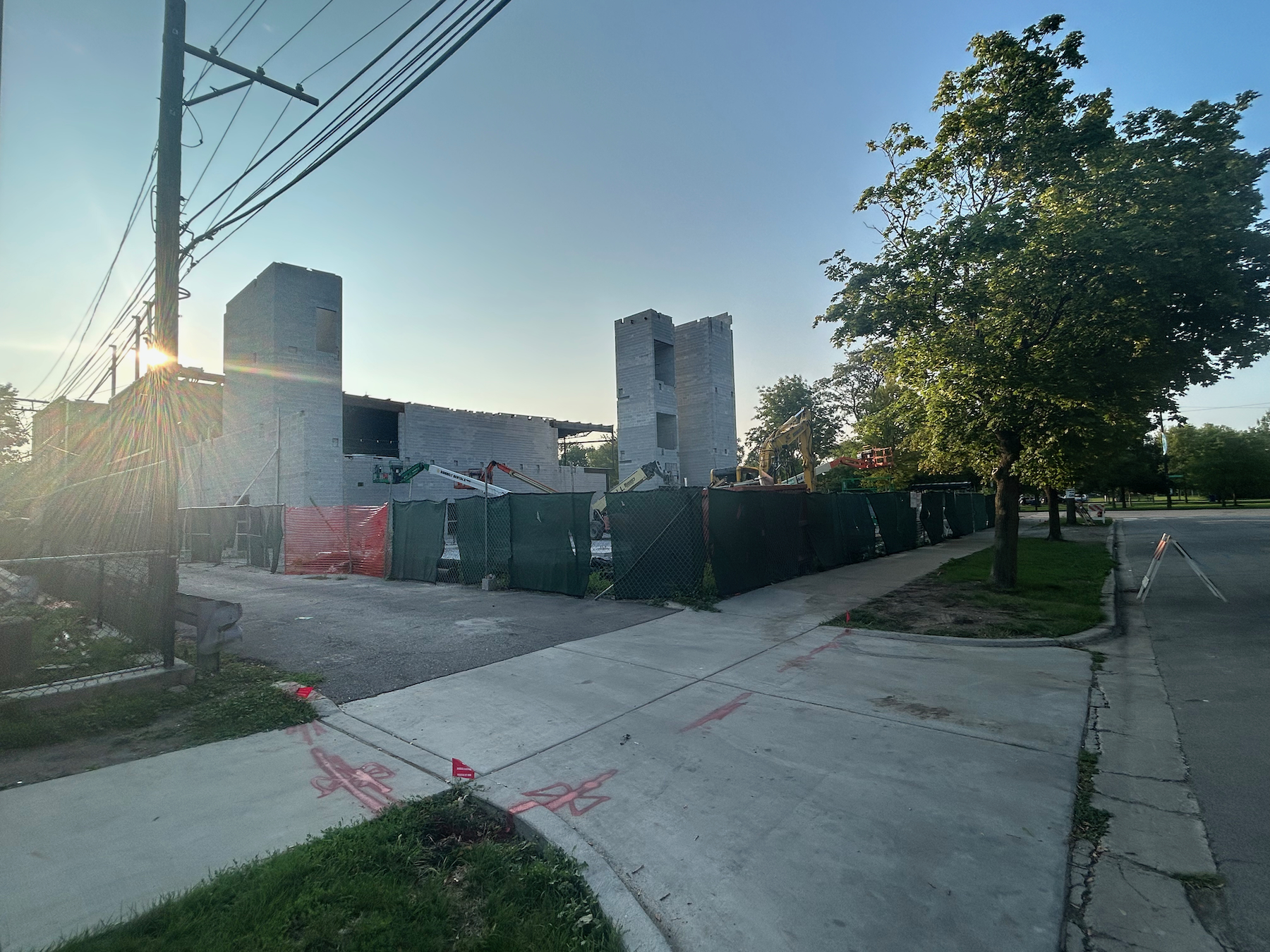
2933 W Division Street. Photo by Jack Crawford
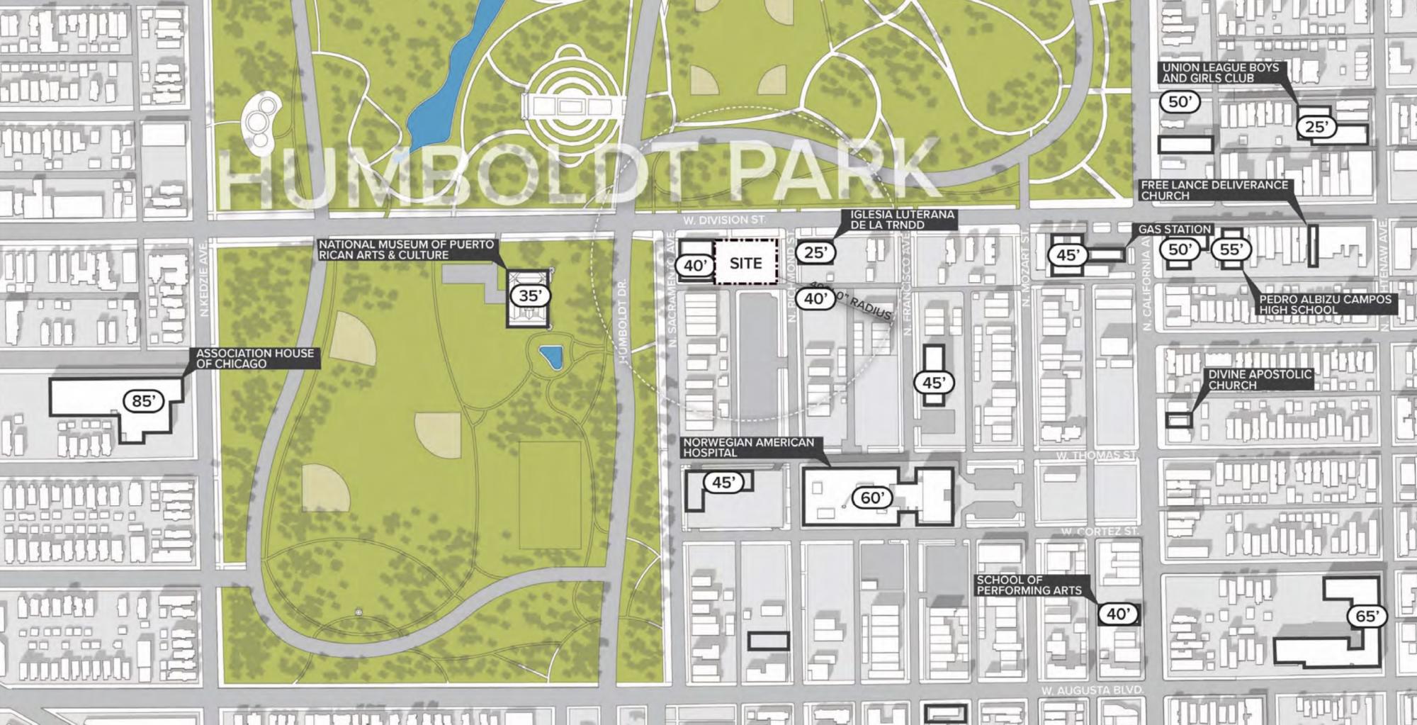
Context area plan by JGMA
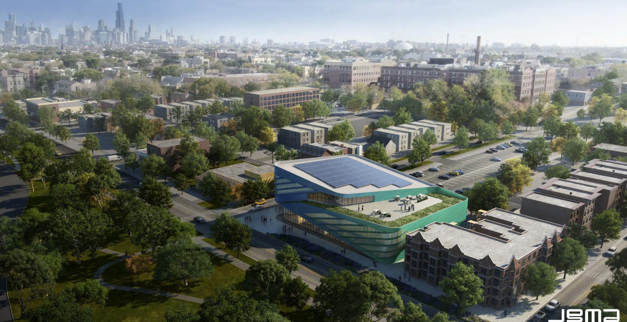
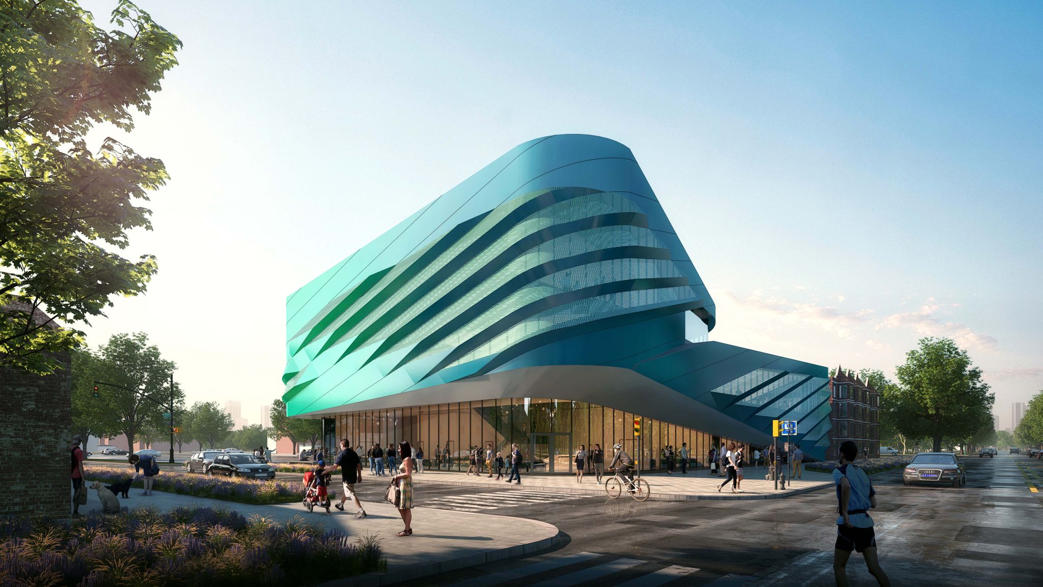
Rendering of 2933 W Division Street by JGMA
The building will showcase a wave-like design enveloped in a blend of blue and teal metal panels, complemented by segments of glass curtain walls. This 62-foot edifice will span 45,500 square feet, focusing on health and fitness provisions.
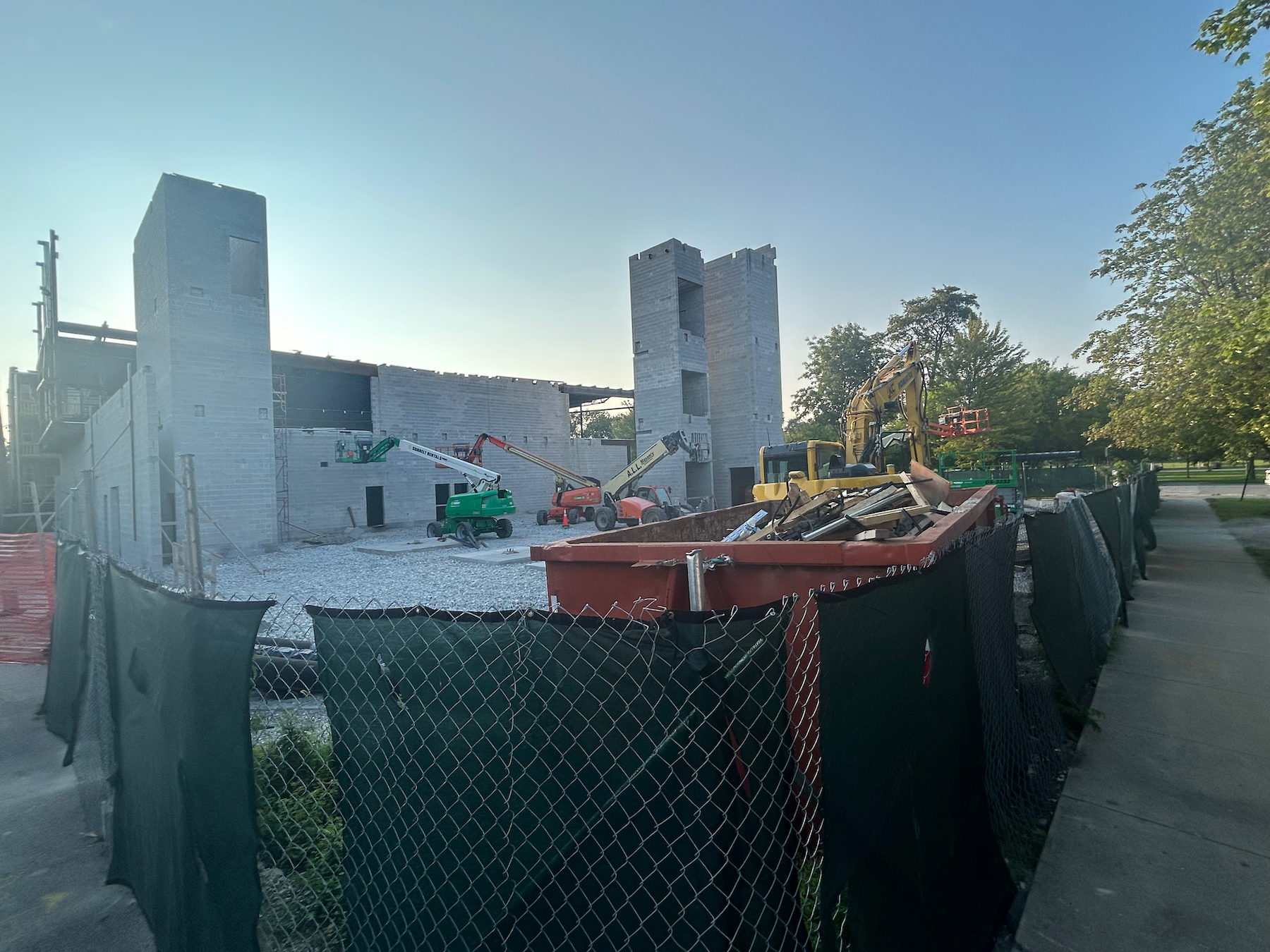
2933 W Division Street. Photo by Jack Crawford
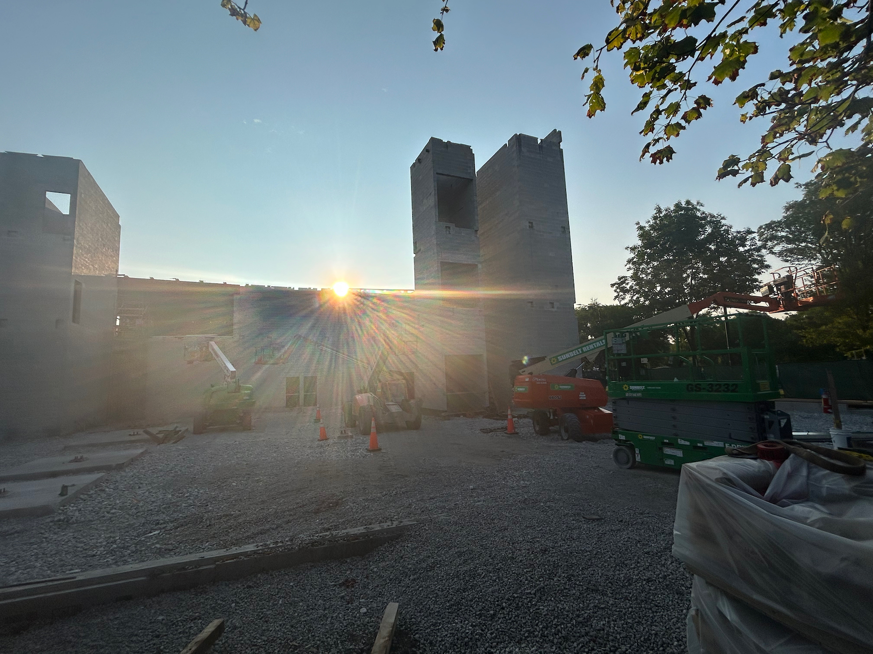
2933 W Division Street. Photo by Jack Crawford
The ground level will feature a spacious entrance, a swimming area spanning 6,400 square feet, changing rooms, a sports medicine section, and a dedicated area for children.
The subsequent floor will have a sprawling 8,500 square-foot fitness zone encircled by an internal running track, coupled with areas for group workouts, holistic training, cycling, and added lavatories.
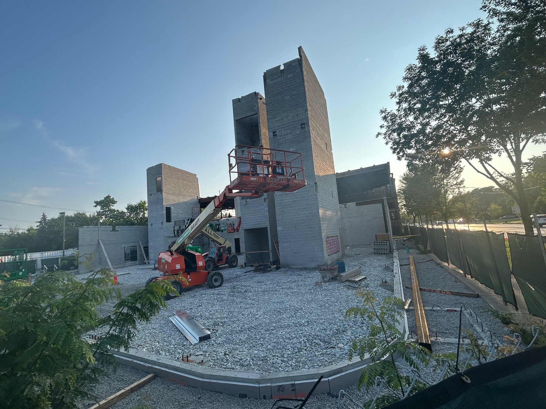
2933 W Division Street. Photo by Jack Crawford
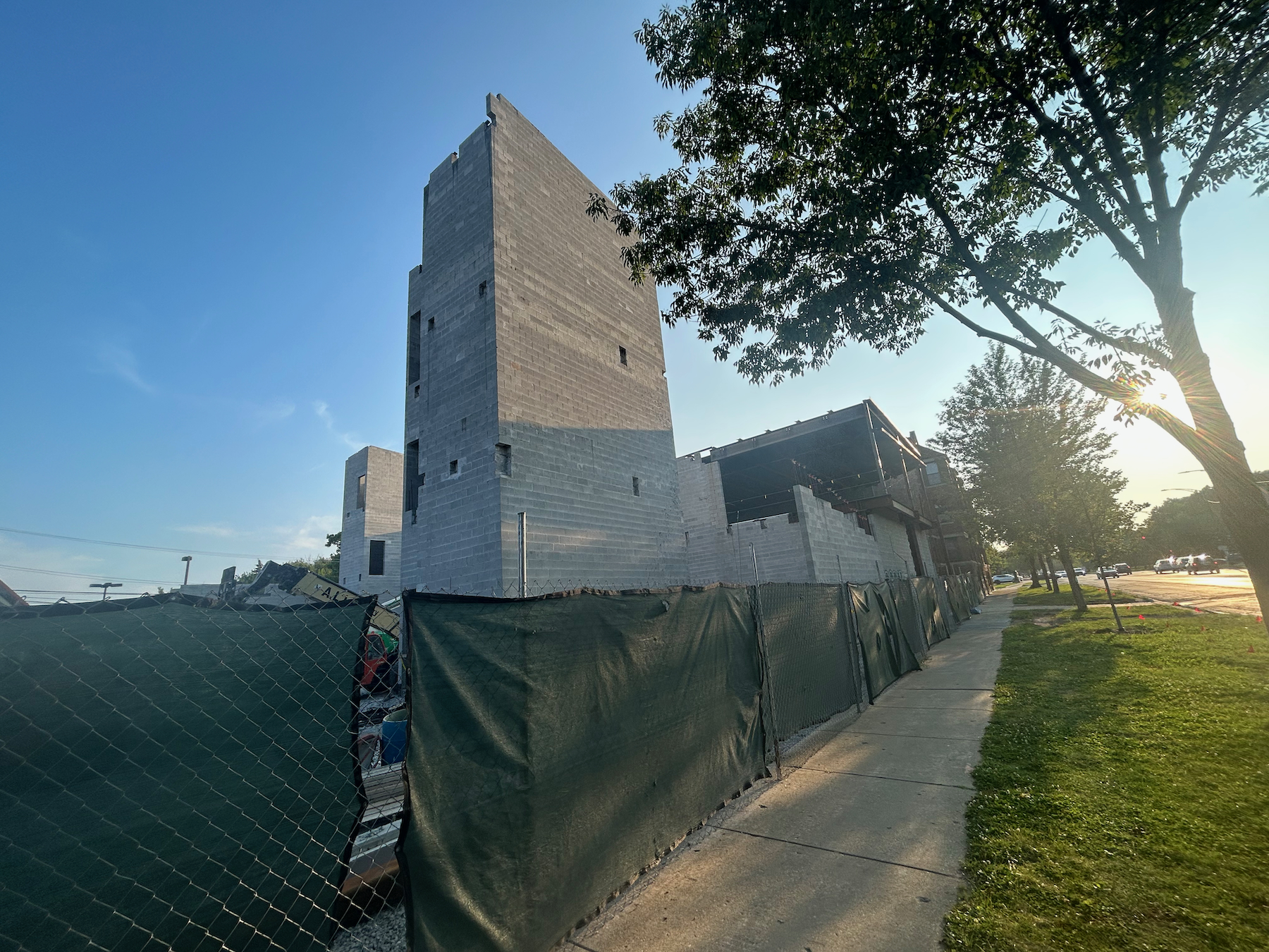
2933 W Division Street. Photo by Jack Crawford
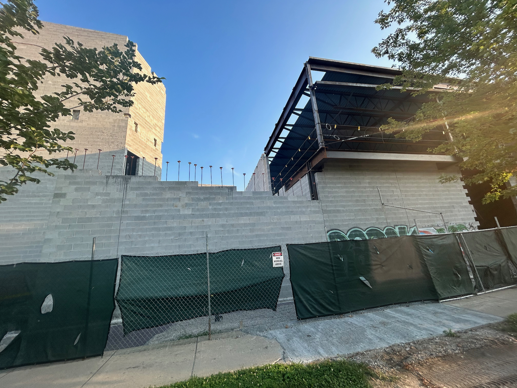
2933 W Division Street. Photo by Jack Crawford
The top floor will house spaces like a 1,245-square-foot event prelude zone, a community space of 1,600 square feet, a couple of seminar rooms, more lavatories, and an external lounging space with a verdant canopy.
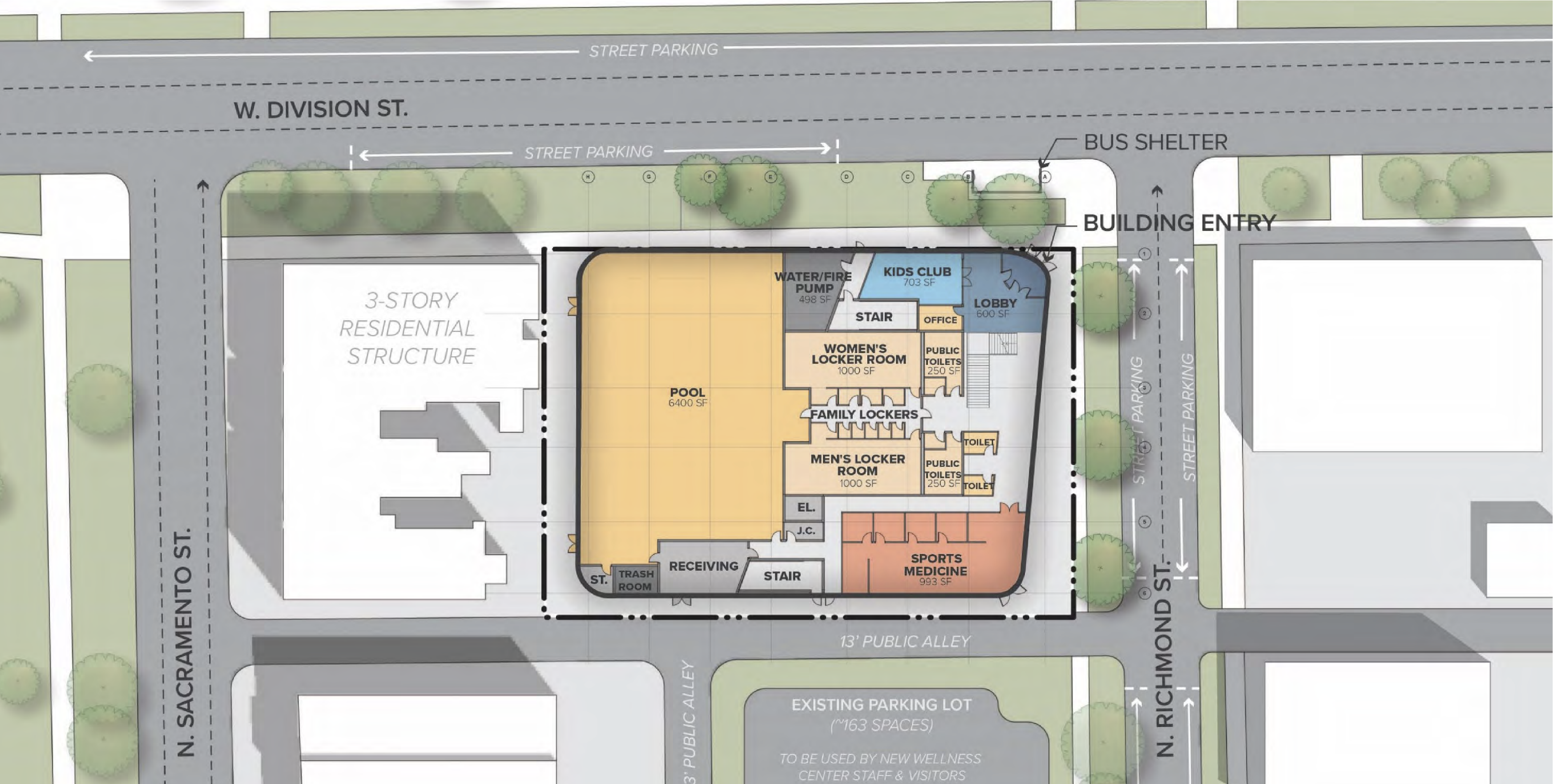
First floor plan of 2933 W Division Street by JGMA
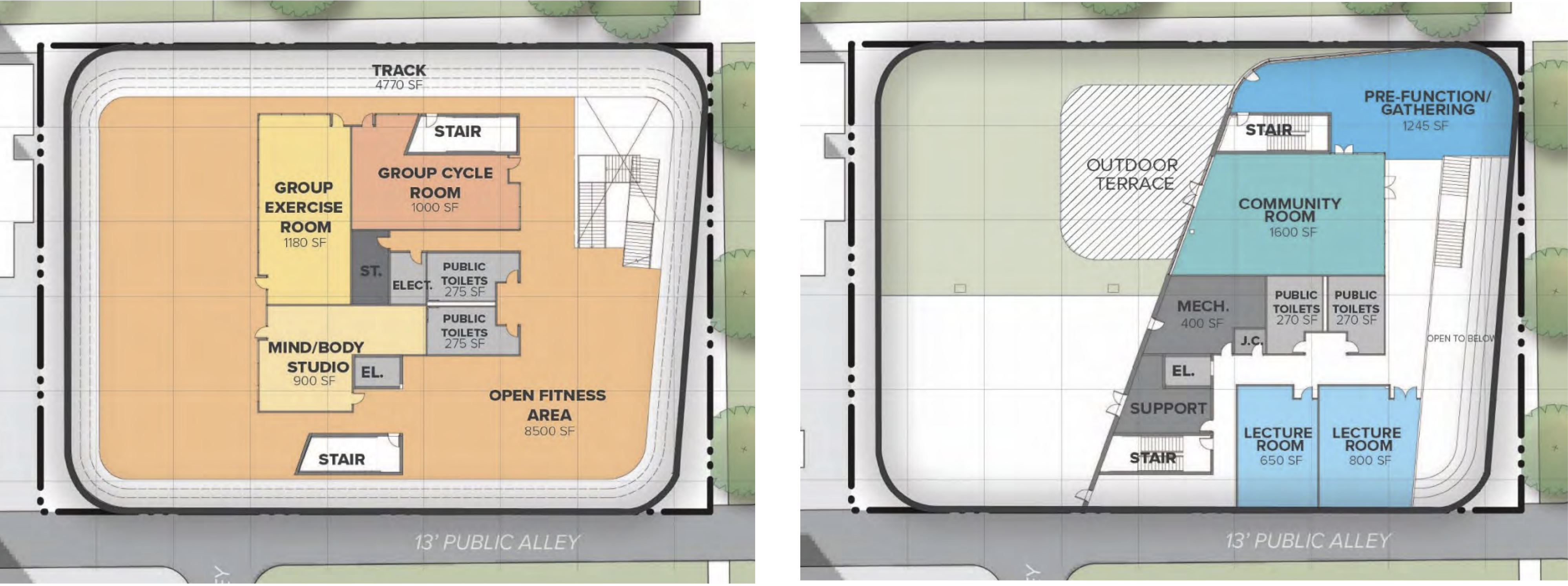
Second and third floor plan of 2933 W Division Street by JGMA
The wellness center will adjoin an already existing parking area on Richmond Street with a capacity of 163 vehicles, negating the need for any further parking provisions.
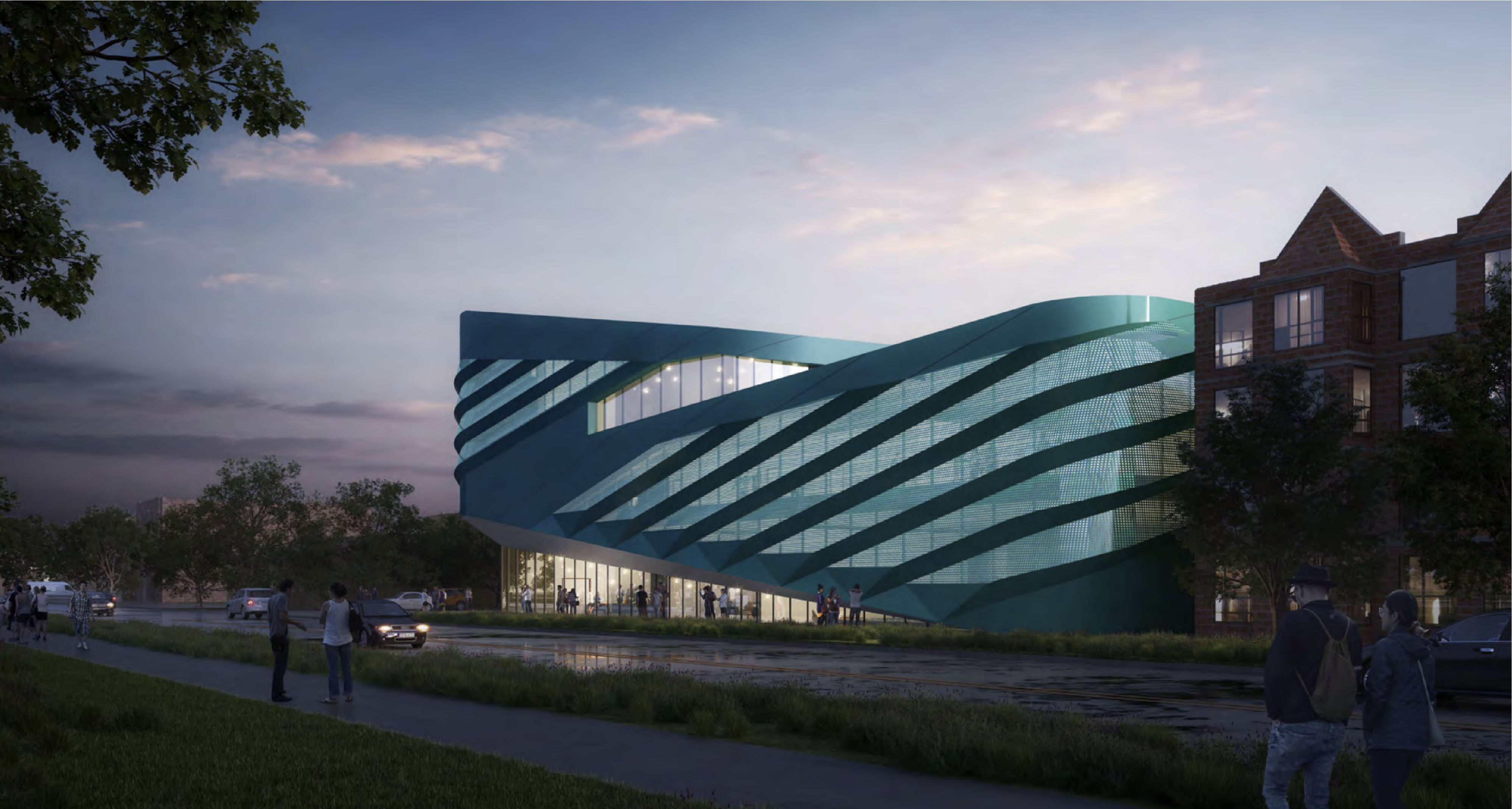
Rendering of 2933 W Division Street by JGMA
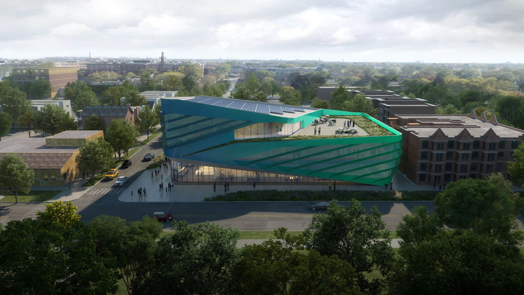
Rendering of 2933 W Division Street by JGMA
The $24 million undertaking has commissioned All Masonry Construction as the main builders. Construction is slated to span approximately 18 months with work expected to complete toward the end of 2024.
Subscribe to YIMBY’s daily e-mail
![]()
Follow YIMBYgram for real-time photo updates
Like YIMBY on Facebook
Follow YIMBY’s Twitter for the latest in YIMBYnews

Might be worth mentioning that this is part of Humboldt Park Health, the hospital one block south of the build site (and listed as Norwegian American Hospital on the included map). All the other articles on Yimby mention this.
Very, very ugly. Teal glass? No – just no.
Given the rows of box buildings, anything that has flow and not right angels provides visual relief, kind of like the St. Mary Hospital on Division.
What a great little infill project!! Although, I’m not sure why the outdoor terrace wouldn’t take advantage of skyline views and be located on the east side of the building; truly a missed opportunity, and makes one wonder if the architects ever made a site visit to contextualize their vision. The oxidized copper look on the other hand isn’t too bad.
They probably wanted to push the taller part of the building away from the existing structures, although I agree that the views would have been nice.
This will be a very beautiful architectural gem. Great addition to the area. We are so lucky.
That is actually a respectable consideration of their neighbors and overall structure massing. I’ll take it.
Send this back to Miami ca. Y2k. Terrible, stunningly bad design.
Commenters here constantly rail against the dozens of “banal” cookie cutter projects going up in Chicago each year. This one is so different, eye-catching, and vibrant — and of course…people complain. Do we need to start a NIABY (not in anyone’s backyard) site?
I grew up in the neighborhood. It good to see changes. 🇵🇷 🇵🇷 Puertorican Pride.