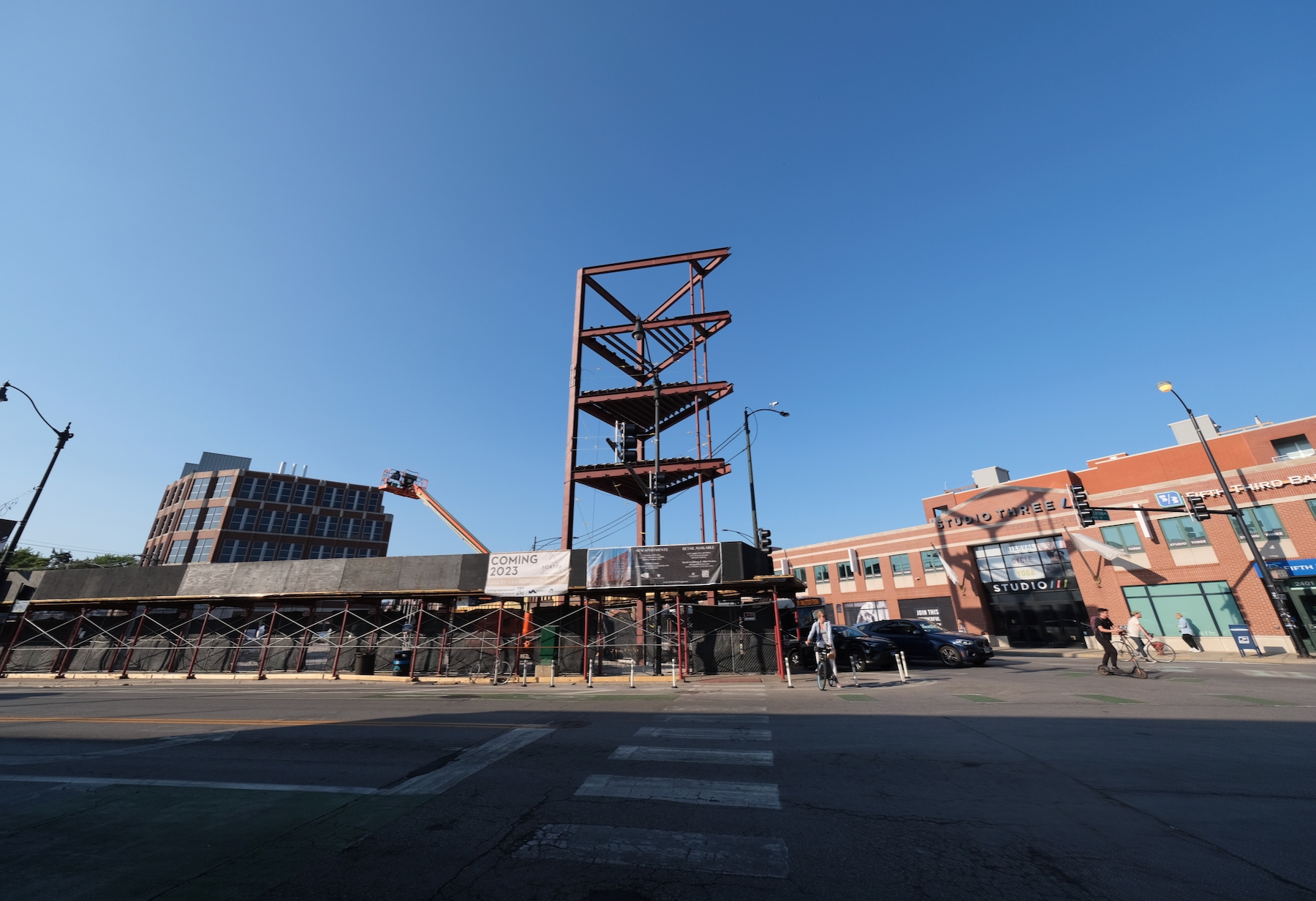
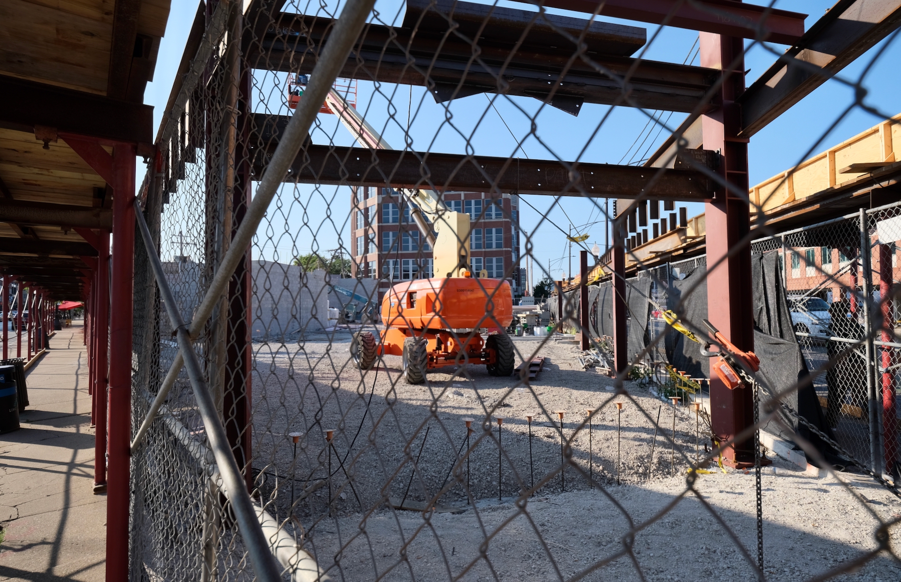
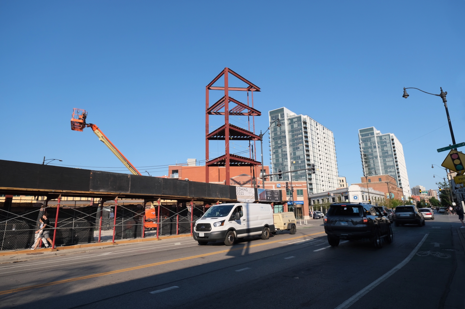
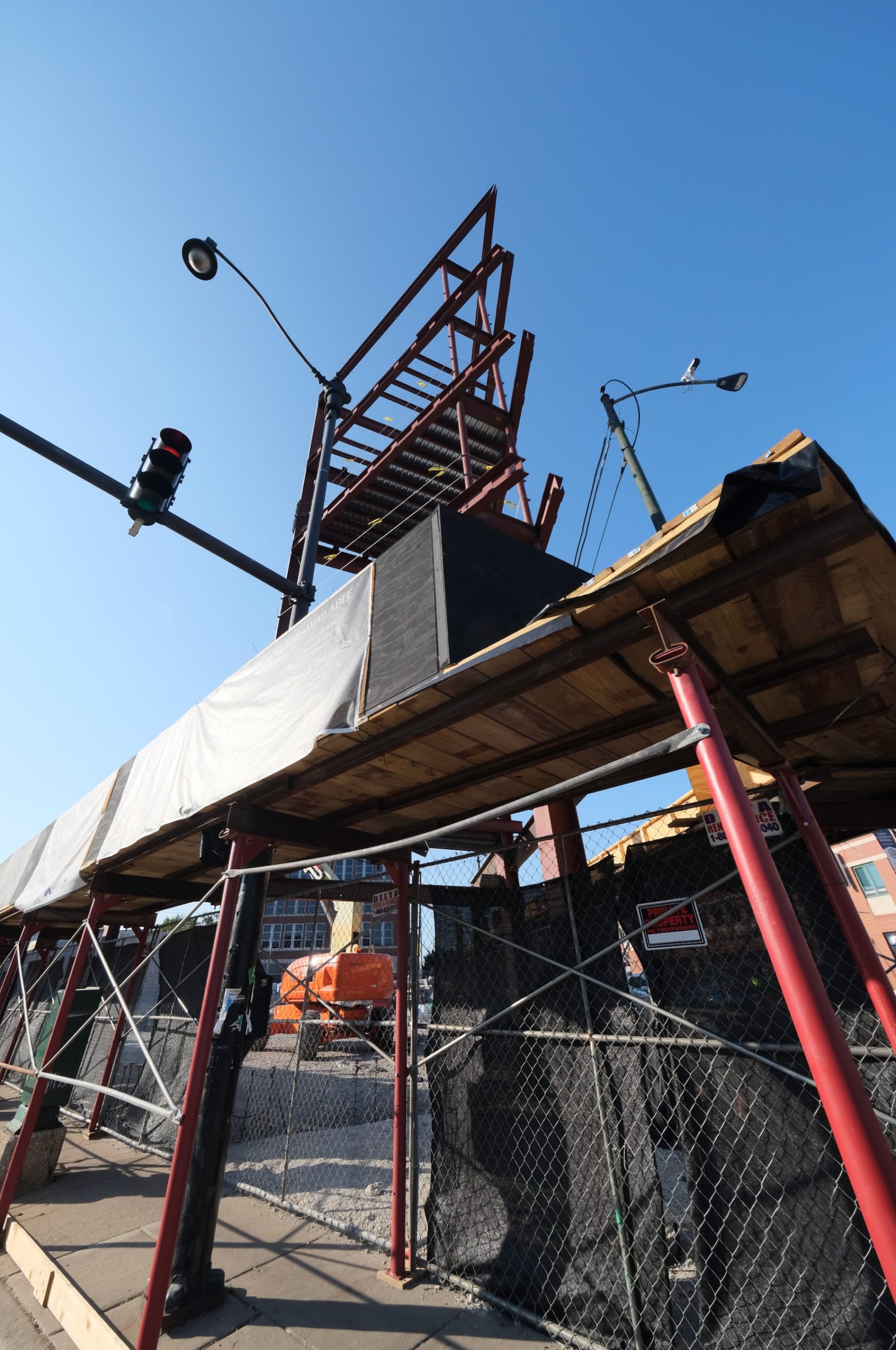
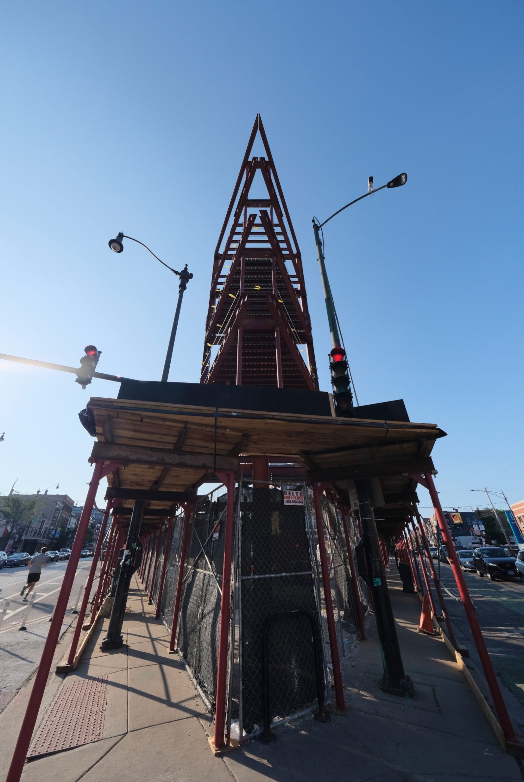
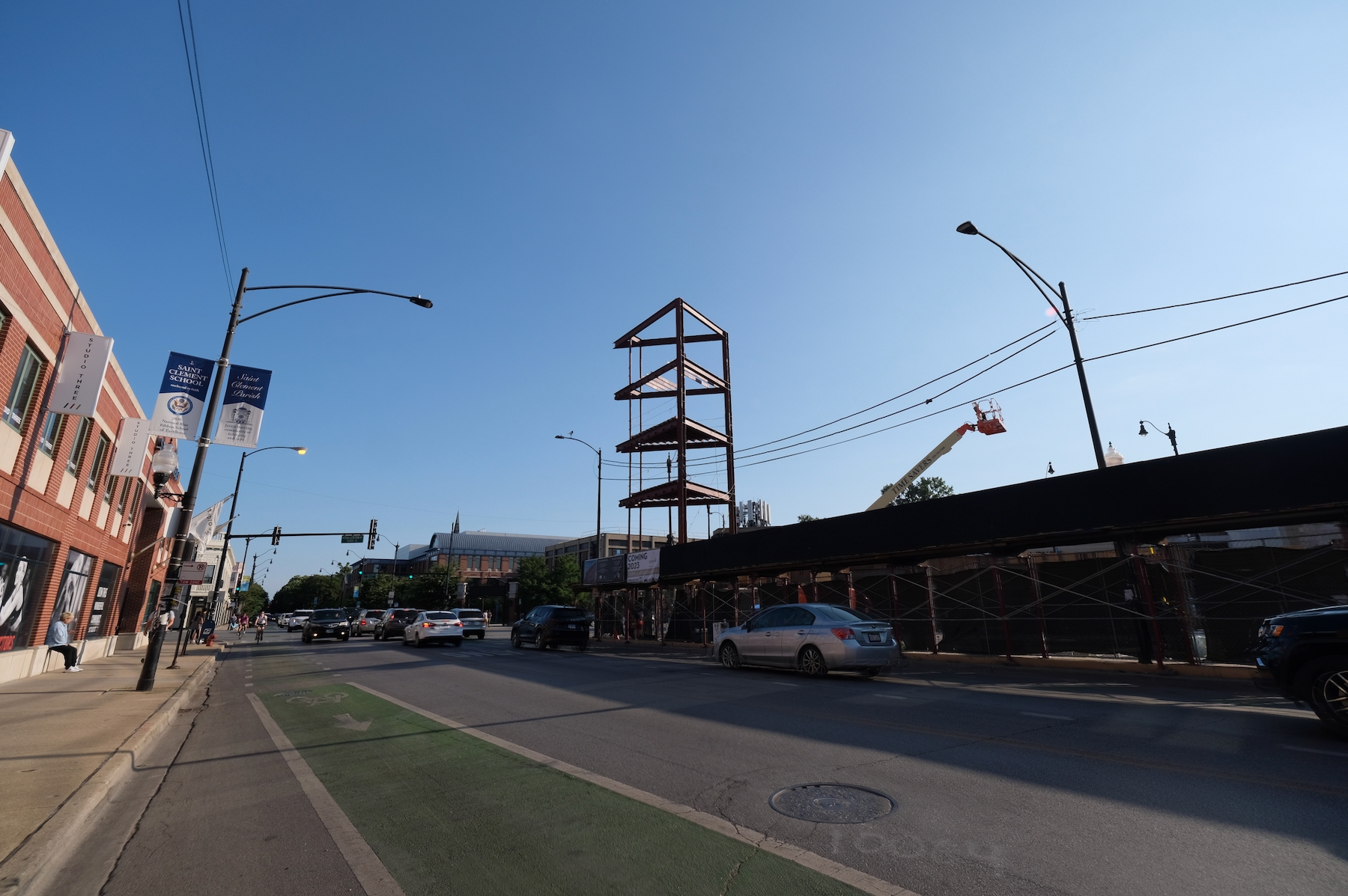
Structural steel has reached its pinnacle for the frontmost section of “The Porter,” a five-story mixed-use building rising at 2411 N Lincoln Avenue in Lincoln Park. Having replaced a privately-owned park at the three-way intersection of Lincoln Avenue, Halsted Street, and Fullerton Avenue, the scheme by Mike Breheny involves 3,700 square feet of retail, a 1,700 square-foot covered patio, and 36 for-rent apartments above.
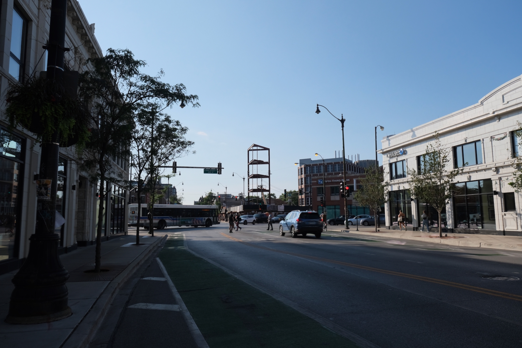
The Porter. Photo by Jack Crawford
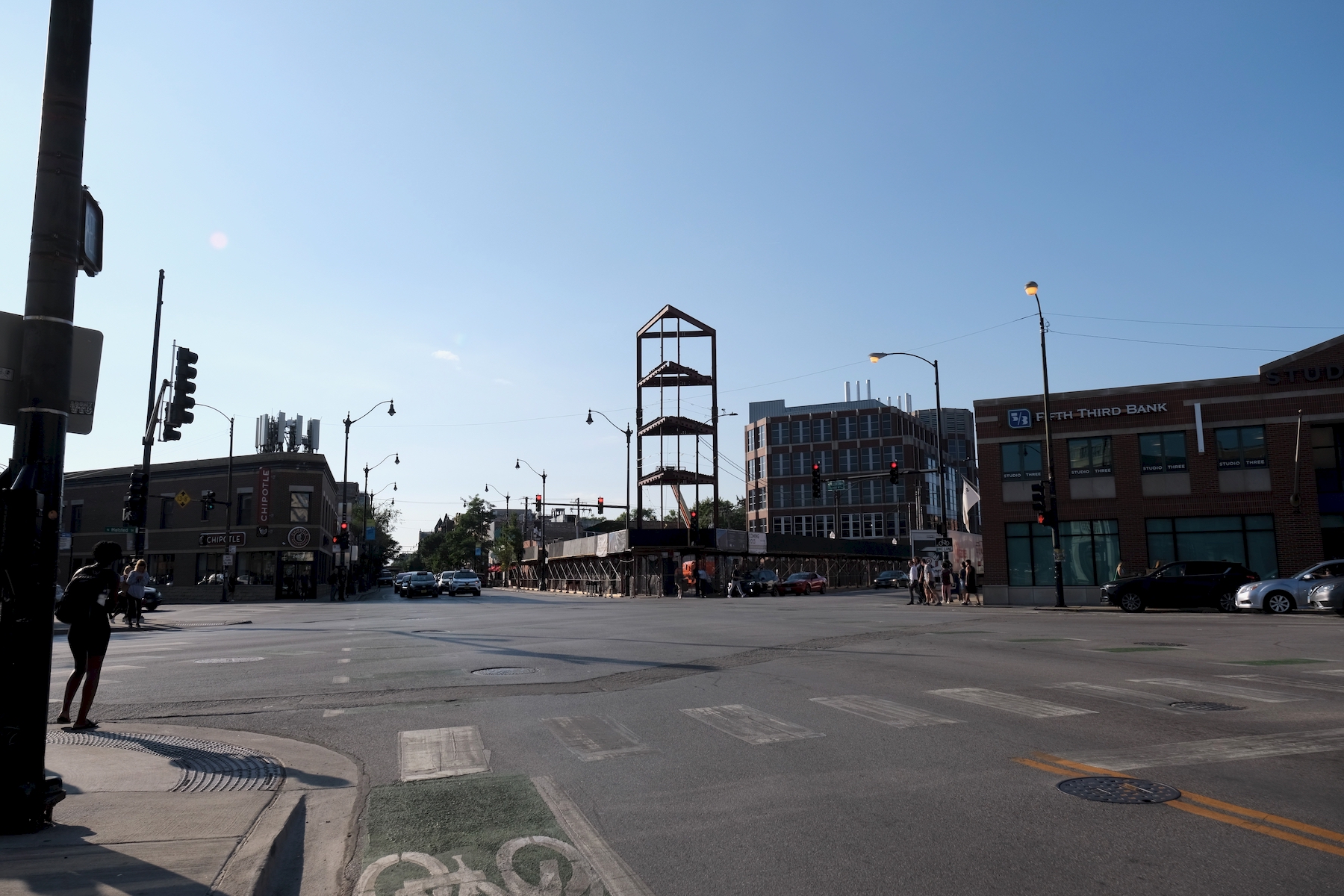
The Porter. Photo by Jack Crawford
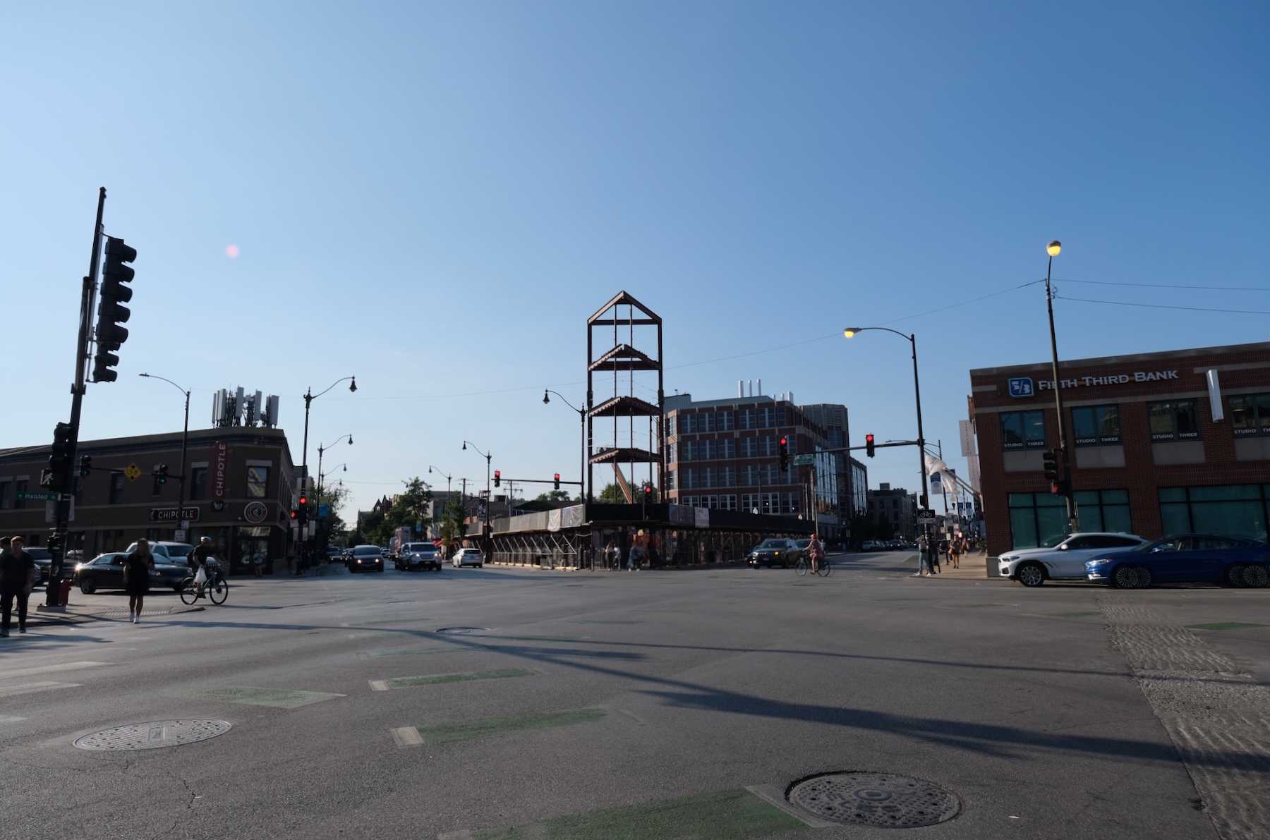
The Porter. Photo by Jack Crawford
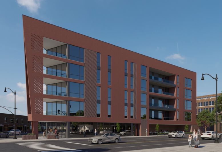
The apartments will lean toward the larger end, comprising of 25 percent two-bedrooms, 60 percent three-bedrooms, and 15 percent four-bedrooms. There will also be a covered rooftop amenity deck and 36 on-site parking spaces.
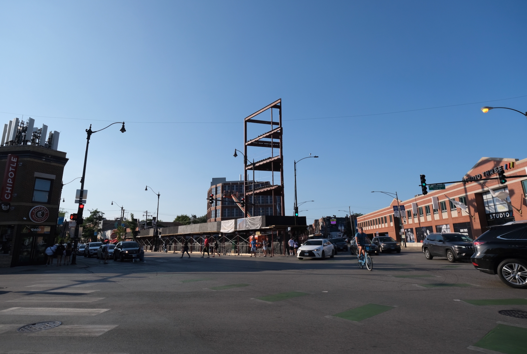
The Porter. Photo by Jack Crawford
The Porter. Photo by Jack Crawford
The Porter. Photo by Jack Crawford
The Porter. Photo by Jack Crawford
The Porter. Photo by Jack Crawford
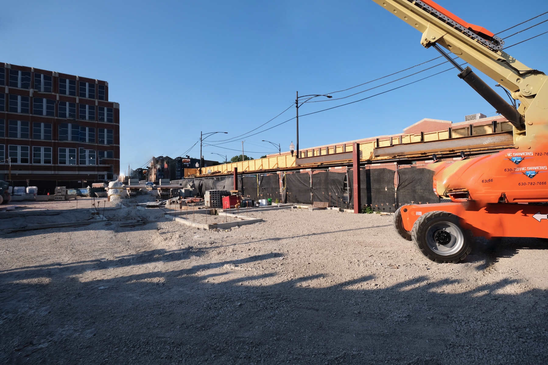
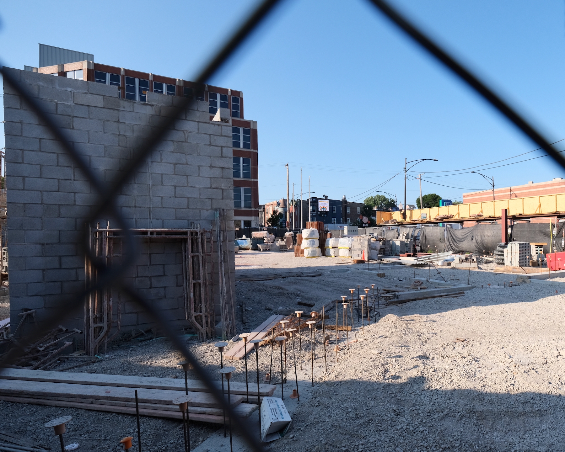
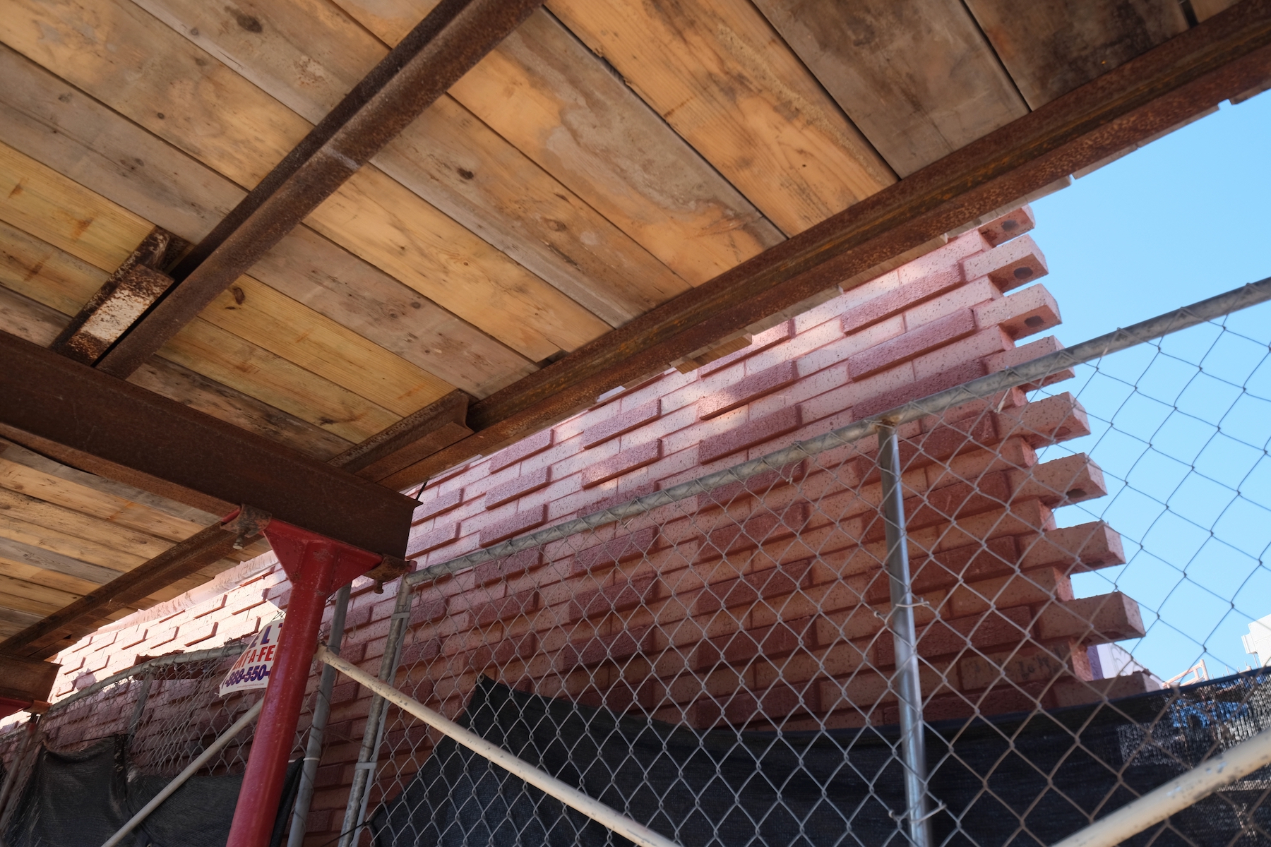
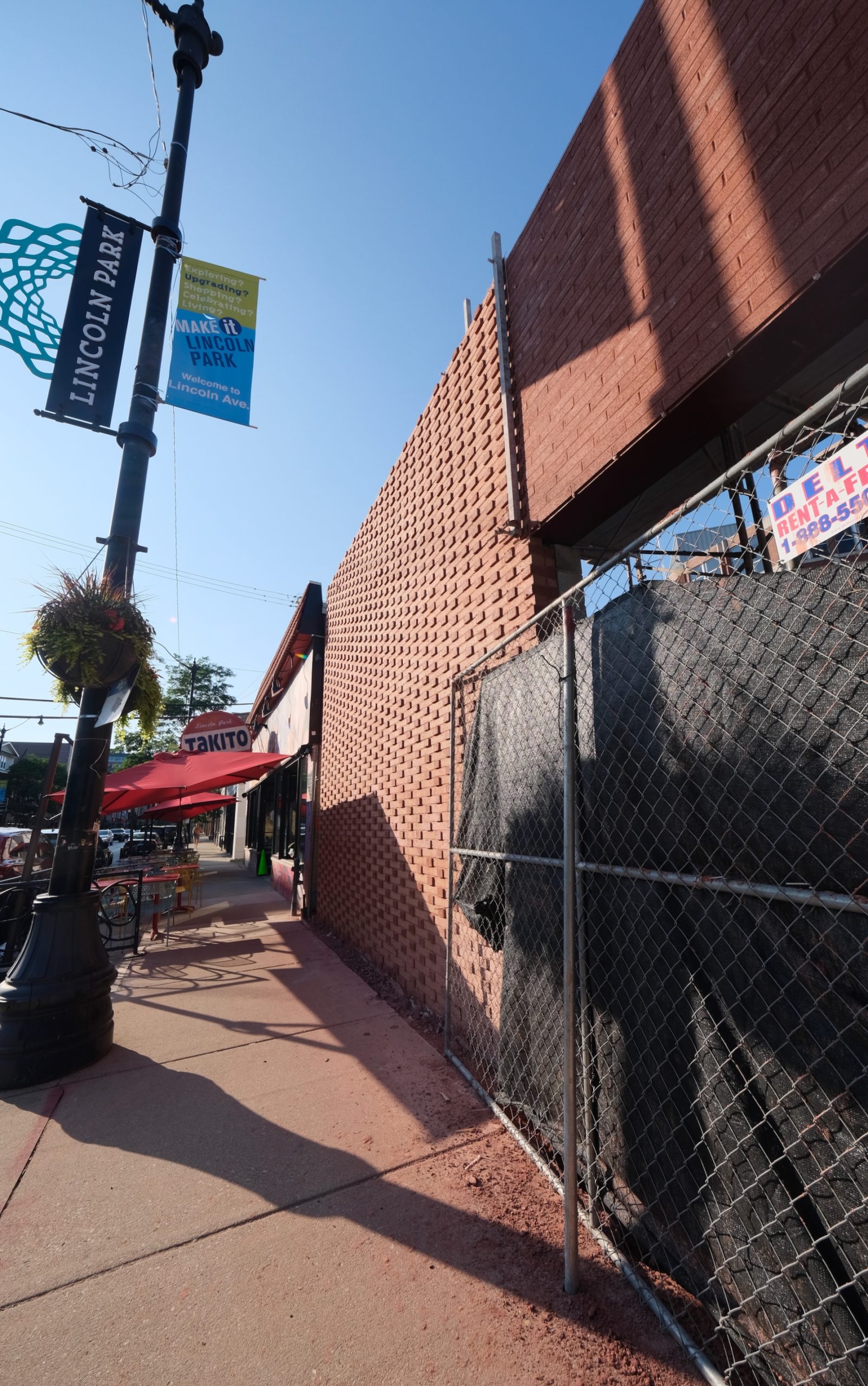
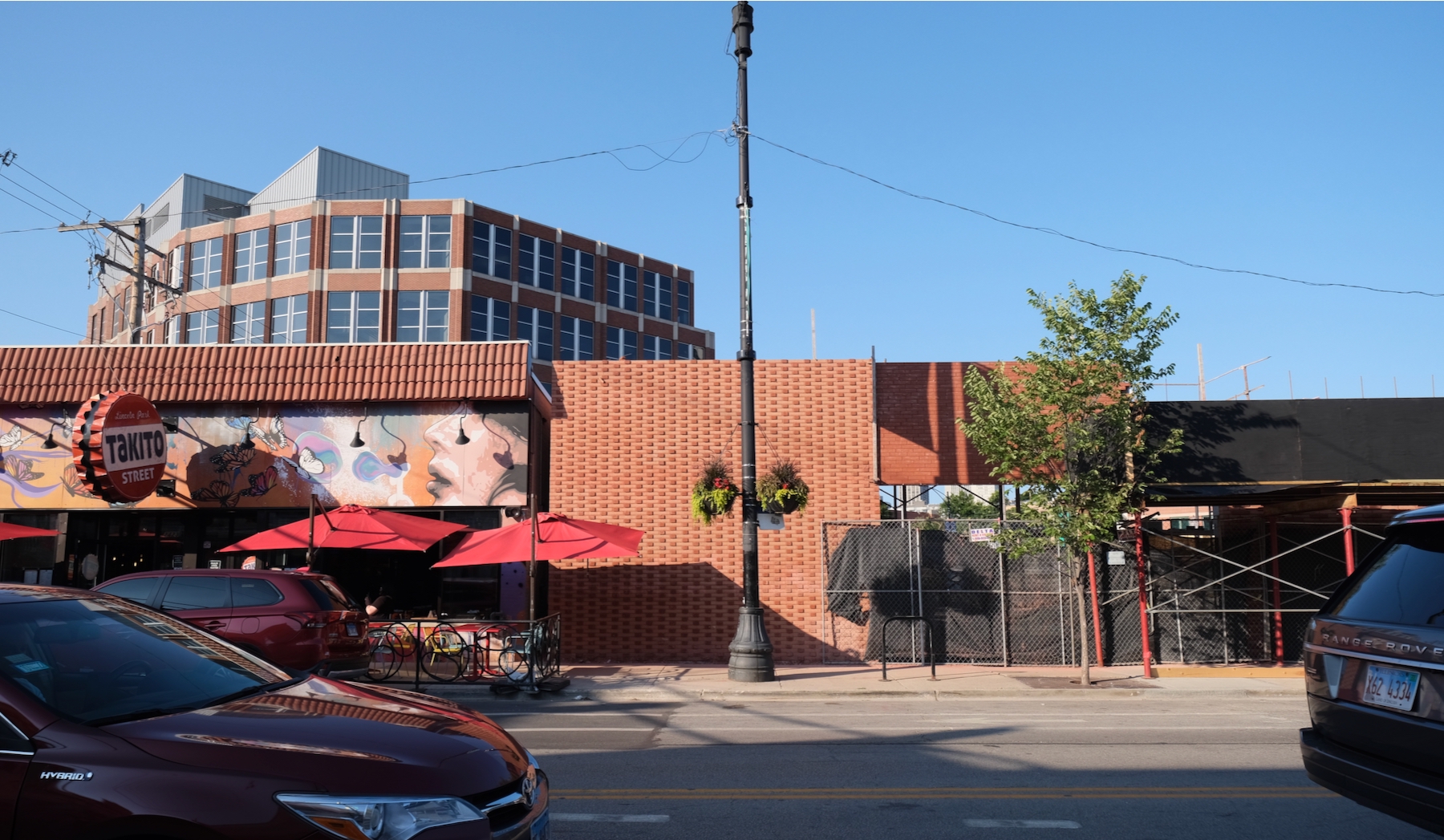
Studio Dwell is behind the design, whose massing vaguely resembles the shape of a boat due to the triangular site. As such, the “bow” of the building will be open-air to allow for private balcony spaces, while other residents will also have access to balconies along the Lincoln Avenue- and Halsted Street-facing sides. Already, a red brickwork can be seen towards the rear of the project, arranged in a pattern of varying protrusions.
The Porter. Photo by Jack Crawford
The Porter. Photo by Jack Crawford
The Porter. Photo by Jack Crawford
The Porter. Photo by Jack Crawford
Closest transit includes bus service for Route 74 located within a two-minute walking radius. Meanwhile, all three of the Red, Brown, and Purple Lines are available in under a five-minute walk west to Fullerton station.
The Porter. Photo by Jack Crawford
The Porter. Photo by Jack Crawford
With all permits now issued, Contemporary Concepts is serving as the general contractor. The retail segment is expecting a fall delivery, while a full completion is anticipated for next year.
Subscribe to YIMBY’s daily e-mail
Follow YIMBYgram for real-time photo updates
Like YIMBY on Facebook
Follow YIMBY’s Twitter for the latest in YIMBYnews

What a peculiar construction.
I can’t believe this ugly POS replaced such a nice pedestrian friendly landscaped plaza. Only in Chicago. The hospital could have traded for zoning rights very easily but what else do you expect from the city that no longer works.
so are you mad at the “city that no longer works”, or the property owner?
That park sucked to be honest. It had like two benches and some planters and a couple mature trees. It was hot and exposed in the center and there were noisy cars zipping with exhaust on all sides w/ no main “attractor.” They should have invested in making it a proper green space with a “surrounding, ensconcing” effect, but a discount flatiron building isn’t any worse — at least if I sit there now I’ll have better seating and more shade with some retail. I guess my point is that both the green space and the building are in the same rank, just different types of “blah”
The corner is over kill and the building under embellished. For an important corner, a lackluster blah undercooked design that adds nothing to the urban landscape….
Love a nice flatiron and the brick is nice. Y’all are whiny. Complain about that horrid drive in bank across the street if you must.
2 wrongs…These are not proud buildings meant to create great urbanism…they are both thin place holders with the least ability to create meaningful long lasting design.
Oh man, every time I pass by that building I close my eyes and imagine a Lincoln Commons Phase II with more green space and mews. People can dream….
I actually like the design; especially with all that varying brickwork! A really bold, jagged use of the corner lot too. It’ll be nice once constructed, I think
Great design! Will look great once completed next year.
I share the same sentiments as most commentators, it’s a nice design. This development will rent out pretty quickly because LP rentals are in a huge demand right now.