The Chicago Plan Commission has approved the mixed-use development at 1234 W Randolph Street in Fulton Market. Located along the busy corridor just east of the intersection with N Elizabeth Street, the upcoming high-rise has gone through various changes to its podium after presenting in front of the Committee on Design late last year. Now developers Azur Holdings and Golub & Company are moving forward with the latest iteration of the SCB-designed project, which was originally pitched as a hotel replacing the two small commercial structures on site.
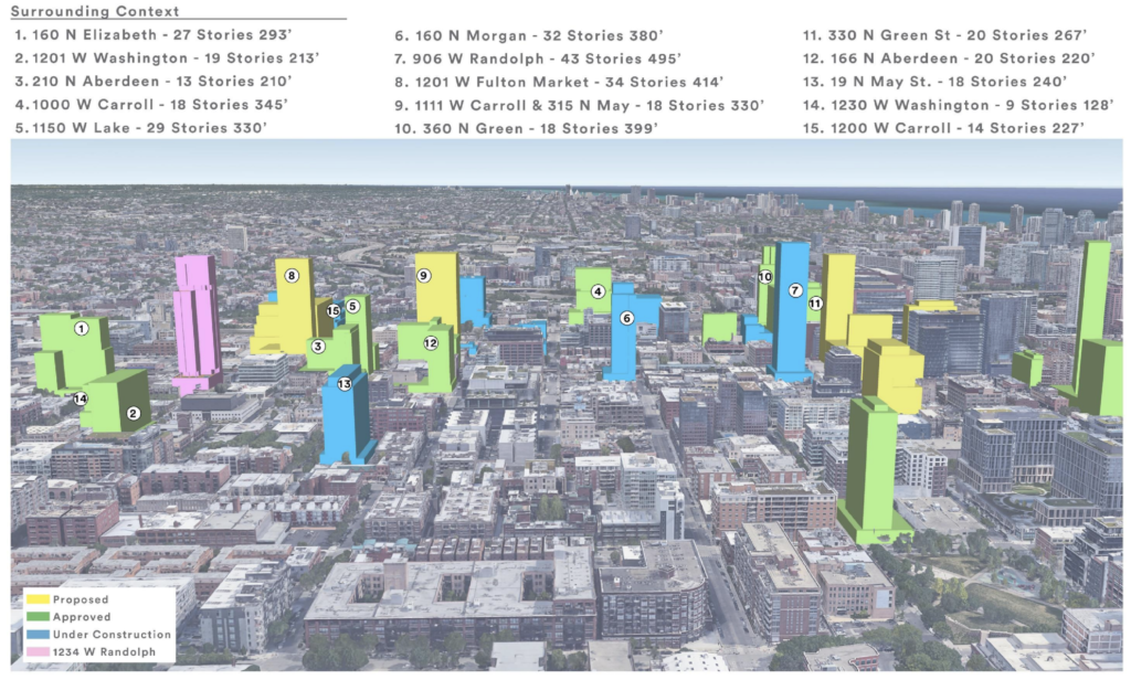
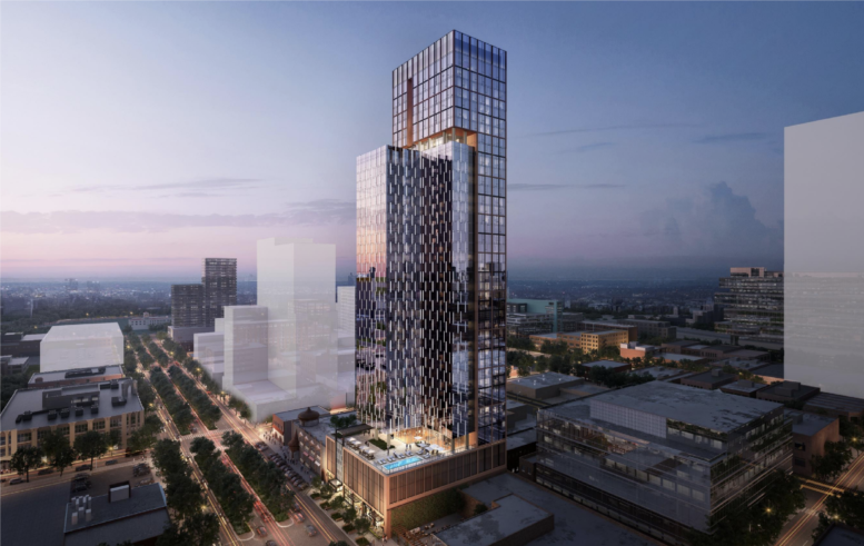
Site context rendering of 1234 W Randolph Street by SCB
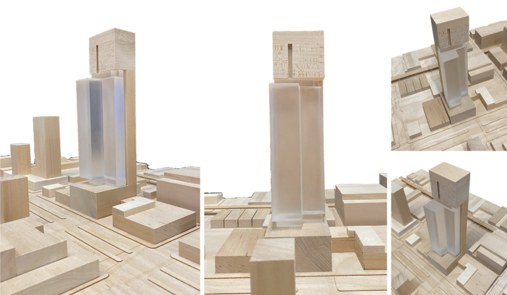
Massing model of 1234 W Randolph Street by SCB
Rising 41 floors and 460 feet in height, the L-shaped tower will sit on top of a four-story podium which was enlarged due the committee’s comments. The original proposal included no retail space in exchange for a small plaza carved out on the southeast corner of the site, however comments revolved around maintaining the commercial wall of the corridor and thus the space has now been incorporated. Now a small commercial space with retractable windows will hug the sidewalk with the residential lobby and back of house spaces on the ground floor.
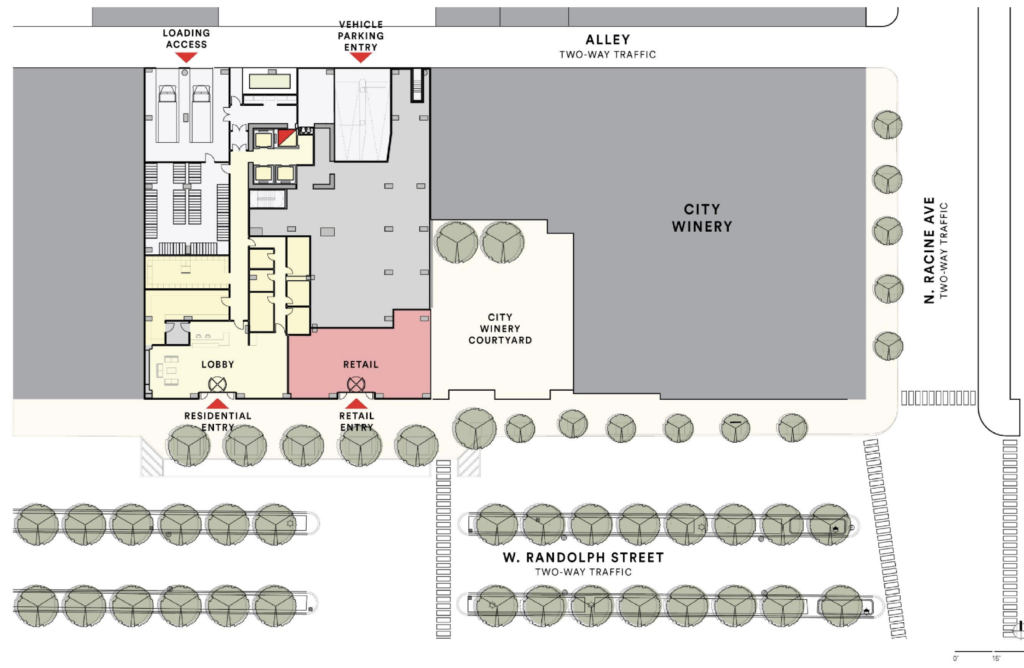
Ground floor plan of 1234 W Randolph Street by SCB
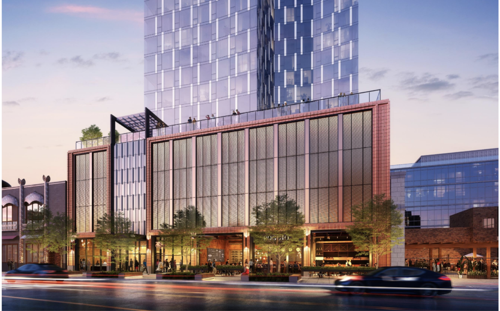
Podium rendering of 1234 W Randolph Street by SCB
Above this will be three levels of parking containing a reduced number of vehicle parking spaces from 124 to 113 along with an increased number of bicycle parking spaces from 200 to 290. The podium will be capped by an amenity floor with a large outdoor deck and pool facing east. Above this will be 395 residential units made up of studios, one-, and two-bedroom layouts of which 79 will be considered affordable for those making 60 percent AMI. All residents will also be able to enjoy an upper amenity space on the 33rd with an adjoining terrace as the structure sets-back for its final vertical rise.
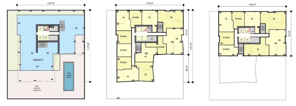
Fifth (left) – 20th (center) – 40th (right) floor plan of 1234 W Randolph Street by SCB
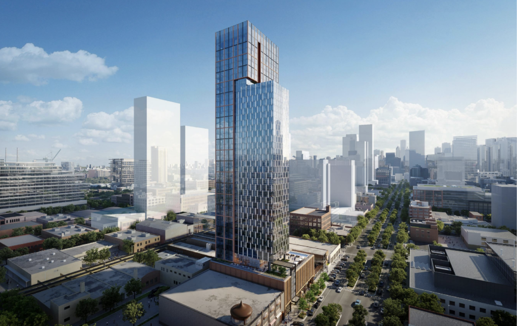
Rendering of 1234 W Randolph Street by SCB
The tower will use strips of inset space to break up its overall massing, with the lower portion of the structure that caps out at 33rd floor utilizing mostly a reflective glass facade with alternating vertical metal panel accents. Meanwhile the taller east-west portion which reaches the full 41 floors will have a curtain wall that is subdivided into a grid by black and orange metal panel fins and spandrels, with the facade extending on the crown to conceal the mechanical equipment within.
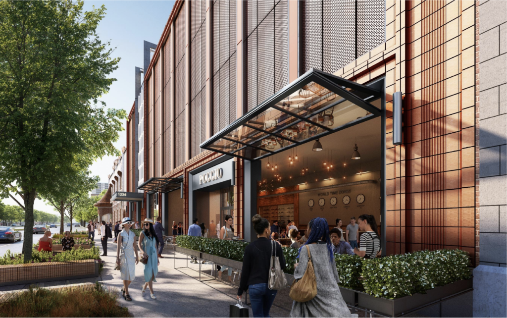
Podium rendering of 1234 W Randolph Street by SCB
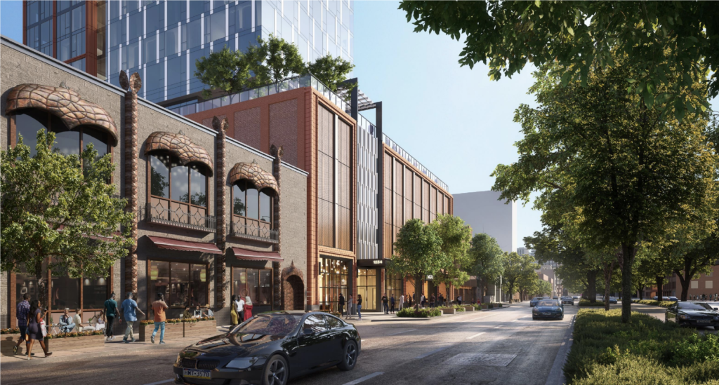
Podium rendering of 1234 W Randolph Street by SCB
Future residents will have access to both CTA Green and Pink Lines at the Morgan station as well as bus service for Routes 9 and 20 within a short walk. At the moment no further construction details have been revealed for the multi-million dollar proposal as it will need to be approved by various other city entities including City Council for its zoning and more. The full design presentation for the project can be found here.
Subscribe to YIMBY’s daily e-mail
Follow YIMBYgram for real-time photo updates
Like YIMBY on Facebook
Follow YIMBY’s Twitter for the latest in YIMBYnews

This podium is hideous. At least before the metal panels had some depth to them. The committee on design cannot count this one as a win. Their suggestions killed the plaza space and their concerns about the podium were completely ignored. If anything it’s worse now without the plaza breaking up the flat metal panel wall. Maybe someday this will blend into the background, but right now it looks like a big sore thumb.
Lol I can’t tell the difference between most of these West Loop towers anymore. I just see anything on Fulton, Carroll, Randolph etc. and think ‘oh great another one’
Happy to see all the investment at least
Agreed. The podium, as always, looks terrible.
Chicago is ‘recentering’ around its actual center!
If these developers insist on putting in so much car parking, at least the city (and design committee) should enforce that the outward-facing sides should be active uses, like 1 apartment deep or 1 office/retail slot deep with the parking hidden behind. Chicago has buildings like this and other cities (like Toronto) seem to be doing this as standard. This would be a great and reasonable compromise that really would help the pedestrian experience, the vitality feeling of the building and aesthetically much more pleasing.
Great idea!