Updated plans have been revealed for the mixed-use development at 1300 W Carroll Avenue in the West Loop. Located on the northwest corner with N Elizabeth Street and replacing a vacant lot that once held the ADM Wheat Mill silos, the multi-phase project has now received a redesign after feedback from the community and the Department of Planning and Development. Developer Sterling Bay is still working with global design firm SOM on the proposal which received some major changes from its initial announcement in November 2021.
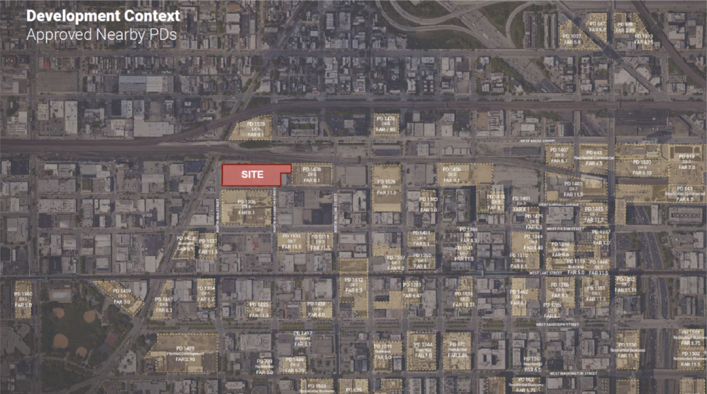
Site context of 1300 W Carroll Avenue by SOM
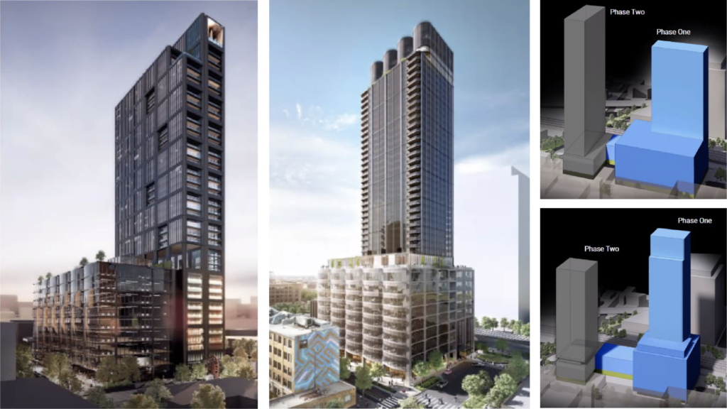
Previous (left and top) and current (right and bottom) design of 1300 W Carroll Avenue by SOM
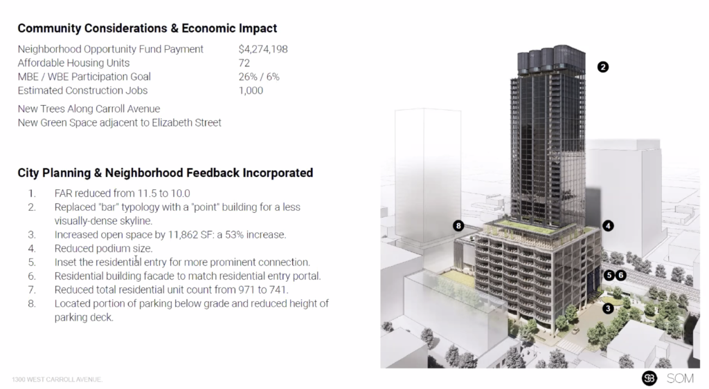
Original plans for the two-phase project called for a boxy 418-foot-tall tower in phase one and a silo-inspired 515-foot-tall tower for phase two with 971 residential units in total. Now the building heights and design inspirations have flipped and the unit count has been lowered, with phase one being presented last night and set to rise 40 stories and 515 feet in height with 741 residential units in total between the two. The overall development also had its podiums shrunk in exchange for more green space, part of the parking moved underground, and the overall massing minimized.
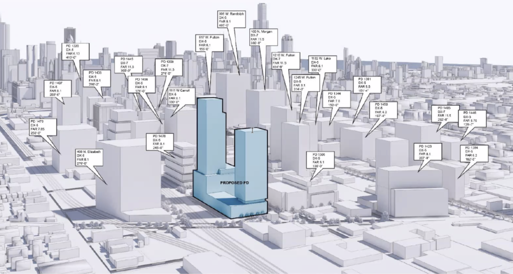
Context massing model of 1300 W Carroll by SOM
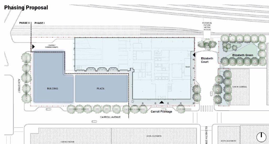
Updated site plan of 1300 W Carroll by SOM
On the ground level both phases will have expanded sidewalks with no curb cuts aside from one on N Ada Street on the site’s west boundary, here is where all vehicular traffic will move into the development and parking as well. On the Elizabeth Street side, phase one will bring a new pocket park along the Metra tracks with a sliver leading down to Carroll Avenue, phase two will then build out a large plaza in between the two towers. Active uses on all levels will surround all public areas with parking and back of house limited to the north end towards the tracks.
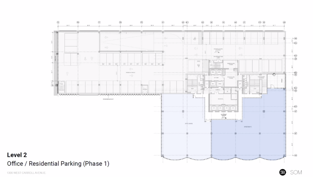
Second floor of 1300 W Carroll Avenue phase one by SOM
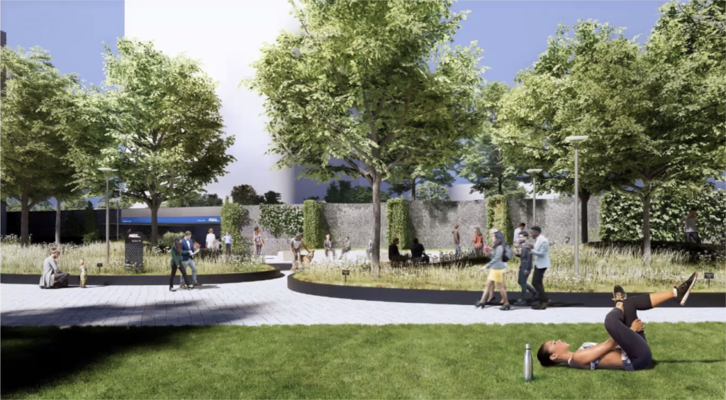
Pocket park rendering of 1300 W Carroll Avenue phase one by SOM
The podium for phase one will consist of a residential lobby on Elizabeth Street, retail spaces, amenity spaces, and an office lobby facing Carroll Avenue. Floors two through four will hold office space and 259 vehicle parking spaces, with the tower setting back on the fifth with a large shared rooftop capping the parking and office uses continuing through floor ten with a terrace on each floor. Floors 12 to 38 will hold 361 residential units made up of efficiencies, one-, and two-bedroom layouts of which 72 units will be considered affordable.
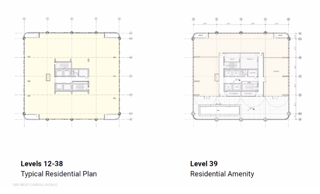
Typical floor plans of 1300 W Carroll phase one by SOM
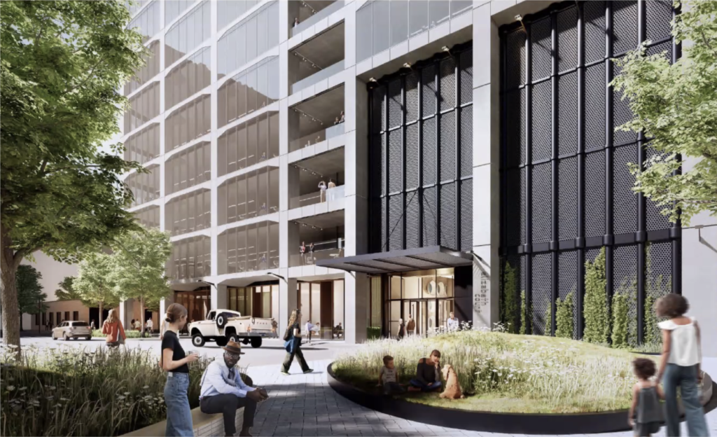
Residential entrance rendering of 1300 W Carroll Avenue phase one by SOM
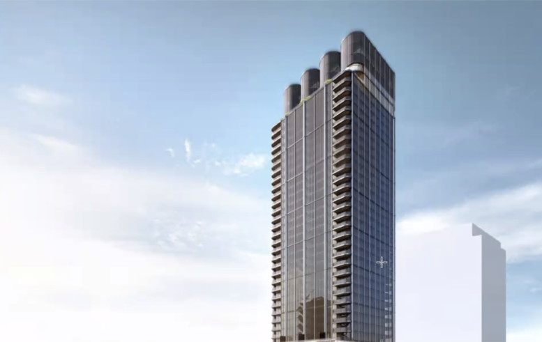
Units on the corners will feature private balconies with all residents having access to a large amenity space and rooftop pool on the 39th and 40th floors, topped by a silo-inspired crown that rises a few stories more. While the tower will be clad in glass and metal panels, the base will boast an exposed concrete structure that pulls inspiration from the surrounding context with curved bay windows on the southern face. Hoping to create a placemaking statement on the avenue, the updated design will also utilize metal screens and plenty of landscaping.

Office entrance rendering of 1300 W Carroll Avenue phase one by SOM
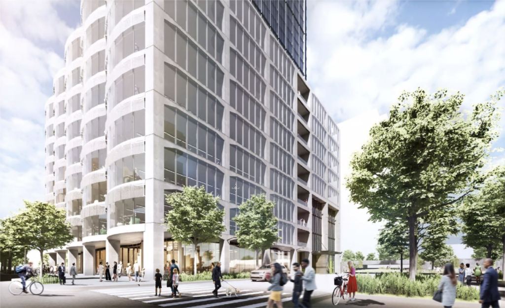
Podium rendering of 1300 W Carroll Avenue phase one by SOM
Although the project is only required to have the aforementioned 20 percent of affordable units, it does sit in an area where 30 percent is encouraged and the developers stated they will work with the Department of Housing on finalizing the numbers. It is also worth noting the project is set up to connect to a future Metra station that is being explored just north of the site, with the park and small plaza near it aimed at moving pedestrian traffic.
Overall rendering of 1300 W Carroll Avenue phase one by SOM
Phase two’s 418-foot-tall revised design will be presented at a later date and the first will now require approval from the Department of Planning and Development prior to being able to move forward. No budget was made public but Sterling Bay hopes to break ground on the first phase by the end of the year with a two-year construction timeline, a year or so after they plan to begin work on the second tower.
Subscribe to YIMBY’s daily e-mail
Follow YIMBYgram for real-time photo updates
Like YIMBY on Facebook
Follow YIMBY’s Twitter for the latest in YIMBYnews

What the actual f…? Hideous. Strangely reminds me of the old Prentice Hospital in some aspects. Looks disjointed between podium and tower.
Welp they ruined it. This city sucks. Thanks for killing the one tower I was looking forward to
The first version was interesting. It’s been downhill from there. SOM and Sterling are doing nothing interesting or innovative. Here they tried to do something but failed. They should have kept the Silos and the gorgeous old brick factory building and just beyond a simple glass tower around it. Too late for all that.
Really? The original was that good iyo and this is that bad?
Am I the only one that doesn’t dislike this building?
It’s not the best, but overall I like it
Naw, you’re just one of the few willing say something positive
this is a vast improvement, if for no other reason that some of the parking was forced underground where it belongs. I like the new design better, but that is just a matter of subjective taste.
The posts on this site have degraded to the point that I’m probably going to just read the articles – between trolls, NIMBYs, anti-gubbermint rants, and support for buildings that are historical knock-offs or parking garages with housing on top, I just don’t enjoy reading the posts here any more.
Are you serious? That’s supposed to be an office block and they designed it into a downtown 1988 parking garage. It’s literally a stubby USB sticking out of a fat box. On what planet is that a good use of space? And that flat facade, woof! Take a trip to Singapore honey.
Definite design downgrade.
Crematorium vibes up top. So disjointed.
This building is fantastic. Major upgrade.
If you don’t like it… Get a degree and become certified and then put your mouth to some physical action.
Exactly! And until you do, just shut up and don’t dare offer your plebeian opinions! SouthLoop doesn’t have time for them!
Another hideous garage with metal screens.
Hideous.The parking should be underground .
Incredible how badly SOM HAS FALLEN .
Those faux smokestacks are ridiculous.
Bottom line : DO NOT BUILD THIS . IT STINKS .
Seeing this “revamp” evokes a punch to the face hangover I had waking up to the news from the 2016 presidential election result.
Everyone keep your pants on. This change is more of a reorientation of the building sizes for Phase I and II. This new Phase I is a redesign using the tower from the original Phase II design, and this iteration is actually an improvement, imo. The original boxy tower from above will presumably be the starting point for the redesign of Phase II.
hedious, 80s looking, out of place, cheap design.
Looks like an evil villain’s tower.
dreadful
I actually quite like it 🤷♂️
How disappointing. Its clear that SOM knows nothing about residential, they should stick to bland office buildings.
Where are the City’s self-anointed design police when we need them?
It’s not Horrible and the only reason Chicago isn’t building super tall buildings like Manhattan is because we have much more space to build wider and shorter and or just two shorter buildings instead of one skinny tall one. Being a more spread out city is what makes Chicago Chicago. If you want crazy density and super tall buildings go move to nyc. I for one don’t mine all the 300-500ish height buildings going up. But just so you know we have had 4 600ft+ building finish construction in the last three years. And two more currently under construction.
It’s not Horrible and the only reason Chicago isn’t building super tall buildings like Manhattan is because we have much more space to build wider and shorter and or just two shorter buildings instead of one skinny tall one. Being a more spread out city is what makes Chicago Chicago. If you want crazy density and super tall buildings go move to nyc. I for one don’t mine all the 300-500ish height buildings going up. But just so you know we have had 4 600ft+ building finish construction in the last three years. And two more currently under construction.
Ted Moseby is at it again in west loop.
The proportions between the base and tower feel way off to me. And that crown. Good god. Hideous.
Sigh
Honestly, I don’t hate it because every other building going up right now in West Loop is a black box. It’ll be nice to have some contrast
At first I hated it. Now I’m kind of thinking this is neo 80s. Industrial Pomo camp. If the finishes are good it could be very interesting. Bit of brutalist with the exposed concrete – hope it remains unpainted. The exposed skeleton on the east facade resembles the building when it was half demolished in a way.
So sick of stacked glass boxes. This is something else at least.
Since I will have to look at this thing daily (I face south just at the bottom left corner of the massing drawing), I have to say it’s “meh”: not wretched, not ohmigod. Another tower-on-a-box with some architecture stuck on it. Overall looks will probably depend on finishes (and we know renderings are somewhat unreliable on that). My favorite bit is the $4.27 million payment to the Neighborhood Opportunity Fund for the FAR bump. My guess is they’re betting on the new Metra station showing up sooner rather than later.
The original is definitely better