The Chicago Plan Commission has approved the mixed-use development at 640 W Randolph Street in West Loop Gate. Located on the northwest corner of the intersection with N Des Plaines Street, the slim proposal will be replacing a surface parking lot and joining a row of brick-clad commercial buildings near the highway. The team of Vista Property Group and designers Antunovich Associates is back after working on 741 N Wells and 609 W Randolph nearby, utilizing a similar design language.

640 W Randolph Street. Rendering by Antunovich Associates

Ground floor plan of 640 W Randolph by Antunovich Associates
Going up to the property line on all four sides of the 81-foot-wide site, the slender tower will rise 15 stories and 225 feet in height. The ground floor will be anchored by a 2,500-square-foot corner retail space and joined by a small lobby, bike room, and ramp to the parking garage above. The second floor will hold 19-vehicle parking spaces with shortest ceiling height of all of the floors, above this will be 117,000 square feet of office space offered on floors three thru 14 with small corner terraces alternating on each floor.
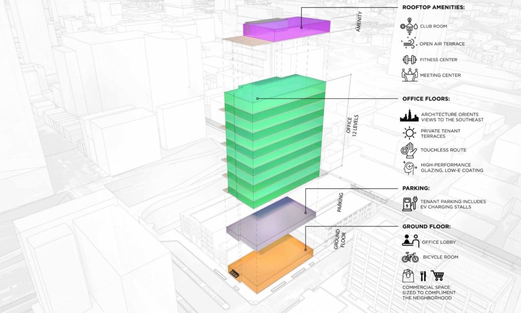
640 W Randolph Street programming diagram by Antunovich Associates
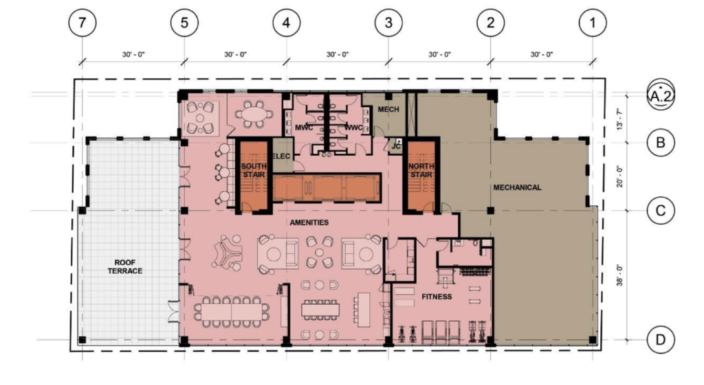
Rooftop floor plan of 640 W Randolph by Antunovich Associates
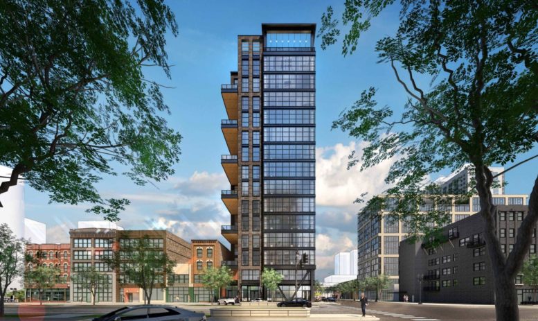
This will allow west-facing terraces to have a two-story clearance before the bottom of the next one. Tenants will also have access to a large top floor amenity floor with a fitness center, lounge, breakout rooms, and a large rooftop terrace facing south. Most of the structure will be clad in a semi-reflective glass facade similar to 741 N Wells with small panels to mimic an industrial aesthetic, with dark metal spandrels separating the floors. The westernmost portion of the tower around the core will be covered in brick with wood on the underside of the balconies.

640 W Randolph Street. Rendering by Antunovich Associates
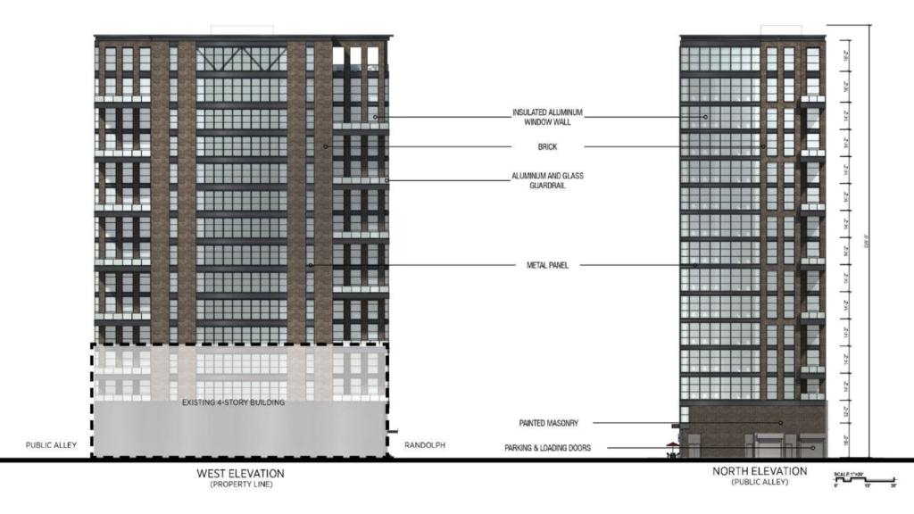
Elevations of 640 W Randolph by Antunovich Associates
Users of the boutique Transit-Oriented-Development (TOD) will have bus access to CTA Routes 20, 56, 120, and 156, CTA Pink and Green Lines Clinton station, as well as Ogilvie Station all within a five-minute walk. The approval is one of a few more it will require prior to a groundbreaking. Although no construction timeline has been revealed, we know W.E. O’Neil Construction will serve as the project’s contractor.
Subscribe to YIMBY’s daily e-mail
![]()
Follow YIMBYgram for real-time photo updates
Like YIMBY on Facebook
Follow YIMBY’s Twitter for the latest in YIMBYnews

Awesome – Hoping Vista Property continues swiftly building. Everything they’ve put up thus far has been solid. Also, what tf happened to this site’s chat?? Seems like this UnionMade troll has single-handedly derailed all sense of sanity…
Just enjoy watching obsession play out. I admire the devotion.
The trolling is the best part of these comments. How many of the exact same complaints over parking podiums do you need to hear? There are already enough people in this space complaining that “Chicago needs to wake up” as though Chicago were a single person. The market drives things like height, materials, and design. Those who rage against those things deserve to be mocked.
Settle down now. I think 640 W. Randolph might need to get a restraining order.
Looks great.
This group is really coming up a nice contemporary vernacular for Chicago brick and glass and steel. It’s composed, balanced, quiet but engaging. And finally a successful attempt at “breaking up a facade”. I think this should be Chicago’s go-to style when rethinking classical warehouse architecture
Well said, and agree! My pet topic of course, it has an appropriate number of car parking spaces as well. This is truly a transit-oriented-development that doesn’t take from the CTA or active street life.
Yes! This design would be completely demolished with even a small parking podium, attached to it. Amazing how much more “NYC” and “vertical” our buildings look without one. Take note Fulton Market
Bravissimo!
I have an impersonator…I’m flattered! I don’t recall any commentary on sexual tension and architecture but this is great!
It is my ardent hope that I too get an imposter troll. I’m feeling left out. But , then again, maybe my posts are already too farcical to bother co-opting.
Congratulations, Union and Bot!