The Hotel Riu Plaza Chicago is putting finishing touches on the exterior, as the interior progresses ahead of its scheduled opening this summer. The 28-story hotel will feature nearly 390 rooms when it welcomes its first guests, who can wine and dine each other at the 27th-floor bar “The Rooftop” opening in the fall.
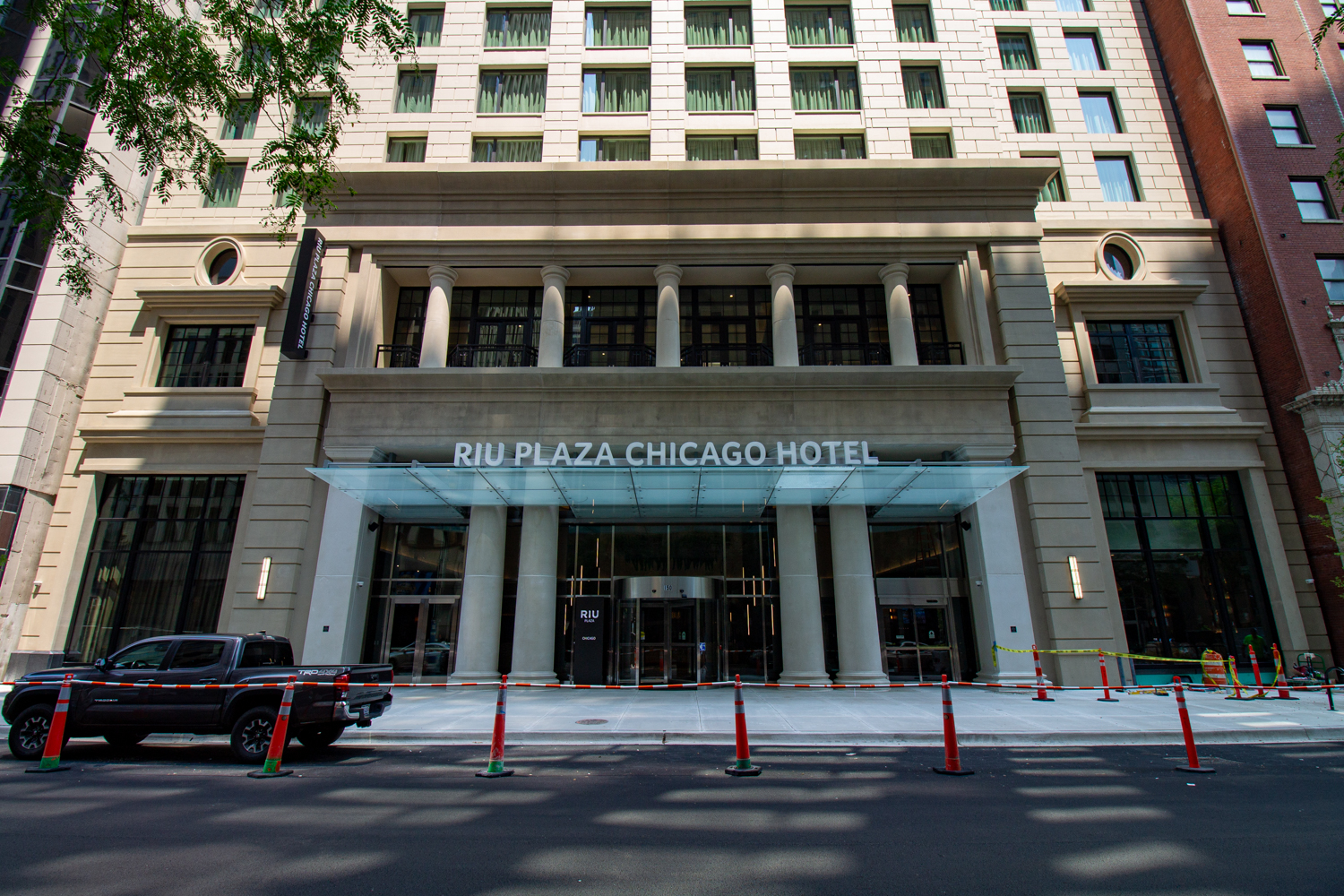
The Hotel Riu Plaza Chicago, opening this summer. Photo by Daniel Schell
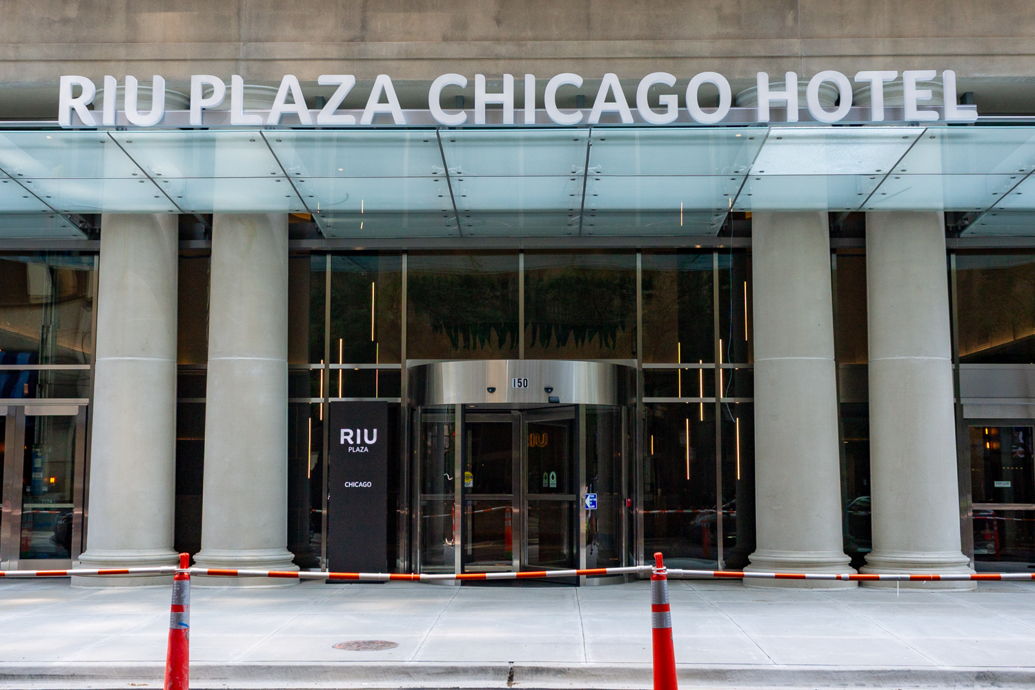
Photo by Daniel Schell
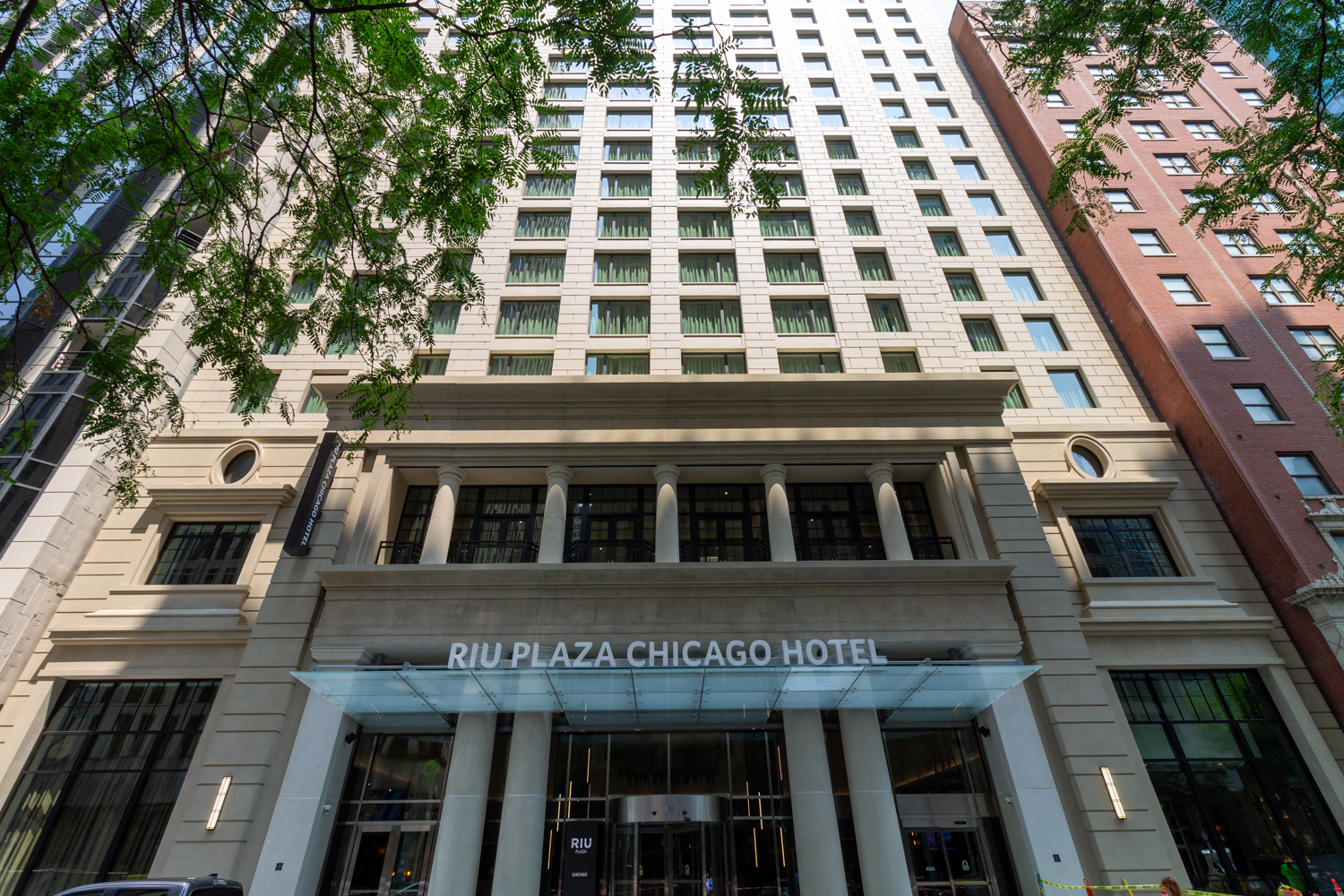
Photo by Daniel Schell
W.E. O’Neil is the general contractor for the hotel, located at 150 E. Ontario Street in Streeterville, for developer The Prime Group. Designed by Lucien Lagrange Studio, the hotel tower topped out last fall. Caissons were permitted back in July of 2022, while tower crane and full building permits followed on October 7, 2022. Construction took place in a lot that had been sitting vacant for well over a decade.
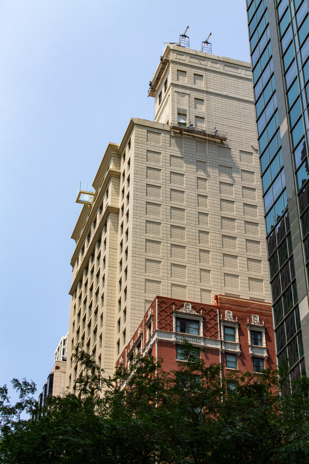
Photo by Daniel Schell
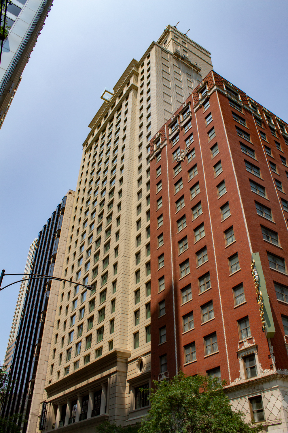
Photo by Daniel Schell
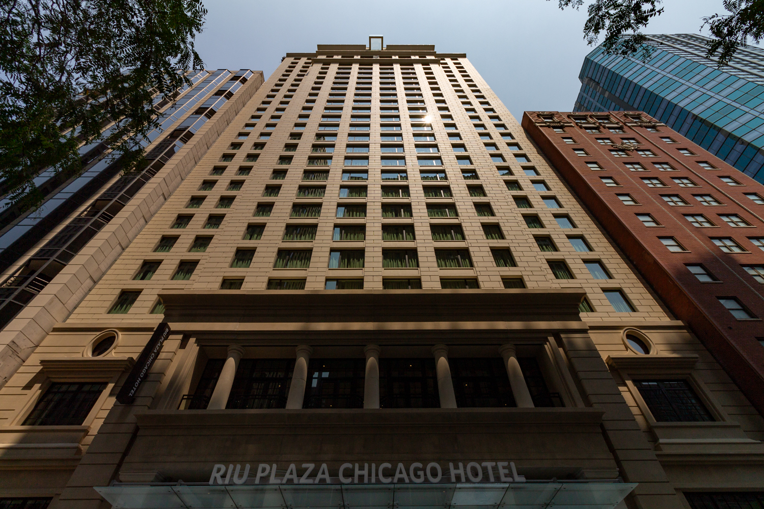
Photo by Daniel Schell
The Hotel Riu Plaza Chicago is ideally located half a block from Chicago’s Magnificent Mile, placing guests within a one-block walk for bus service for the CTA’s 2,3, 10, 26, 126, 143, and 157 buses. The nearest subway access point is the Grand Red Line station about five blocks southwest.
Subscribe to YIMBY’s daily e-mail
![]()
Follow YIMBYgram for real-time photo updates
Like YIMBY on Facebook
Follow YIMBY’s Twitter for the latest in YIMBYnews


Why design and build a new structure made to look old. This is well executed but it should be more modern.
except for the two silly glass cantilevers, the building turned out better than the renderings, including the signage as long as it stays white. With all the effort to turn out something with classical leanings, why not add an appropriate canopy that is classy, instead of cutting the columns with a glass wedge….and why that thing at the top….how many times do we need to pretend we’re standing in the air?!!?!
I agree. The cantilevers are probably for weather protection and possibly to hang heaters…but canvas or copper would have looked better and probably cost less.
And yeah…the thing at the top…like producing a retro sofa but including large plastic cup-holders in the arms.
Yeah the canopy really throws me off too.
The facade looks like something from 2004 while the building itself is a classical Chicago School design. That said, the windows are strangely proportioned, especially the larger middle ones, and cornices are detail-less and bulky. The golden ratio was not followed with these details. And that faux limestone looks like gross stucco paneling. Overall I like the idea but the execution really does look like 2004-2006 condo
This is solid infill for the city. Their attempt to replicate the old world architectural style is entertaining, they did a pretty good job. Someone here asked why they would choose this over a modern blue glass style, I encourage you to check out “One Bennett tower” in chicago, It’s a 70 story tower built in an art deco style and looks gorgeous. American cities have torn down thousands of these old stone and brick buildings, and every time it is replaced with glass walls. Another 75 years when your cities all look (EVEN MORE) like copy and pasted blue boxed skylines, We might miss when cities had charm and uniqueness in its structures.