Updated plans were presented to the Committee on Design for a residential development at 12 W Maple Street in the Gold Coast neighborhood. Located just west of the intersection with N State Street and on the same block of the upcoming 1130 N State Street tower, the project looks to bring designer residences to the area. New developers Fern Hill, who is behind the upcoming Old Town redevelopment, and Calmwater Capital are working with architecture firm Lamar Johnson Collaborative on the design of the updated tower.
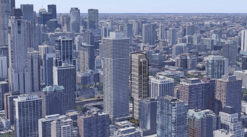
Context rendering of 12 W Maple Street by Lamar Johnson Collaborative
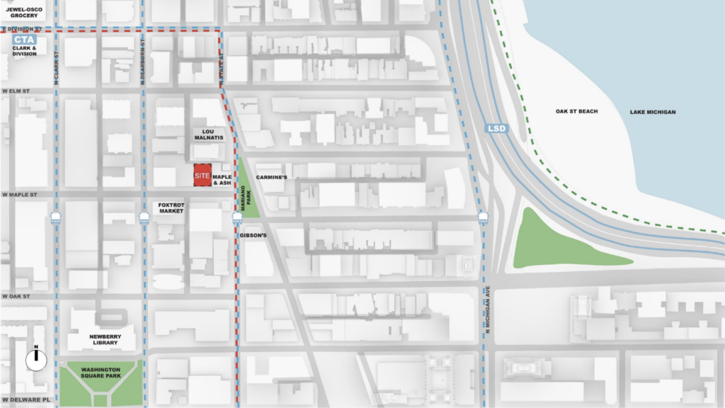
Site context map of 12 W Maple Street by Lamar Johnson Collaborative
The site is currently occupied by a four-story, 20,000-square-foot commercial building that was built in 1991 and holds no historical significance, unlike the adjacent empty lot also included in the proposal which once held a historical Queen Anne Rowhouse. This was demolished for the original iteration of the development which was brought forward by David Pisor, partial owner of Maple & Ash eatery next door, and designed by architects Booth Hansen; this 22-story tower would have delivered 12 large units, topping out at 330 feet in height.
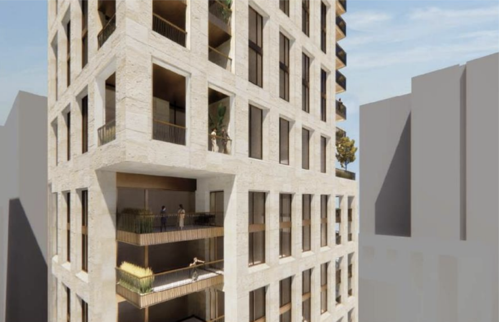
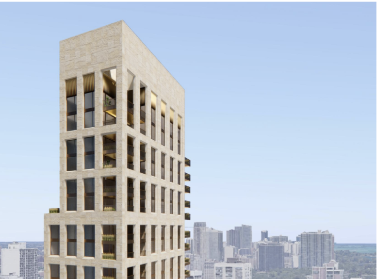
Rendering of mid-rise facade of 12 W Maple Street by Lamar Johnson Collaborative
The new proposal sheds some of the previous amenities like a restaurant, private club, room service, and housekeeping for a taller, purely residential project on the site which is zoned for up to 88 units. The now 34-story tower will rise up to 449 feet in height and contain 54 condominiums made up of predominantly two-bedroom layouts averaging 1,330 square feet, and three-bedroom floor plans ranging from 1,936 to 2,315 square feet. The last remaining levels will be occupied by four full-floor, 3,035-square-foot penthouses which are capped by a single 6,070-square-foot duplex-penthouse; all residences will have private terraces.
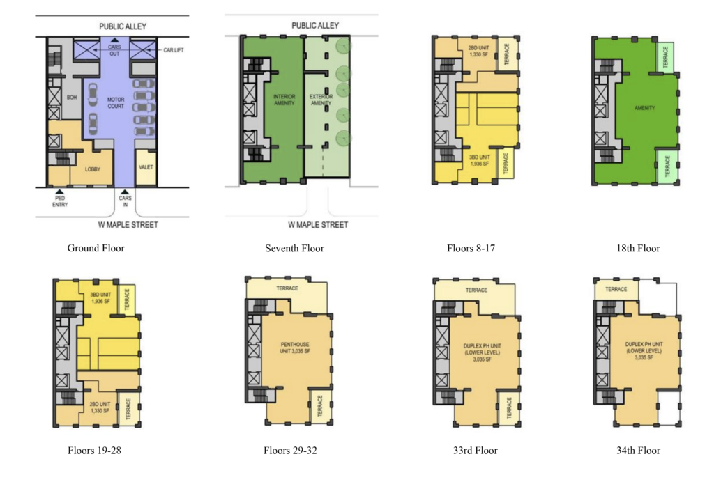
Floor plans of 12 W Maple Street by Lamar Johnson Collaborative
The first floor will house a small lobby, elevators, and support spaces within the structural core on the west of the site, a large motor court that cuts through the building to the rear alley featuring two vehicle elevators to the parking garage above, along with a small valet house to operate the service. The garage itself will occupy all of levels two through six and hold 81 spaces, a ratio higher than the required for the proposal. Residents will have access to a large amenity space with a rooftop deck on the seventh-floor setback, as well as on the 18th-floor with smaller terraces.
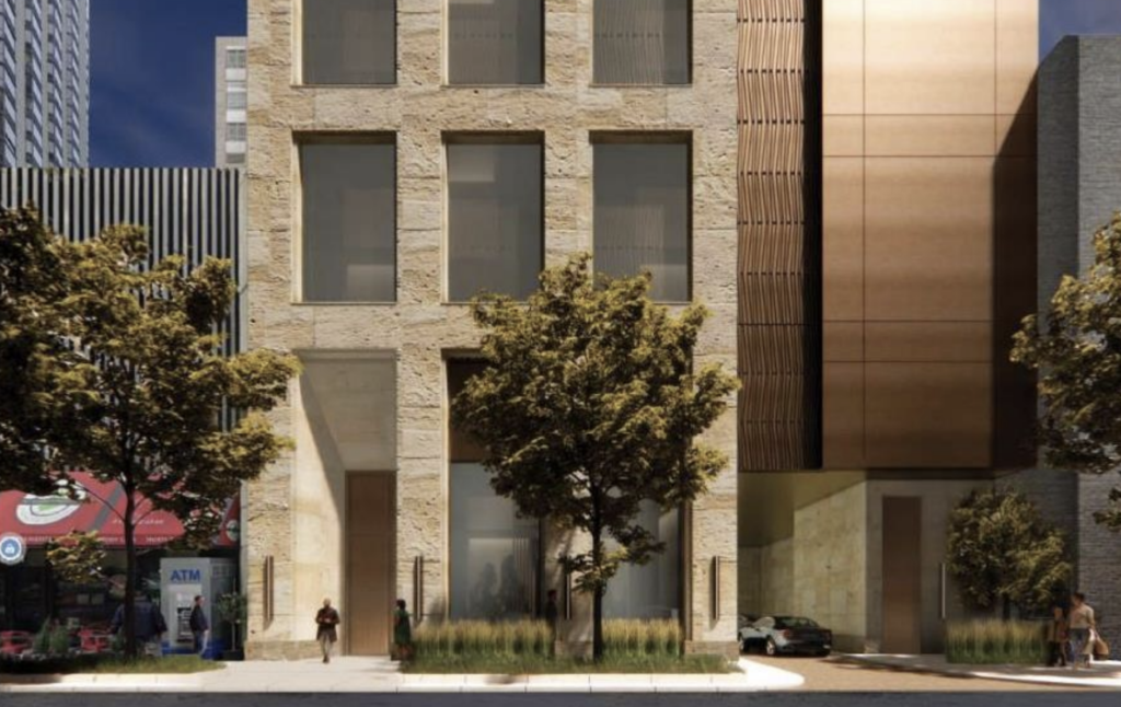
Rendering of ground floor with motor court of 12 W Maple Street by Lamar Johnson Collaborative
While much of the interior is still in development, with no specific use for the amenity spaces or floor plans for the penthouses being included in the presentation, the exterior has been relatively flushed out. The building facade would be a heavily pronounced grid with rectangular punched-in windows and balconies that break up the overall massing. The podium levels of this would be clad in natural limestone and copper-colored metal panels, while the upper floors would use a similar colored cast stone along with bronze-colored windows and railings, capped with a large crown disguising the mechanical equipment.
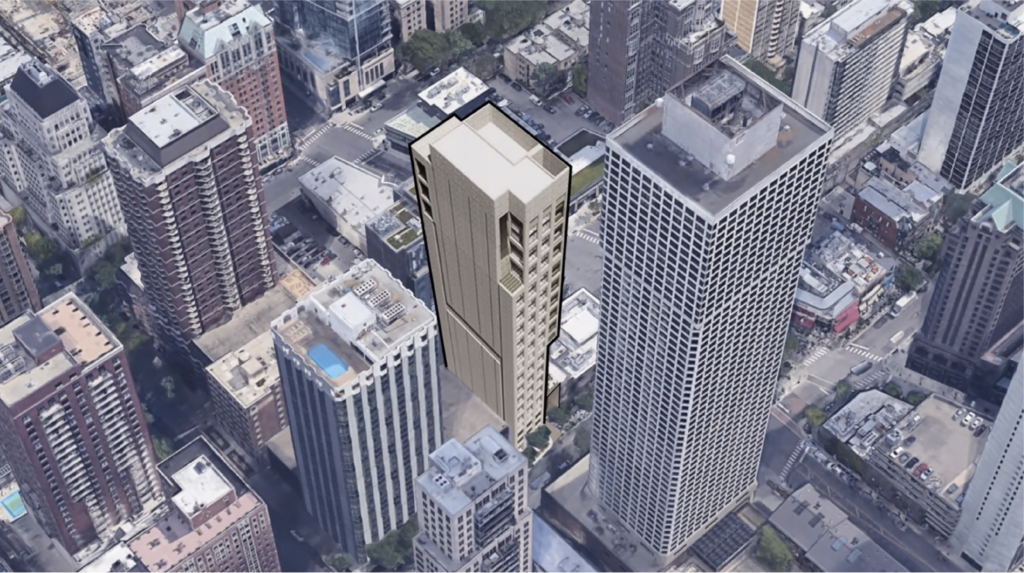
Context rendering of 12 W Maple Street by Lamar Johnson Collaborative
Comments on the design came from the committee members after the presentation with many focusing on the motor court and its flow of traffic, including the potential for a redesign hoping to address the usage of the rear alley as an exit as well as the amount of parking spaces provided in the transit rich area. Other comments ranged from the proposed unit layout, sizes, and penthouses to discussion on the exterior material, its contextual ties to the neighborhood, change as the tower rises, how it would hold up, and the large blank wall facing west following the structural core.
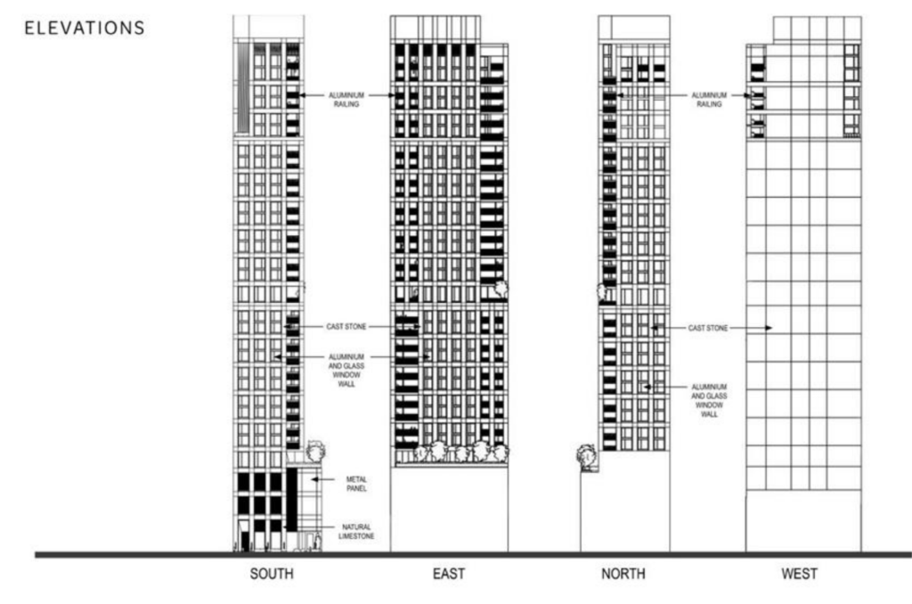
Elevations of 12 W Maple Street by Lamar Johnson Collaborative
The concept is quite unique to Chicago where more broad shorter towers are the recent norm, the exterior also breaks away from the common curtain wall facade most developments currently use. Prices for the condominiums have not yet been made public, but if priced similarly to new builds in the surrounding area they could go for anywhere between $1.8 to $8.1 million according to Crain’s. The proposal will now need to take back the comments from the Committee and derive which to include as it moves forward with its design and permitting process, at the moment a formal groundbreaking date has not been announced.
Subscribe to YIMBY’s daily e-mail
Follow YIMBYgram for real-time photo updates
Like YIMBY on Facebook
Follow YIMBY’s Twitter for the latest in YIMBYnews

Sleek – build it!! Very New York like.
Agreed! My first thought was Upper East Side or West Side
This has potential. I like the cast stone, but the building needs more movement/shape/setbacks. Currently reminds me somewhat of the Metropolitan Correctional Center downtown.
I love this development.. though the blank slab on the back is a peculiar choice.
it is odd as the west property is the parking deck of the building next door. Not like that is going to be razed and a new building put up to block any windows. But then you would have views into the other building at less than 100′ away??? Are going to have to wait for the detailed floor plans to see why.
Finally we get the utilization of “high-end” materials. The small footprint is great. Hopefully it isn’t dumbed down to precast in the end. Lamar Johnson is very capable and needs to be given bigger budgets to show his skills. This is the most refreshing design on a Chicago building in years. We needs dozens of these types of buildings at the taller end.
I don’t like it, the blank rear is awful looking, the lack of mix-used is a myopic idea for this area, and the massive amount of above ground car storage continues to turn Chicago into a car city like Houston/Miami instead of more like NYC or London.
These are $1M+ condos, these people are going to want car(s), they are not the kind of people who want to take the bus. I was at Tribune Tower early preview and one person asked if 3 spots was possible.
Also, i question the CoD wanting cars to exit in the alley, that seems to make it easier for carjackers to lurk & grab out of site.
So bury the garage, am I the only one who finds above ground garages that face the street incredibly ugly and completely destroying of the city experience as a pedestrian? And why do private developments get to destroy the public experience of a city?
Again I ask, are we more like Miami and Houston or are we NYC and London? Too much offstreet car storage has a real cost that we all pay dearly for.
The city should absolutely require all parking to be underground like NY and SF. Podiums with louvers and blank-walls definitely destroy the pedestrian experience. They create a hostile, sterile environment that lacks vibrancy and intimacy. Activity at the 2nd and 3rd floor is vital for a good street experience. This city gets it wrong almost always.
Maybe they are planning another tower abutting it?
The blank rear is facing the alley… which should be utilized for pedestrians in an area like this, but then where would the garbage go?
Elevated parking is fine if they had liner units on the South side to keep the street active. If they did that, I’d be happy.
The real travesty here is knocking down 16W Maple a year or so ago. Now this block has 0 character.
Finally, no more blue glass. More of this please
Kudos to Fern Hill. They’ve been proposing some really impressive projects. Very very excited for this one!
The Committee on Design spoke out about the Blank western wall and didn’t like it at all so changes will hopefully be made. I just hope that we don’t see a switch to concrete.
I missed this before. Pretty cool!
What happened with this development? Any updates if it’s moving forward?
Looks HORRIBLE! DO NOT PUT THIS IN CHICAGO