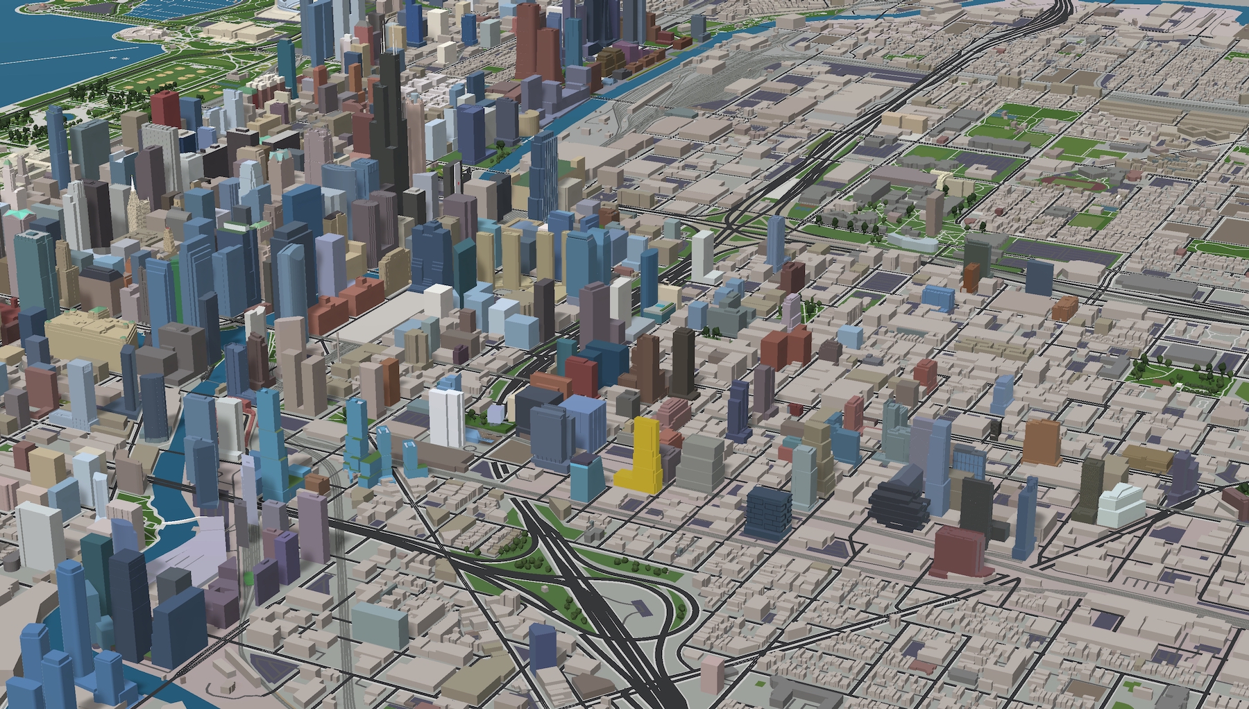
By Fulton Market‘s height standards, a towering new residential development has been proposed for the 375 N Morgan Street, lying adjacently west of the underway Guinness Brewery project. Spearheading both projects on the two adjacent parcels, developer Fred Latsko has called for a nearly 40-story building with more than 500 for-rent units. Given its similar number of floors to the nearly topped-out 900 Randolph, we can likely expect a height in the range between 450 and 500 feet. Latsko had previously mulled plans for a 30-story office development, but has shifted due to ever-increasing apartment demand and the lifting of the neighborhood’s moratorium on new residential developments.
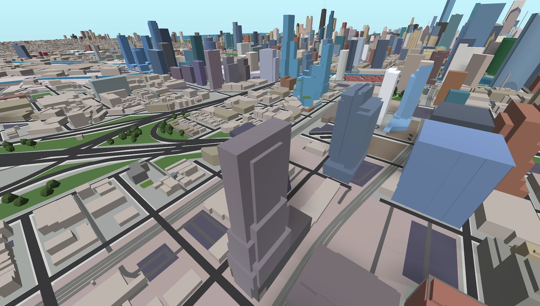
375 N Morgan Street (center foreground). Model by Jack Crawford
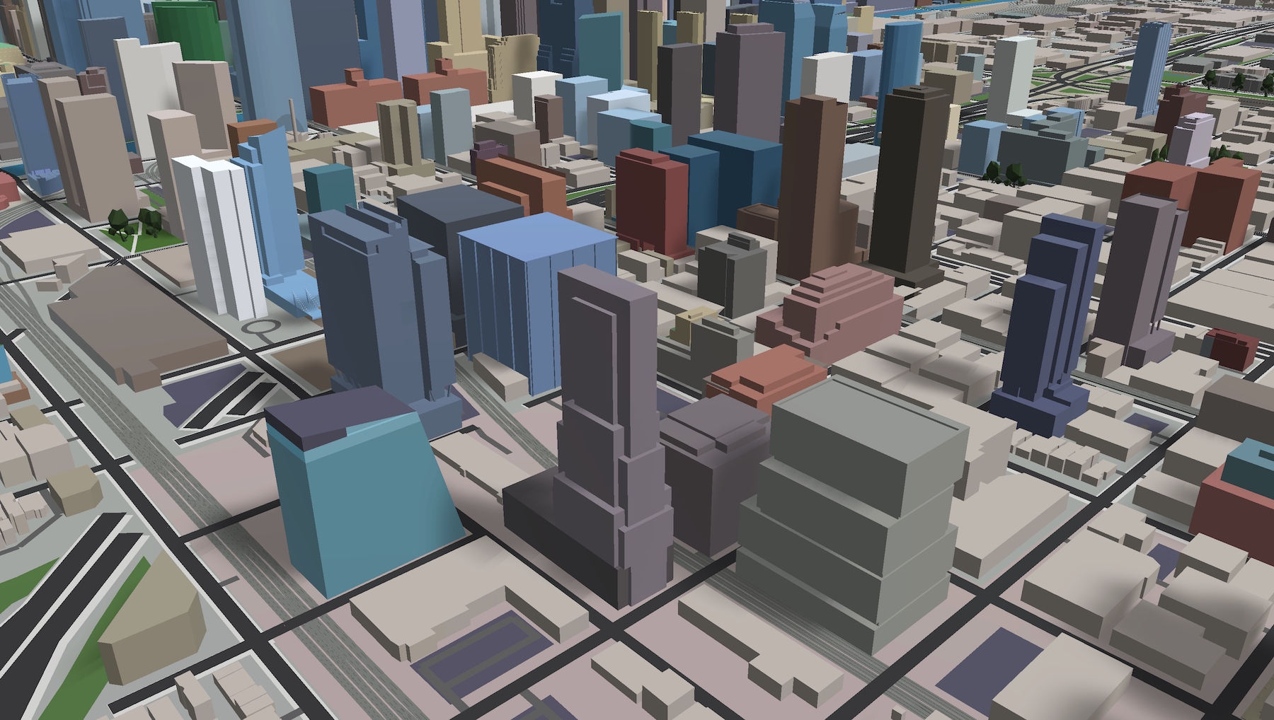
375 N Morgan Street (center foreground). Model by Jack Crawford
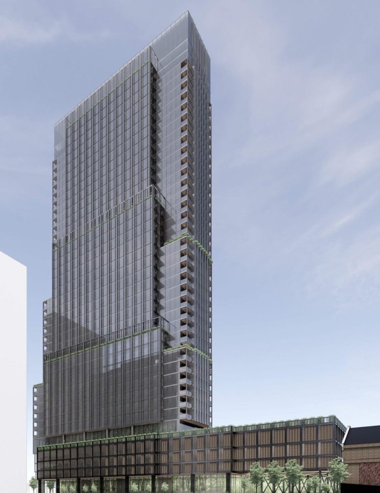
As noted in an article by The Real Deal, the project would come with a vast quantity of new green space, connecting to the new landscaping of the neighboring brewery and further transforming the former meatpacking district. The boxy design features inset balconies and a facade featuring a mix of metal mullions and floor-to-ceiling windows. The massing will also contain numerous setback that will allow for outdoor amenity areas and what appears to be additional private terraces. Details regarding the architect could not be found, though this additional information will likely come to light in the near future.
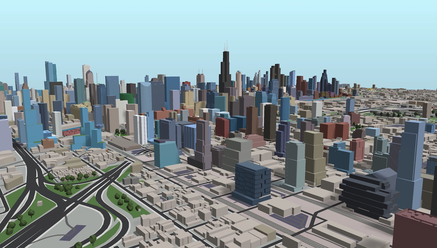
375 N Morgan Street (center foreground). Model by Jack Crawford
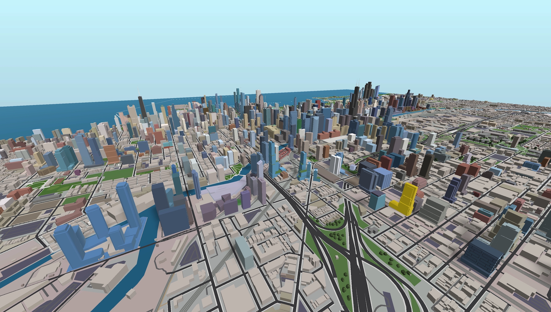
375 N Morgan Street (gold). Model by Jack Crawford
The vast majority of Chicago’s recent high-profile development proposals are located in either along the river’s North Branch or in the Fulton Market vicinity. While there had been a mild lull in new proposal over the past few months, a new wave of proposals has very recently been unveiled in both, indicating continued demand for both apartments and offices. The westward progression of new high rises will continue to further round out the city’s skyline while creating new urban epicenters.
375 N Morgan Street (gold). Model by Jack Crawford
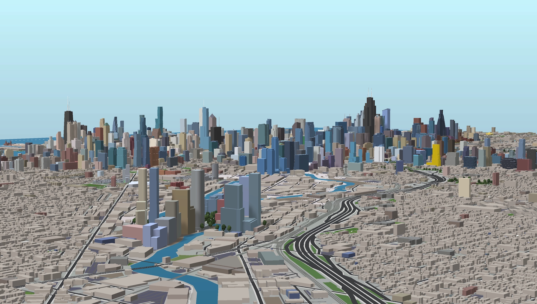
375 N Morgan Street (gold). Model by Jack Crawford
As for next steps on 375 N Morgan, Latsko’s vision will require multiple city approvals and a re-zoning to allow construction to proceed. No further details regarding an anticipation construction start date or timeline have been revealed.
Subscribe to YIMBY’s daily e-mail
![]()
Follow YIMBYgram for real-time photo updates
Like YIMBY on Facebook
Follow YIMBY’s Twitter for the latest in YIMBYnews

Hopefully the design changes as it’s more refined. This could be so much better with a few changes.
I like the design, especially with all the set-backs. To me it seems very Rockerfeller Center-esque. That said I’m all for refinements as long it doesn’t stray too far from the original.
Yeah I think the massing looks good too. It’ll come down to the facade treatment and materials. If anything, maybe they can better incorporate the balconies akin to One Chicago.
Totally agree. It’s very “meh” from all but one angle.
Maybe some more contrast on the glass and cladding? Looks pretty bleak with that grey but exciting to see these large apartment projects going up.