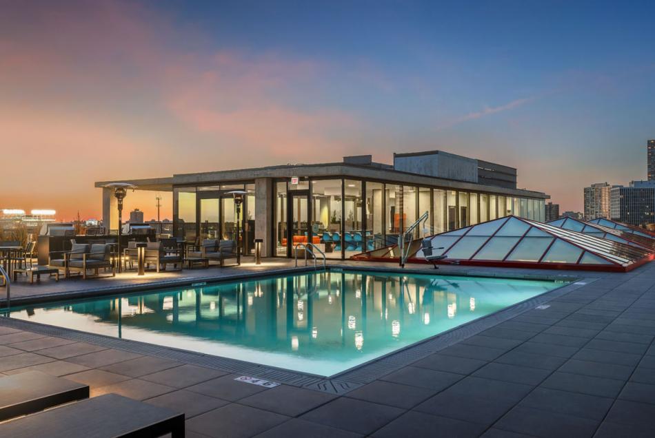
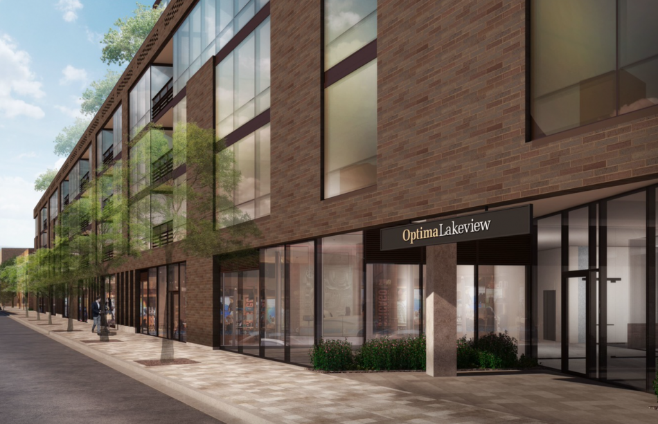
Optima‘s seven-story mixed-use development known as Optima Lakeview has announced its grand opening. The rental apartment building is located at 3460 N Broadway on the former site of Treasure Island Foods in Chicago’s Lakeview neighborhood and is featuring the region’s first year-round rooftop pool.
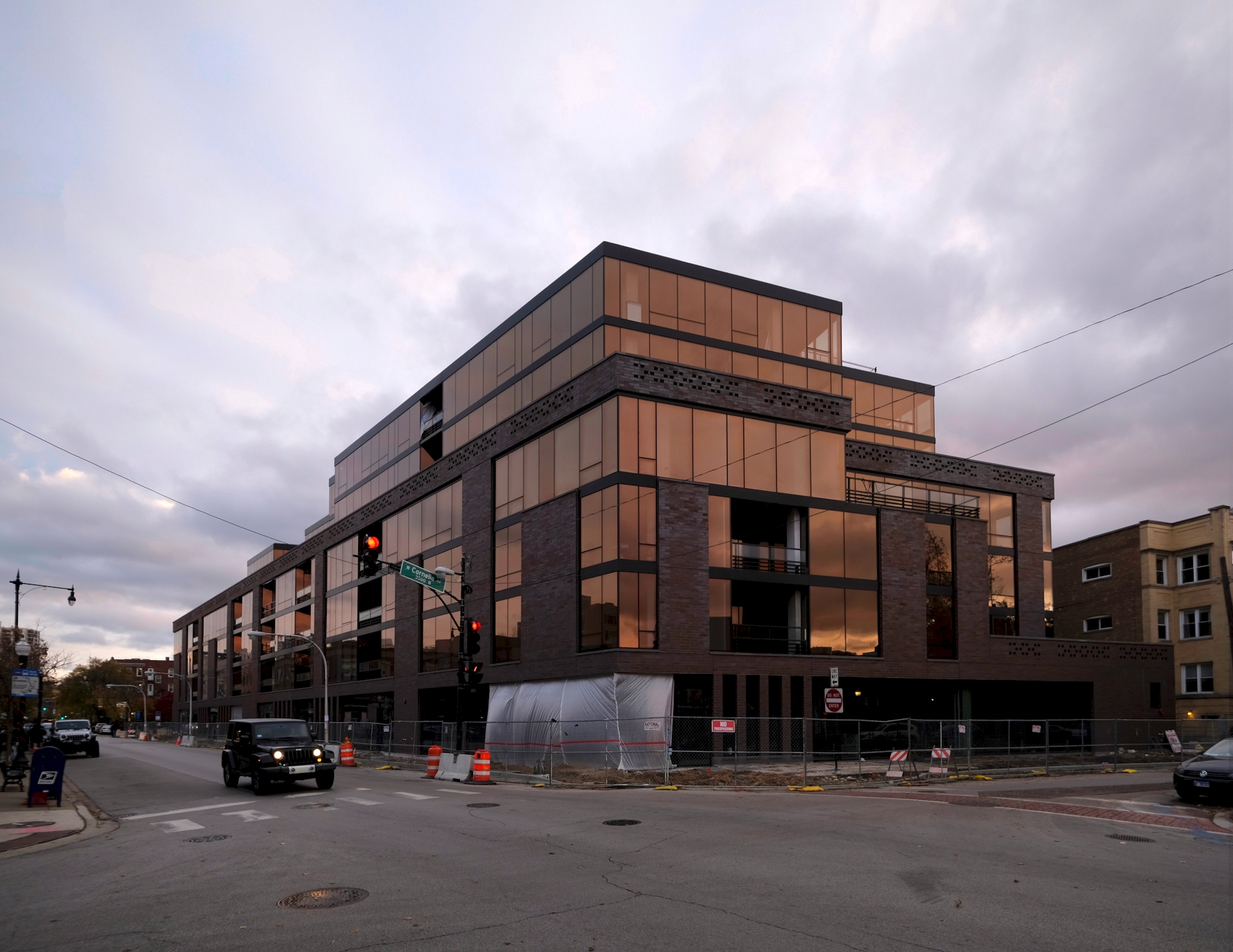
Optima Lakeview. Photo by Jack Crawford
The development has reportedly leased 35 percent of the 198 rentals. As previously reported, the rentals range from one- to three-bedroom floor plans and each comes with a private balcony or terrace. All residences are fairly spacious with a minimum of 1,053 square feet to give residents the flexibility to accommodate their lifestyles. Though unfurnished, apartments have custom wardrobes with built-in shelves and drawers for clothes and storage and bring in more light than traditional walled-off closets. Rents start at $2,500 per month. The building will also include 14,000 square feet of street-level retail.
Optima Lakeview caters to work-from-home residents by featuring two wired conference spaces and a business center, as well as several indoor and outdoor seating areas. The building notably became the first North American residential development to earn WiredScore® Gold Rating for Digital Connectivity. Each residence is equipped with smart home technology, including keyless unit entry and smart thermostats and lights.
Many of Optima Lakeview’s amenities are connected by the seven-story atrium which is topped with a skylight, allowing for natural light to flood the building’s interior. For a touch of green, planters have been placed throughout the floors surrounding the atrium, and when the plants mature it will create a hanging garden effect.
Indoor basketball and pickleball courts, a sports lounge, and a golf simulator are accessible near the building’s entrance. There is an upstairs fitness center with state-of-the-art equipment, a yoga studio, sauna, pet spa, children’s play area, and more.
The rooftop sky deck offers views of Lake Michigan, Wrigley Field, and the Chicago skyline and is equipped with fire tables and heaters suitable for Chicago’s colder climate. As mentioned the rooftop pool is accessible all year and will stay heated and swimmable during traditional off-seasons. Optima Lakeview residents can use the rooftop’s additional outdoor amenities, including a spa, movie theater, lounge seating, and outdoor kitchen stations. The rooftop also features a glass-enclosed party room complete with a TV, various seating arrangements, and a full chef’s kitchen. The building also houses a 2,000-square-foot heated dog park several floors down. With the opening updated, site photos will be released soon.
Subscribe to YIMBY’s daily e-mail
![]()
Follow YIMBYgram for real-time photo updates
Like YIMBY on Facebook
Follow YIMBY’s Twitter for the latest in YIMBYnews

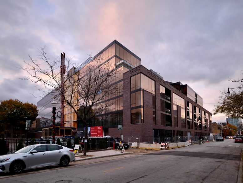
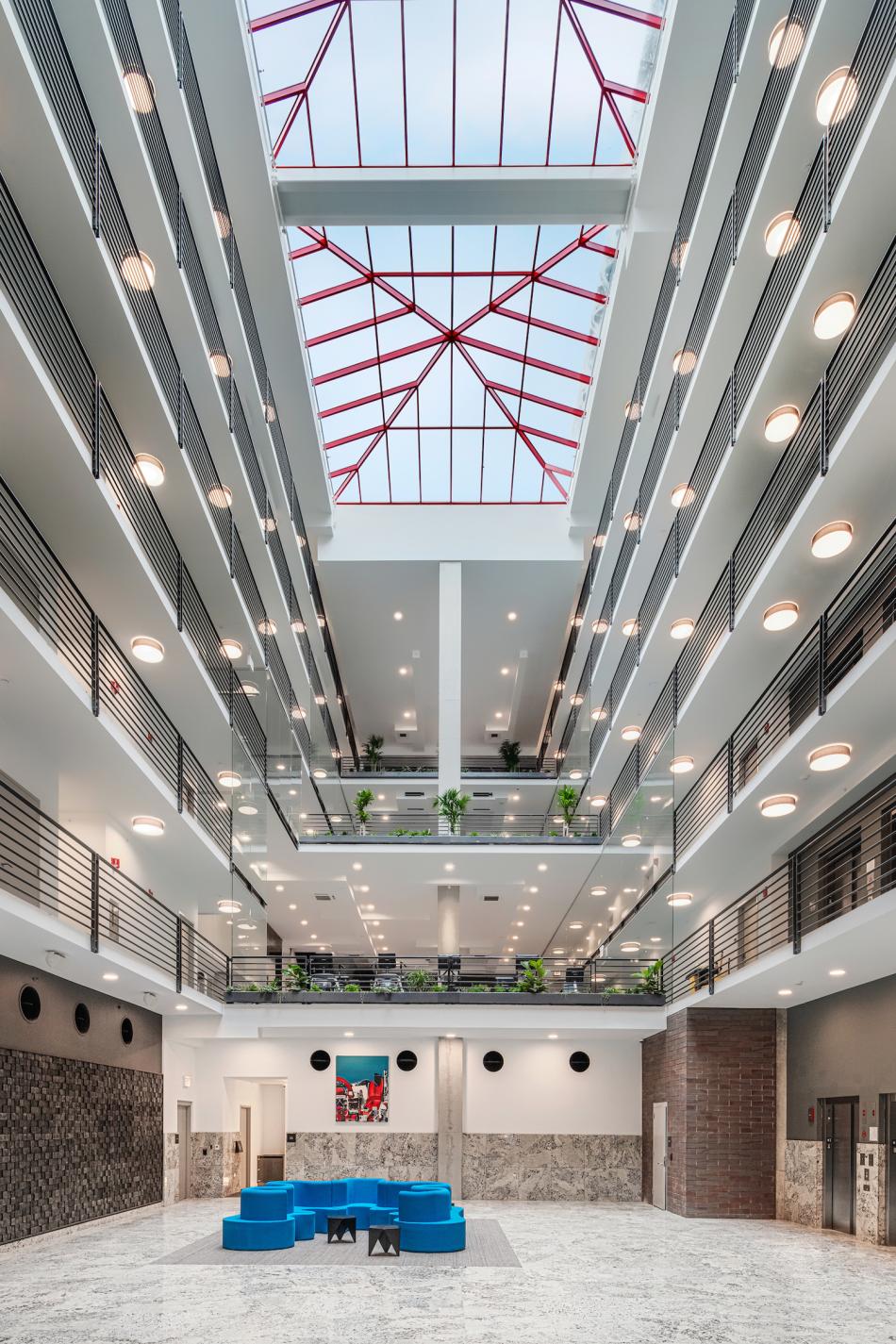
The Building looks commerical. The interior atrium space looks like a cheap holiday inn in a small Dakota city, and the apartment plans are drawn by people who don’t live in homes: interior bedrooms without windows or space for furniture, columns in the middle of rooms, and kitchen islands that stick out into the floor plan. Optima has been doing this for too long to be this cheap, or this incompetitent. If you can’t make good buildings, don’t make buildings.
Aside from the red paint on the steel structure of the skylight, I can’t see a single thing I don’t like in the photos. Brown, black, white, or even orange (if you really knew what you were doing) would look better if the color of the brick and floor in the photo is accurate. I can’t speak to the floorplans, and really am not concerned with that as I am unlikely to be inside the building. But buyers/renters apparently find that other aspects of the building and location outweigh windowless bedrooms.
Hideous
Man Friday. It’s a building built for habitation…doesn’t take much to go to the website to review the plans. There is NOTHING likable about the Atrium space which looks like it was designed by someone who was sight and detail imparred. Most people might not know the difference, but Optima pretends to be a high-design firm…..it doesn’t meet it’s own expectations, (or, sadly it does)
It’s a matter of opinion. Not living there, so don’t care what it is like inside. Different isn’t always bad, and most of the naysayers in that neighborhood want taped on classical details, or are complaining that it is too tall. In the middle of a city. No one is being forced to live in the building, yet people will live there.
dumb reply. doesn’t matter what it’s like inside because you’re not living there……….rise above the mundane and offer a critical response based on intelligence not base reactions. No one is forced to live there. That is always correct.
Your response “dumb reply” is impressive mainly for its irony.
Also – a “base reaction” is responding to one’s memories of 80s buildings while ignoring the detailing of the atrium, which seems to be very well done. Please reconcile yourself to the fact that I have a different, and equally valid, opinion of the design. My opinion is not based on knee-jerk memories of a shopping mall from my college days.
Love the glass tint. A cold but alive design, well done imo.
It does look like they took a 1980s commercial low rise building and renovated it. if that were actually true this would be amazing.
I think this area definitely calls for more amenity buildings, so this is a nice addition to the neighborhood. The rooftop is one of the more impressive rooftops I have seen in the city! That being said, I don’t really understand some of the design choices. The exterior design is pretty cold and uninviting, but at least it’s something different. Much preferred the original design.
The interior is bizarre. The management office is completely open and a glass box, would hate to work there. The atrium/open gym concept just doesn’t make sense. After visiting once, I can tell you, as a resident I would get real annoyed with the constant noise from the gym.
The layouts are also bizarre, with half walls, no windows in the “bedrooms” and instead of closets, you just have walls of cabinets.
I don’t really see this building standing the test of time, particularly the layouts/interior.
Man Friday. MCW got it right on many aspects of the execution. It’s not that everyone has a right to an opinion, which we all do: look at the arbitary use of materials on different walls of the atrium, (brick up one wall, something else on the other), different material on the third…a somewhat silly piece of art (is that a rendering gimmick or real installation), on one side – furniture floating like a marooned ship in the sea…..you opinion is not based on a visit to a mall in your college days? There really is no defense for the lazy architecture of the interior space, let alone windowless bedrooms with no space for furniture.