Foundation work is making quick headway for 160 N Morgan Street, a 30-story apartment building gearing up to rise in Fulton Market. At 350 feet, the tower will be one of the taller structures to rise as West Loop‘s development boom gains momentum. Developed in partnership between Sterling Bay and Ascentris, plans for the structure include 282 rental units, occupied by two levels of retail at its base.
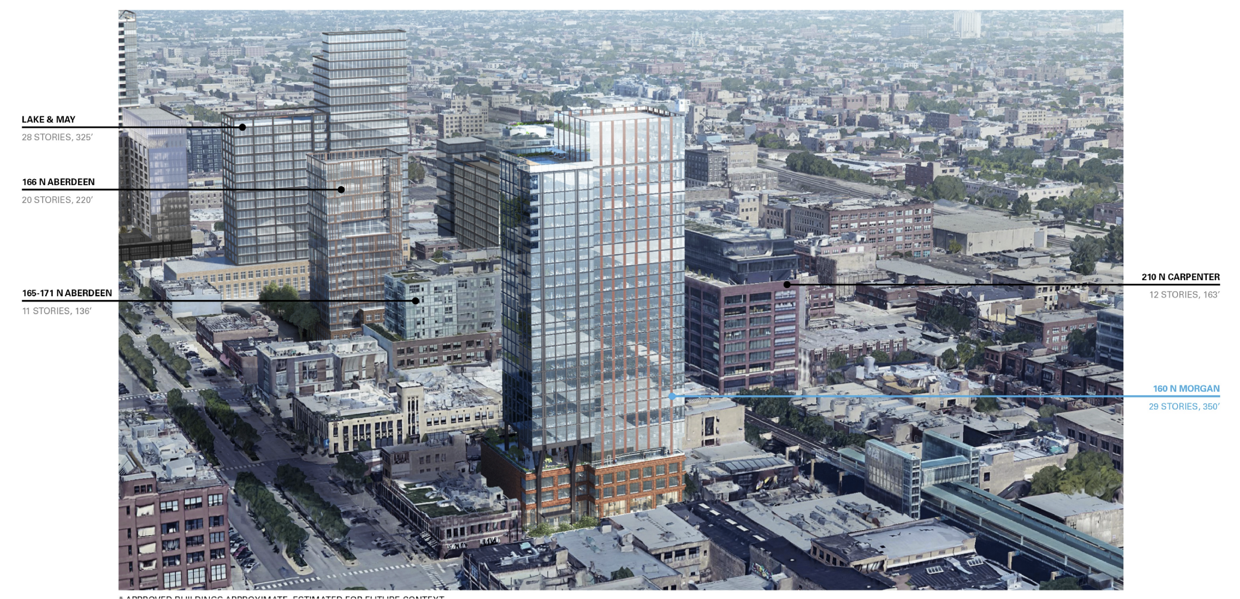
Contextual rendering of 160 N Morgan Street by bKL
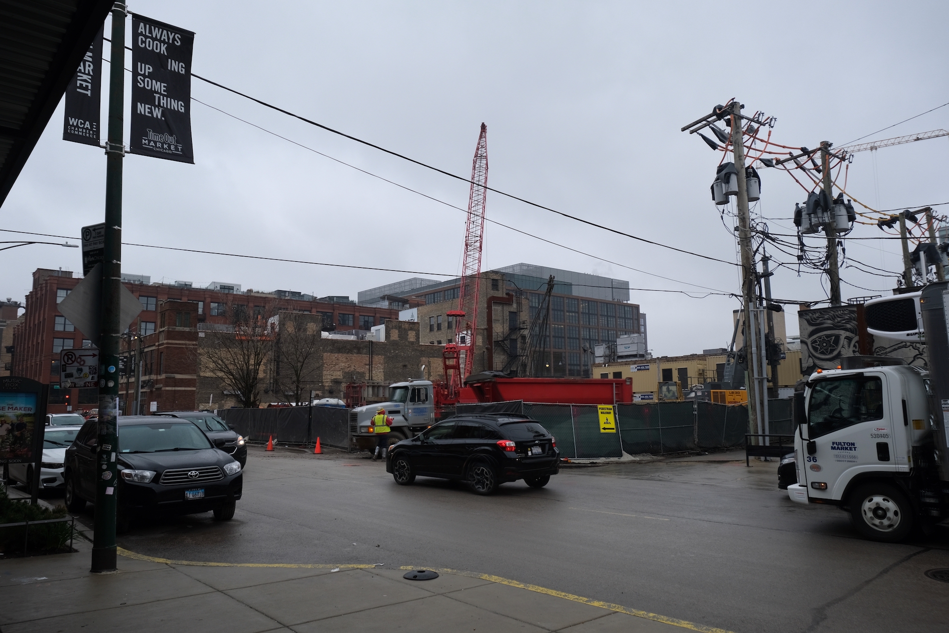
160 N Morgan Street. Photo by Jack Crawford
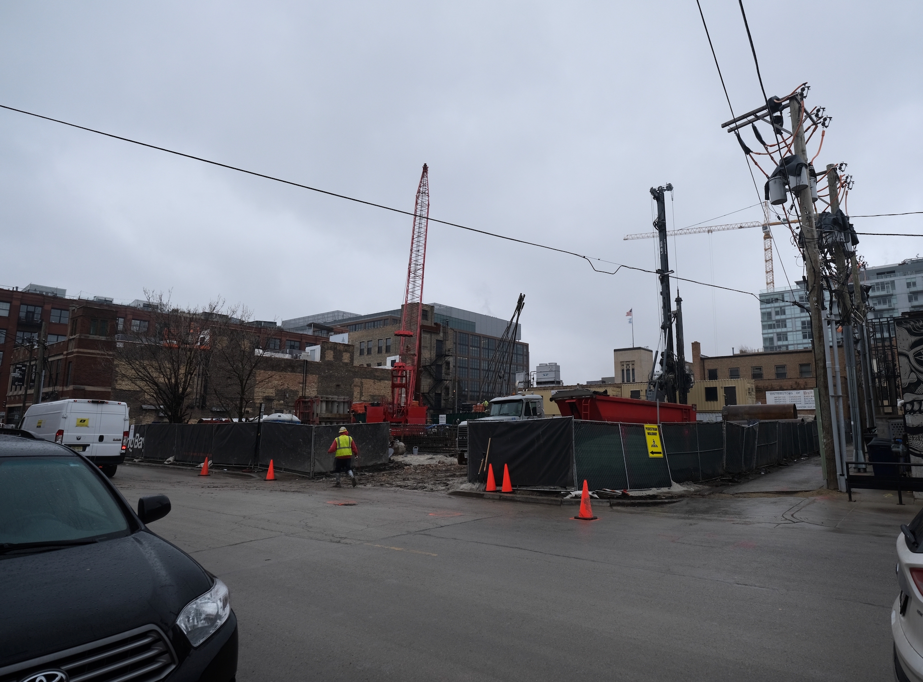
160 N Morgan Street. Photo by Jack Crawford
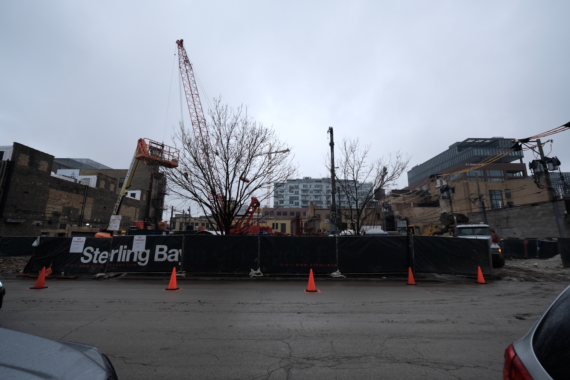
160 N Morgan Street. Photo by Jack Crawford
Unit sizes will scale from studios through three-bedrooms floor plans. Of the on-site units, 28, or 10 percent, will be available under ARO. Sterling Bay will also contribute $2 million to the neighborhood opportunity fund and $5.26 million to Solar Lofts, a mixed-income residential development in South Loop.
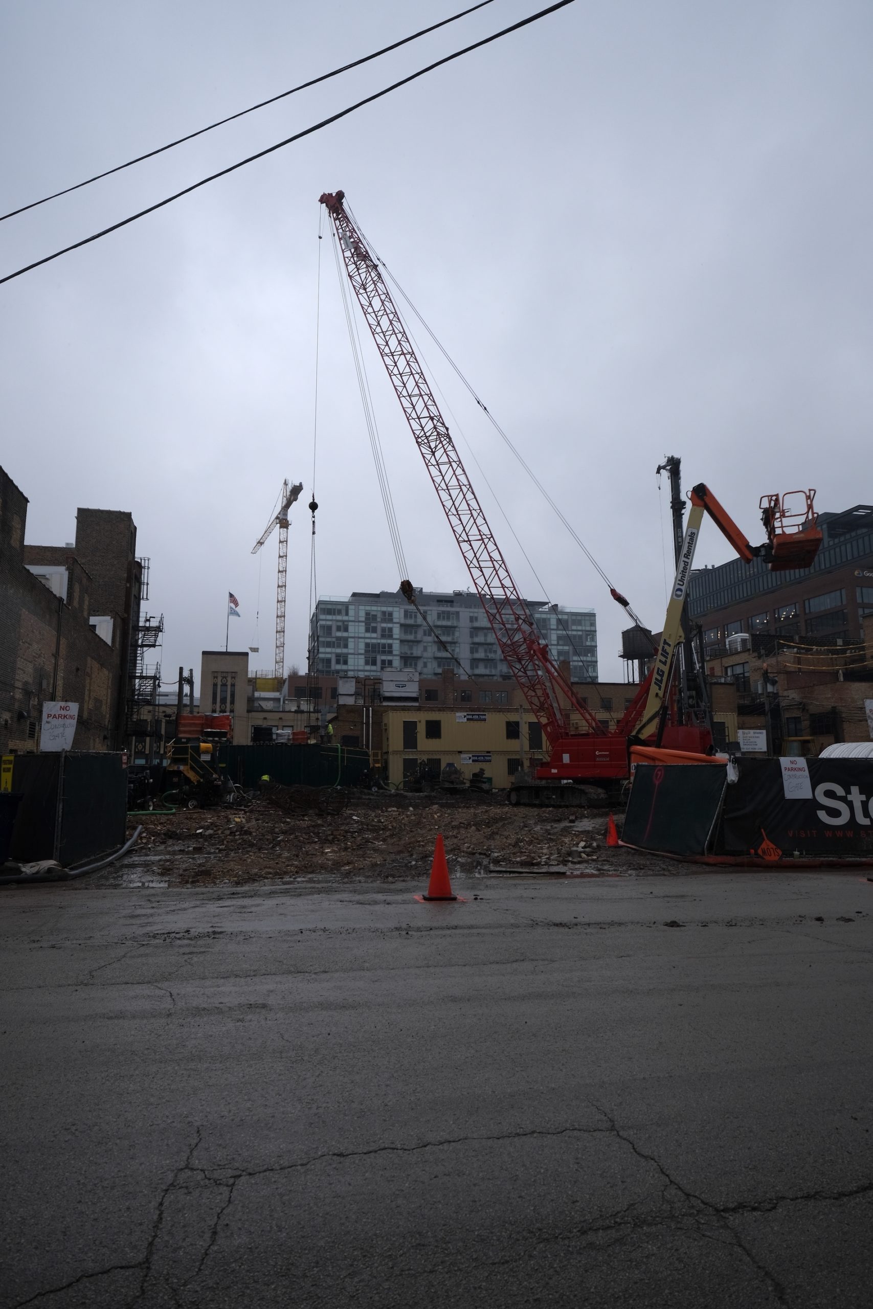
160 N Morgan Street. Photo by Jack Crawford
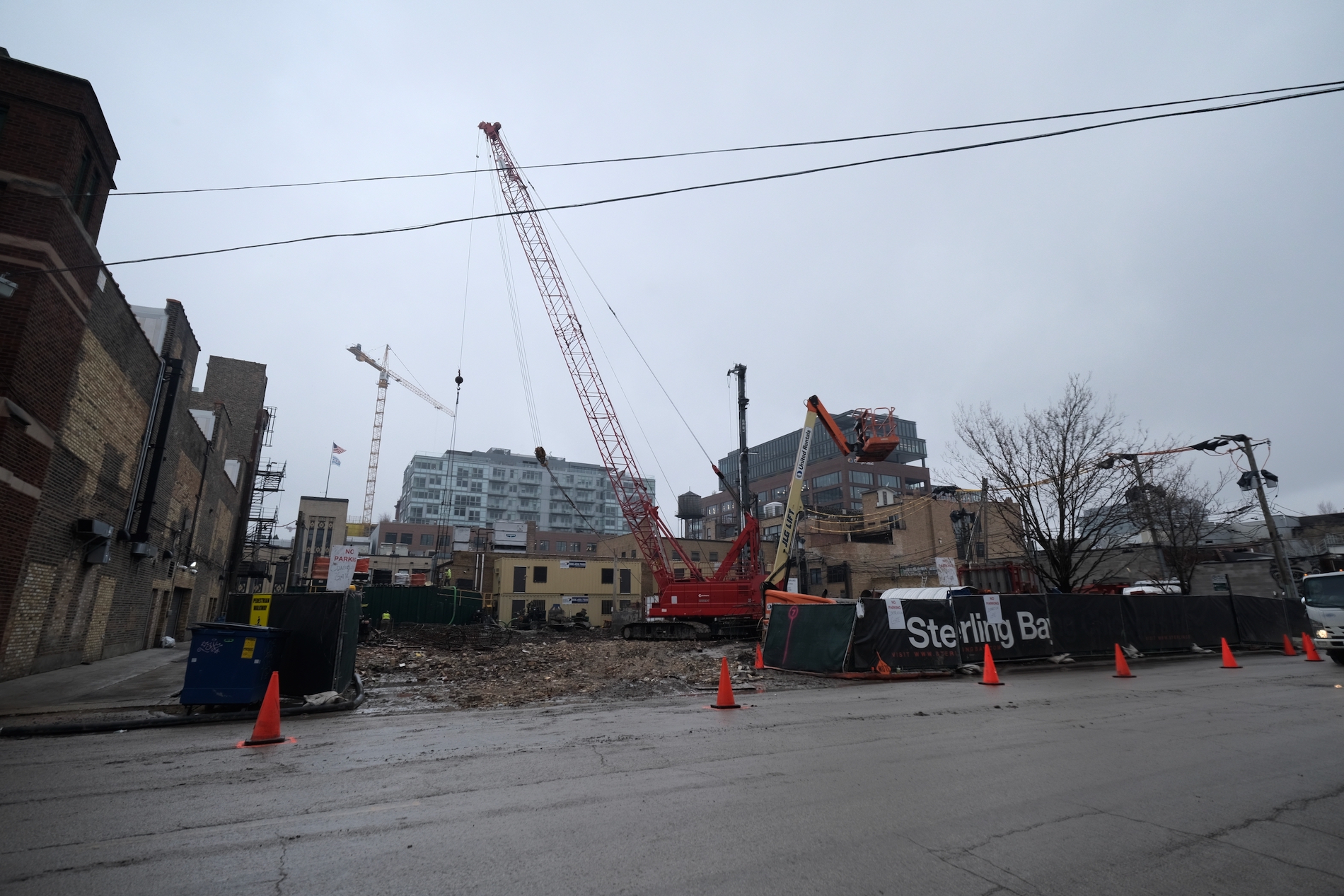
160 N Morgan Street. Photo by Jack Crawford
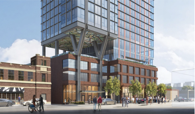
For amenities, there will be an outdoor deck on the fifth floor, underneath the cantilevered portion of the tower. There will also be a rooftop terrace with sweeping city views and a pool.
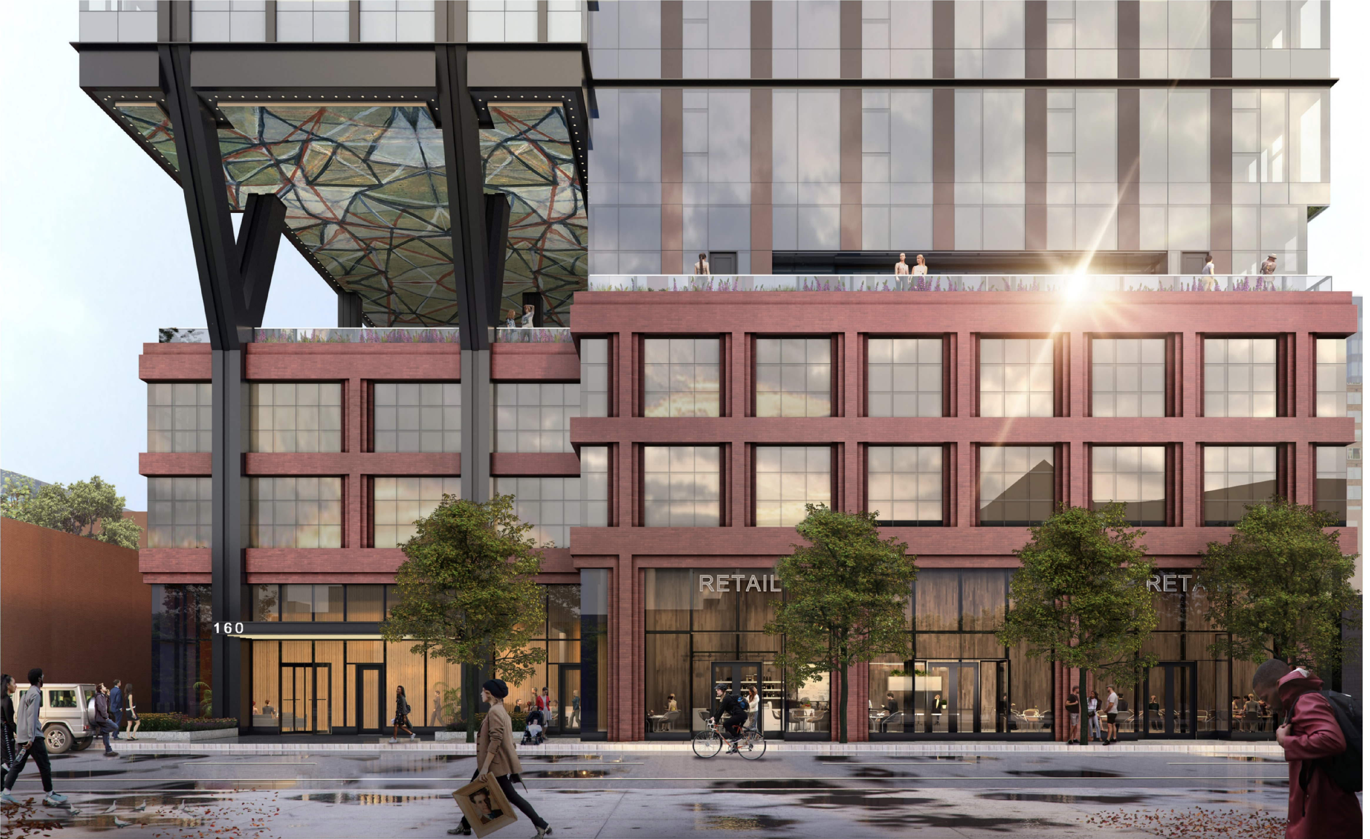
Updated Rendering For 160 N Morgan Street Courtesy of bKL Architecture
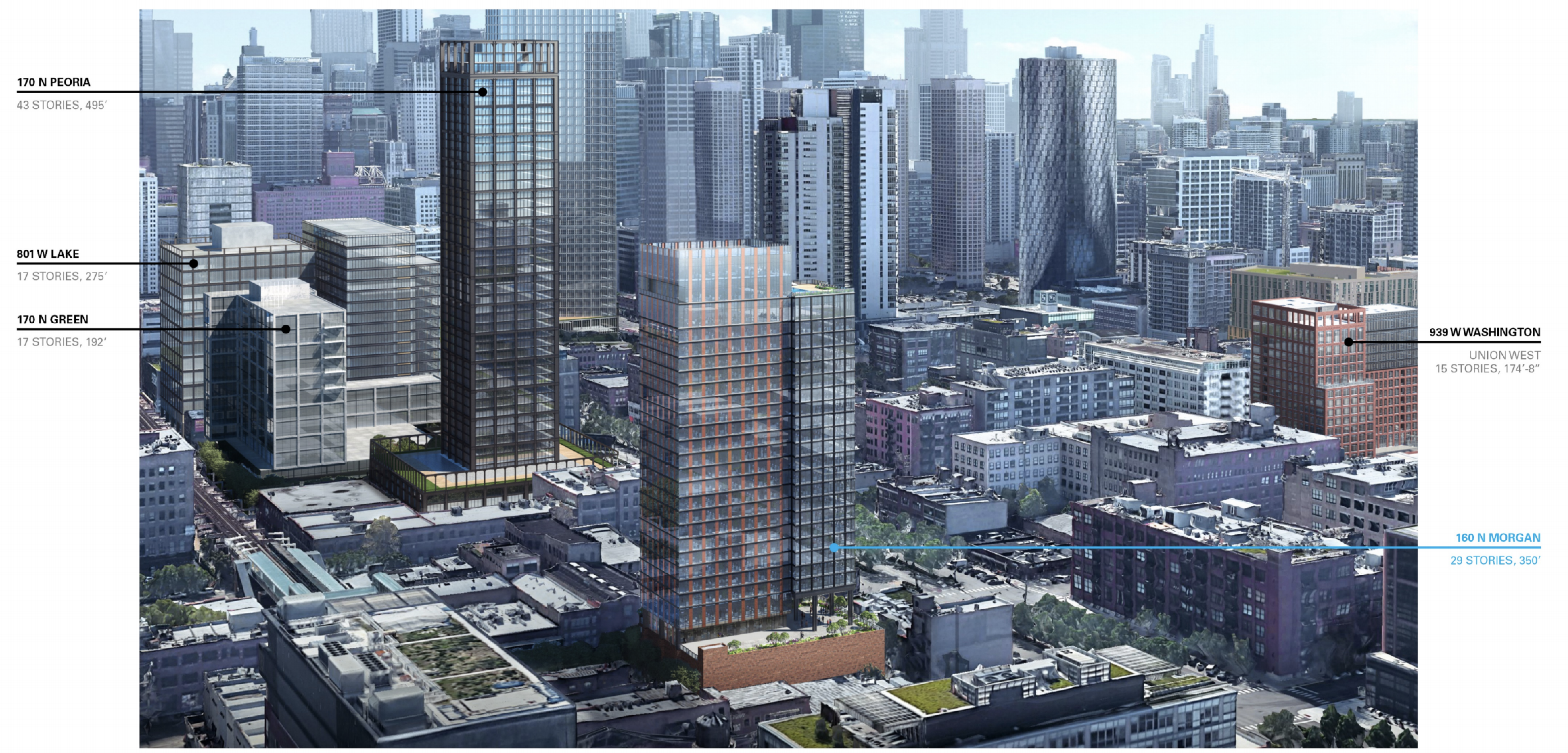
Context Rendering For 160 N Morgan Street Courtesy of bKL Architecture

160 N Morgan Street. Model by Jack Crawford

160 N Morgan Street. Model by Jack Crawford

160 N Morgan Street. Model by Jack Crawford
bKL Architecture is responsible for the design, whose podium will be clad in face brick, while the upper levels are wrapped in a glass and dark metal facade. One notable feature will be Y-shaped supports underneath the overhanging tower.
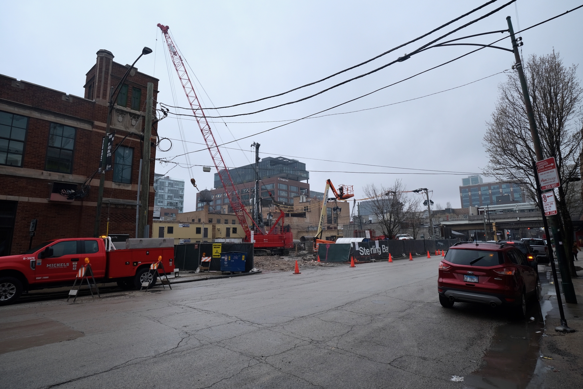
160 N Morgan Street. Photo by Jack Crawford
Apart from the 89 on-site parking spaces and 153 bike storage slots, the development will provide close transit access to a range of public transit options, including Divvy Bike stations, Green and Pink Line trains via Morgan station, as well as bus stops for Routes 8 and 20.
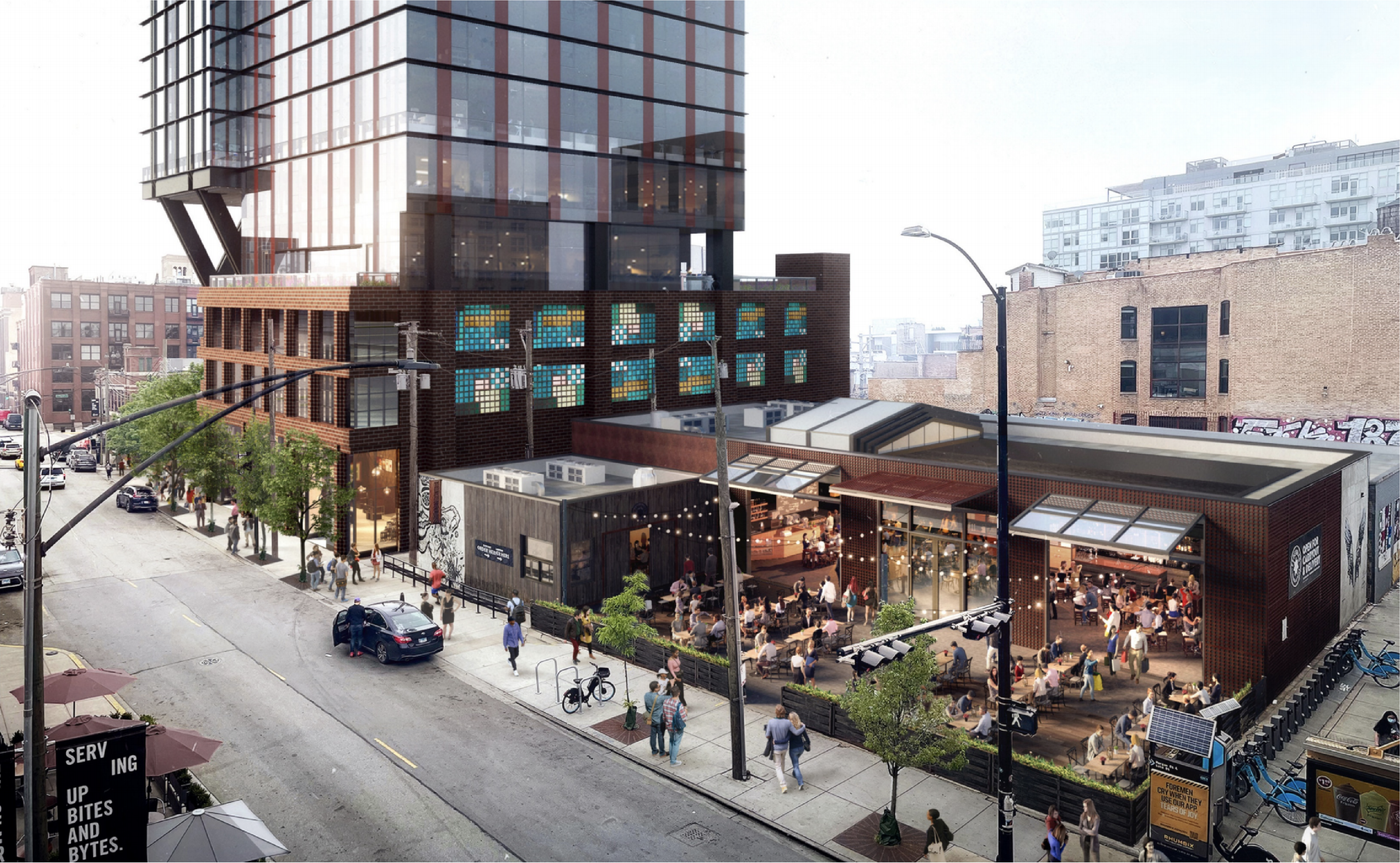
Rendering For 160 N Morgan Street Courtesy of bKL Architecture

160 N Morgan Street. Model by Jack Crawford
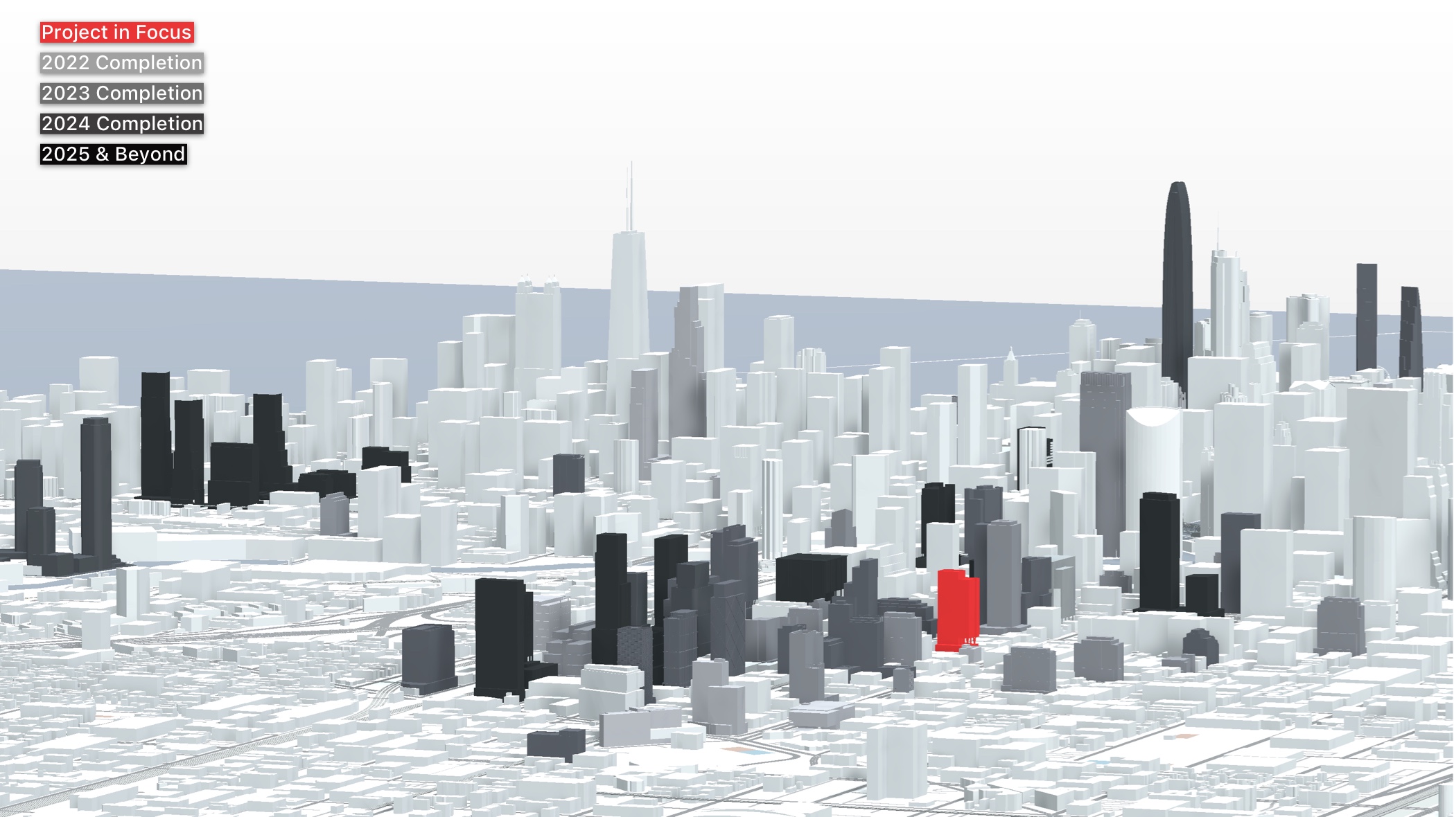
160 N Morgan Street. Model by Jack Crawford
Walsh Construction is serving as general contractor, with a reported cost of just under $82 million. With the full construction permit having been issued this past Wednesday, a full delivery of the project is expected for 2024.
Subscribe to YIMBY’s daily e-mail
![]()
Follow YIMBYgram for real-time photo updates
Like YIMBY on Facebook
Follow YIMBY’s Twitter for the latest in YIMBYnews

In a few years Fulton Market is going to be dominated by 300′- 500′ glass boxes. These West Loop design guidelines are killing any hopes of variation and innovation. This was the one neighborhood in the city that developers could have elevated the standards with the insane demand.
I have no problem with that – glass boxes in the town where Ludwig M was an architecture professor. Most of these buildings are well designed and will bring vitality to the area. I will take a well designed building over a flavor of the month innovation. Innovation is welcome, but well-designed is necessary. If you want an example of rancid design, go to Ohio and Dearborn.
Mies was some time ago. I think we can end his death grip on the city 50 years later. We can embrace sculpture, creativity, expression, natural materials and ornate detail again. This God-like reverence for Mies among the architectural establishment and academia is ridiculous.
Glass architecture can be innovative or expressive. These same flat-slabs all incorporating the same facade systems over and over again that have minimal aluminum accent metal has run its course. David Childs’ original design for the Spire site was inspirational. Jeanne Gang takes risks. These are just practical, predictable, boring buildings. Innovation is much more than “flavor of the month” Chicago used to be a city of innovation that introduced many design concepts to the world.
I think the district has awesome design! A couple big reasons:
1. at least they nailed the warehouse aesthetic. Who knew Fulton Market would have some of the best contemporary masonry in the city?
2. The mews!! The developers have been obsessed with creating activated “alleys” thru buildings that create porosity. It always struck me as odd that we have so many alleys and the city never activates them. Yet here’s Fulton Market trailblazing alley activation from a large placemaking perspective. Quite impressive when you get to “zig-zag” through all these brick laneways and warehouses like a more European city.
However, I always welcome more China-style “curvilinear” glass buildings. Life’s better with a beveled edges.
I agree… a few well placed developments from architects like Gehry or Hadid would do well to break up the current theme faux warehouse + glass box (likely with offset windows). It’s not a bad combo, but is becoming overdone.
Exactly. That is what Chicago is missing. Signature buildings from people like you mentioned, or Bjarke Ingles, SHoP, Calatrava, etc. Everything can’t be filler. We need modern buildings that redefine our city in the way so many past gems did in their era. That spirit has left the city as a whole from what we are witnessing the last decade.
@Zaptron. Take a look at what NY and London are building in the 300′-500′ range. Faux-warehouses with “activated alleys” is hardly comparable to the purely sublime architecture they’re producing today.
Yes I feel you, I have been. I’ve lived in London, NYC, Shanghai, Beijing, HK, Sydney, and even Singapore. I lived next door to Beijing’s Galaxy SOHO by Hadid while she was alive, and I’ve lived close to French-designed Tianzifang in Shanghai as well. The small alleys that thread spaces together are what really impress the pedestrian the most, especially in the USA b/c our grid pattern really makes a “stroll” feel very predictable. This is an exceptional problem in NYC. You marvel at the buildings from afar, but when you approach them you realize you can only continue walking past them, hope a Chipotle is inside so you can wander, snap a pic and maybe there’s a small museum inside. It’s very un-interactive and makes everything feel like an “impasse” or a fortress. I don’t much care for it, especially in burning heat of summer with the lack of trees.
On the flip side, interestingly re: your point on London; the “mews” system is actually borrowed from their mews, and is one of their big tourism features. Shanghai has been employing this more as well, like in Xintiandi. It’s quite a hot trend in global placemaking for sheltered pedestrian experiences, and, frankly, I think NYC sucks at it compared to Fulton Market, tho I totally agree with you that they have prettier “curvilinear” glass fortresses (but we also have less kleptocracy money).
Chicago needs a supertall tower in west town or atleast give us 75 story tower it can be done it will be done
thank you