The Zoning Board of Appeals has approved variances for a mixed-use development at 3244 W Bryn Mawr Avenue in North Park. Located on a midblock site between N Spaulding Avenue and N Jersey Avenue, the project site fronts W Bryn Mawr Avenue and is currently occupied by a historical building. Grand Properties Acquisitions is the developer behind the proposal.
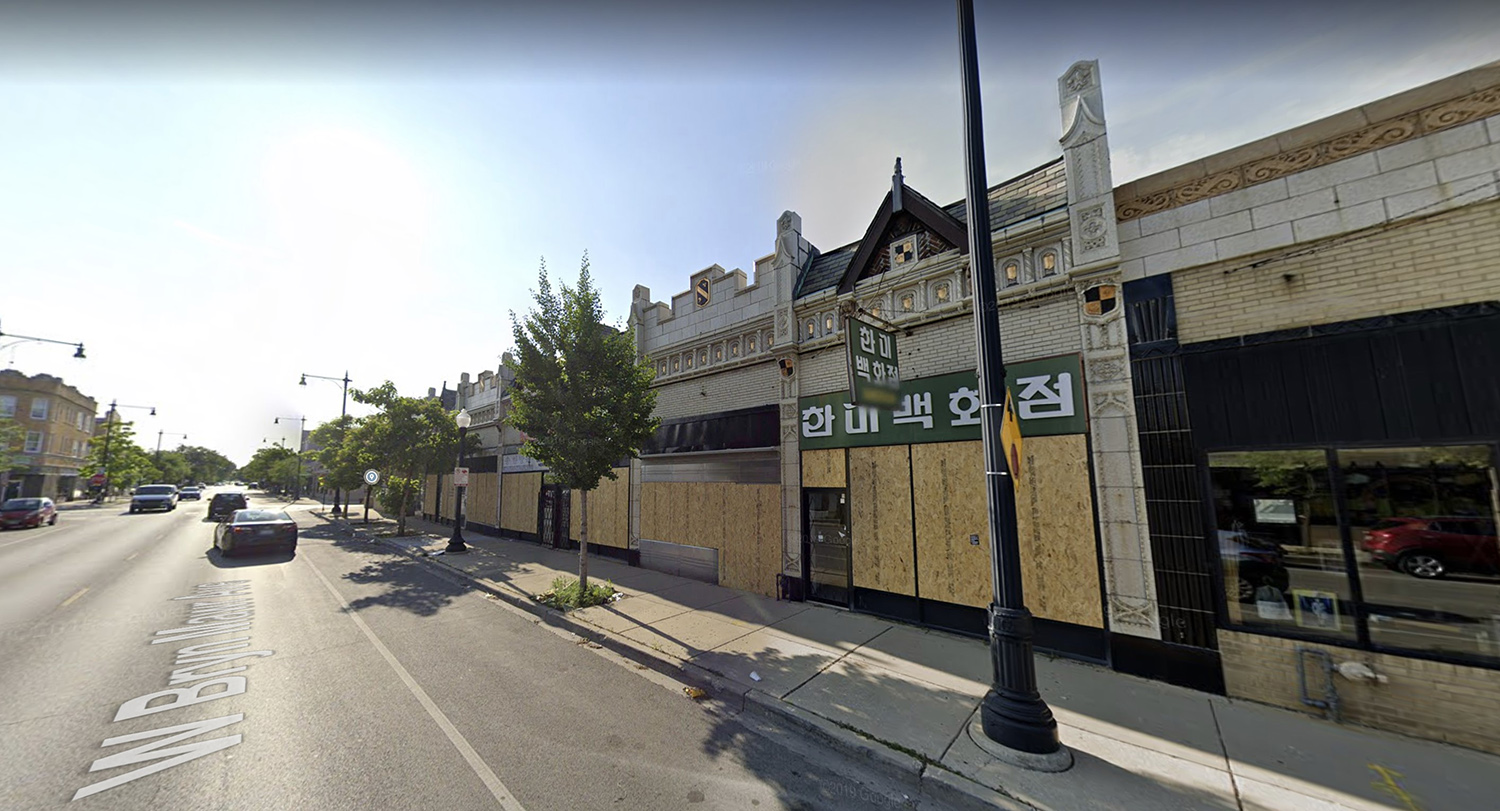
3244 W Bryn Mawr Avenue via Google Maps
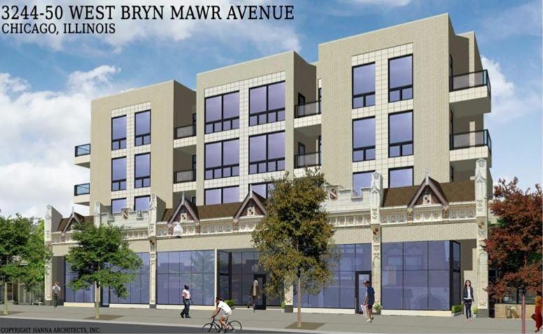
Designed by Hanna Architects, the new construction is a four-story mixed-use building. Planned to hold 30 units, the development will feature commercial space on the ground floor and provide 30 parking spaces. The existing vacant building was designated as historical by the city, and the structure will retain the front historical facade. The new structure will rise behind it with a 13-foot-long setback.
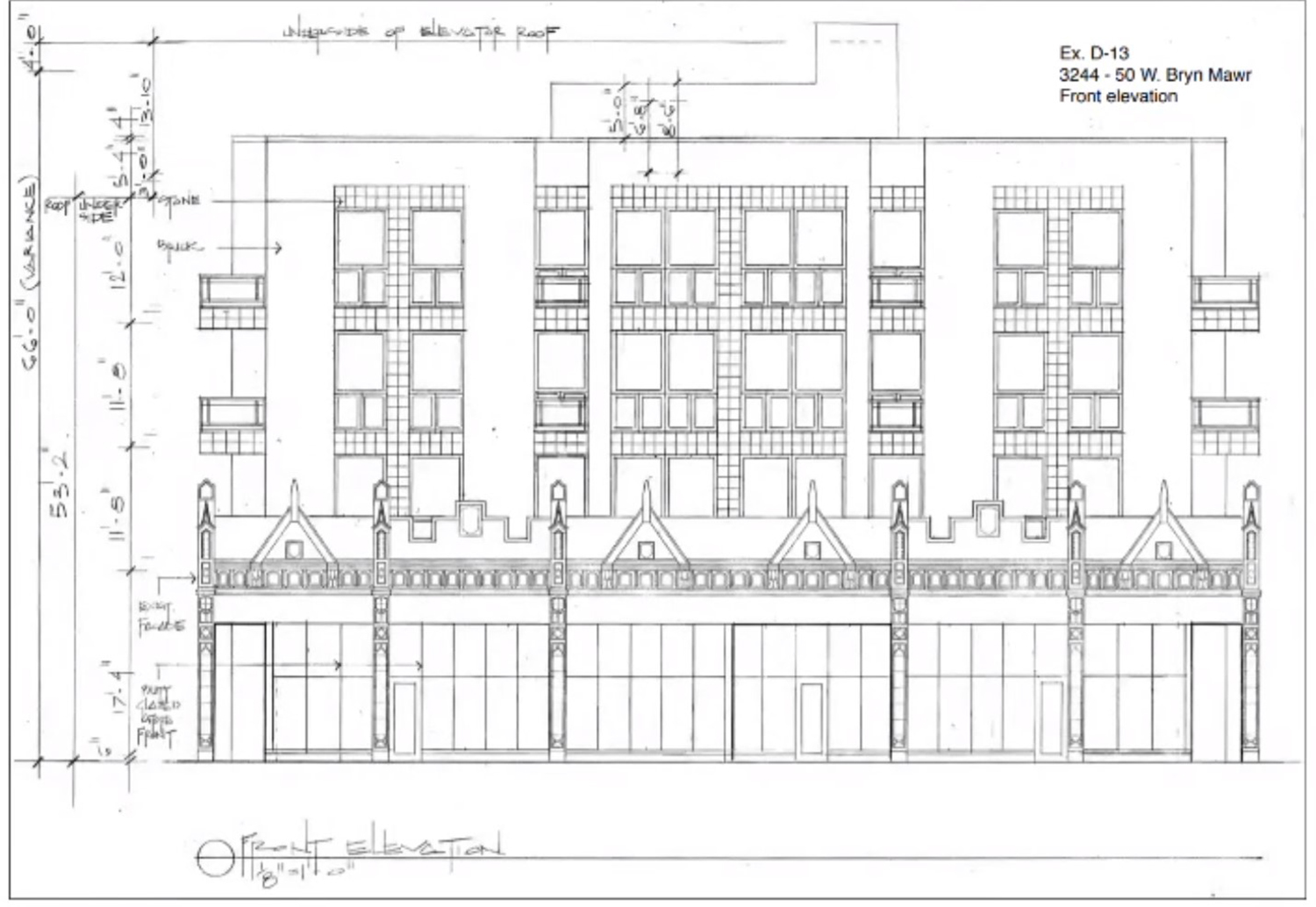
Front Elevation for 3244 W Bryn Mawr Avenue. Drawing by Hanna Architects
The first variance will be to reduce the rear setback on floors containing dwelling units from 30 feet to three feet. This will relieve the restriction of the front setback. The second variance is to reduce the loading requirements from one stall to zero. The ground-floor commercial space limits the space for parking, so removing the loading berth allows for the full accommodation of parking spaces.
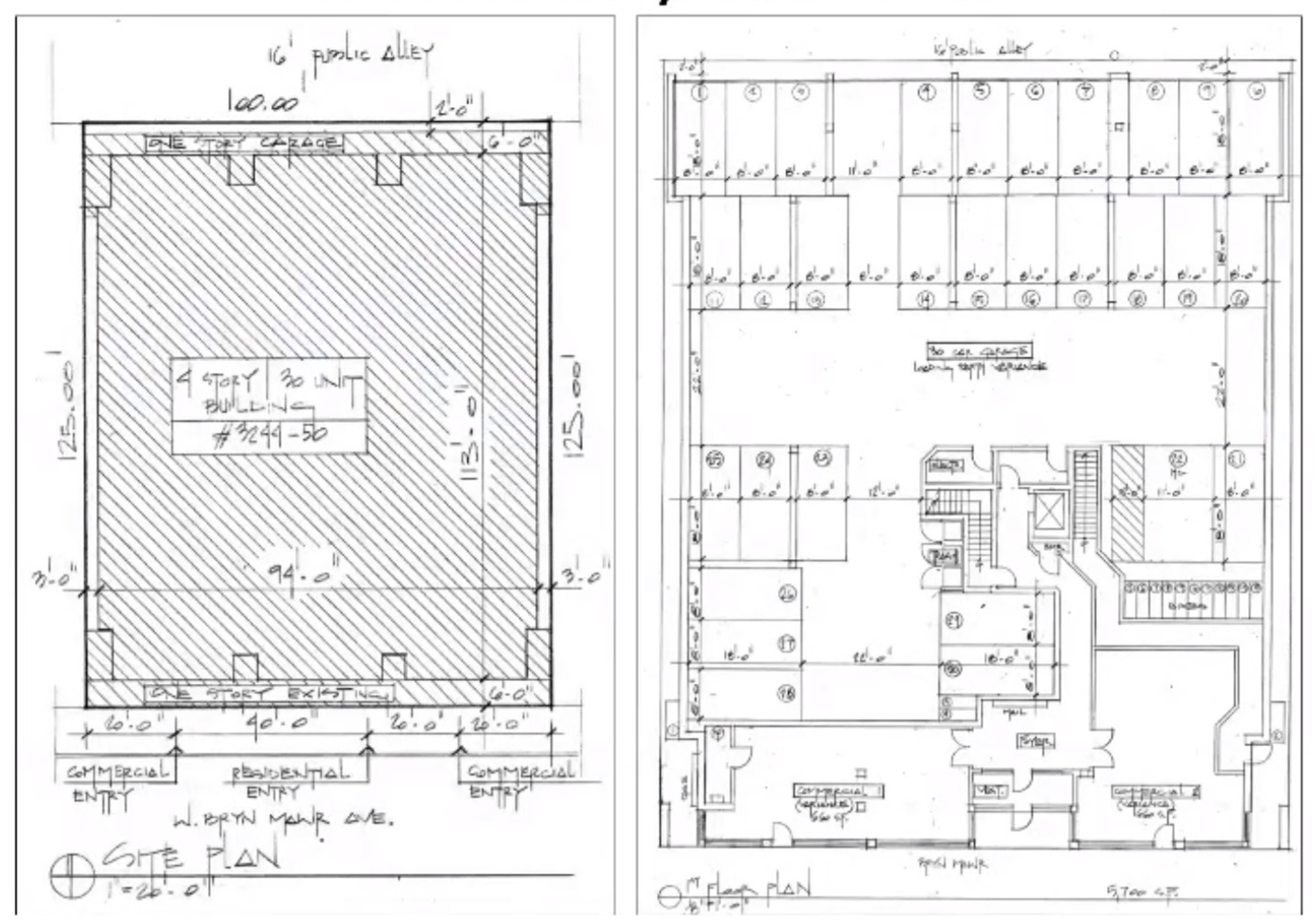
Floor Plans for 3244 W Bryn Mawr Avenue. Drawing by Hanna Architects
The 82 CTA bus route, accessed at the Kimball and Bryn Mawr stop, can be reached via a three-minute walk from the site.
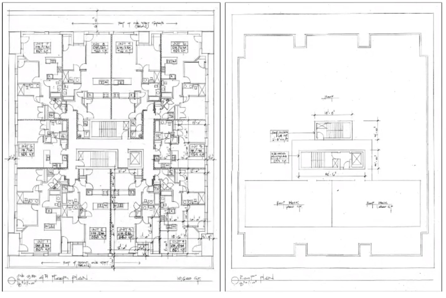
Floor Plans for 3244 W Bryn Mawr Avenue. Drawing by Hanna Architects
Permits for the construction of the development have been filed and are awaiting approval. An official timeline for the construction has not been announced.
Subscribe to YIMBY’s daily e-mail
![]()
Follow YIMBYgram for real-time photo updates
Like YIMBY on Facebook
Follow YIMBY’s Twitter for the latest in YIMBYnews

Fantastic! I’m glad to see the historic facades saved and incorporated into the new structure, and I’m glad to see that stretch being revitalized. It’s so close to Northeastern Illinois University. This should be a vibrant district.
Greg….look what they’ve done to the storefronts!! Save the storefronts and the scale and proportions and details and charm and historic qualities and let some of that detailing flow to the new construction…..why does everything look like a builder who has no eyes is building?!
Hannah: the tiles are floating, no sills, no headers, no cornice…..storefront windows on homes…..you can do better. BLECH
Totally agree with both. I am thrilled they are preserving the historical parts, and the bottom bit looks great. But then the top addition could not be uglier. It’s like they put all the work into the preservation then let a kid design the top. No cornices, no headers, no ornamentation, it’s just a box, but at least the bottom looks good.
thank you but the point is, the bottom also doesn’t look good…all of the scale and character of the original architecture is deleted, save for the terra cotta frames and maybe the roman bricks (will they be restored?)…..given the image presented, they might cover it with a lesser quality material.