Facade work is nearly complete at 320 N Sangamon Street, a 13-story mixed-use building that’s wrapping up in West Loop‘s Fulton Market.
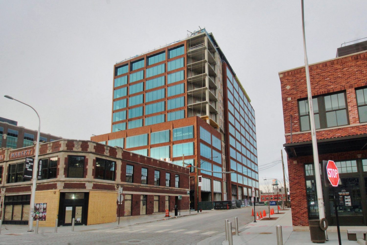
320 N Sangamon Street. Photo by Jack Crawford
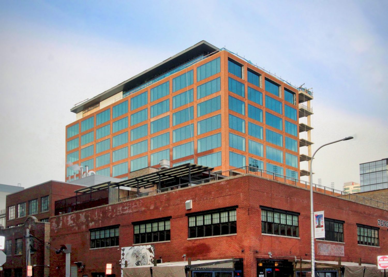
320 N Sangamon Street. Photo by Jack Crawford
Developed by Tishman Speyer and Mark Goodman & Associates, the project will contain a mix of commercial space on the ground floor and office floor plates above, ranging from 24,000 to 27,000 square feet.

320 N Sangamon Street office space. Rendering by SCB

320 N Sangamon Street wellness/fitness center. Rendering by SCB
Office tenants will have access to various amenities, including an indoor and outdoor wellness center, a meeting space able to hold 100 people, and a penthouse lounge and terrace. The sixth floor will also come with a private terrace space for its occupants.

320 N Sangamon Street meeting area. Rendering by SCB

320 N Sangamon Street. Rendering by SCB
Solomon Cordwell Buenz is behind the design, with an exterior that features brick, aluminum, and glass. Both the southeast corner of the building and the penthouse level will include an all-glass and aluminum curtainwall to juxtapose with the surrounding brickwork. A metal “hat” fixture will also sit atop the 13th-floor penthouse.
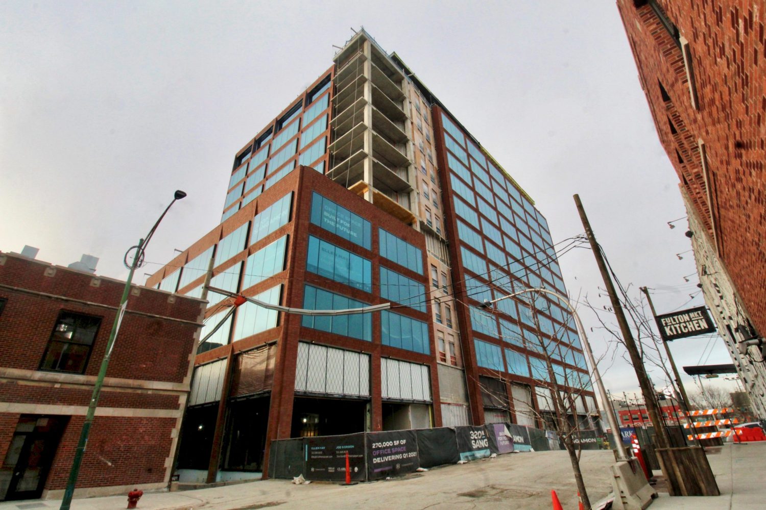
320 N Sangamon Street. Photo by Jack Crawford
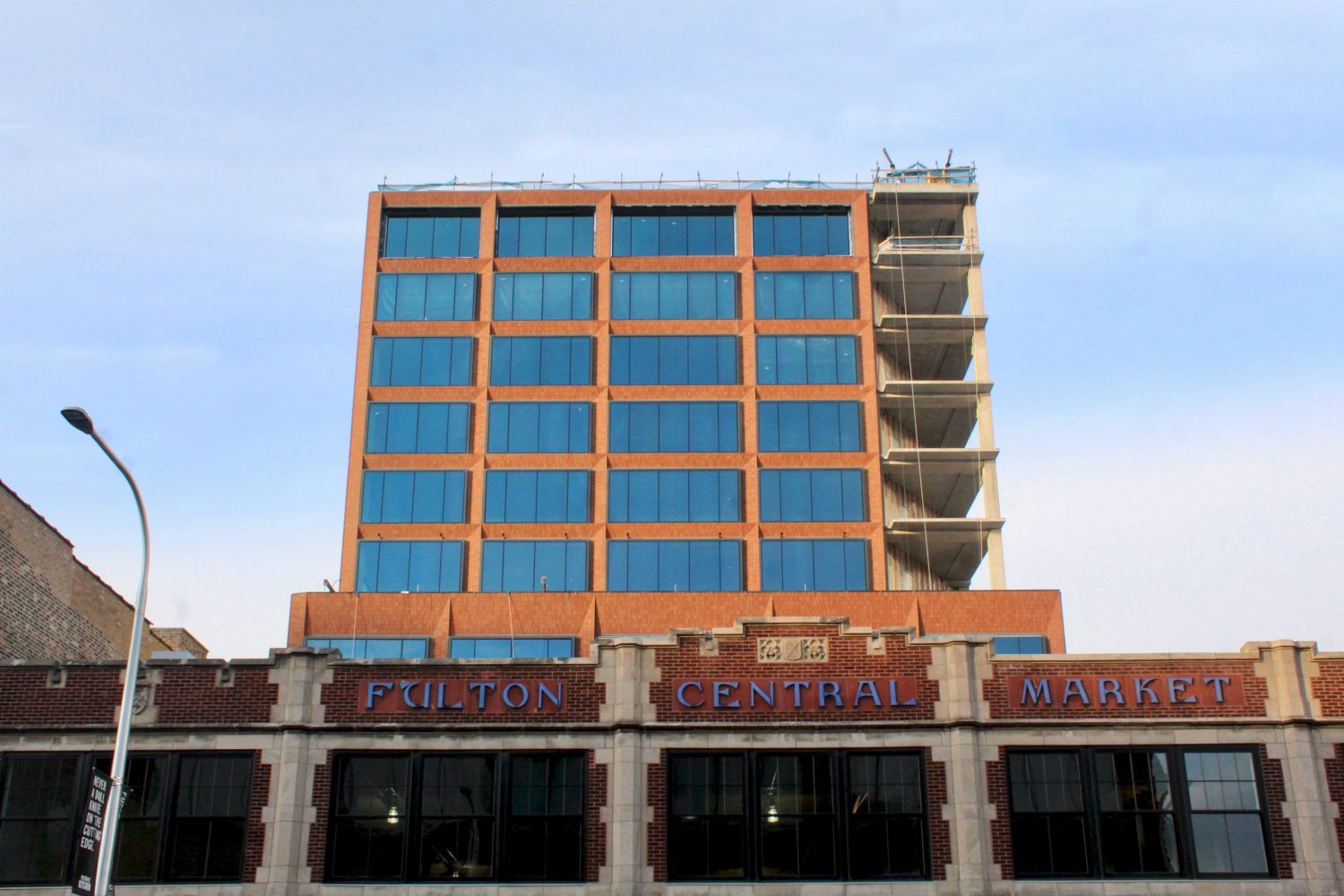
320 N Sangamon Street. Photo by Jack Crawford
Parking will include 48 indoor spaces and an indoor bike rack, in addition to many public transportation options nearby. Nearest bus stops include Route 8 three blocks east along Halsted. Additional buses within a 10-minute walking radius comprise of Route 65 to the north, Route 56 to the east, and Route 20 to the south. Those wishing to access the Green and Pink CTA L lines will find Morgan station via a three-minute walk southwest.
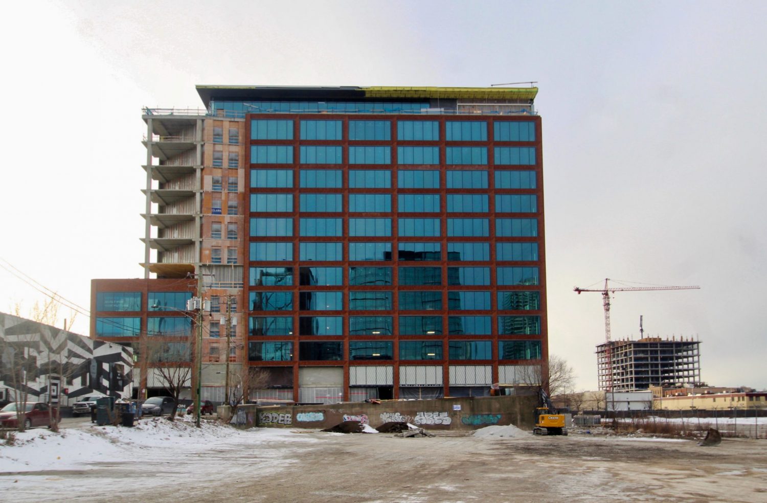
320 N Sangamon Street. Photo by Jack Crawford
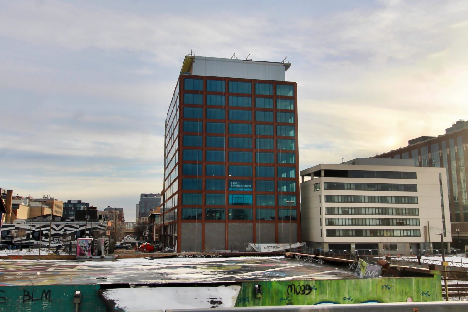
320 N Sangamon Street. Photo by Jack Crawford
320 N Sangamon Street lies in the midst of a host of retail and dining options lining the Fulton Market corridor. Those who may be visiting the building for a business trip will also find a host of hotels, including Ace Hotel Chicago within the same block.
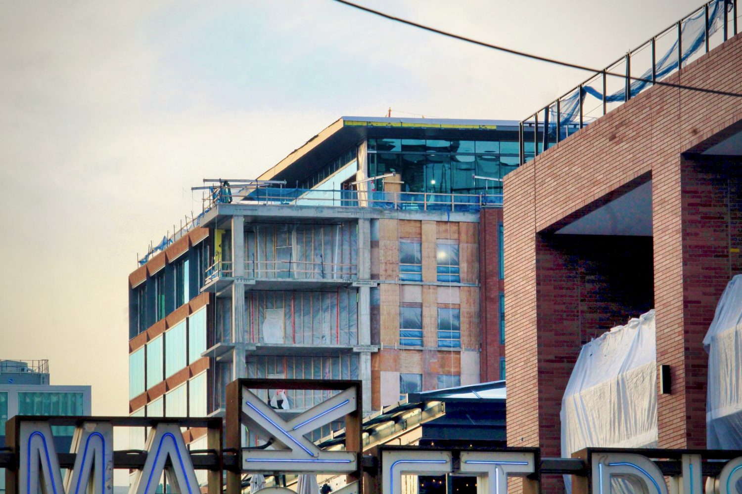
320 N Sangamon Street. Photo by Jack Crawford
Clark Construction is the general contractor for the 270,000-square-foot construction. A completion is expected for this quarter.
Subscribe to YIMBY’s daily e-mail
Follow YIMBYgram for real-time photo updates
Like YIMBY on Facebook
Follow YIMBY’s Twitter for the latest in YIMBYnews

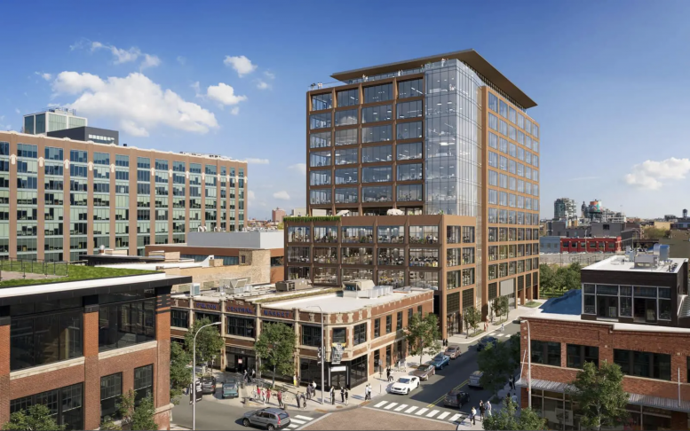
Not a fan of how this one is turning out… It’s rather plain and to me, looks cheap. There’s also something about the glass that I do not like.
It’s good to know other things besides parking grinds your gears. Lol
I’m wondering what criteria are you using to come up with the conclusion that this $81+ million project is using cheap glass? And what expensive looking glass should they be using?
You sure love to track and analyze my comments!
I said the overall development looked cheap and plain, not the glass specifically. I think the tint/shade of the glass looks odd against the red brick and that a more translucent glass would be more complementary.
Does that work for you or should I refrain from making anymore opinions?
I was scrolling and thought the same exact thing. I feel as though no explanation is necessary…
I agree regarding the glass. The translucent glass in the render is really lovely. The aqua glass in reality has a suburban office park feel