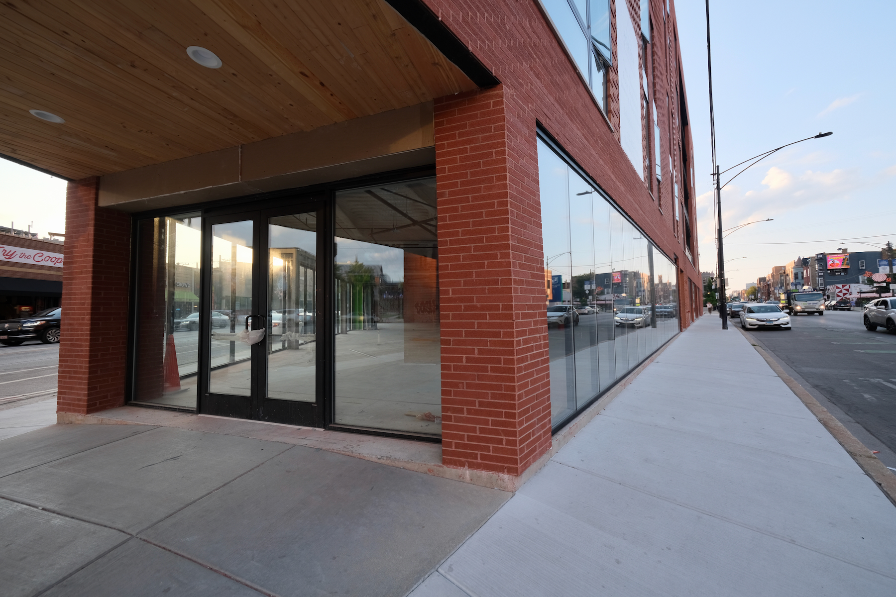
Construction is finalizing for a five-story mixed-use building, The Porter, at 2411 N Lincoln Avenue in Lincoln Park. The development, spearheaded by Mike Breheny of Contemporary Concepts Inc., involves 3,700 square feet of retail, a 1,700-square-foot covered patio, and 36 rental apartments above. The privately-owned Julia Porter Park, the namesake of the new construction, previously occupied the site.
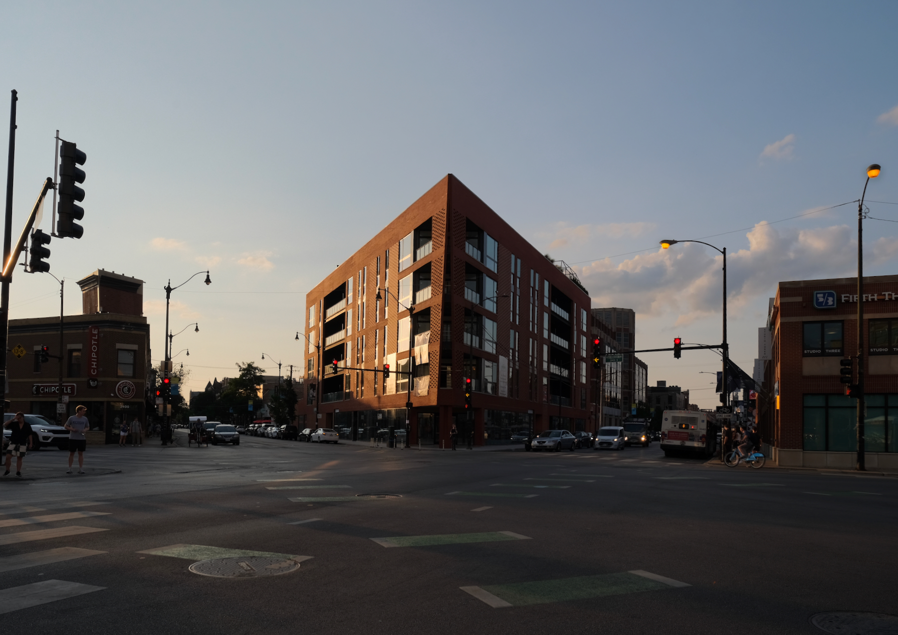
The Porter. Photo by Jack Crawford
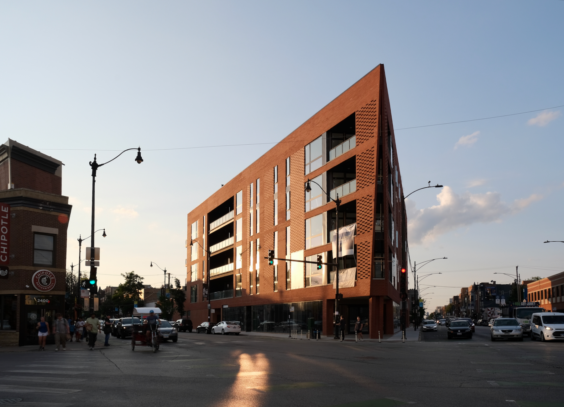
The Porter. Photo by Jack Crawford
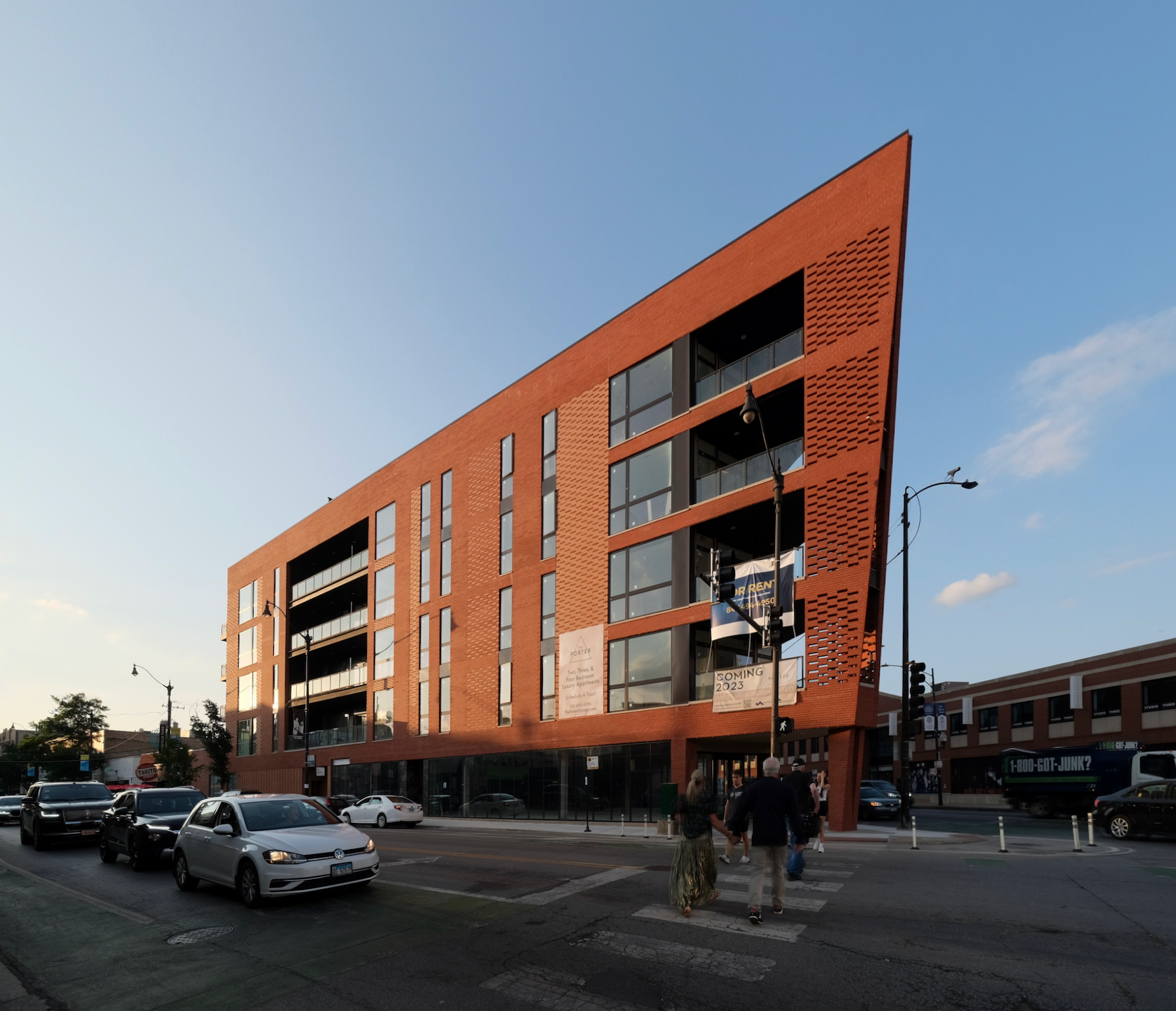
The Porter. Photo by Jack Crawford
The large apartment layouts consist of 25 percent two-bedroom, 60 percent three-bedroom, and 15 percent four-bedroom units. Moreover, the complex will feature a covered rooftop amenity deck and provide 36 on-site parking spaces.
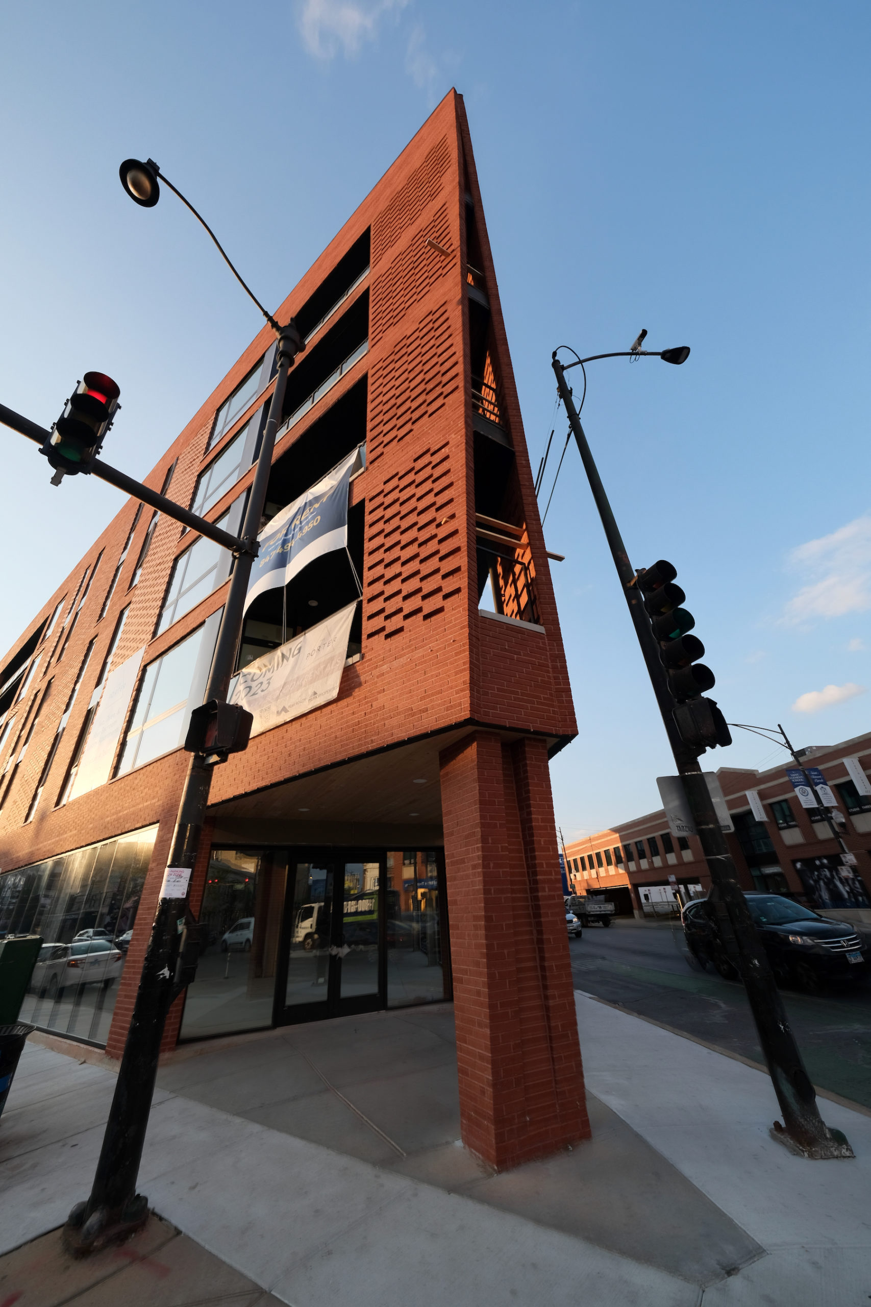
The Porter. Photo by Jack Crawford
The Porter. Photo by Jack Crawford
The Porter. Photo by Jack Crawford
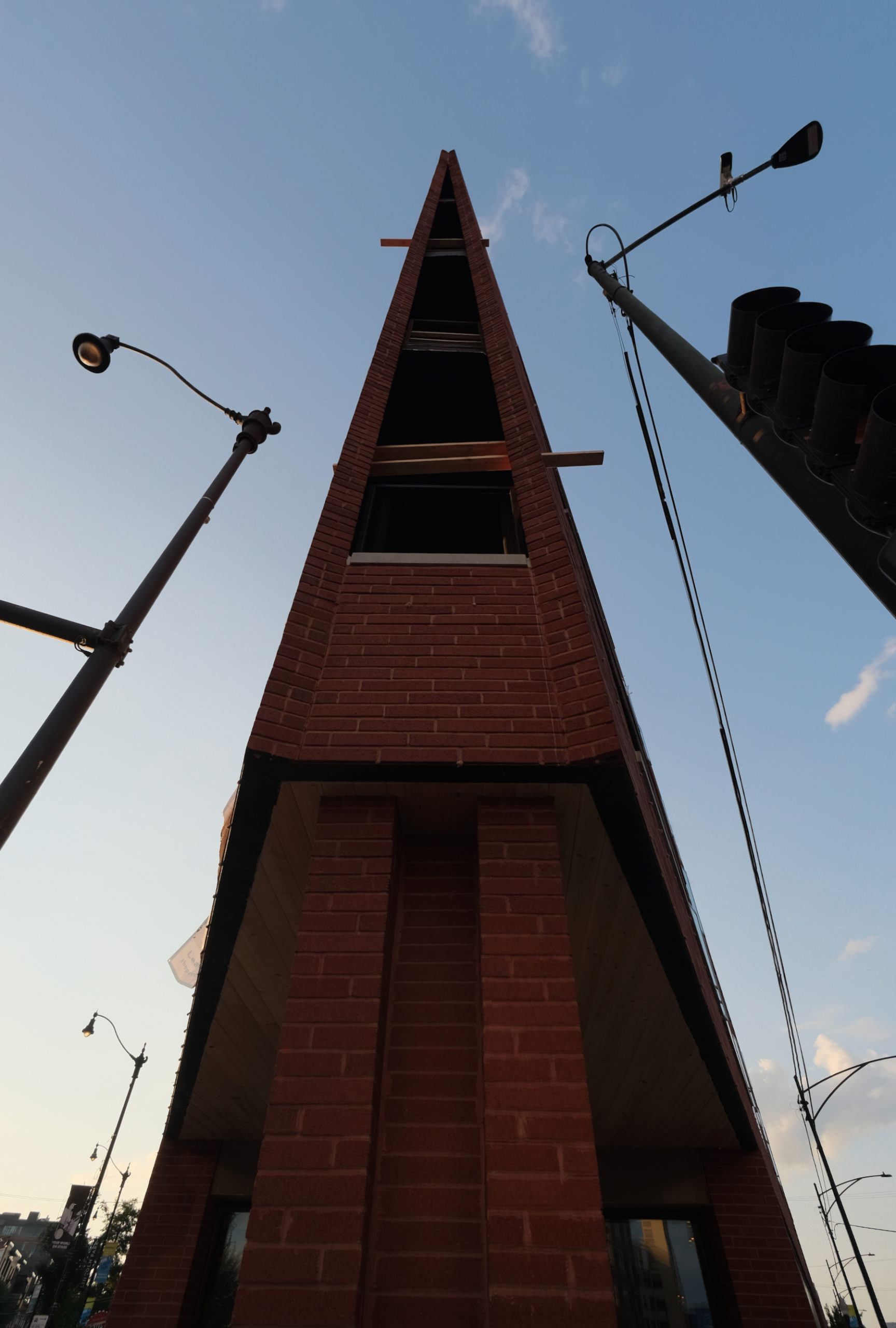
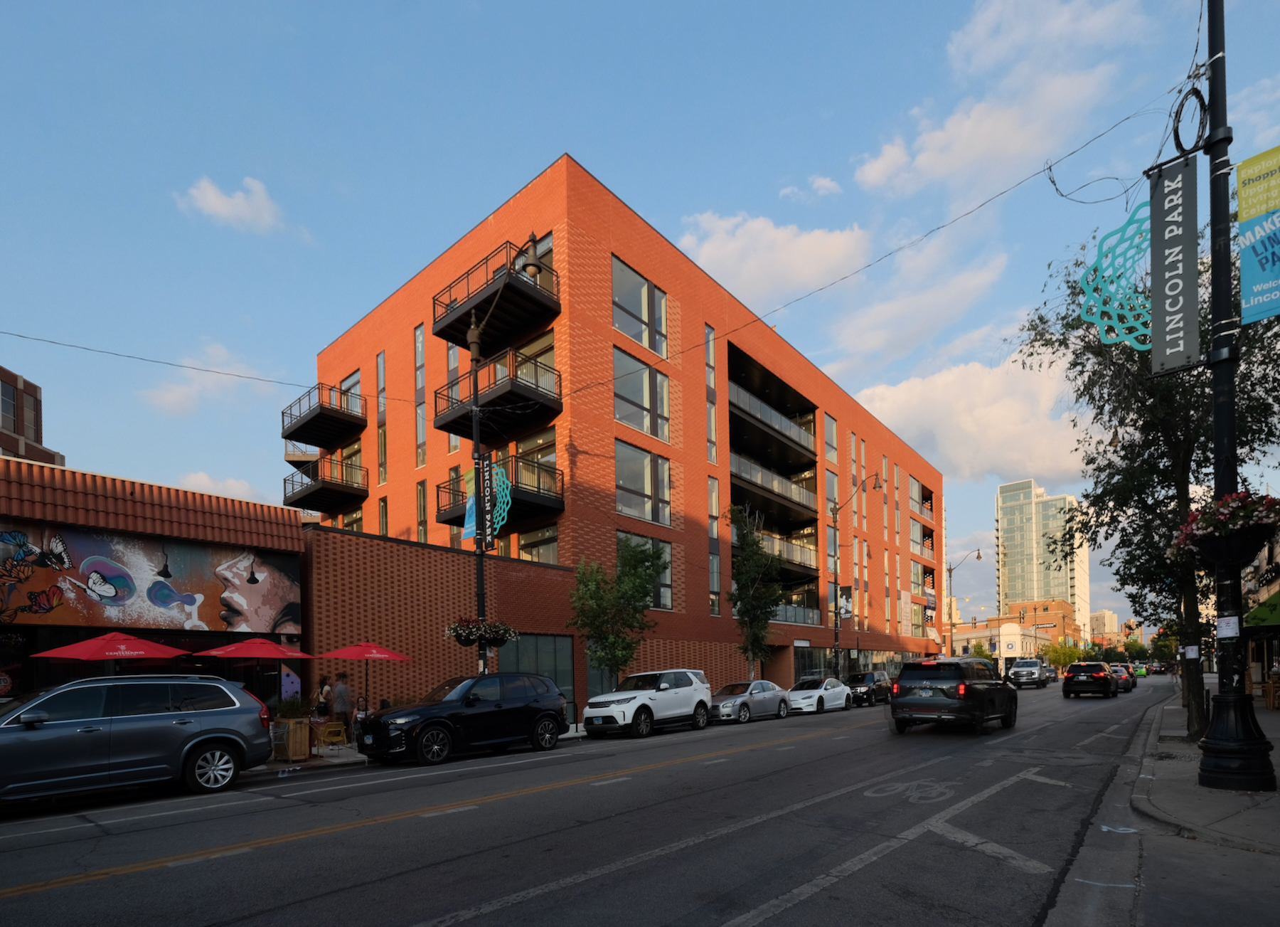
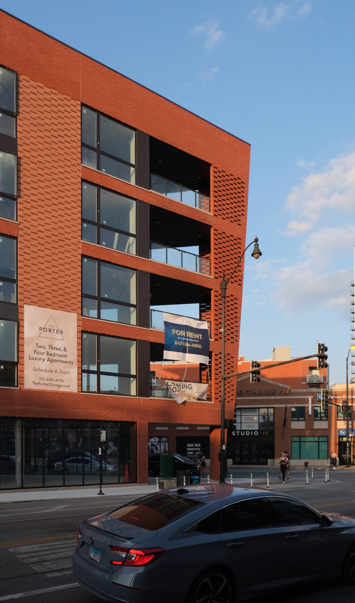
The building’s triangular design envisioned by Studio Dwell molds to the distinct site footprint created by the six-corners intersection. The boat-like massing comes with inset private balconies throughout, most notably along the southern point of the structure. The facade materials, meanwhile, showcase a mix of patterns and orange-red hues of brick cladding.
The Porter. Photo by Jack Crawford
The Porter. Photo by Jack Crawford
The property lies within close distance of several public transportation options. A bus stop for Route 74 is within a two-minute walking radius, while the Red, Brown, and Purple Line trains are accessible at the Fullerton station, a five-minute walk west of the property.
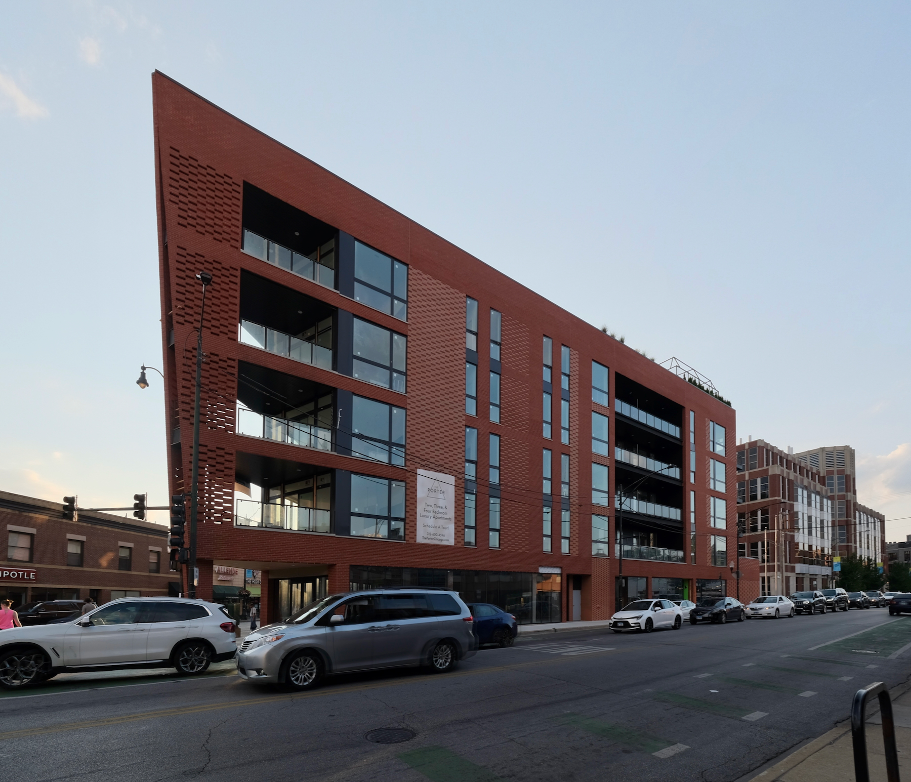
The Porter. Photo by Jack Crawford
Contemporary Concepts is serving as the general contractor for the project. The opening of The Porter is expected for later this summer.
Subscribe to YIMBY’s daily e-mail
Follow YIMBYgram for real-time photo updates
Like YIMBY on Facebook
Follow YIMBY’s Twitter for the latest in YIMBYnews

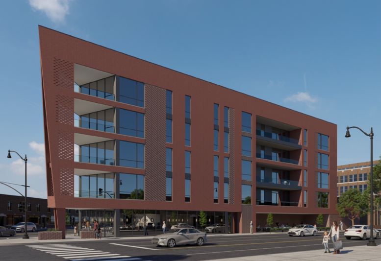
Reality is better than the rendering. This turned out nicely.
I agree that does not happen often but it looks good.
Anyone else think this is reminiscent of the Jawas’ Sandcrawler?
I realize it was private property, but it’s still sad to lose the green space.
I’m sure it was.
That “green” space was full of rats and homeless unfortunately. Was not kept up at all. Could have been done well like Lincoln commons current green space but they let it go.
I can’t believe someone will pay top dollar to live and “relax” literally 10 feet above that massive corner. It should have been two floors of retail to create a bit more of a buffer. Everyone in the hood can see what you’re doing on that second floor corner balcony.
Hey now, some goldfish enjoy showing off!
Truth Be Told, you are correct. The rendering made it look like a prow of red plastic, whereas the classic brick cladding renders tolerable this tacky triangle.
The brickwork is refreshing to see but that angular focal point really misses the mark. Could just be straight up but these architects are convinced they’re doing something striking with every filler residential block.
This building is such a nice addition. It definitely feels worthy of that prominent corner. Bravo, Studio Dwell!