Final touches for both interior and exterior work can be seen at the 2740 North Spaulding Avenue (filed under 2755 N Milwaukee Avenue) in Logan Square. R.P. Fox & Associates is the developer behind the six-story mixed-use building, whose interior programming involves ground-level retail split into five segments, along with 60 apartments on the upper floors. Prior to demolition and subsequent construction, the roughly half-acre property was occupied by a single-story bakery and a parking lot.
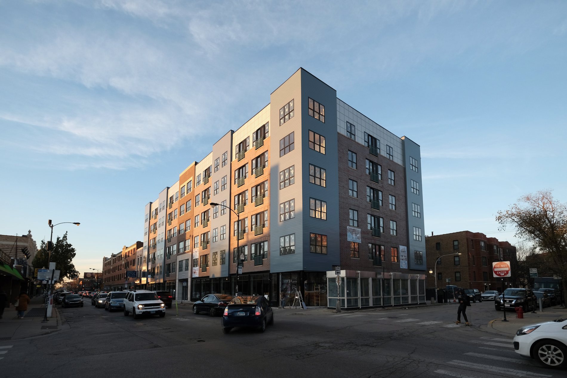
2740 North Spaulding Avenue. Photo by Jack Crawford
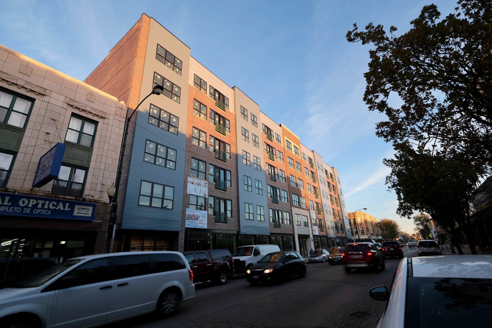
2740 North Spaulding Avenue. Photo by Jack Crawford
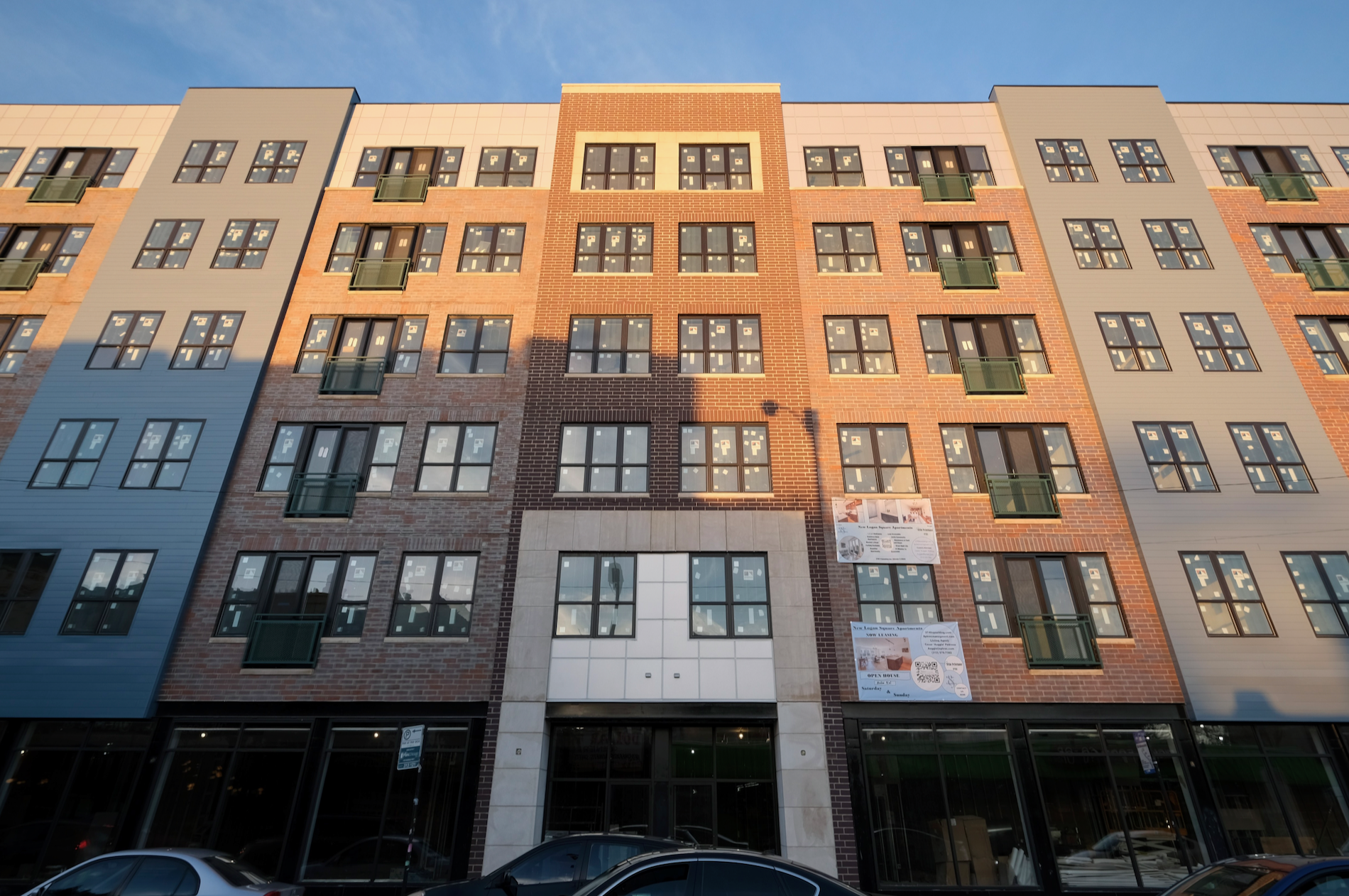
2740 North Spaulding Avenue. Photo by Jack Crawford
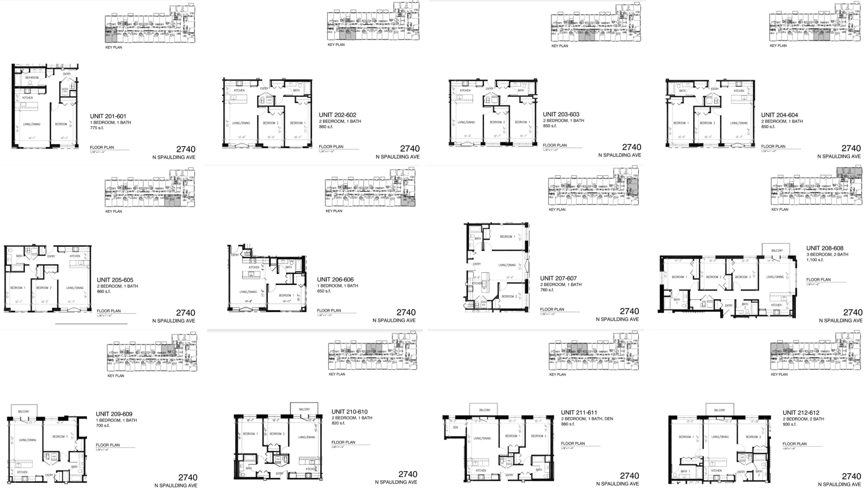
2740 North Spaulding Avenue floor plans. Floor plans via R.P. Fox & Associates
As shown via the marketing website, units range from one- to three-bedroom residences, spanning between 650 and 1,100 square feet. In total there are 12 unique layouts, five of which come with outdoor balconies.
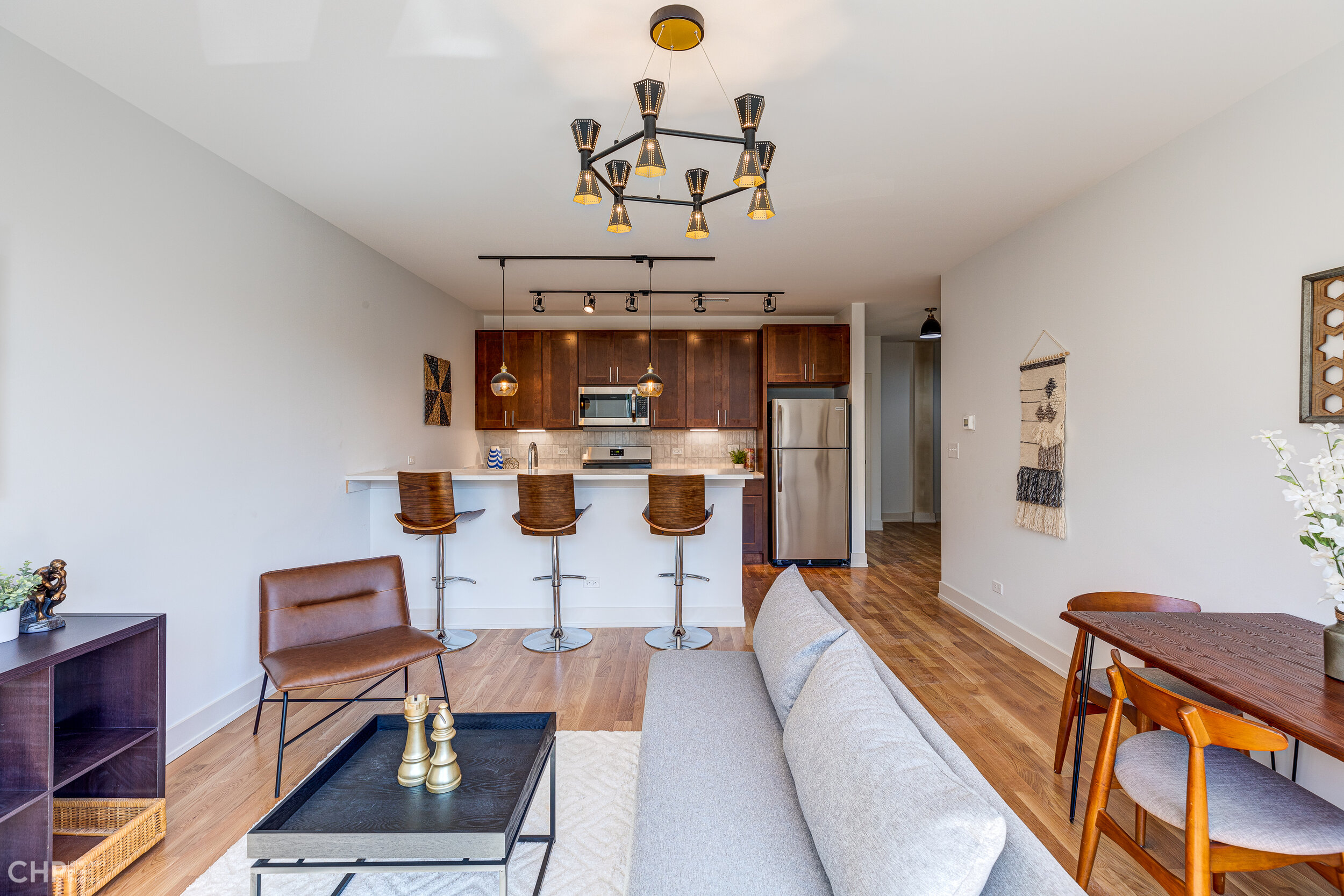
2740 North Spaulding Avenue unit interior. Photo via R.P. Fox & Associates
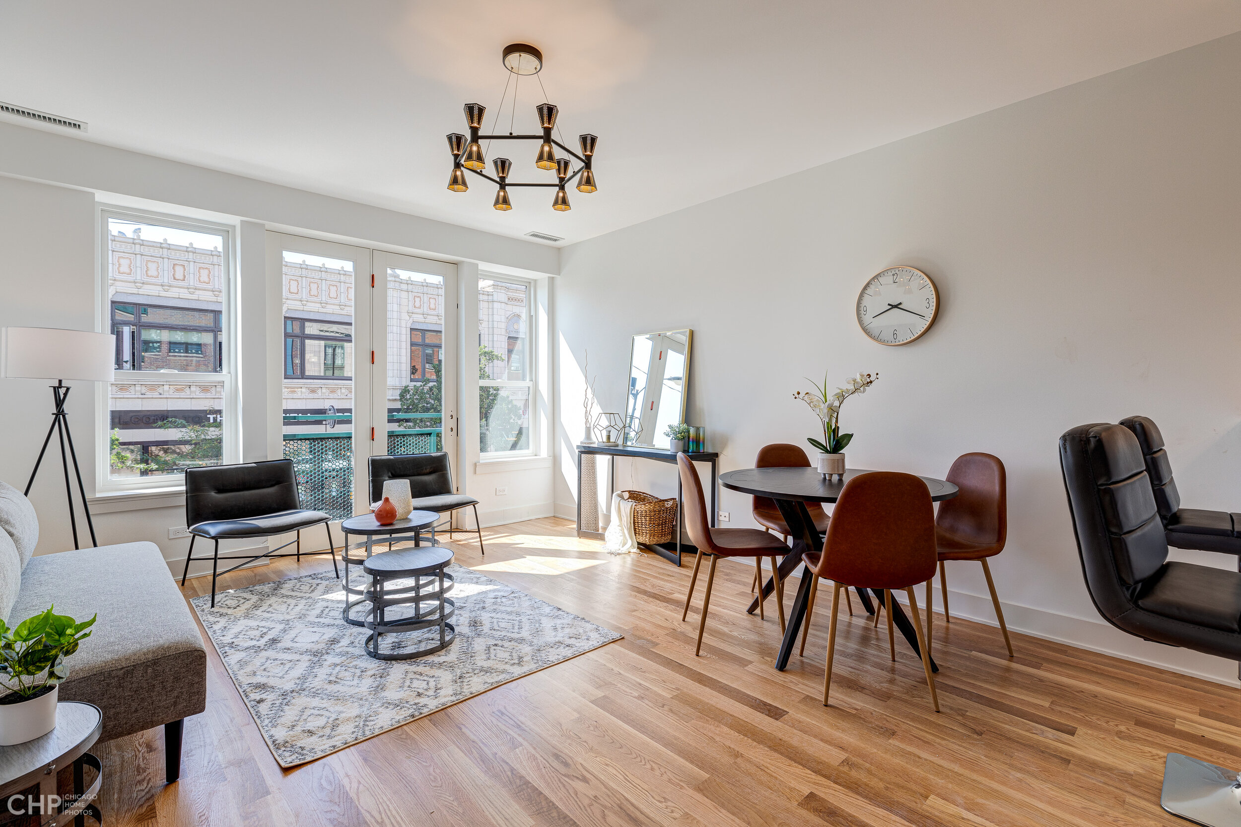
2740 North Spaulding Avenue unit interior. Photo via R.P. Fox & Associates
With a design by Mayer Jeffers Gillespie Architects, current construction photos show a two-toned red brick facade with intermittent grayish blue vinyl siding. Additionally, Juliet and cantilevered balconies can be see arranged throughout the majority of the sides. Another feature of note is a roof deck that was added to the project scope last year via an additional permit.
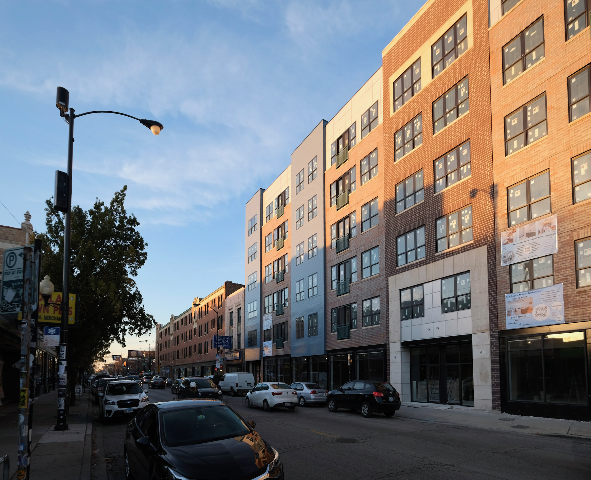
2740 North Spaulding Avenue. Photo by Jack Crawford
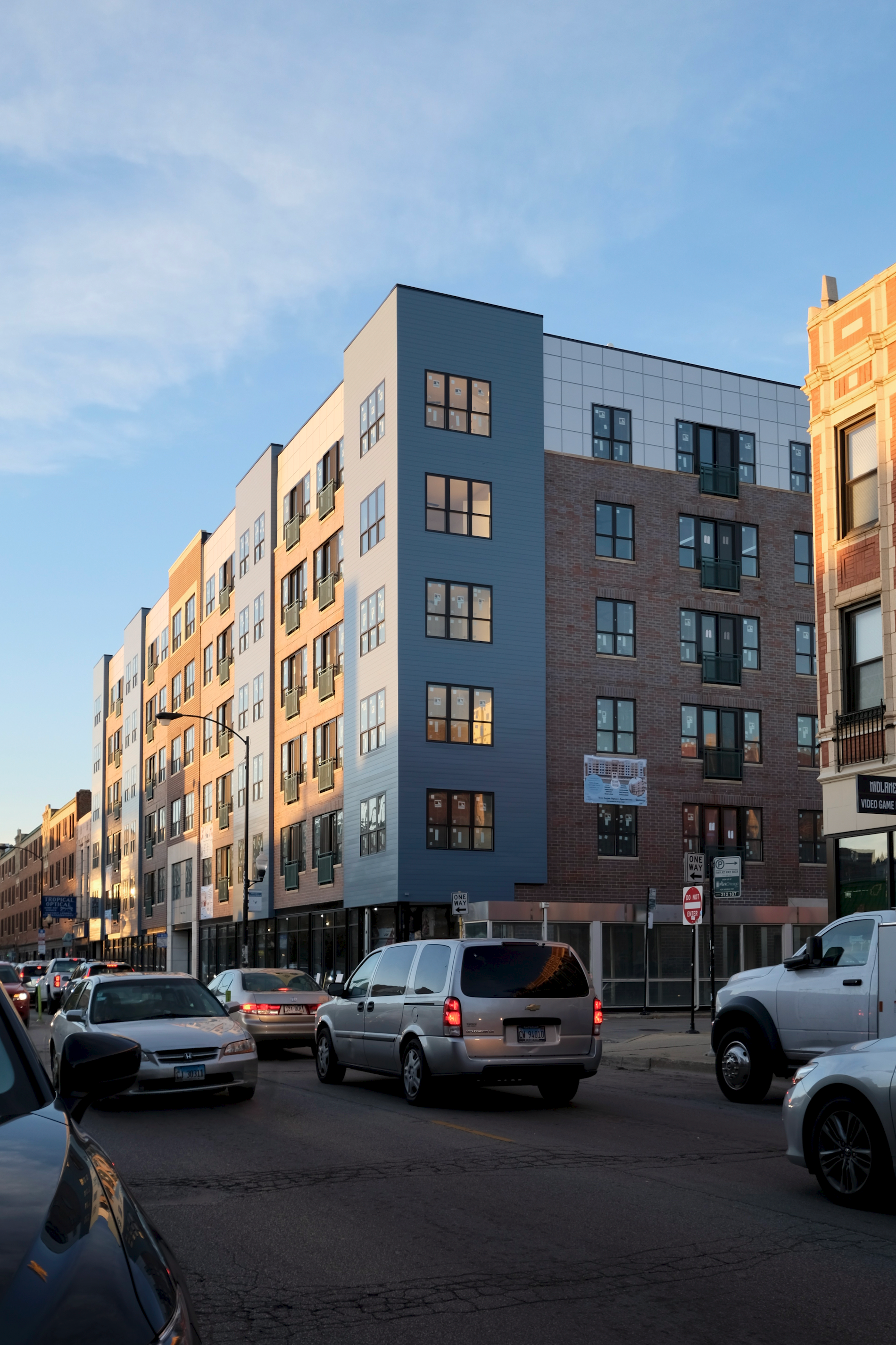
2740 North Spaulding Avenue. Photo by Jack Crawford
Despite no accessory parking, the project will lie close to several transportation options, the closest are bus stops for Route 56 at the adjacent intersection of Milwaukee & Spaulding. A two-minute walk northwest to Diversey & Milwaukee/Kimball are additional stops for Routes 76 and 82. As far as CTA L transit, the Blue Line can be found a four-minute walk southeast to Logan Square station.
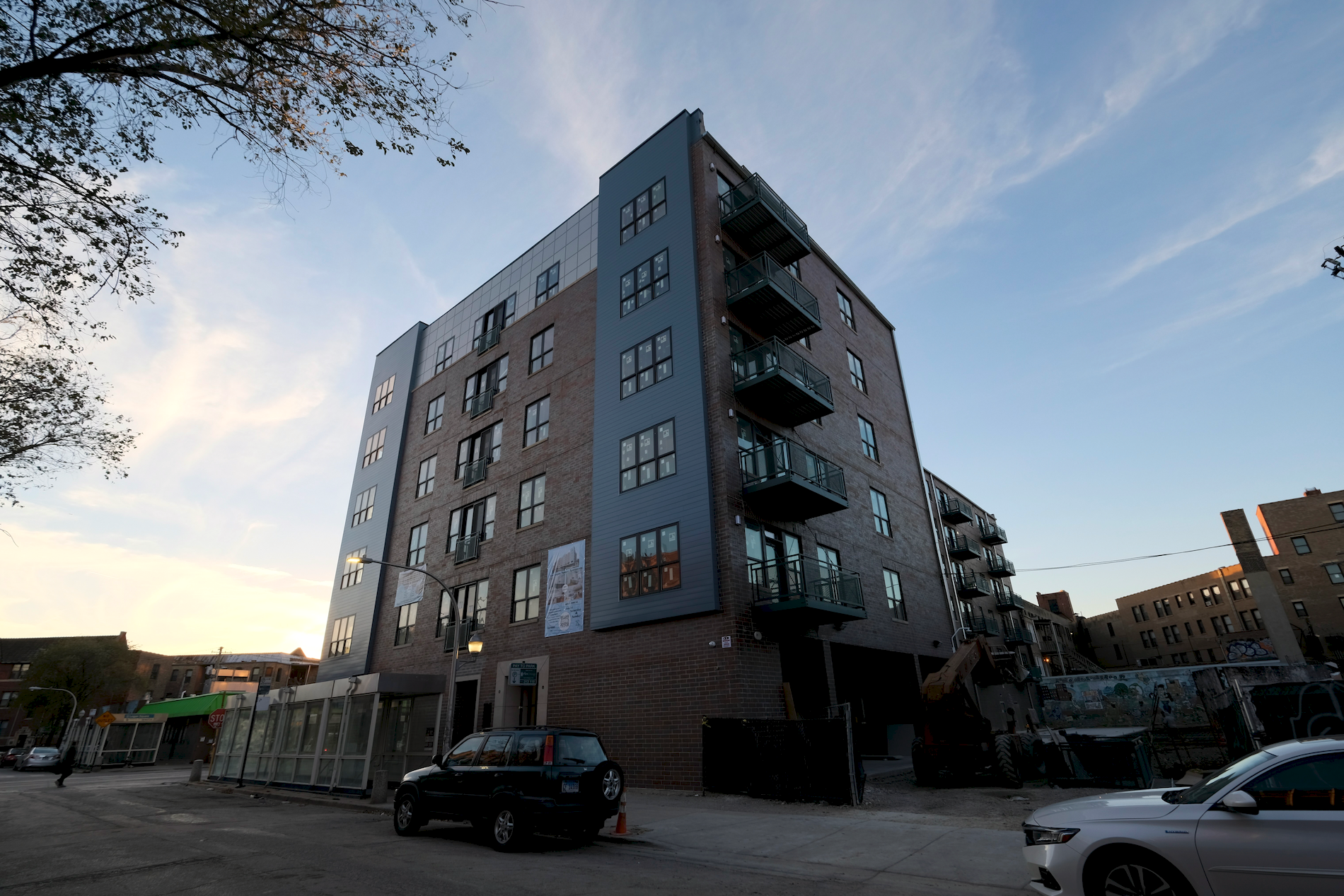
2740 North Spaulding Avenue. Photo by Jack Crawford
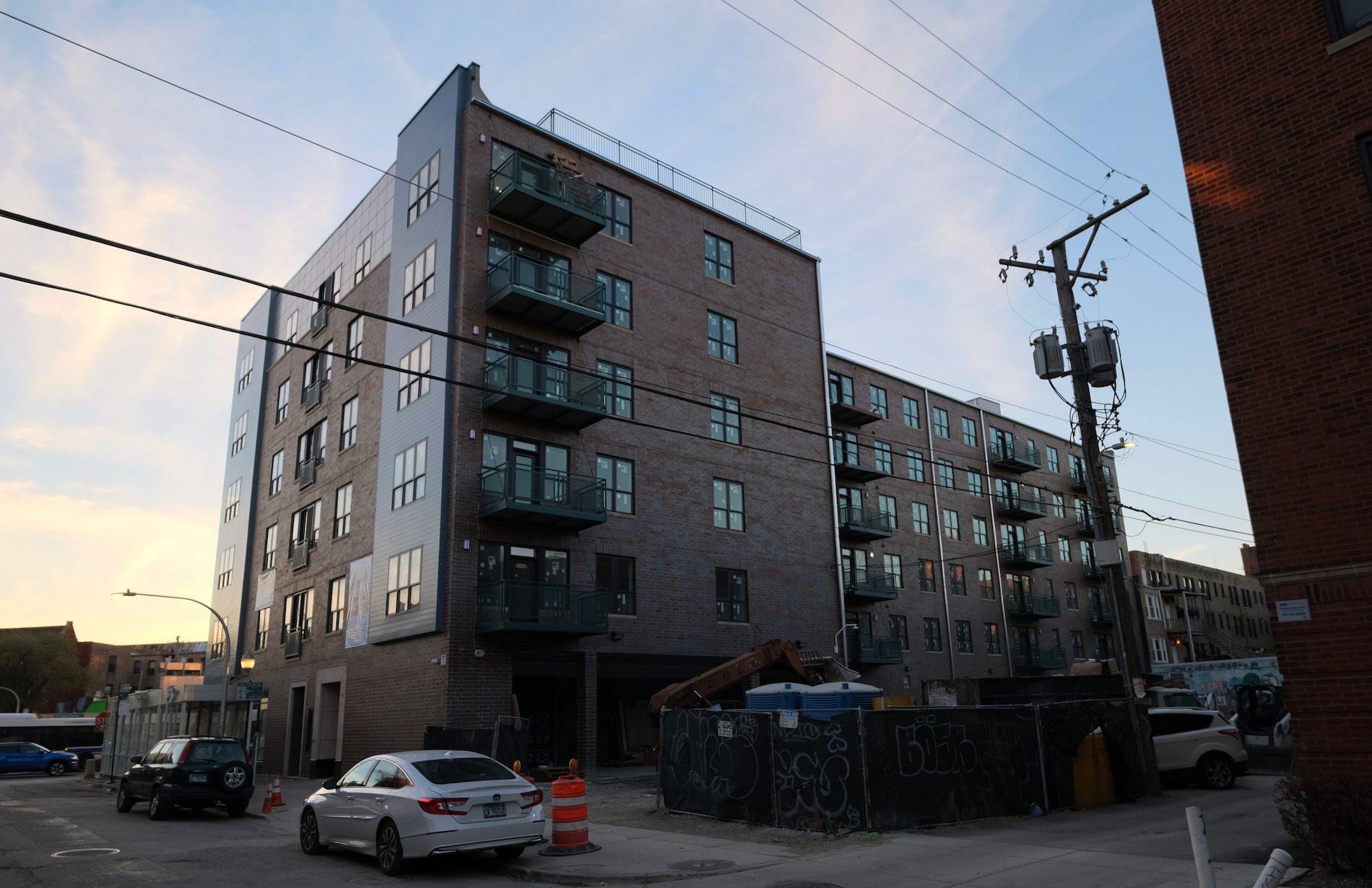
2740 North Spaulding Avenue. Photo by Jack Crawford
Given its walking score of 96, residents will find a various retail and dining options in the immediate vicinity, most of which lie along Milwaukee Avenue. Various nearby park spaces also consist of Unity Park, Fireman’s Park, and Logan Square Park.
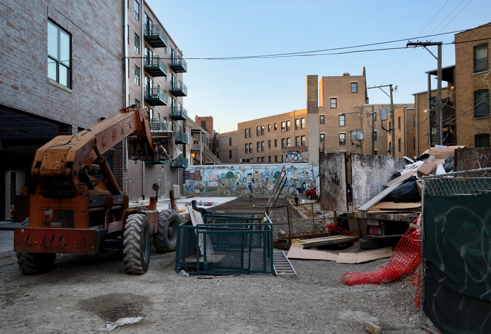
2740 North Spaulding Avenue. Photo by Jack Crawford
Since YIMBY’s last update, much of the new frontage has been added along the Milwaukee Avenue-facing side, with the final design beginning to materialize. With a reported construction cost of $7 million, FGAC Construction LLC is serving as general contractor. A full completion is expected by the end of the summer.
Subscribe to YIMBY’s daily e-mail
Follow YIMBYgram for real-time photo updates
Like YIMBY on Facebook
Follow YIMBY’s Twitter for the latest in YIMBYnews

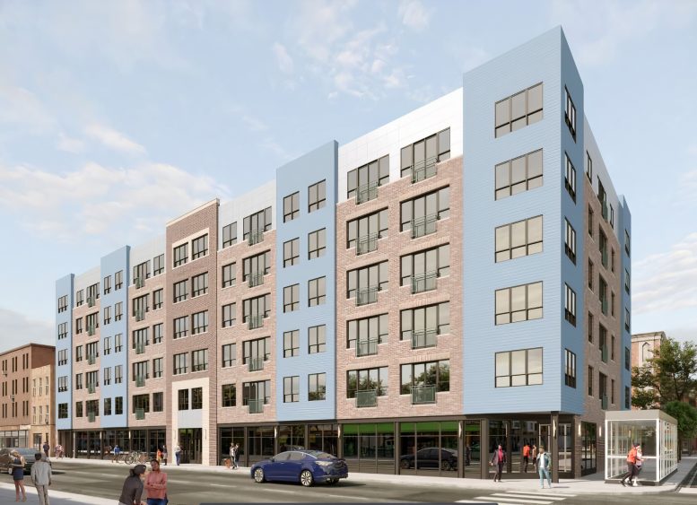
Painfully generic.
design is absolutely awful, but zero parking, lots of retail, and taking up a surface parking lot makes up for it i guess.
did a 9 year old with ADHD pick out the facade?
It’s unfortunate that the developer didn’t provide any public green space. No consideration for pedestrians.
Another sad case of “opposite facade” where the back is fully bricked but the prominent vertical sections facing the street get cheap materials. Not to mention how “contemporary” architects seem to either hate or have no knowledge of moldings whatsoever. Its not like this is an affordable development where there’s at least that excuse to cheap out.
Buzz’s girlfriend, WOOF