
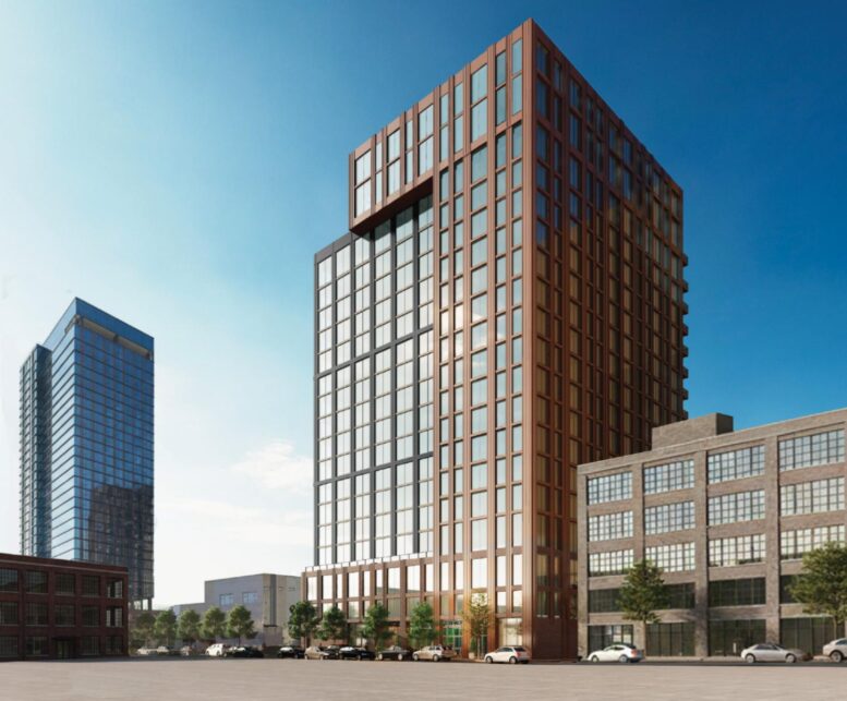
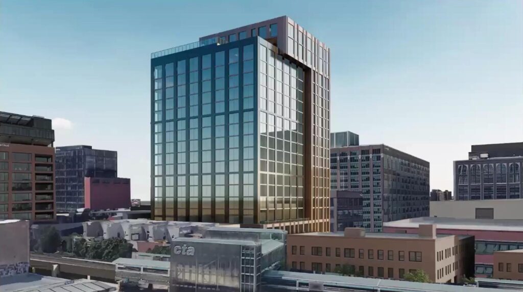
Further renderings and details have been revealed for the upcoming mixed-use development at 214 North Morgan Street in Fulton Market. Sitting mid-block between Lake and Fulton Streets, the current high-rise proposal was revealed a month ago by developers Parq Development and Luxury Living. Now, the plans have officially been presented to the community.
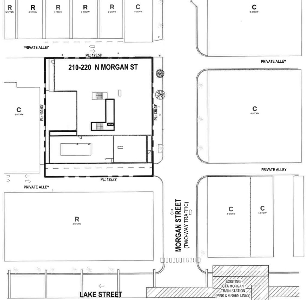
Site plan of 214 N Morgan St by ParkFowler Plus
As we previously reported, the new 18-story proposal replaces earlier plans for a 33-story, three-tiered high-rise with 204 units, retail space, and a 50-vehicle parking garage. Led by a different developer and design team, the glass-clad tower was approved by the city in 2022 before stalling and ultimately being canceled.
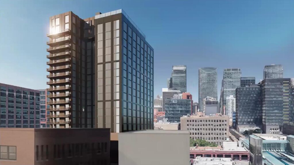
Rendering of 214 N Morgan St by ParkFowler Plus
Rendering of 214 N Morgan St by ParkFowler Plus
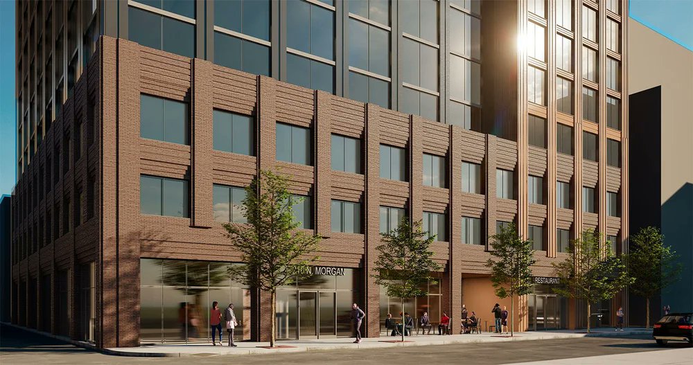
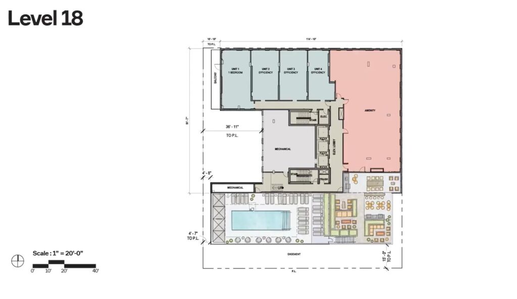
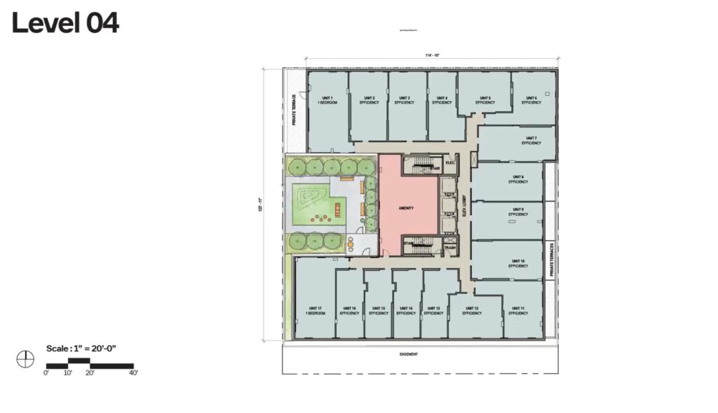
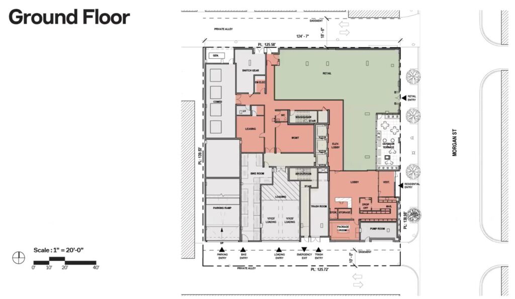
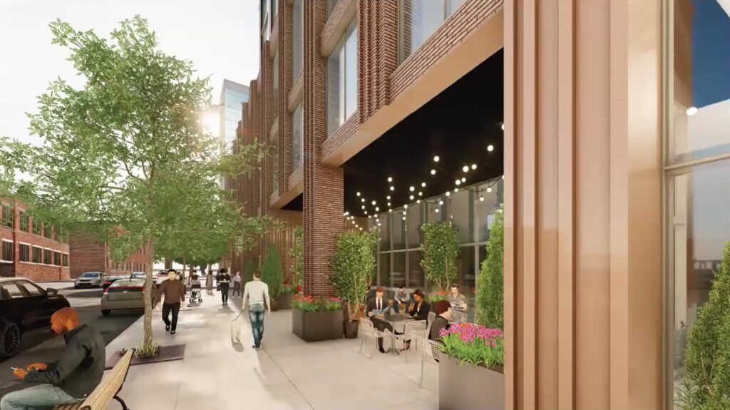
The new development team has brought on ParkFowler Plus to design the 260-foot-tall, U-shaped tower. The plan includes a three-story podium with nearly 4,000 square feet of retail space, a lobby, amenity areas, and a 30-vehicle parking garage. The podium will be capped by a small outdoor space featuring a dog run.
Floor plans of 214 N Morgan St by ParkFowler Plus
The remainder of the tower will contain 268 residential units, consisting of studios and one-bedroom layouts. Select one-bedroom units will include outdoor terraces. Of the total unit count, 54 will be designated as affordable. All residents will have access to a rooftop amenity space and terrace with a larger pool.
Rendering of 214 N Morgan St by ParkFowler Plus
Rendering of 214 N Morgan St by ParkFowler Plus
The development team will not be starting from scratch but is seeking approval to amend the existing planned development designation for the site from the previous proposal. Once all approvals are received, the project aims to break ground next year and deliver units in 2027.
Subscribe to YIMBY’s daily e-mail
![]()
Follow YIMBYgram for real-time photo updates
Like YIMBY on Facebook
Follow YIMBY’s Twitter for the latest in YIMBYnews
If they did what they did on the podium with the masonry and carried that same facade all the way to the top, this easily would’ve been one of the best projects to grace the West Loop.
Sadly, metal panels do be the easy cheap scapegoat of contemporary design. I’ll be spending most of my time looking at the ground floor only, so at least that’s got some winning funk.
Indeed. Even though this has a pretty low number of parking spaces for these kinds of developments, it’s because of the parking podium that this is even a thing. From what I can tell, podiums are mostly a thing because of large scale retail spaces instead of traditional small scale ones (thanks big chain financing). If they weren’t for parking cars, they could be designed in so many different ways including just integrating the entire building visually all the way from the ground floor on up (like old building design was done, again, before parking podiums). They really are a plague on our city for so many reasons. And I won’t stop railing on them until they’re at least relegated to the back by zoning, or underground.
The projects I’ve worked on in California, I’d take metal panels over concrete and stucco any day. Either the construction quality was poor or the architects f’ed up, but I’ve seen numerous projects that are less than 20 years old have their entire stucco replaced and receive massive repairs. No one is doing stucco high rises, but it’s certainly a material used heavily out there.
I don’t know if it’s the podium sucking most the life out of this one. It could be a project trying to defy an aggressive market, but there is definitely a lot to say on other projects that get the massive podium-cruddy architecture treatment. It could be the over-saturation of luxury units finally settling for the area. The best of NY’s new masonry towers are untouchable by the common Joe masses. Maybe some more realistic numbers tightened the belt.
Future projects might not be hindered by parking podiums, since the Chicago City Council recently passed a sweeping zoning reform that eliminates parking mandates for most residential and commercial development in the city. Under the new ordinance, developers are no longer required to provide any off-street parking in “Transit-Served Locations” in most districts. That includes sites within a quarter-mile of a CTA bus corridor or a half-mile of a CTA rail station.
I think the fourth photo of the ground level is a bit outdated. If you check out the first photo and some blueprints of the ground level, you’ll see that the retail space is only on the right side of the building. On the left side, there’s a wall with some awesome masonry work that displays the building’s address, which is clearly visible in the new high-res renderings Urbanize shared yesterday. This is a huge improvement for the project. I’m definitely giving this a thumbs-up!
I feel like I’ve seen a million different renderings and proposals for this project already. Just build the damn thing already!
Just 2. First proposed in 2021 as a 33 story, 380 ft tower. This is the second proposal.
It’s unfortunate that the height shrunk. There’s quality architecture and design substance here with the masonry seen from street level. I also wish the masonry went all the way up but this location will not get a Central Park return.