Details have been revealed for a new mixed-use development at 5830 N Broadway in Edgewater. Located just north of the intersection with W Victoria Street, the new structure will replace an existing auto lot near the CTA Red Line Thorndale station. The property is being developed by a local resident of Edgewater Glen, who has worked on various nearby projects.
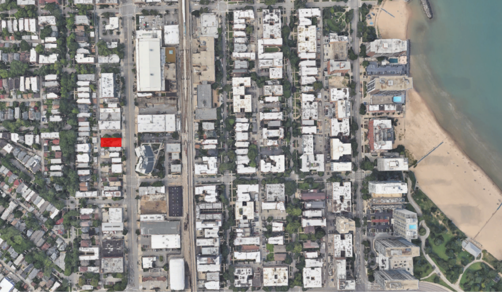
Site context map of 5830 N Broadway via Google Maps
Rising six stories and roughly 70 feet in height, design efforts for the project are being led by local firm Nicholas Design Collaborative. The ground floor will contain roughly 1,400 square feet of retail space fronting Broadway. This will be joined by a small residential entrance as well as a handful of parking spaces within a garage and along the alley, though a total is unknown.
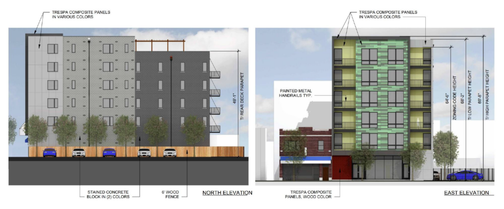
Elevations of 5830 N Broadway by Nicholas Design Collaborative
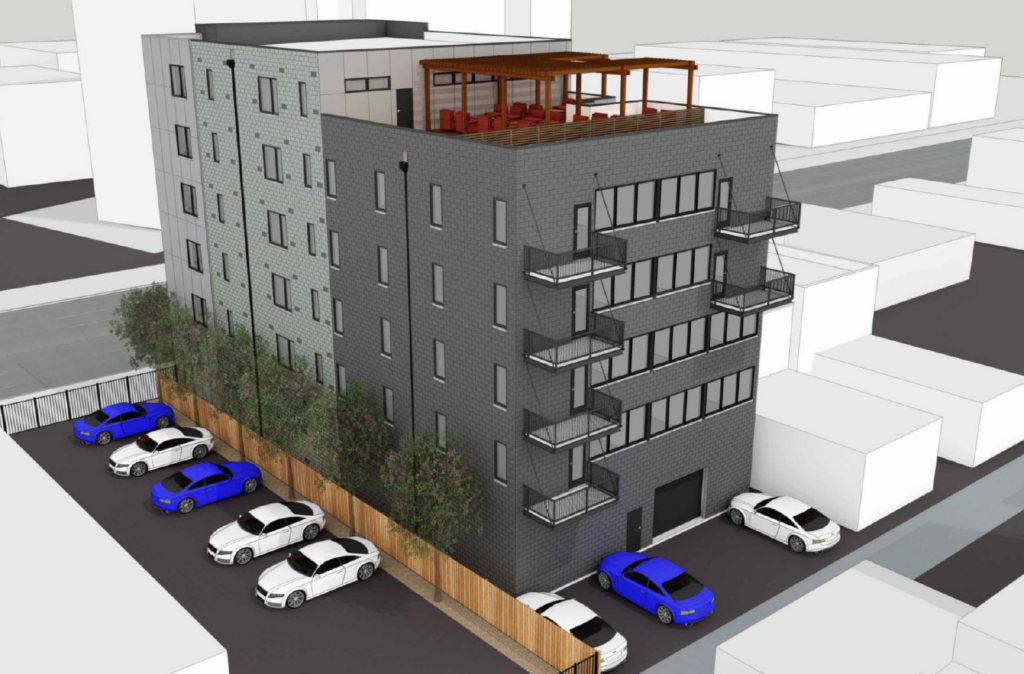
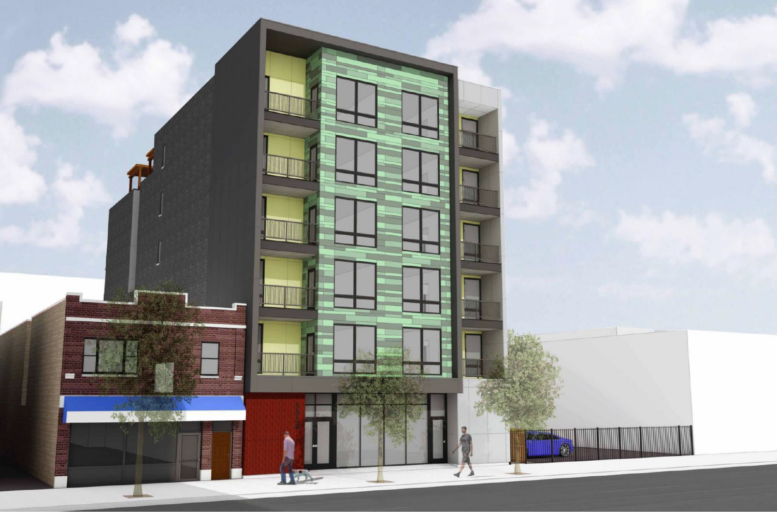
Rendering of 5830 N Broadway by Nicholas Design Collaborative
The floors above will hold 20 residential units, these will be made up of 20 percent studios, 20 percent one-bedrooms, and 60 percent two-bedroom layouts. Of these four will be considered affordable. A majority of units will also have access to private balconies along the street front and cantilevered along the rear facade over the parking spaces.
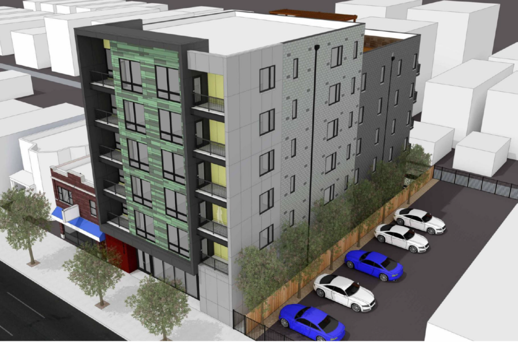
Rendering of 5830 N Broadway by Nicholas Design Collaborative
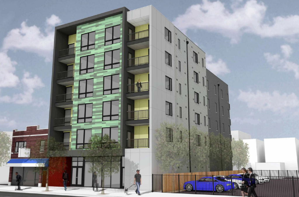
Rendering of 5830 N Broadway by Nicholas Design Collaborative
Residents will also have access to a small rooftop deck in the rear as the structure sets back on the last floor. The exterior will be made up of multiple materials including colored concrete blocks, painted panels, and multi-color metal panels along the front. There will also be rooftop solar panels. At the moment no timeline has been revealed for the development, requiring a zoning approval from the city prior to construction.
Subscribe to YIMBY’s daily e-mail
![]()
Follow YIMBYgram for real-time photo updates
Like YIMBY on Facebook
Follow YIMBY’s Twitter for the latest in YIMBYnews

We gotta stop with that panel color pattern. Just do a solid color yo
I find that the solid ones sometimes don’t age well. The multiple colors may be a way to improve that.
I agree. Especially that color. Ick.
The fact that you need a zoning change to build a 6 story building in this location is completely insane. Chicago could be experiencing a building boom that lowers housing prices/rents, raises massive tax revenue and revitalizes struggling areas of the city, but we just can’t get out of our own way.
Yep ☝🏻
110%
We need more people like you to show up to community meetings and say that. The only ppl who show up are the ones who fight against density and parking reductions.
Now, now. The aldercreatures need a way to fundraise. And zoning approvals are just the thing!
BTW: now do “inclusive zoning”.
According to Block Club this part of Broadway was downzoned 15 years ago which is nuts frankly. It’s the perfect street height — wide sidewalks, extremely close to transit. More people might also help with the speeding problem on Broadway in Edgewater. Among other street improvements.
@Tyler – amen!
@Le Courvoisier – you hit the nail on the head. It’s such an overused gimmick and this particular combination is making me nauseous.
If I were alder I’d demand it be 4 floors taller and much, much less ugly. What’s wrong with brick and glass??
Maybe(please) it will look better in real life vs. the rendering. I googled the architect and they have designed a lot of great looking structures.
Kill this thing and launch the architects into deep space so they can never propose such a crime against god himself again.
Hmmmm . . . I finally get these posts: an excellent satire of typical jury comments from an architecture professor (tenured, of course, so just an ossified snark rather than an insight on good design).
Careful! You might trigger PTSD for former students.
Former architecture student here. Yes, this kind of feedback was common. And if my professor had his way, most of the human race would be cold and dead in orbit around earth.
That stretch of Broadway between Foster and Devon is a quasi freeway hellscape for pedestrians. It should be zoned so that nothing under ten stories is approved. If the city insists upon running a freeway through a highly populated neighborhood, then it should be surrounded on both sides with highrises.
Amen
Psst — sorry to break it to you, but those colors don’t actually go together!
wow this thing is ugly