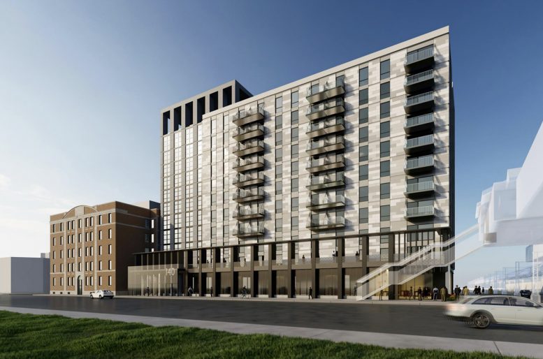
Located in the Near West Side neighborhood along Union Park, the structure and outer walls for 140 N Ashland Avenue have now reached their full height. This 12-story mixed-use building planned by developer Marquette Companies will integrate with a 1920s era, five-story brick structure on its southern side. Once complete, the complex will feature 210 apartment units above ground-level retail spaces.
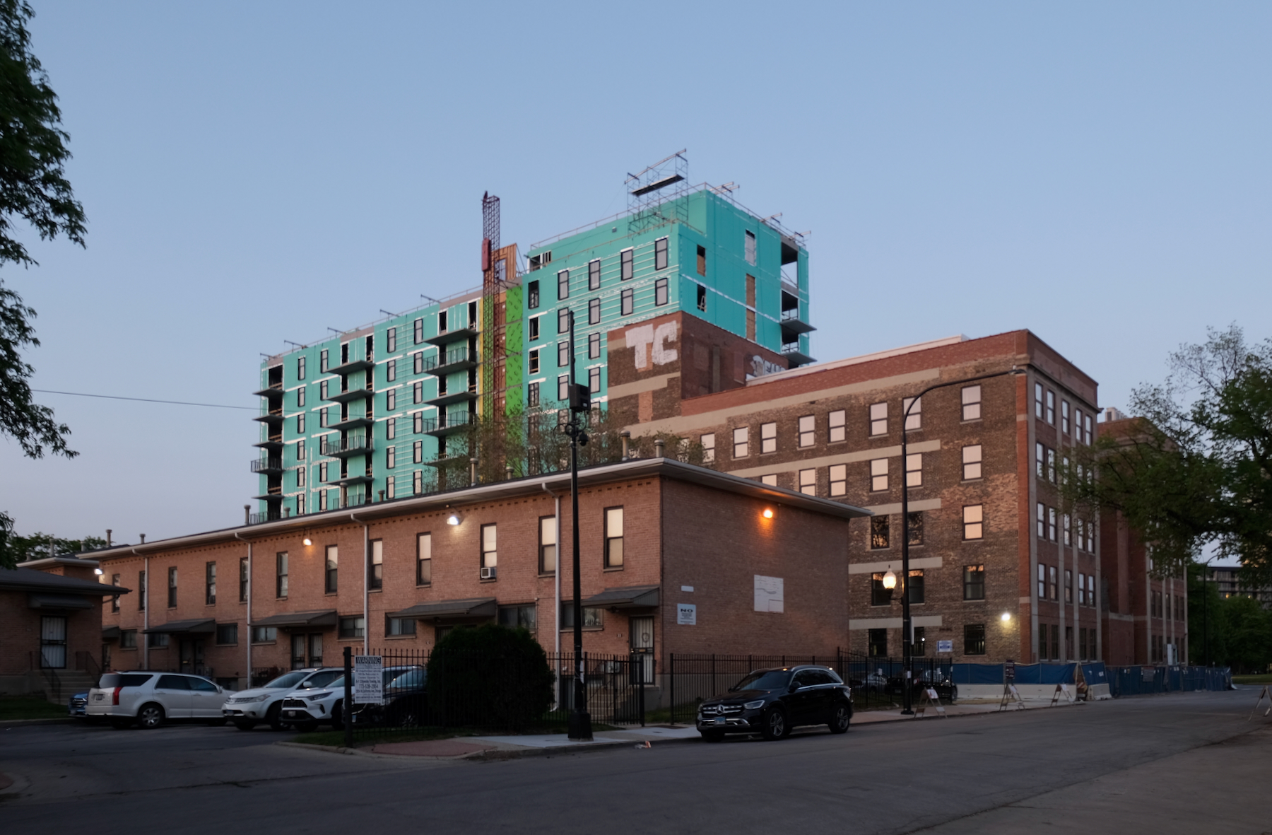
140 N Ashland Avenue. Photo by Jack Crawford
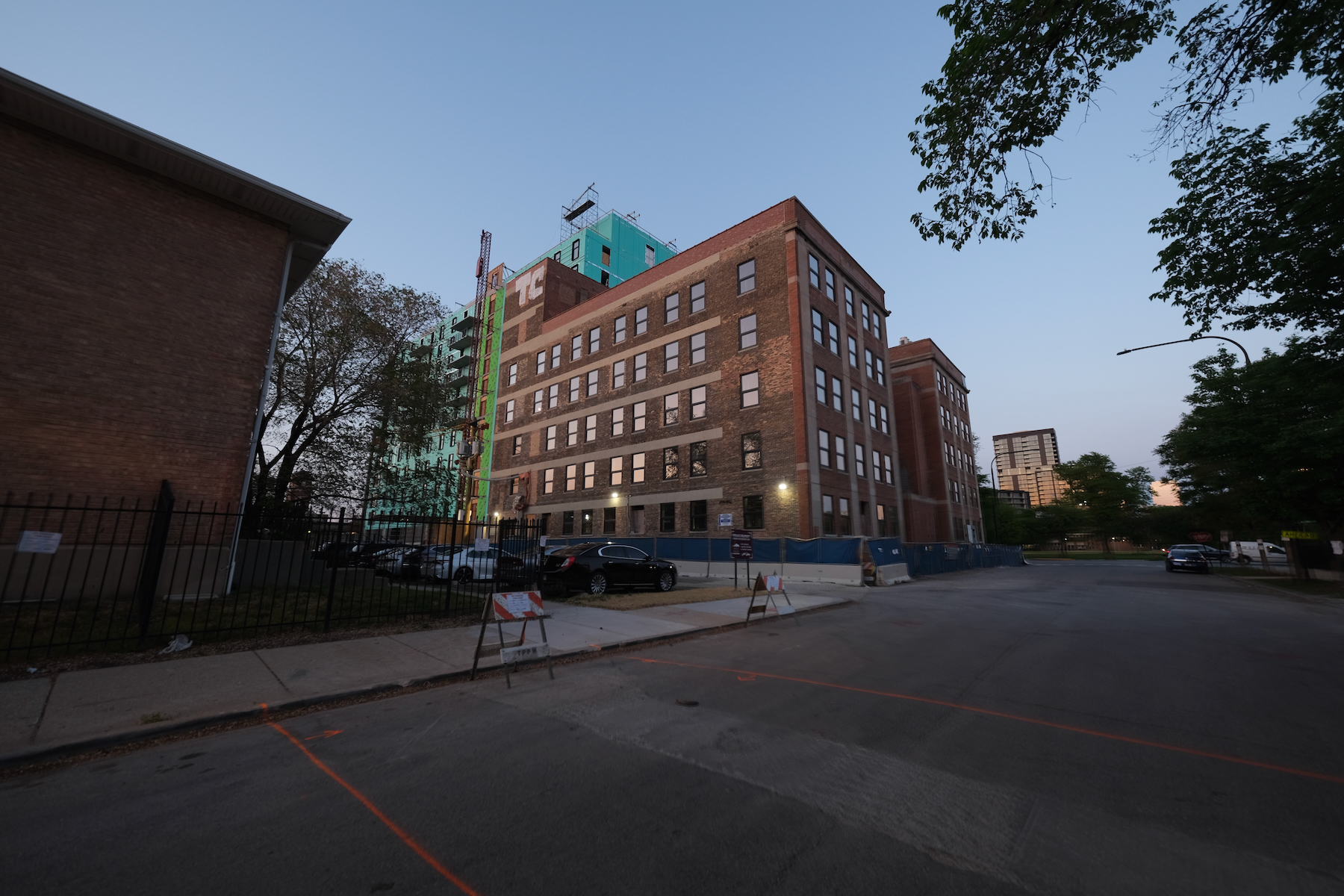
140 N Ashland Avenue. Photo by Jack Crawford
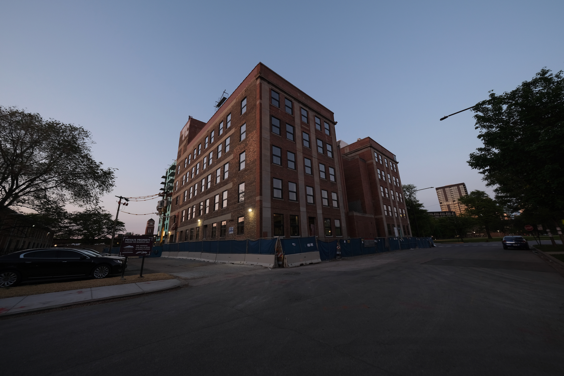
140 N Ashland Avenue. Photo by Jack Crawford
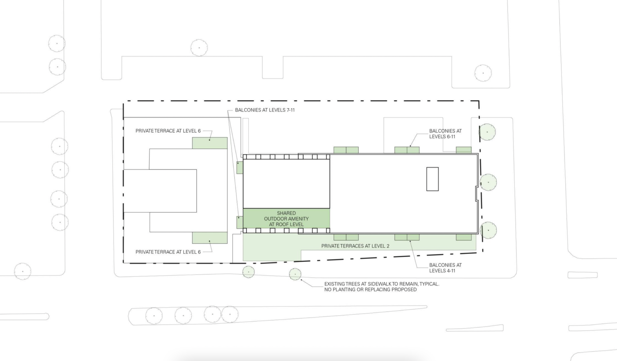
Green/outdoor spaces at 140 N Ashland Avenue. Plan by Brininstool + Lynch
The building will offer various residential units – from studio apartments to one-, two-, and three-bedroom configurations, with some units featuring private balconies or terraces. The common areas will include a lounge and a co-working space, as well as an indoor/outdoor amenity deck on the top floor. Of the total residents to be created by the project, 10 percent will be on-site affordable units, while the remaining five percent will be off-site affordable units.
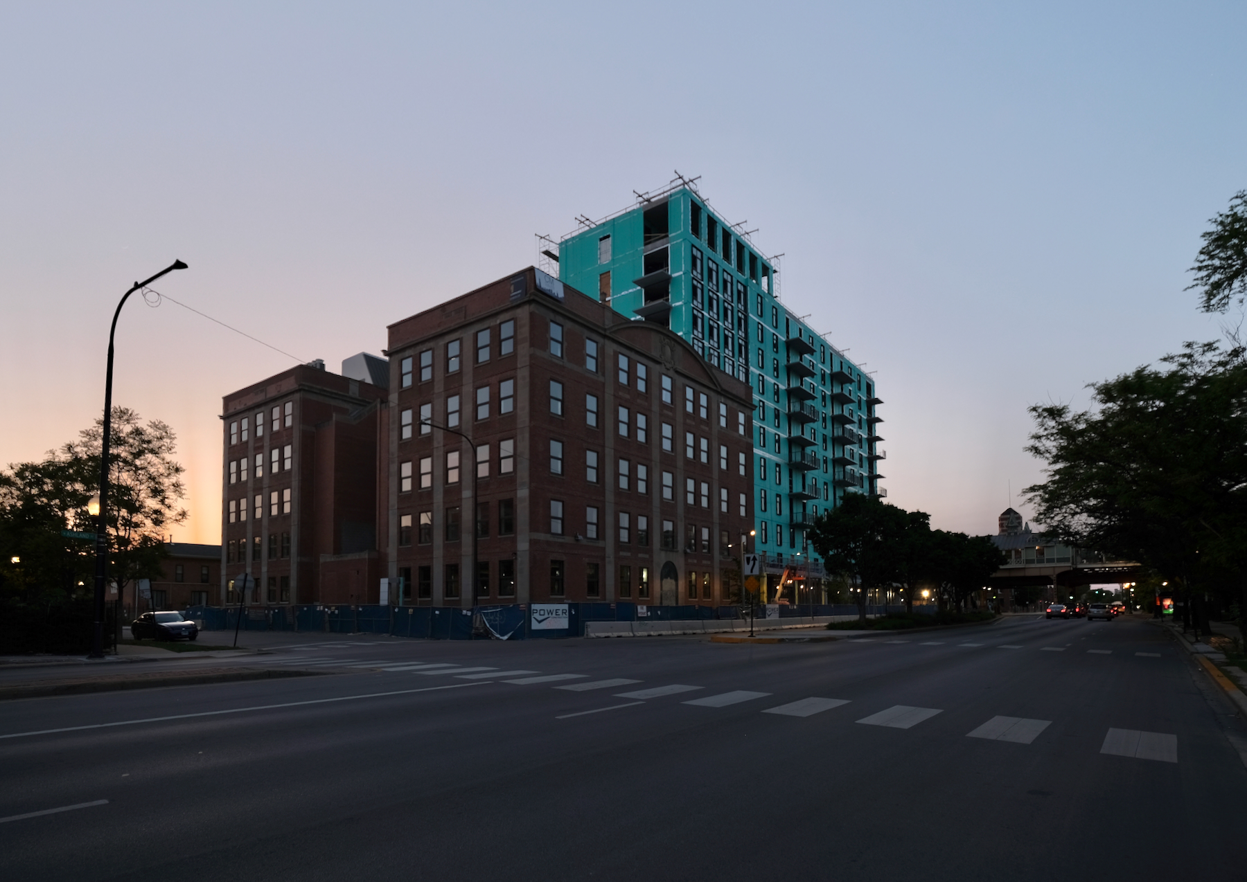
140 N Ashland Avenue. Photo by Jack Crawford
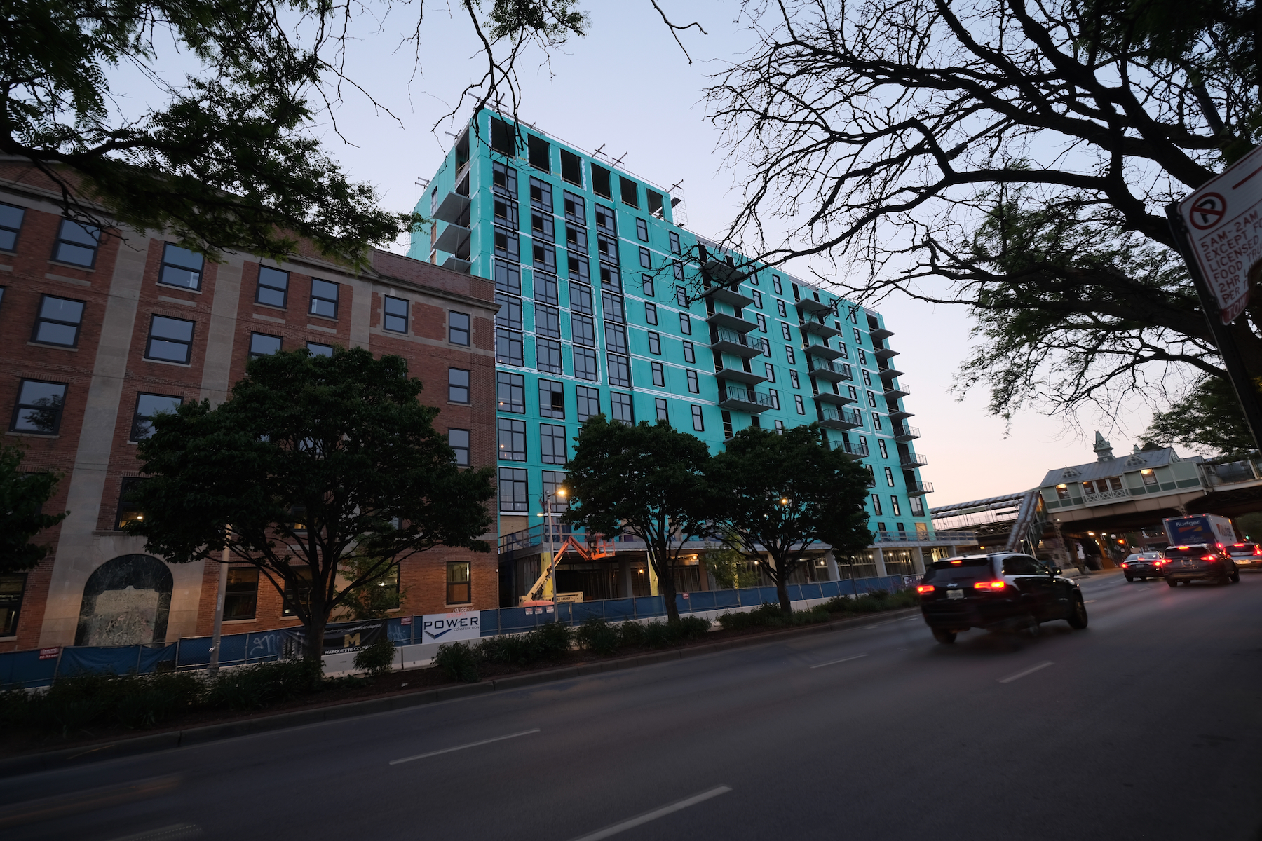
140 N Ashland Avenue. Photo by Jack Crawford
The retail spaces in the building, while not fully defined yet, are expected to offer a variety of shopping and service options. The development also includes 62 on-site parking spaces in a podium garage.
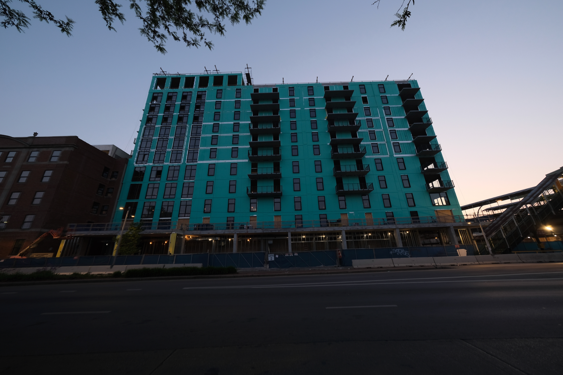
140 N Ashland Avenue. Photo by Jack Crawford
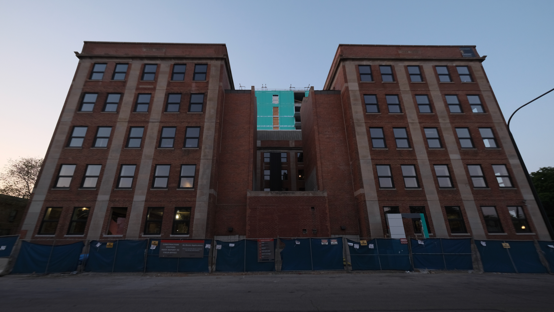
140 N Ashland Avenue. Photo by Jack Crawford
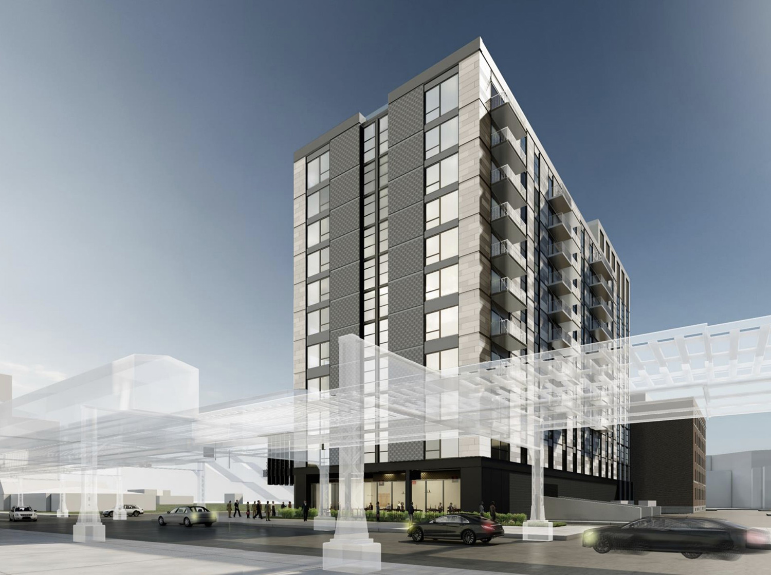
View of 140 N Ashland Avenue. Rendering by Brininstool + Lynch
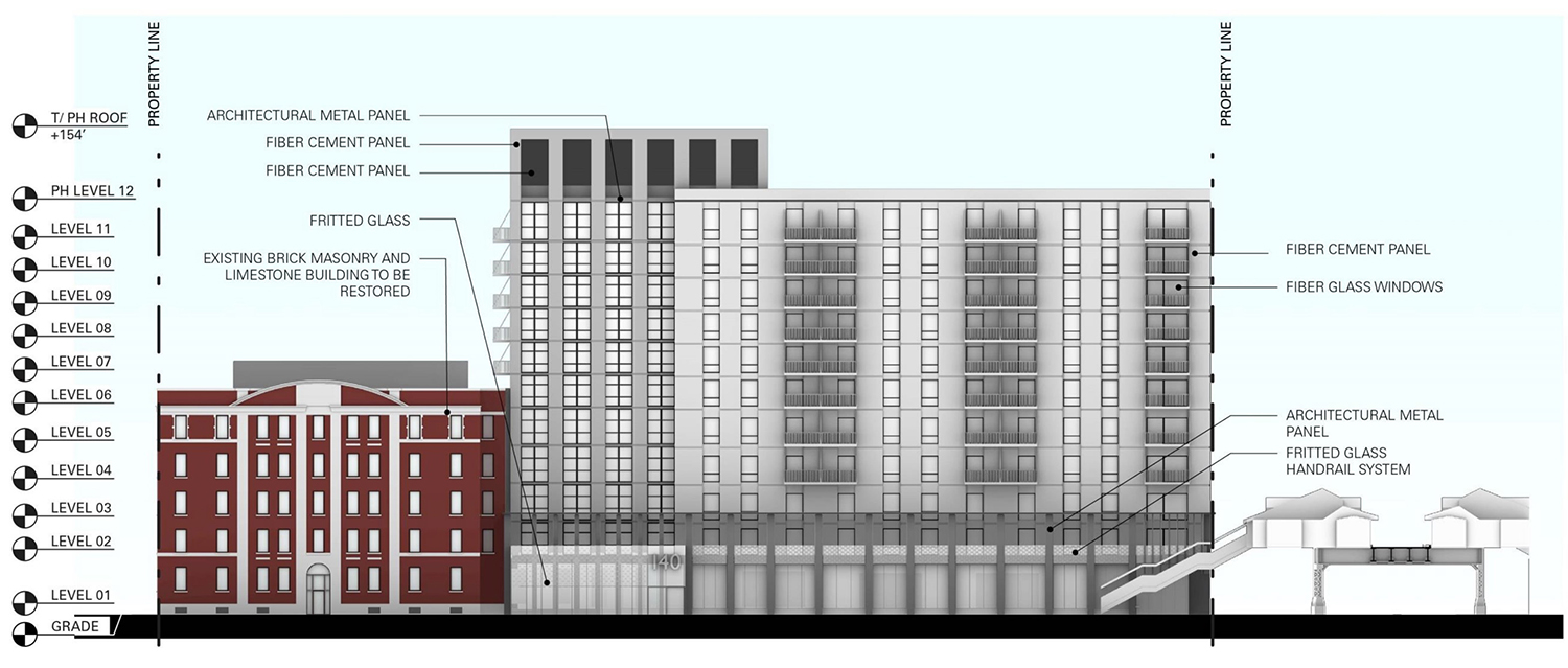
East Elevation for 140 N Ashland Avenue. Drawing by Brininstool + Lynch
The building is designed by Brininstool + Lynch. Although this firm has since ceased operations, members of its former leadership have collaborated to create ParkFowler Plus, effectively a rebirth of the original entity. The design of the new structure incorporates a crown component that carries the height 154 feet. The modern facade exhibits an array of materials – glass, metal, and varying shades of gray fiber cement panels.
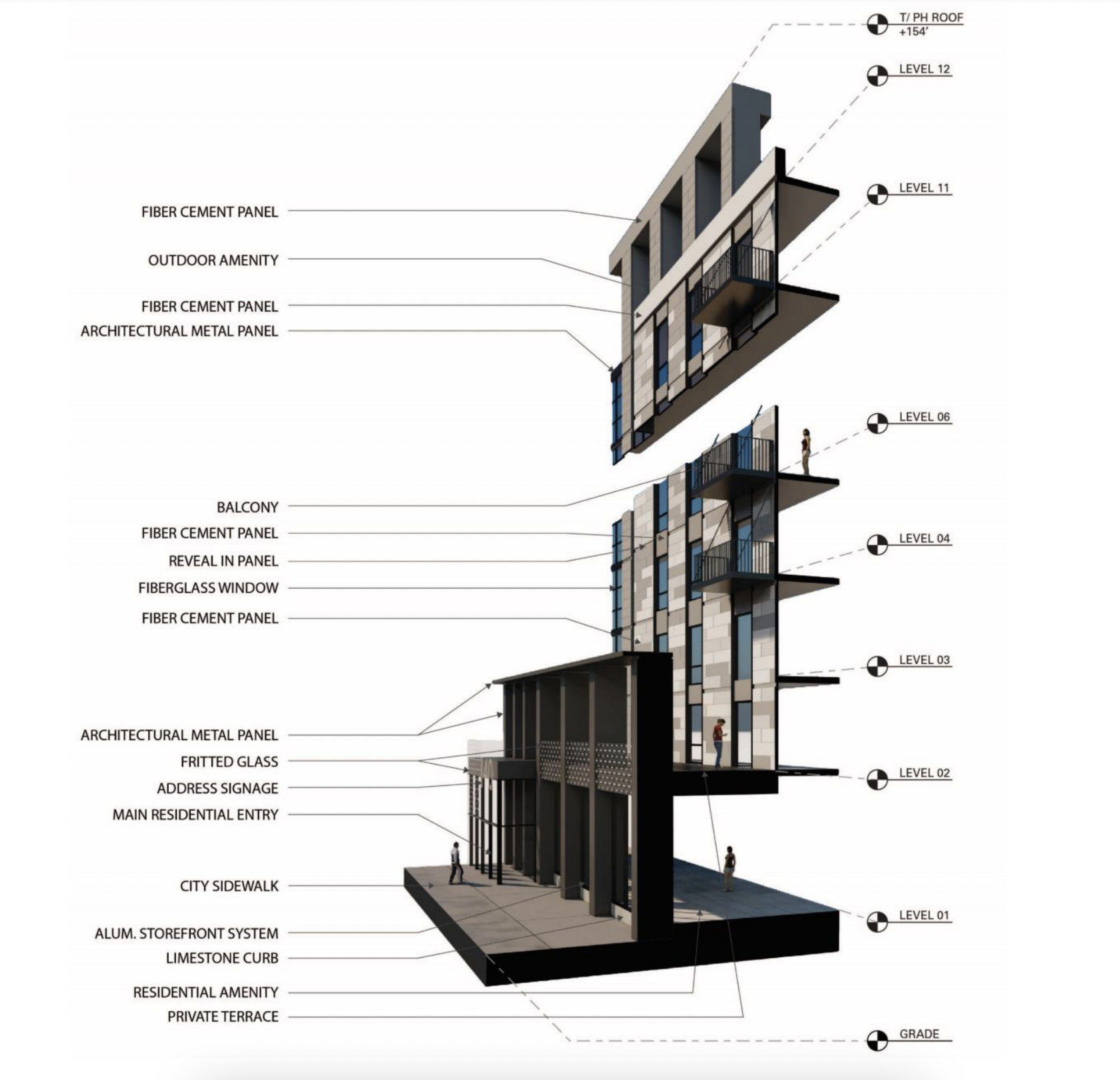
Facade materials for 140 N Ashland Avenue. Diagram by Brininstool + Lynch
The building includes sustainability features like electric car charging stations, green roofs, and a high waste diversion rate of 80 percent during construction. It also aims to exceed Energy Star certification criteria by 10 percent.
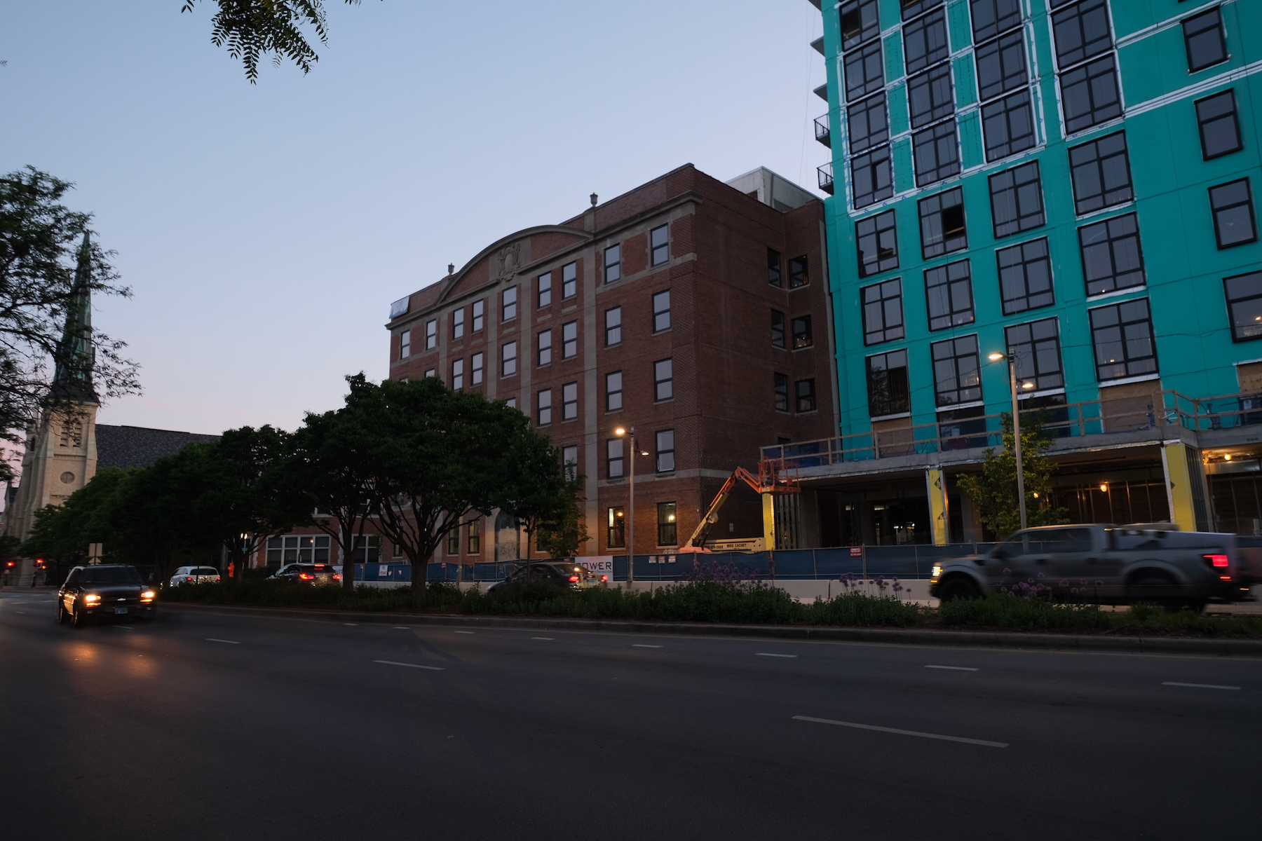
140 N Ashland Avenue. Photo by Jack Crawford
Public transportation options for the residents and patrons of 140 N Ashland Avenue are readily available. Adjacent bus stops cater to Routes 9 and X9, and the nearby Ashland CTA L station offers service for both the Green and Pink Lines. Route 20 bus service is also available within a five-minute walk to Madison & Ashland.
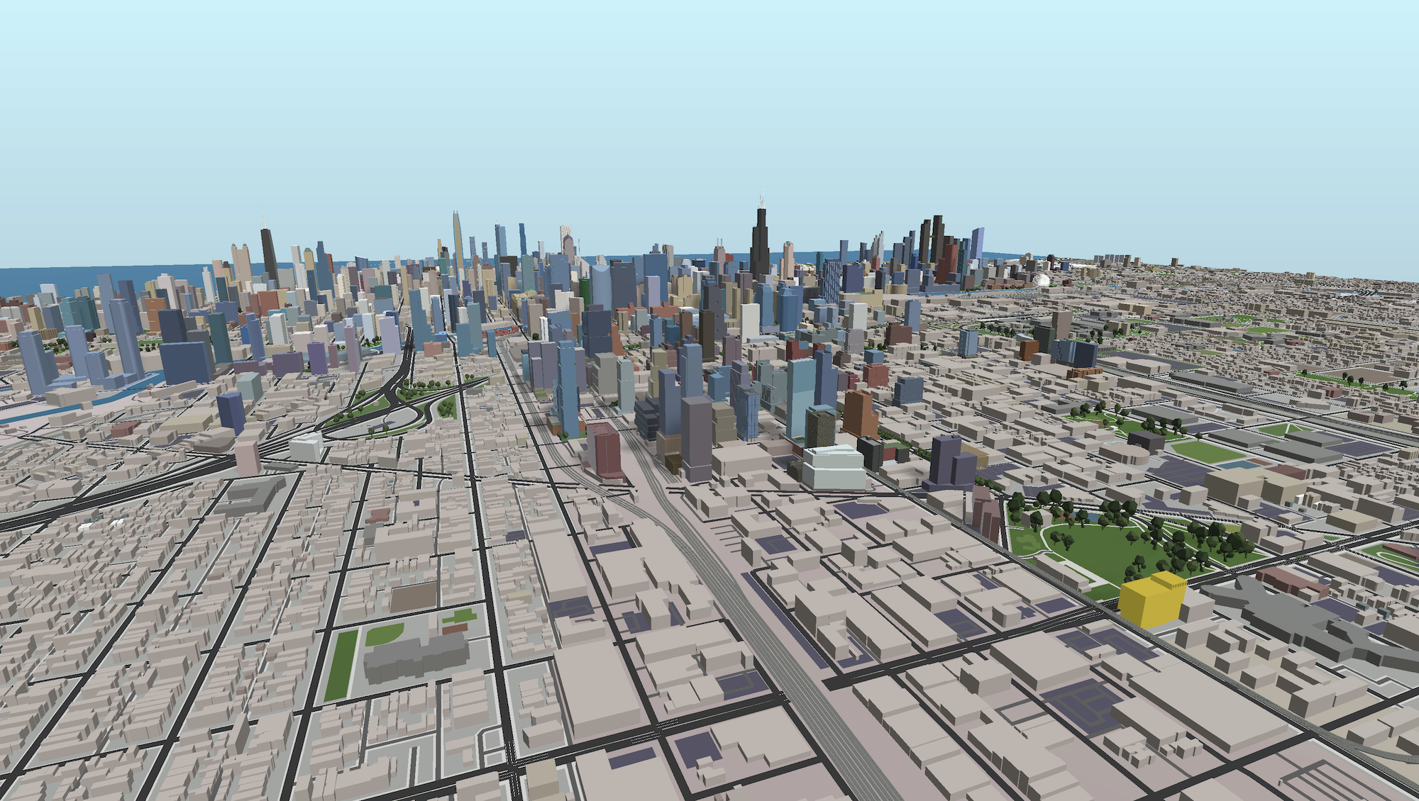
140 N Ashland Avenue (gold). Model by Jack Crawford / Rebar Radar
With Power Construction as the general contractor, work has now progressed to the facade and window installation phase. According to an Urbanize article from earlier this year, the reportedly $52 million build is aiming for November 2023 move-ins.
Subscribe to YIMBY’s daily e-mail
![]()
Follow YIMBYgram for real-time photo updates
Like YIMBY on Facebook
Follow YIMBY’s Twitter for the latest in YIMBYnews

Missed opportunity to create a good building that means something instead of the ordinary anywhere like lack of architecture. It’s everything that is wrong with architects and builders who lack a bigger vision, who understand context and what makes a city charming.
Here, here! Union park is already lit, but a statement piece would make it fire.
It would be nice to have something bigger, but I’m hoping the surrounding parcels can get taller eventually. Great to see development this far west.
Idk why the negativity. This development is pretty awesome. Decently low parking to unit ratio, pretty dense for this far west, as transit oriented as you could possibly get… We just need 5 more like it in the area
ITS A TERRIBLE BUILDING. THAT’S WHY. IT’S NOT CONTEXTUAL, IT’S NOT URBANISTIC, IT’S NOT PRETTY….IT COULD BE A HOLIDAY INN IN ANYWHERE. HENSE THE NEGATIVITY.
(remember the rendering of the corner with all those robotic men walking towards a plate glass window?). It’s not shown in this go around. This is just a bore to even have to explain why the building fails, but, now it’s a fait accompli.
The older building has such strong lines. It is a shame that they did not use the design to play off of those lines.