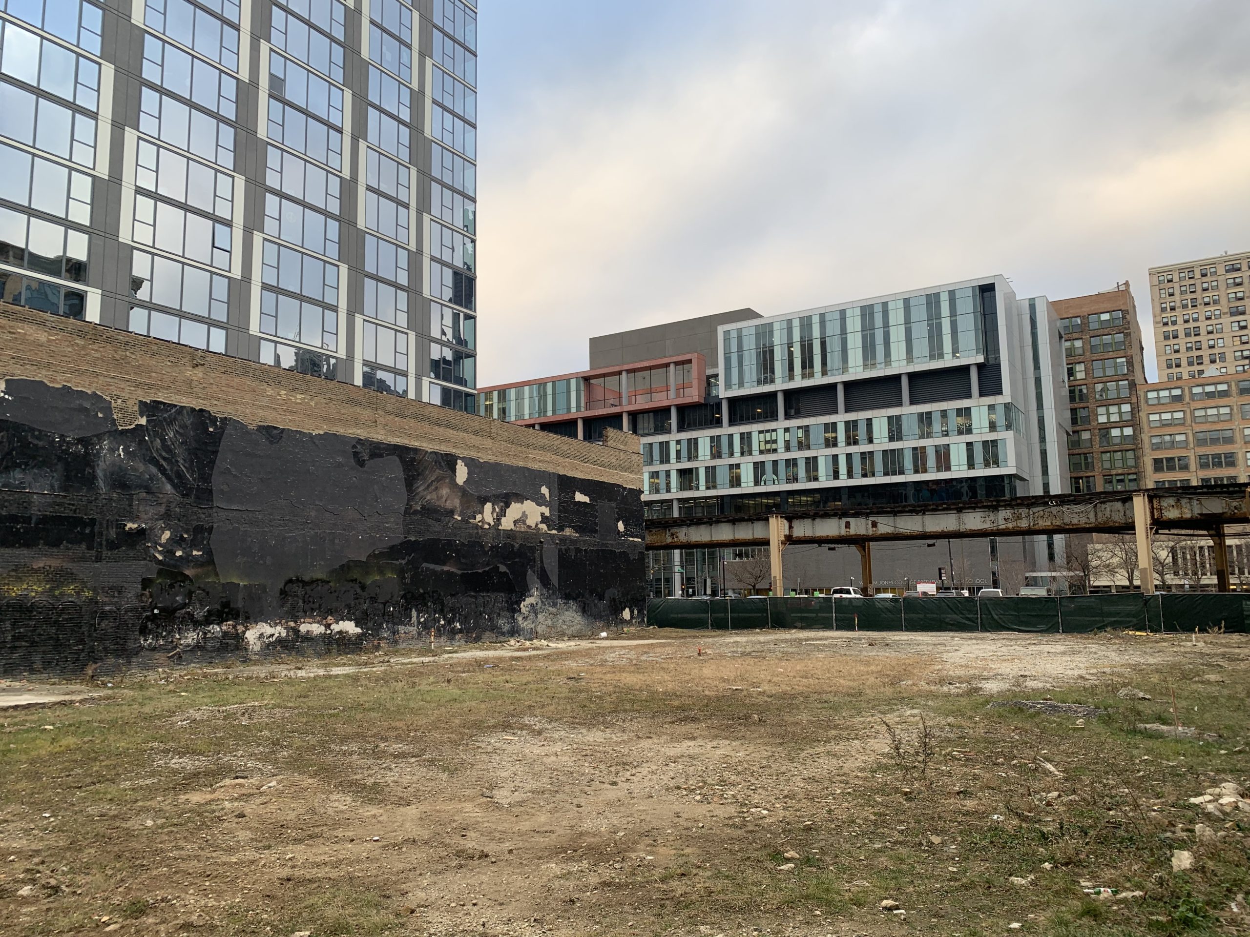
630 S Wabash Avenue. Photo by Jack Crawford
Revealed in 2021, the tower replaces a vacant lot sandwiched between two low-rise buildings and is rising adjacent to 30 E Balbo Drive, which was completed a few years back on the nearby intersection. Development partners Melrose Ascension Capital and DAC Developments are working with local architects Antunovich Associates on its design, adding to the growing South Loop skyline.
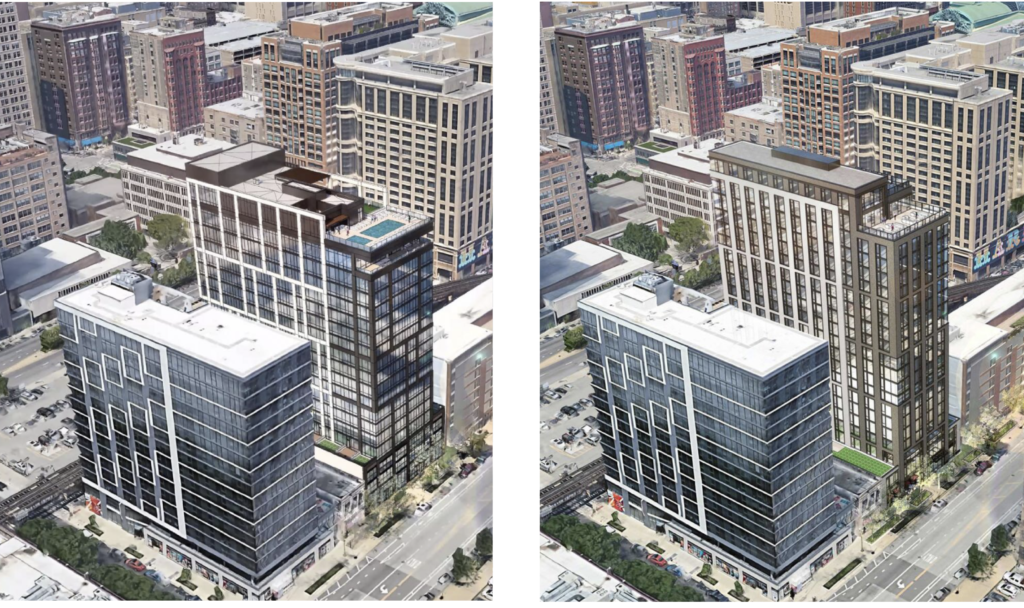
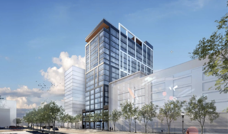
Updated (left) and previous (right) rendering of 630 S Wabash Avenue by Antunovich Associates
After a slight redesign earlier this year in which the tower received an additional story and a slight height increase, the now 19-story, 218-foot-tall structure will bring a refreshed front sidewalk with new landscaping. Fronting the street will be the residential lobby and a 4,100-square-foot retail space on the southern corner, this will be joined by a 100-bicycle parking room, dog run and wash, and a ramp up to the parking garage levels. The floors above within the podium will hold a 64-vehicle parking garage topped by terraces as the tower inserts from the base.
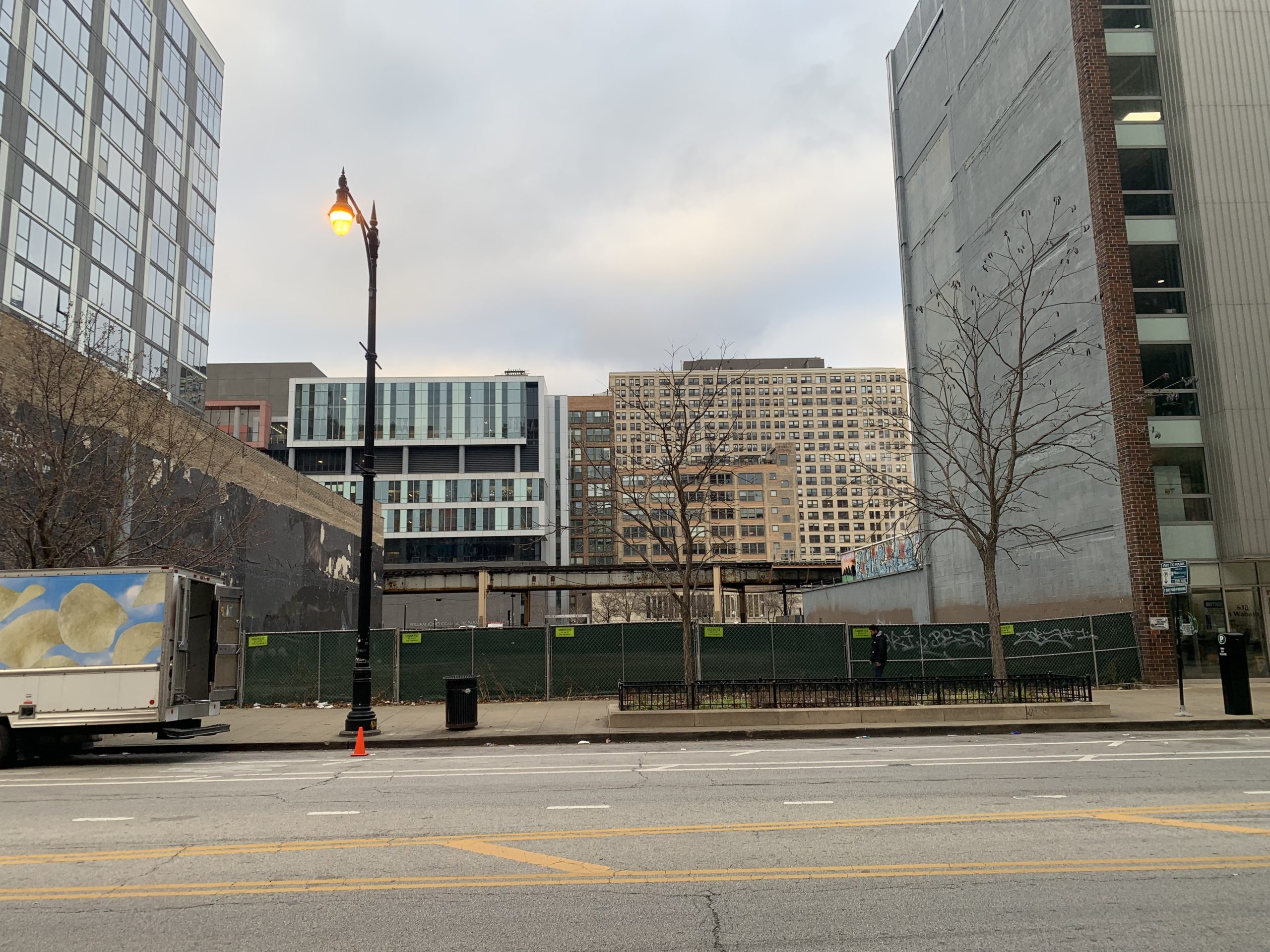
630 S Wabash Avenue. Photo by Jack Crawford
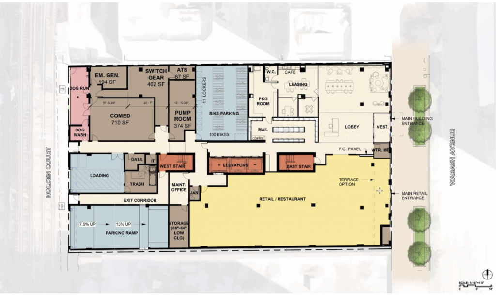
Updated floor plan of 630 S Wabash Avenue by Antunovich Associates
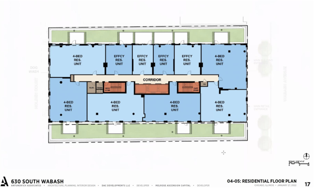
Updated floor plan of 630 S Wabash Avenue by Antunovich Associates
The slender tower itself will contain 164 residential units, an increase from the originally proposed 151, split into 80 studios averaging 500 square feet, 24 two-bedrooms averaging 800 square feet, and 60 four-bedrooms averaging 1,200 square feet. Rent prices were revealed in February to range from $1,700 to $5,000 per month, with the building originally aimed at students and young professionals who want to share a place and can rent single rooms. Residents will have access to a co-working space, gym, lounge, and a rooftop deck with a pool facing the lake.
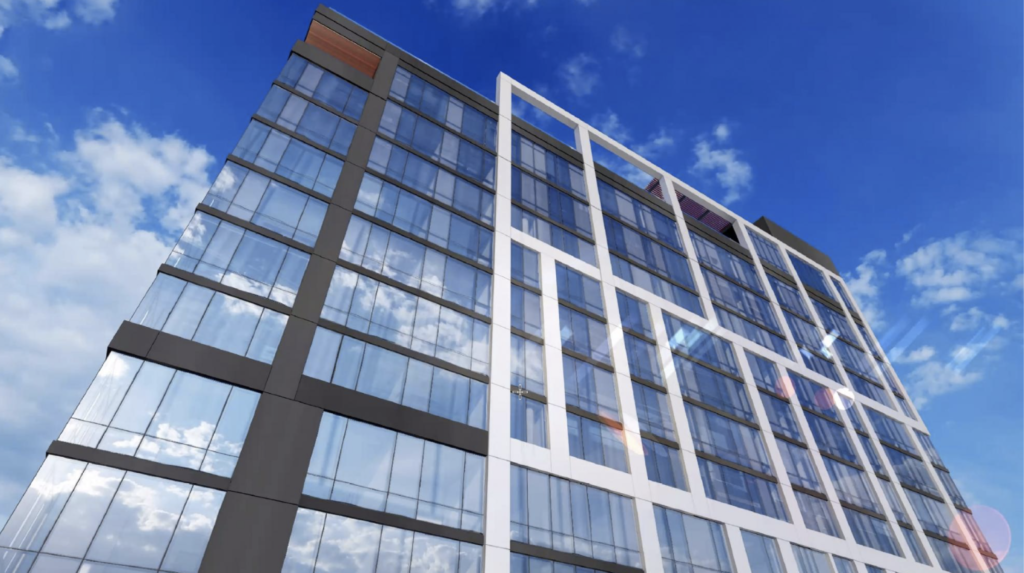
Updated rendering of 626 S Wabash Avenue by Antunovich Associates
In February the structure also received a new facade design, predominantly featuring a black metal framed curtain wall adorned by white rectangle frames similar to the nearby 1400 S Wabash Avenue.
Residents will have access to plenty of transit options nearby including the CTA Red Line Harrison stop and multiple bus routes. With amazing skyline views, the $85 million project will quickly move towards a topping out next year.
Subscribe to YIMBY’s daily e-mail
![]()
Follow YIMBYgram for real-time photo updates
Like YIMBY on Facebook
Follow YIMBY’s Twitter for the latest in YIMBYnews

That black wall used to have a nice mural – the El ride is getting more and more like a trip down a narrow canyon.
I prefer the facade on the previous design but decent infill overall