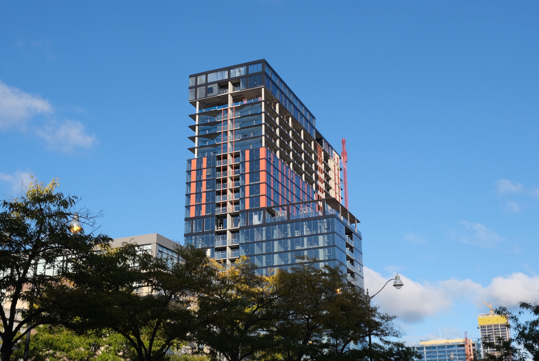
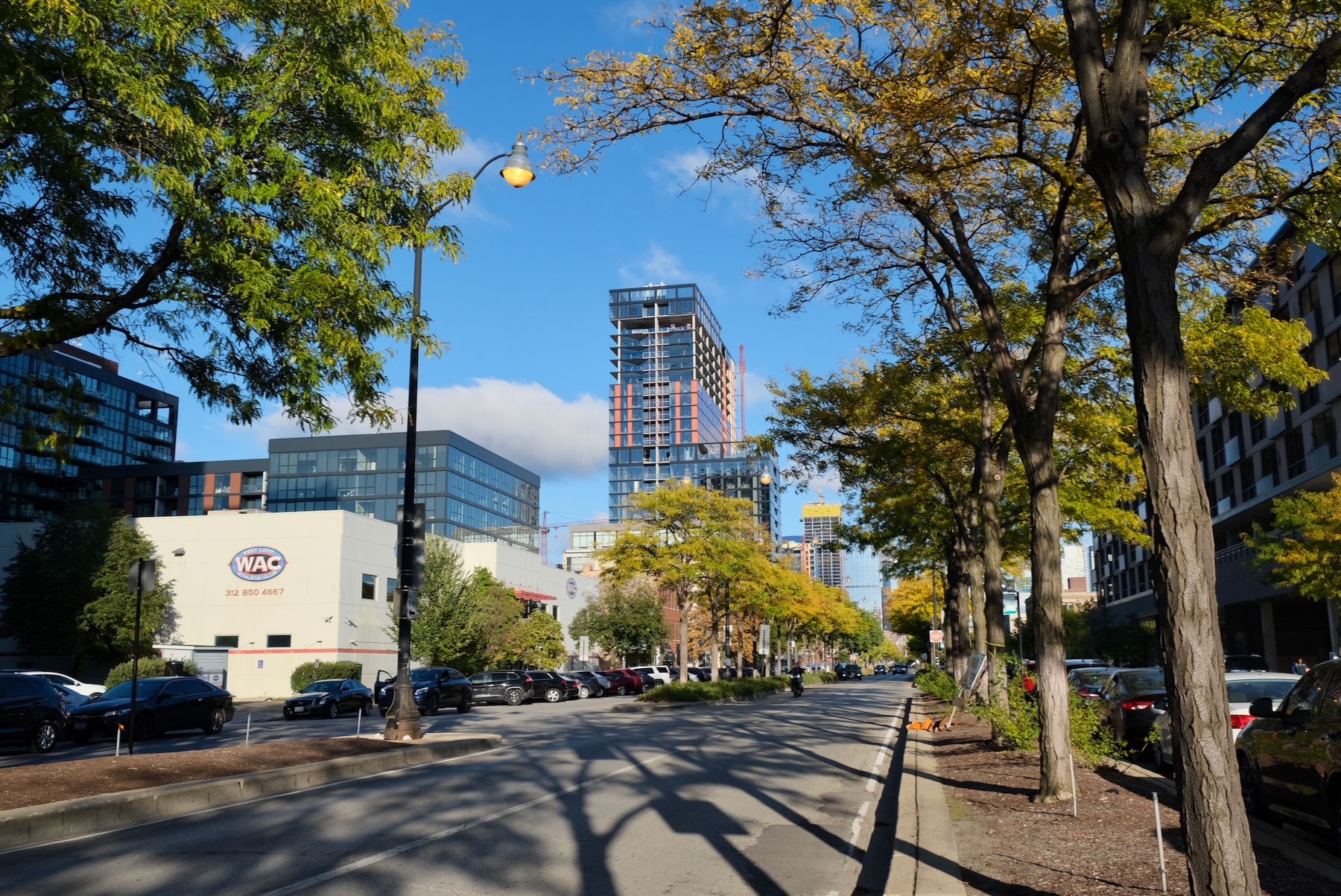
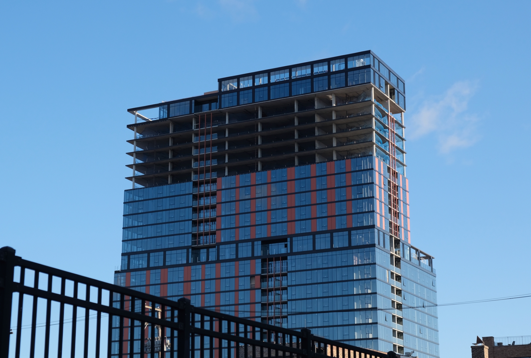
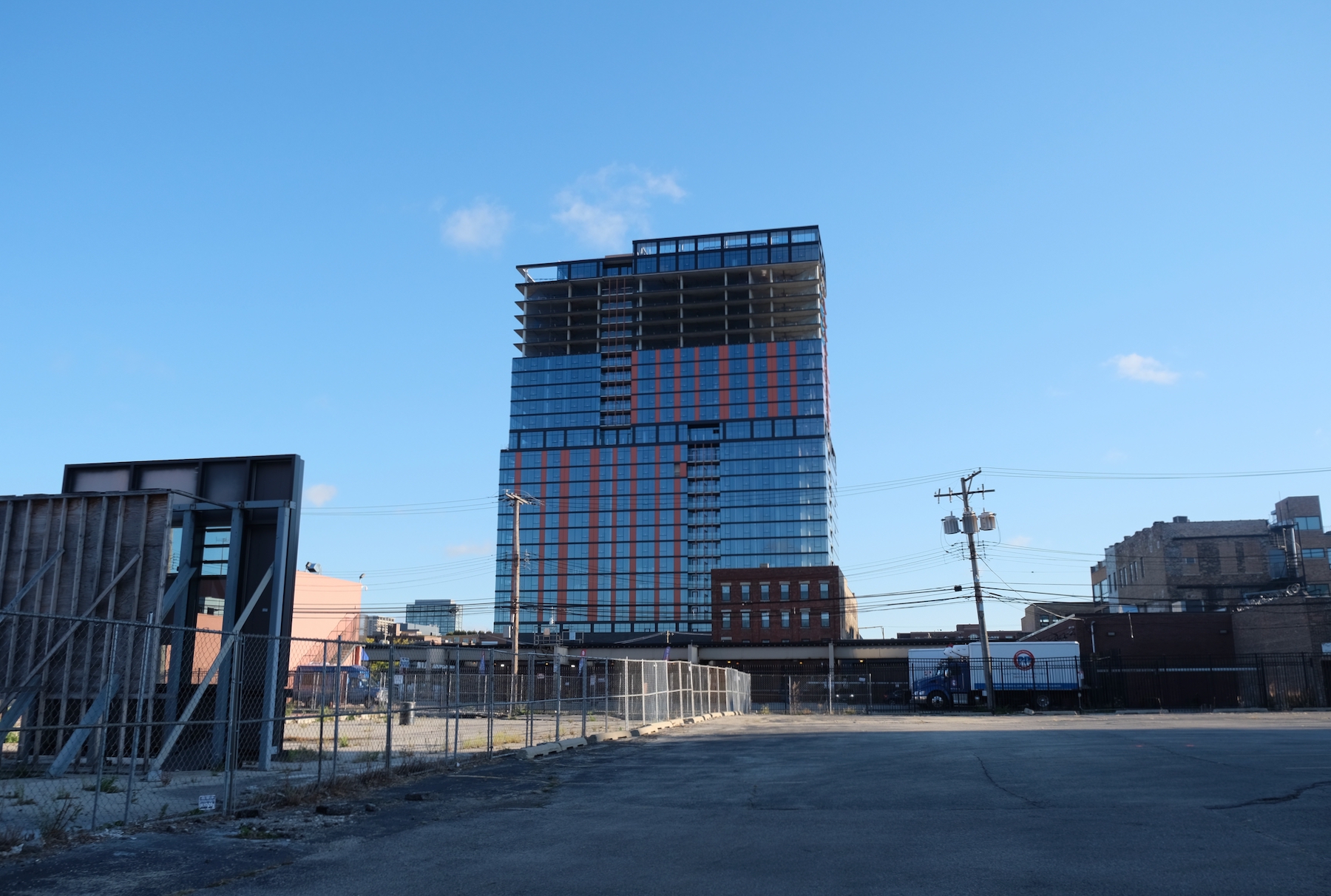
Facade work is nearing full completion for the 27-story 160 N Elizabeth Street, a mixed-use high rise towards the west end of Fulton Market District. Now dubbed “Fulbrix,” Moceri + Roszak‘s 293-foot-tall building will have 9,000 square feet of retail space and 375 rental units. Of those units, 20 percent will be priced affordably under the ARO planning regulations. These residences will include a mix of studios, one-, two-, and three-bedrooms. A large portion will also come with private balconies.
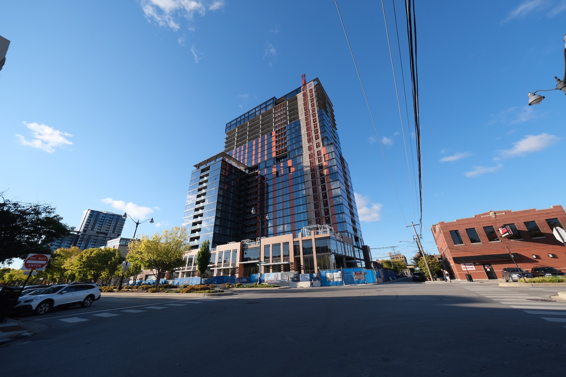
Fulbrix. Photo by Jack Crawford
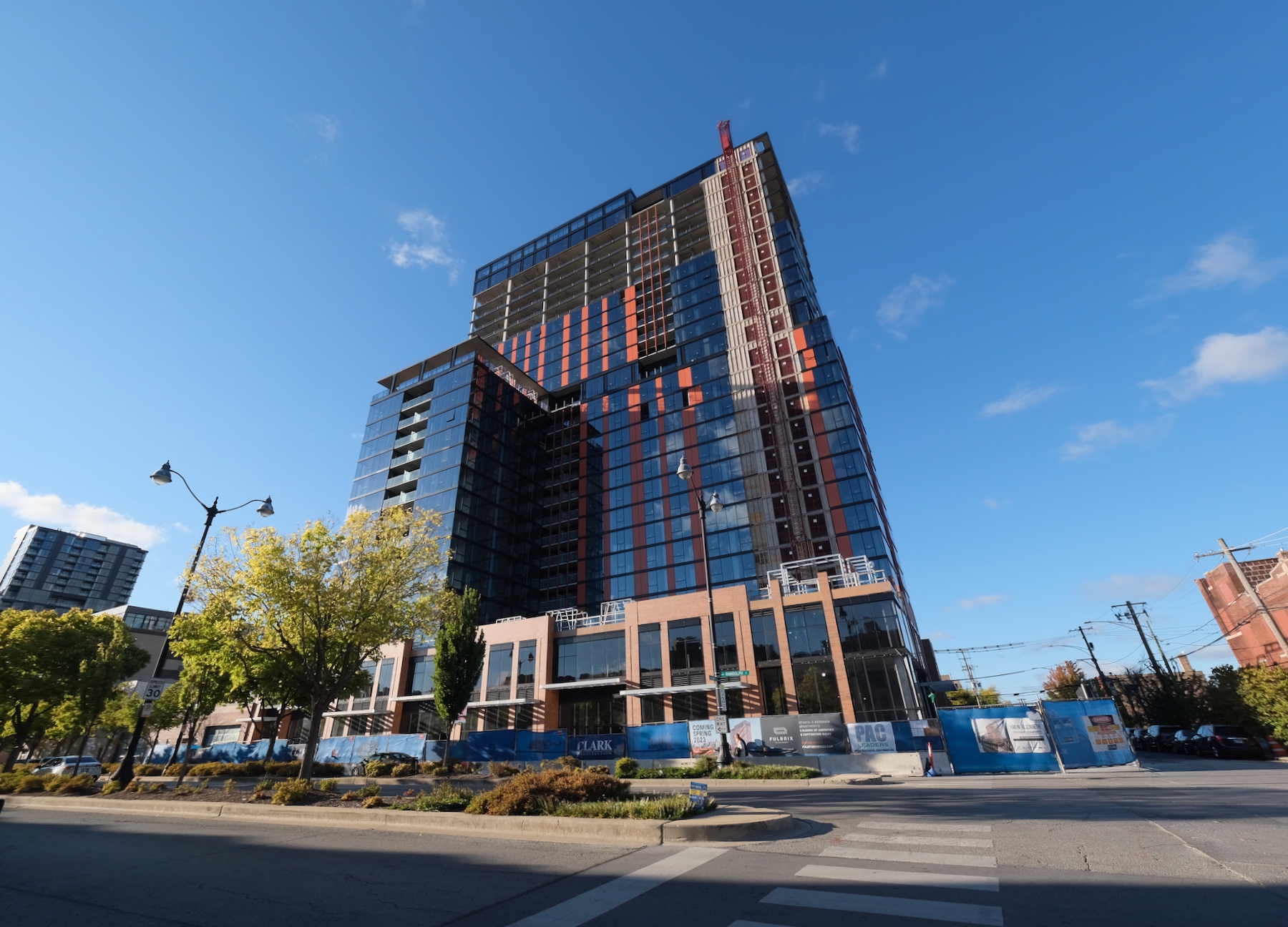
Fulbrix. Photo by Jack Crawford
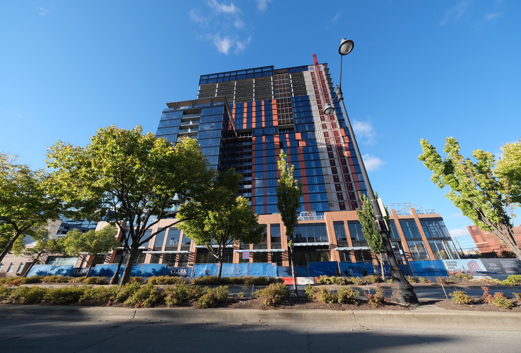
Fulbrix. Photo by Jack Crawford
The fourth-floor outdoor deck will provide a sprawling amenity deck for residents, containing a pool, lawn area, and comfortable lounge seating. In addition, there will be a fitness center and co-working space, as well as additional outdoor decks on the 16th and 27th floors. The parking will include 144 spaces inside the podium and a bike room with 160 bike bays.
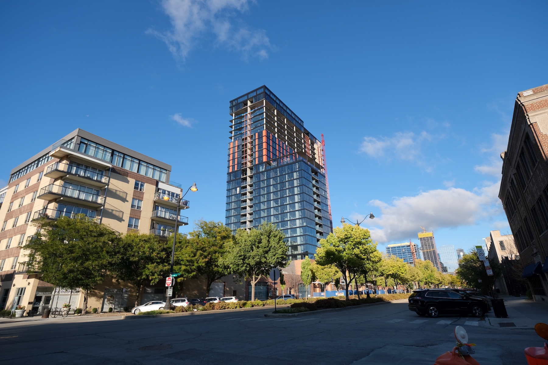
Fulbrix. Photo by Jack Crawford
Fulbrix. Photo by Jack Crawford
Fulbrix. Photo by Jack Crawford
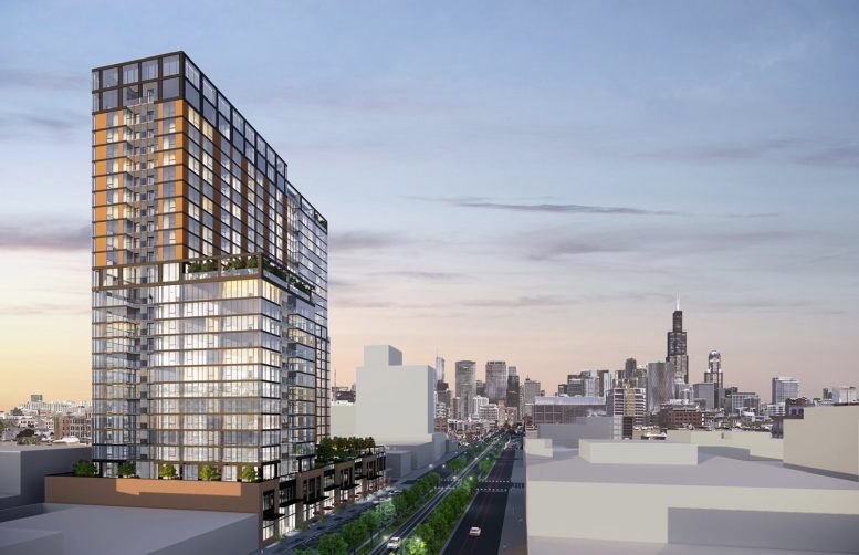
Thomas Roszak Architecture designed the exterior of the full-block property to be a stepped rectangular mass with various setbacks and terraces, topped off with a reflective glass facade contrasted by orange metal panels. The podium will be clad in brick and have a glass storefront system.
Fulbrix. Photo by Jack Crawford
Fulbrix. Photo by Jack Crawford
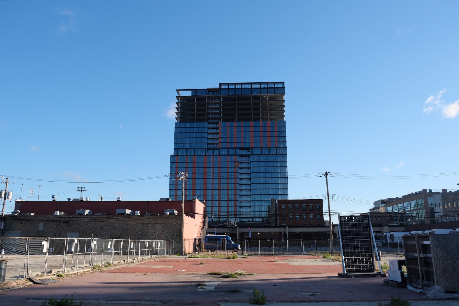
Fulbrix. Photo by Jack Crawford
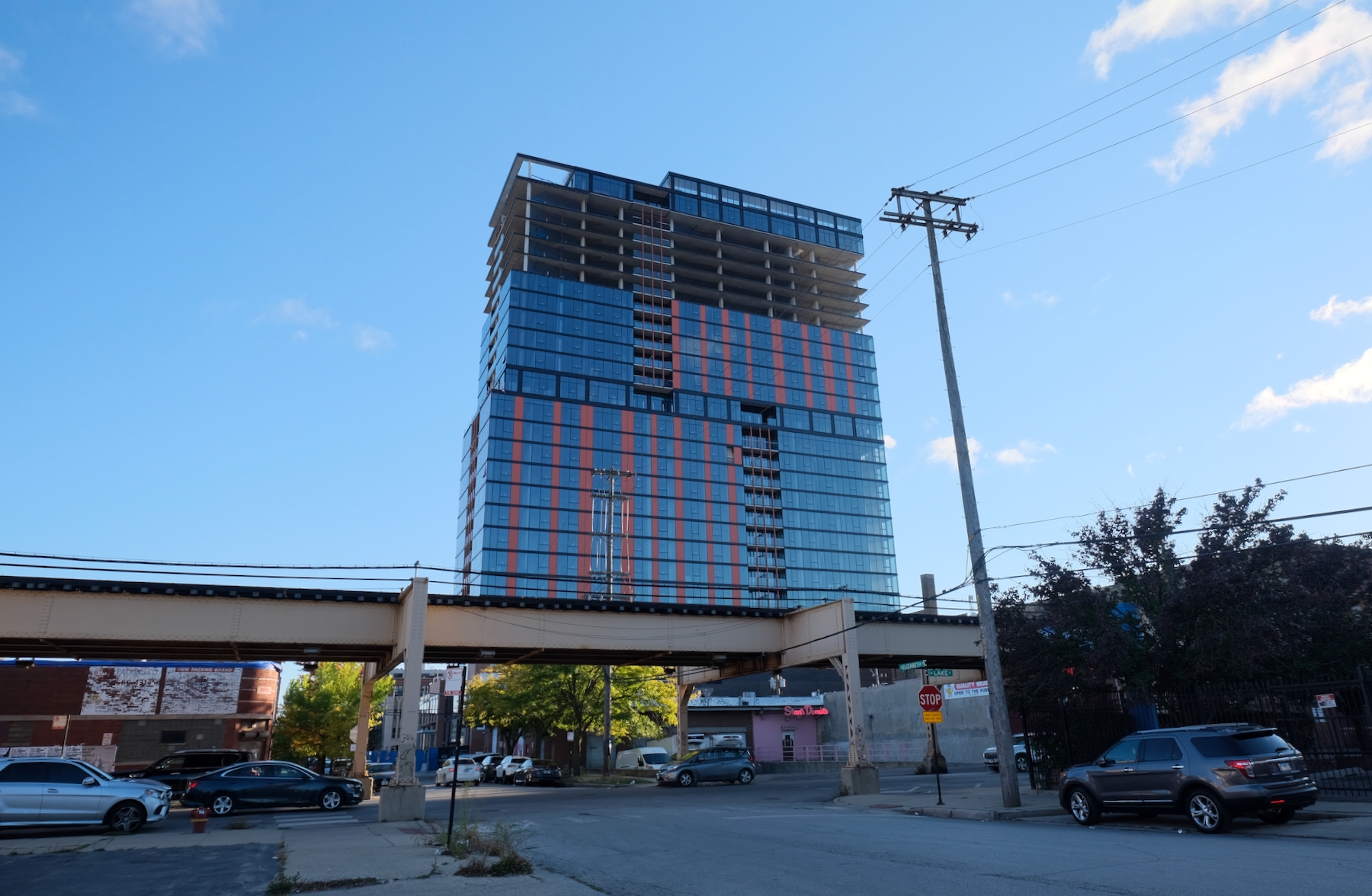
Fulbrix. Photo by Jack Crawford
The CTA L Green and Pink Lines are eight minutes east of Morgan station by foot, while Route 20 bus service is a six-minute walk south. Fulton Market has seen an influx of office, residential, retail, and hospitality developments in recent years which has begun to shift westward. Moceri + Roszak’s new project is driving this growth.

Fulbrix. Photo by Jack Crawford
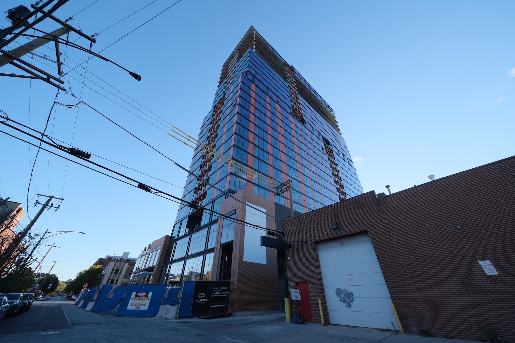
Fulbrix. Photo by Jack Crawford
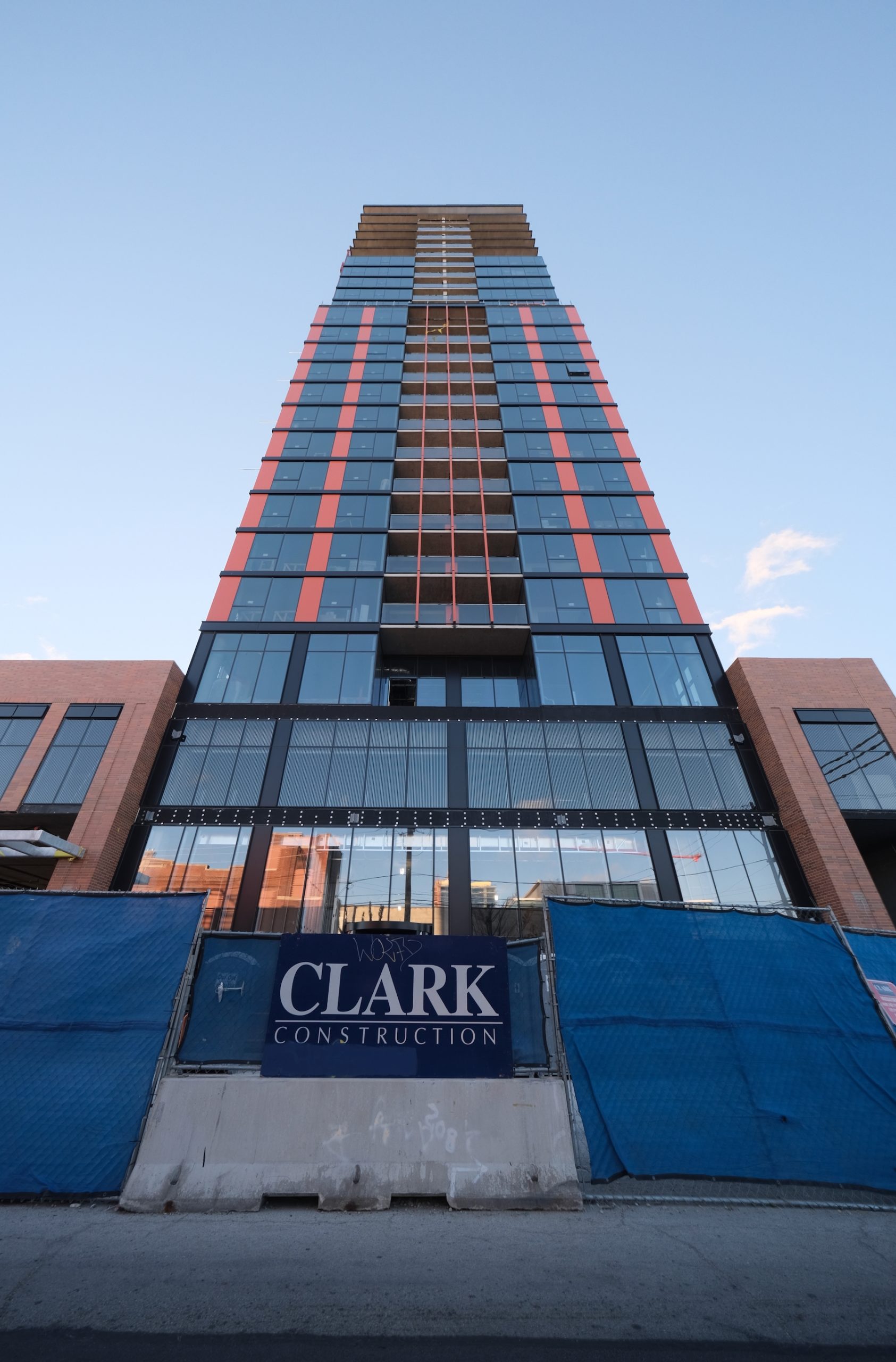
Fulbrix. Photo by Jack Crawford
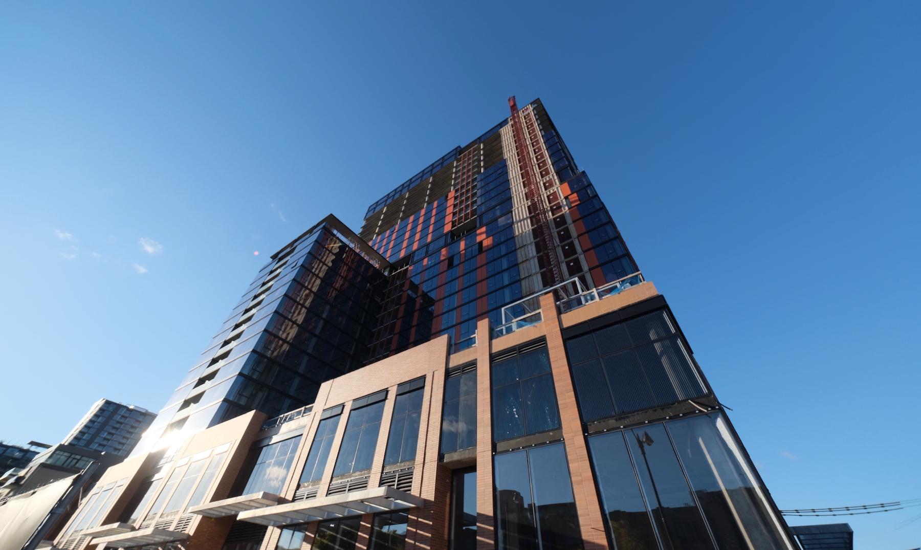
Fulbrix. Photo by Jack Crawford
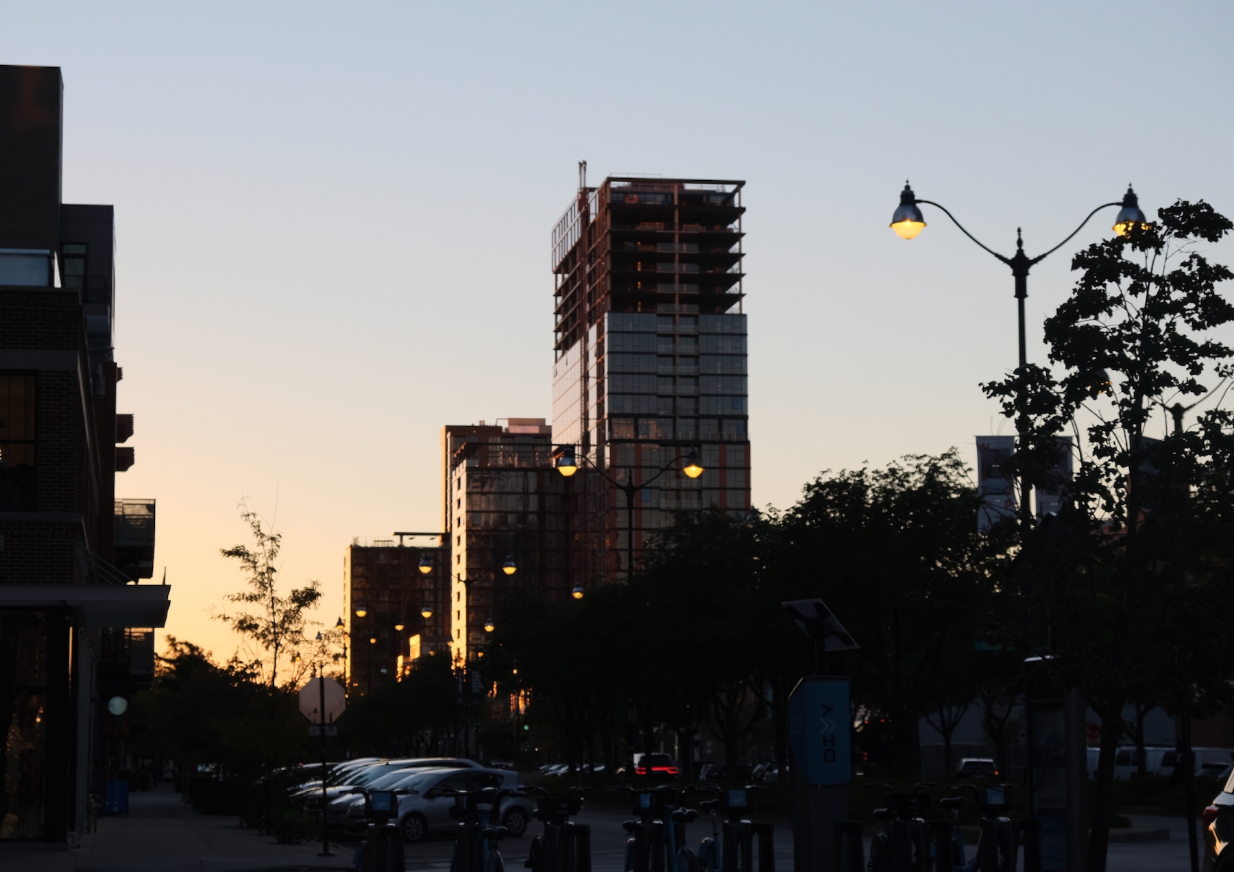
Fulbrix. Photo by Jack Crawford
General contractor Clark Construction is leading the project, with an estimated completion for the second quarter of next year.
Subscribe to YIMBY’s daily e-mail
![]()
Follow YIMBYgram for real-time photo updates
Like YIMBY on Facebook
Follow YIMBY’s Twitter for the latest in YIMBYnews

Good density, but not a fan of the building or this shade of orange cladding
Great project but. Those orange stripes look awful even from my windows a mile away. Why? 😬🙄
They should keep some equipment handy for when they need to re-clad the ugly orange in <2 years
Orange is the new black.
Don’t hate it I guess? I like what they did with the podium, but not sure why Thomas Roszak’s firm keeps getting hired for these ugly designs? Guessing super cheap?