Final interior and landscaping work is underway at the 19-story 800 W Fulton Market, aka 800 Fulton, one of Fulton Market‘s most distinctive new office blocks. Thor Equities has developed the nearly half million-square-foot edifice alongside joint venture partner QuadReal.
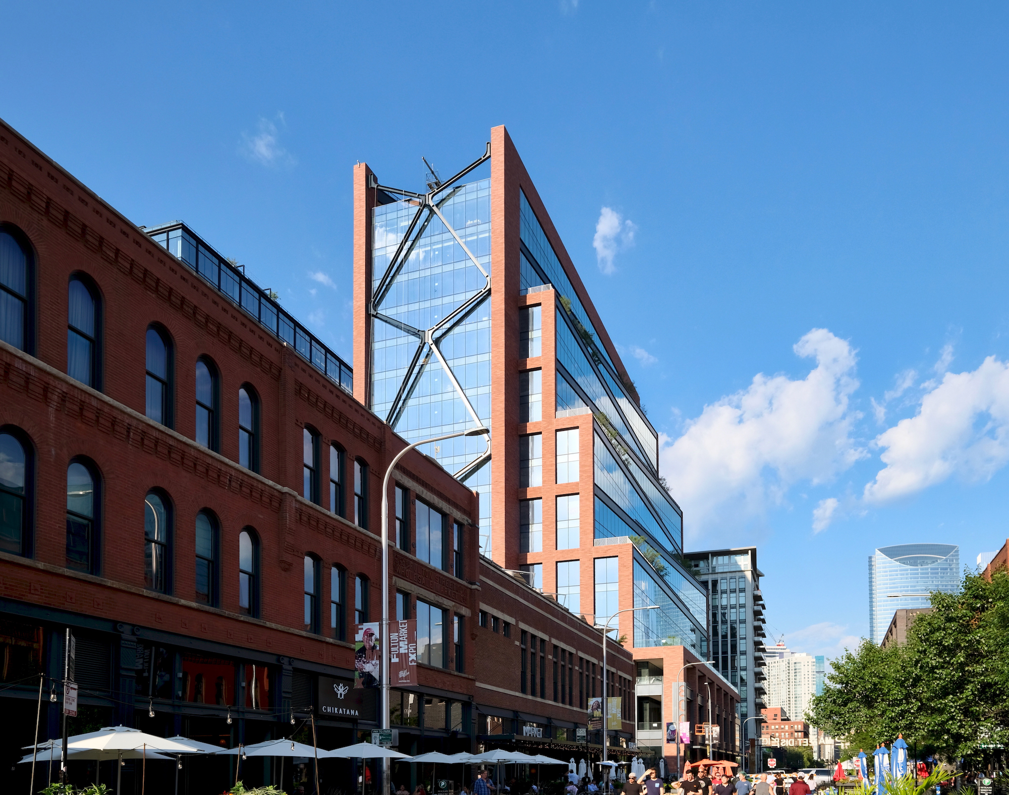
800 Fulton. Photo by Jack Crawford
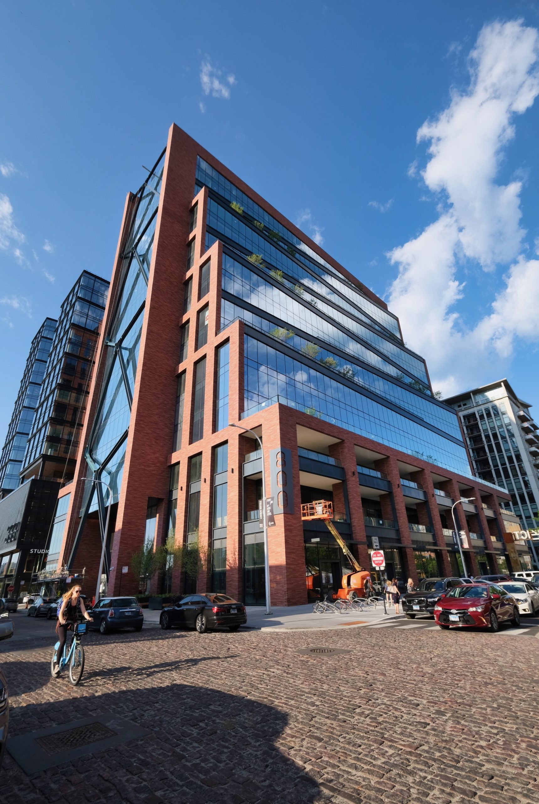
800 Fulton. Photo by Jack Crawford
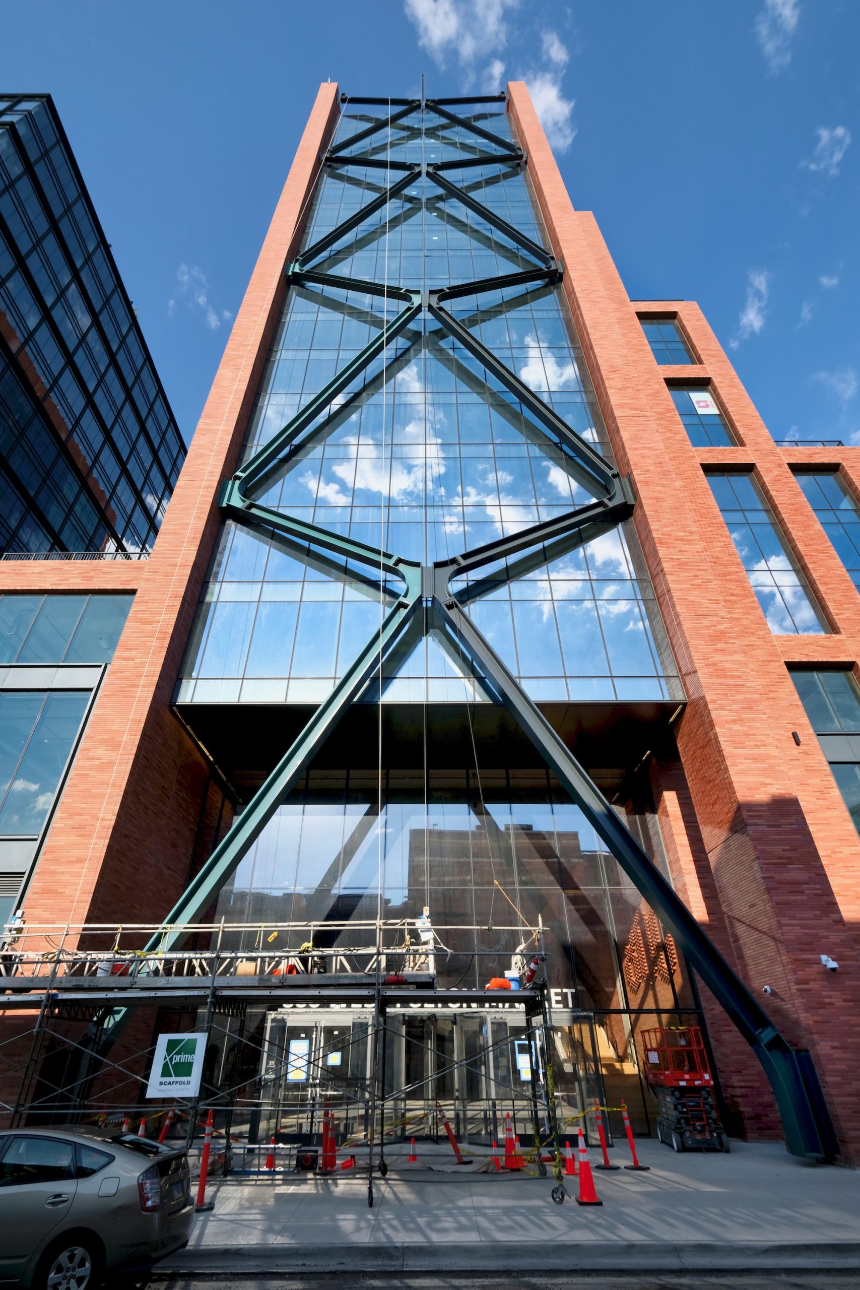
800 Fulton. Photo by Jack Crawford
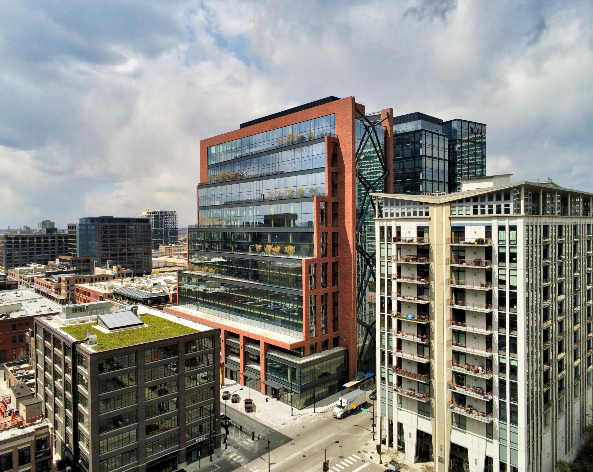
800 Fulton. Photo by Jack Crawford
Programming primarily comprises of class A office space, spanning a total of 431,000 square feet and offering tenants column-free flexible layouts, private terraces on nine different floors, and slab-to-slab heights of over 13 feet. The building also offers 35,000 square feet of retail and restaurant space across the lower three floors, as well as a wide selection of tenant features and amenities. These additional tenant areas include a spacious open lobby, a fully-equipped fitness center, a conference and business center center, a penthouse lounge, and a rooftop deck.

Diagram of amenities at 800 W Fulton Market. Diagram by SOM

800 W Fulton Market fitness center. Rendering by SOM

800 W Fulton Market lounge. Rendering by SOM

800 W Fulton Market rooftop deck. Rendering by SOM
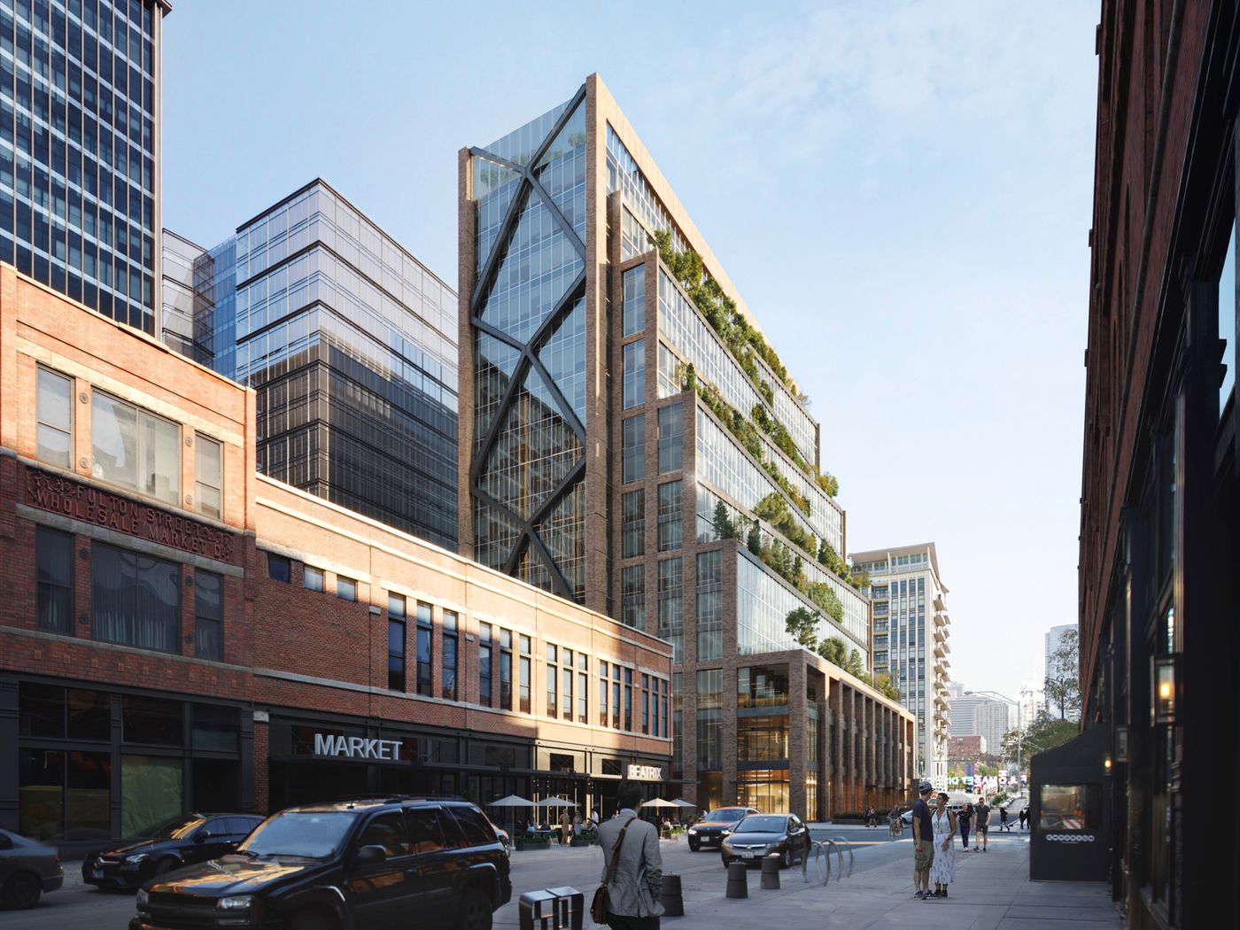
800 W Fulton Market. Rendering by SOM
At exactly 300 feet, the monolith uses a series of terraced triangular setbacks to taper as it rises. With Skidmore, Owings, & Merrill behind its design, the structure employs other unique architectural elements, such as pronounced blue-tinged metal cross-bracing along its sides and brick as the primarily cladding material despite its immense height. The tower’s industrial-inspired aesthetic combined with modern office building design choices represent a growing trend amongst the neighborhood’s high-profile developments.
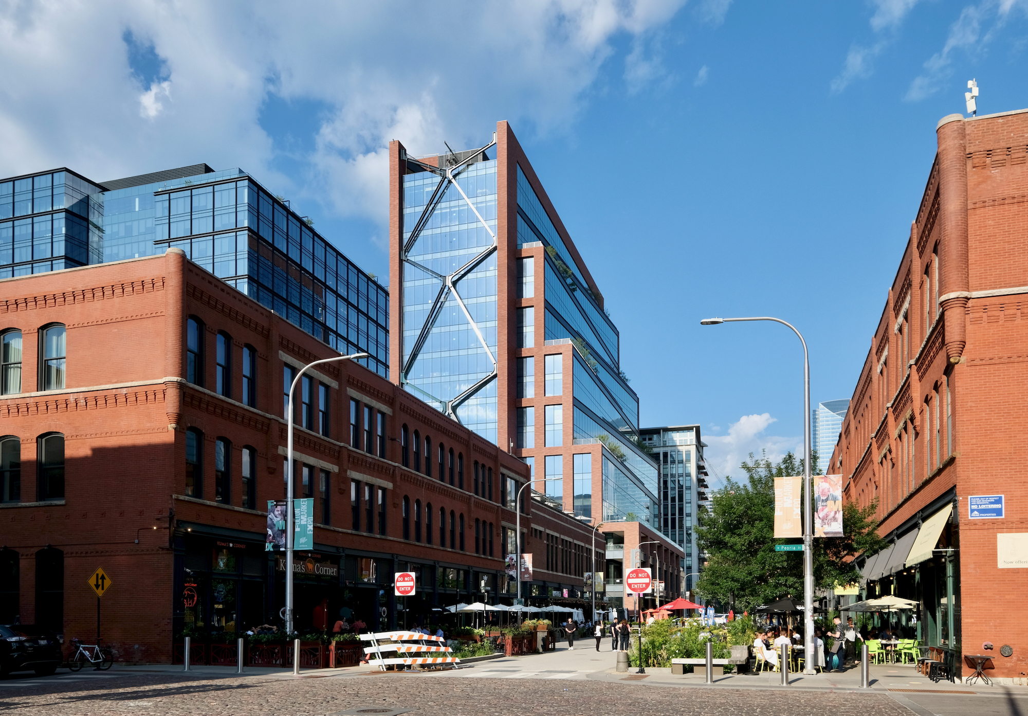
800 Fulton. Photo by Jack Crawford
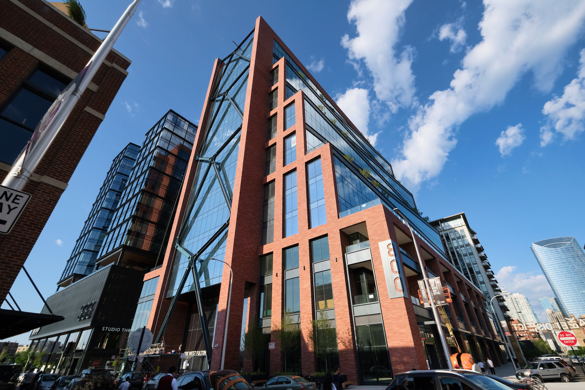
800 Fulton. Photo by Jack Crawford
Tenants will find an underground garage with 34 parking spaces and 150 bike spaces. Various public transit options are also in close proximity, such as stops for Route 8 located along the adjacent Halsted Street. Stops for Routes 20, 56, and 65 can also be found within a 10-minute walk of the property.
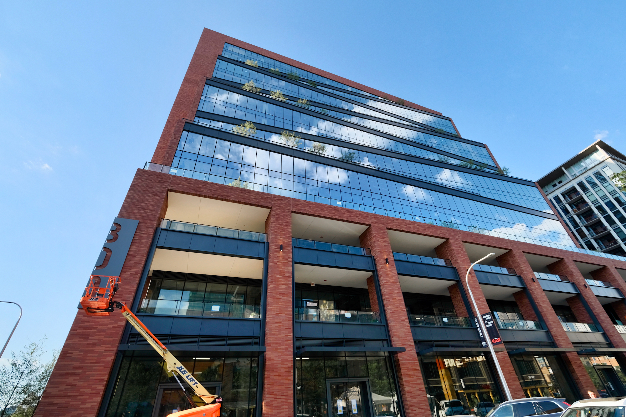
800 Fulton. Photo by Jack Crawford
There are multiple CTA L options in the vicinity, the closest of which is the Green and Pink Lines at Morgan station via a five-minute walk southwest. Slightly further via a seven-minute walk north to Grand station is additional service for the Blue Line.
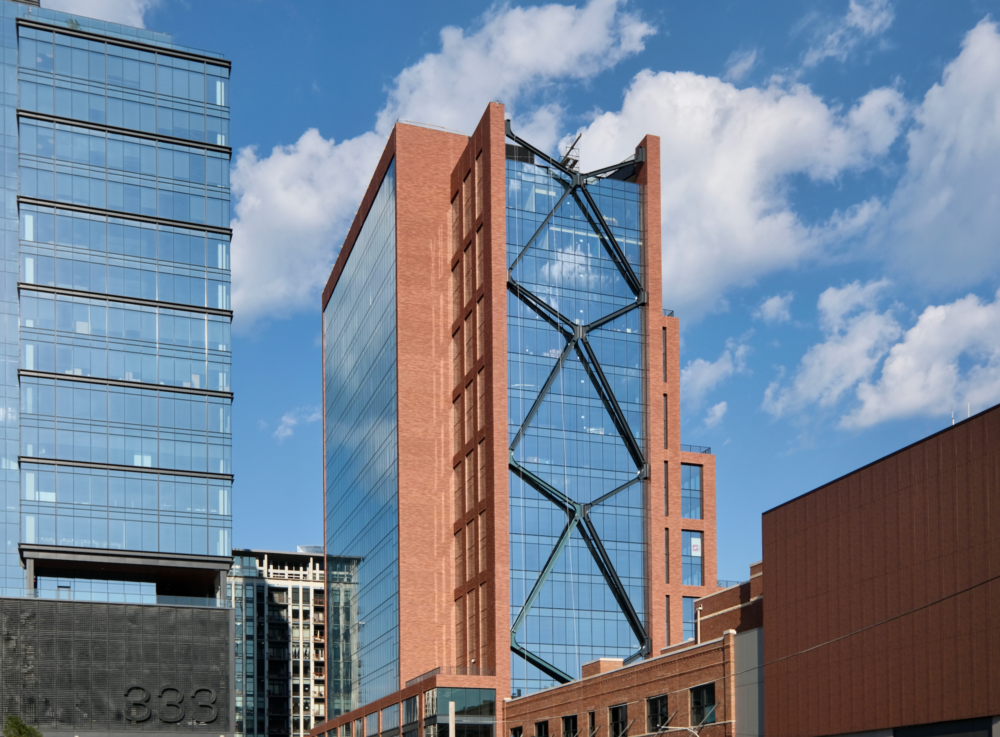
800 Fulton. Photo by Jack Crawford
Not only will occupants and visitors find ample transit within close proximity, but there is a dense collection of retail, dining, and hotel options lining both the Fulton Market corridor and the Randolph Street corridor just two blocks south.
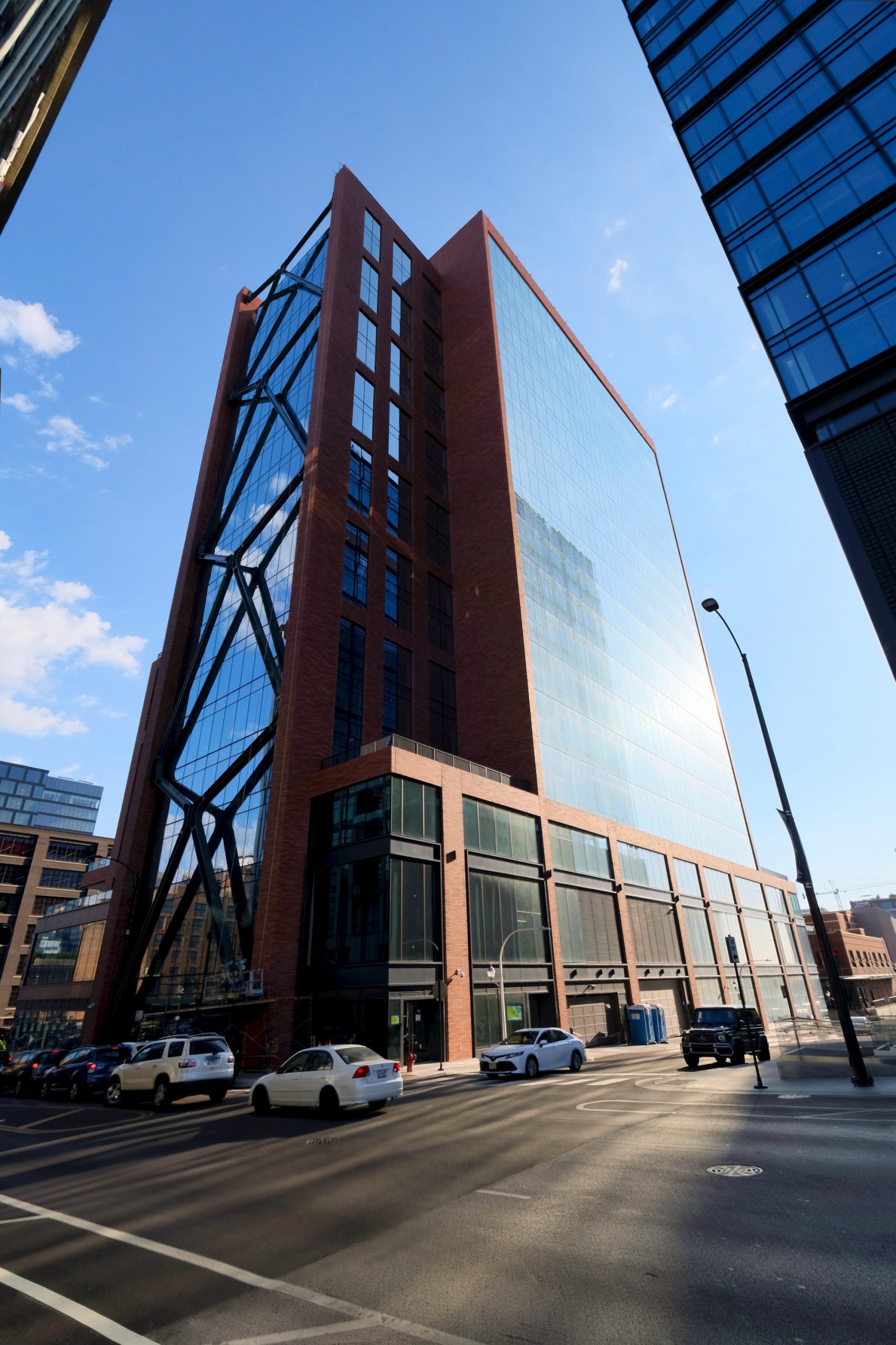
800 Fulton. Photo by Jack Crawford
Lendlease has served as the general contractor, with final construction having wrapped up in recent months. CBRE has served as the broker for the list of new tenants. The development has scored a contract for Aspen Dental to be the anchor tenant, having signed for 197,000 square feet of office space and 8,000 square feet of additional retail space. Other deals include Teknion, Zeppola Bakery, Prevolv, and Inscape. While already a major presence in Chicago’s westward-expanding skyline, 800 Fulton represents the beginning of a flood of similarly-scaled projects that will reshape the former meatpacking district over the next decade.
Subscribe to YIMBY’s daily e-mail
![]()
Follow YIMBYgram for real-time photo updates
Like YIMBY on Facebook
Follow YIMBY’s Twitter for the latest in YIMBYnews


Bravo!! This turned out completely stunning. Nice pics and followup Jack.
Thank you JPIllinois! Agree, the building is looking sublime
wow. One of the few times the finished product is as stunning as the renderings
They should have kept the original lighter brick in the renders for some much needed contrast in the area. Brick should have lined the spans across the windows at each level as well rather than that metal that blends with the glass. The building’s form however is refreshing to see. More creativity like this would go a long way