Plans have been revealed for a new mixed-use development at 5035 N Lincoln Avenue in Lincoln Square. Located on the southeast corner with W Winnemac Avenue, the new building will replace an existing construction site in the growing neighborhood. The project itself is being led by 5019 Lincoln LLC and designed by local firm Hanna Architects, who have worked on other residential proposals in the area.
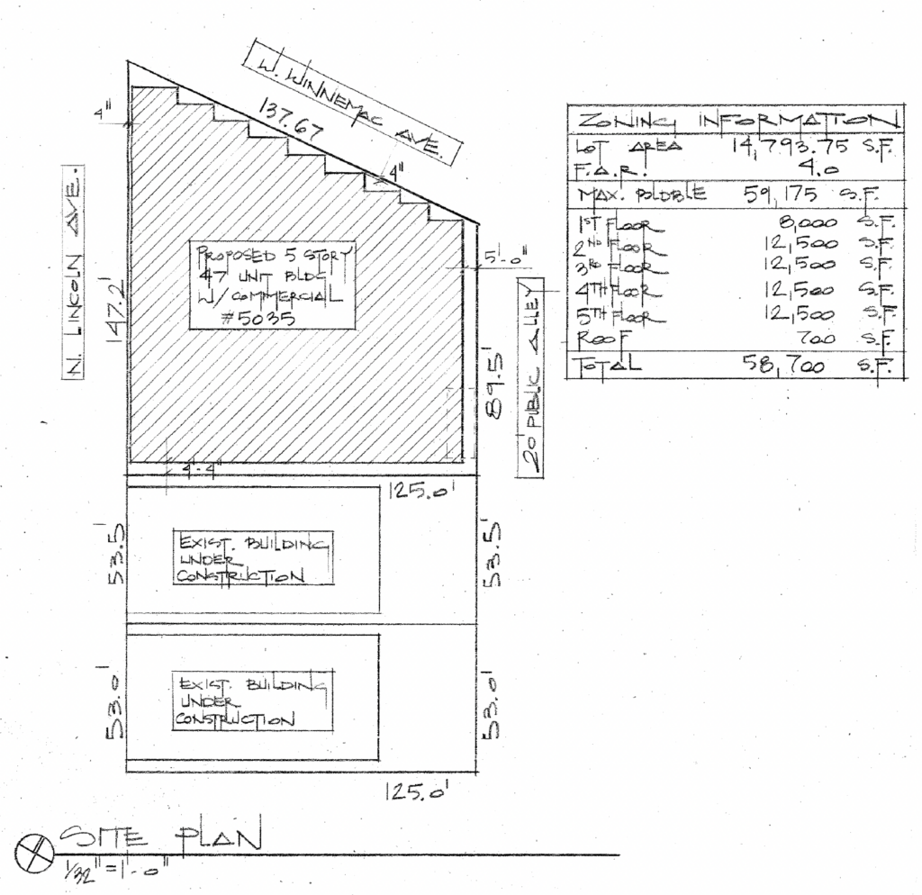
Site plan for 5035 N Lincoln Avenue by Hanna Architects
The 14,793-square-foot lot was previously earmarked for a different development which was canceled, leaving just the foundation walls behind. The project is seeking to rezone the site and will be demolishing all of the existing site work, with further details being presented earlier this week at a community meeting. Once completed, it will bring 58,700 square feet of space adjacent to two new residential buildings.
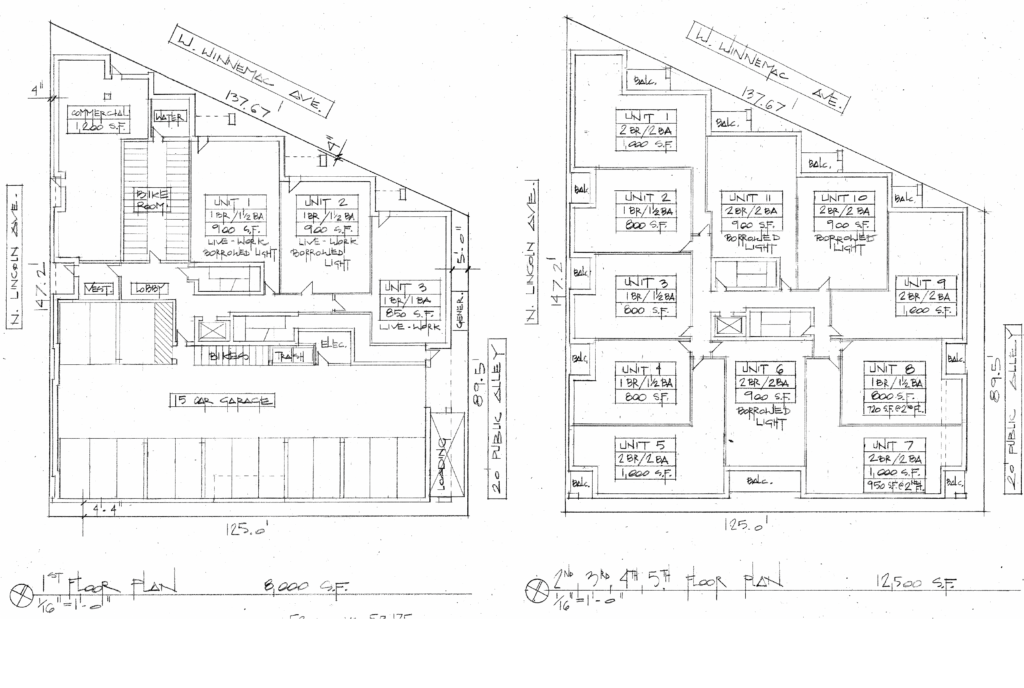
Floor plans for 5035 N Lincoln Avenue by Hanna Architects
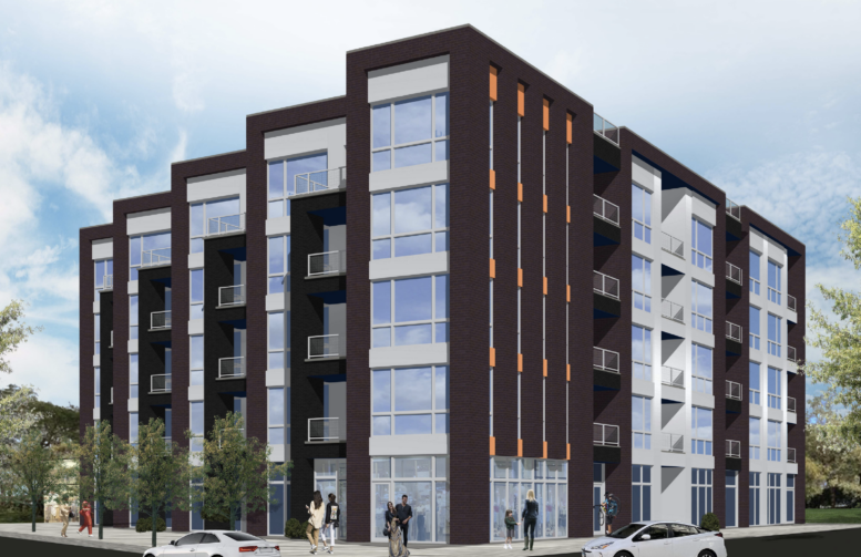
Featuring a sawtooth shape along its front face on Winnemac Avenue, the new structure will rise five stories and roughly 60 feet in height. The ground floor itself will feature a 15-vehicle parking garage in the back running from Lincoln Avenue to the side alley, with a 1,200-square-foot commercial space on the street corner itself. The rest of the floor will contain a bike room, entrance, and three live/work units with storefronts.
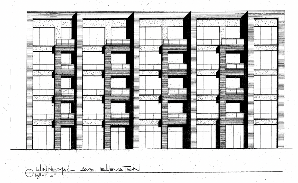
Elevation of 5035 N Lincoln Avenue by Hanna Architects
The rest of the floors will hold residential units for a total of 47, made up of one- and two-bedroom layouts ranging from 800 to 1,100 square feet. Of these, nine units will be considered affordable for those making 60 percent of the Area Median Income, with all of the residences having access to a private balcony.
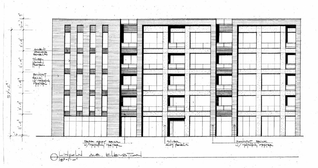
Elevation of 5035 N Lincoln Avenue by Hanna Architects
The building itself will be clad mostly in ironspot brick, with silver and orange spandrel panels as an accent. The overall massing will be split with the balconies and different window layouts. Currently the developer is seeking to keep the site zoning the same, but change some of the previously approved amendments. Currently no construction timeline is known.
Subscribe to YIMBY’s daily e-mail
Follow YIMBYgram for real-time photo updates
Like YIMBY on Facebook
Follow YIMBY’s Twitter for the latest in YIMBYnews

If they value engineer the materials, even just a smidge, it’ll be noticeable and could ruin the design.
The minimalism is walking on thin ice and already feels dated.
I like the form in 2D but the 3D is weak. The Lincoln Ave elevation is especially sad. Just continue the skinny window design. That facade has three different patterns and they’re barely cohesive.
Agreed, why do the skinny windows on one side on the front corner. Leave the skinny window prison-looking design in the 1960s and 70s. If they continued the larger windows to give the corner some real open presence, it’d be much more inviting both inside and out.
Drea, i completely agree. The design for the area is not ideal And agree it looks dated. Good material and this good work, but go cheap and it ould change the feel of the street for the worse.
Sorry, but I’m nearly a NIMBY for any project designed by Hanna. They mostly design buildings that look dated the moment they’re finished.
which architect would be a better option? anyone out there who really gets it?
I have zero faith this will look as good as the rendering which is already bad. Hanna is definitely the Walmart of architects
Dang this neighborhood is so NIMBY that even if this looked like a Bavarian Chalet, it would still not win anyone over
I think this plan allows for maximum light coming in to each unit. I love that. Plus, each unit has an outdoor space which is highly valued in Chicago! The terraced side of the building gives it a unique feature that I think is appealing. I’m wondering if the brick is dark brown? It’s hard to tell. The white walls around the balconies should offset that nicely. My only suggestion would be to try some other colors besides orange in the small contrast areas. I can’t decide if I like that color but would like to see other possible color options. Otherwise well done. I look forward to seeing a nice structure and not a dilapidated defiled ruin.
weak design that was phoned in
Please, people, consider the “Y” in YIMBY. This is infill within a series of adjacent blocks that are an architectural hodgepodge (but are also seriously lacking in street energy/activity).
I seriously doubt any of the negative commenters above are aware that this site has been rotting away as a half-built, overgrown, graffiti-tagged abomination for the past 4 years. The Alderman has been begging for a developer to take it on and most punted on the idea. The design might not win any awards here but let’s not give anymore fodder to the NIMBY crowd and just take this win for what it is.
Absolutely, I like it overall. My suggestion above was as a way I think it can be made even better, design feedback. Empty lots that aren’t being used as gardens or parks are neighborhood block killers.
Waveland, Voldemort: agree completely. Wish the nimby commenters would stop hiding behind their grandma’s’ aesthetics and admit they want McMansions. “Because property value” myth.
Hoping that they don’t add historical touches to commemorate the site’s history, because there is a danger that the sign from the strip mall would be attached to the facade, including the deeply annoying “Boomer’s Wood Burning Pizza” sign.
I think Billy Corgan bought that historic Boomer’s sign to hang above his tea shop in Highland Park (or something like that, I do tend to get my Block Club articles mixed up)
It was the Orange Garden Chinese restaurant that Billy Corgan bought.
*Chinese restaurant sign
I think it was the Driehaus Foundation that bought the Boomers sign
It’s kitch! The right balance of character and sameness with what’s around it. So happy to see something that’s not just a brick box.