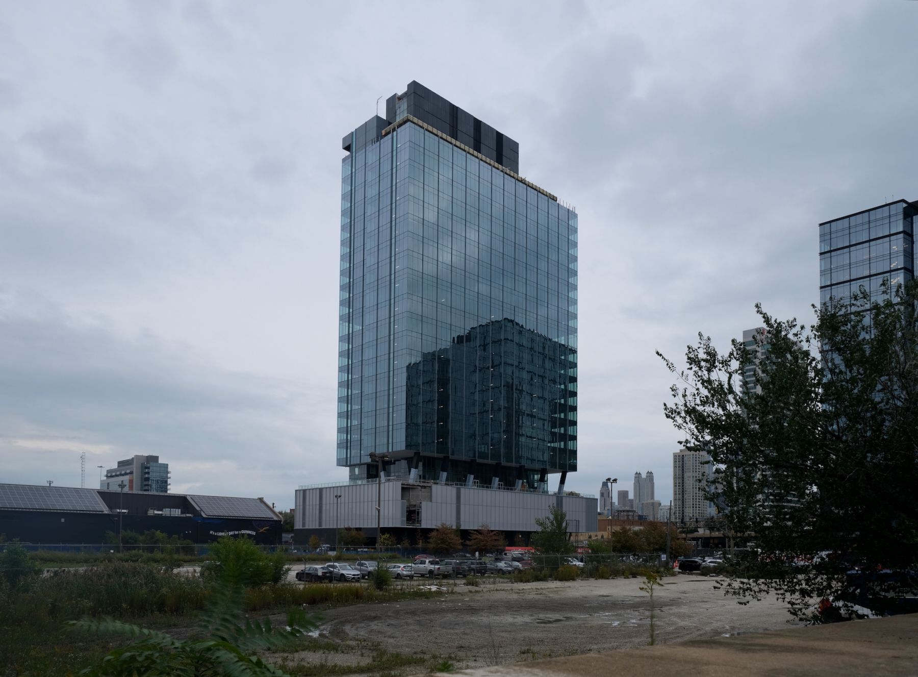
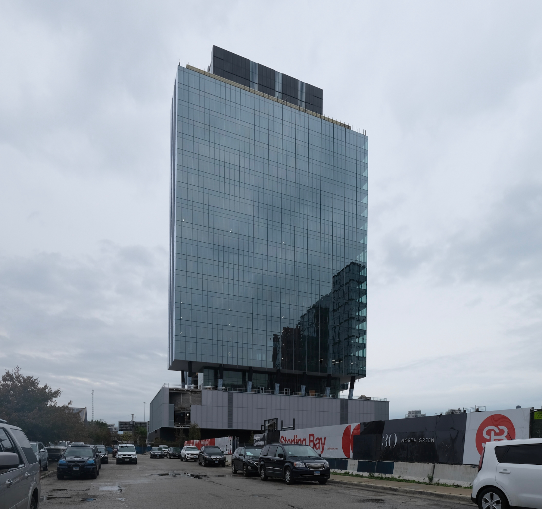
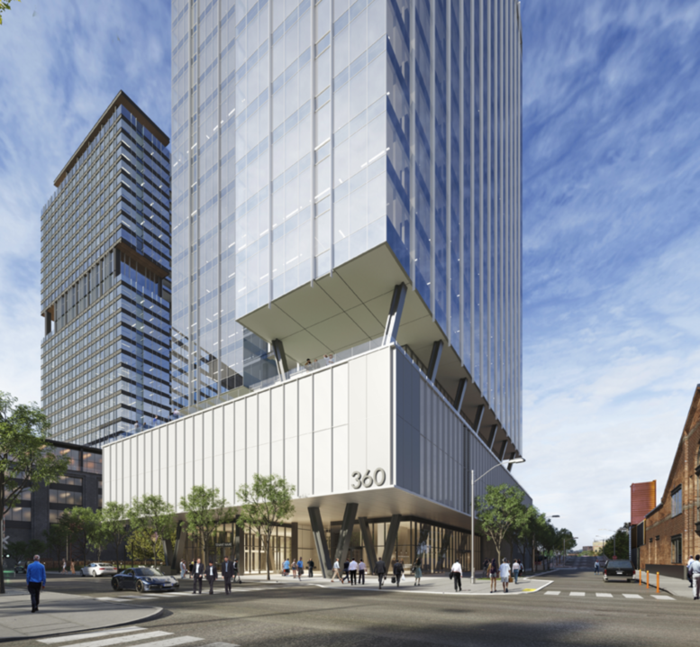
The 24-story mixed-use building at 360 N Green Street has nearly finalized its exterior facade. Situated near the east end of Fulton Market, this 500,000-square-foot structure is being developed by Sterling Bay. Once completed, it will house office spaces, 5,400 square feet of retail, and various tenant amenities. Boston Consulting Group will occupy 250,000 square feet as the primary tenant. Among the amenities, the building will feature a rooftop terrace, fitness center, conference facilities, bicycle storage, and a lobby lounge.
360 N Green Street. Photo by Jack Crawford
360 N Green Street. Photo by Jack Crawford
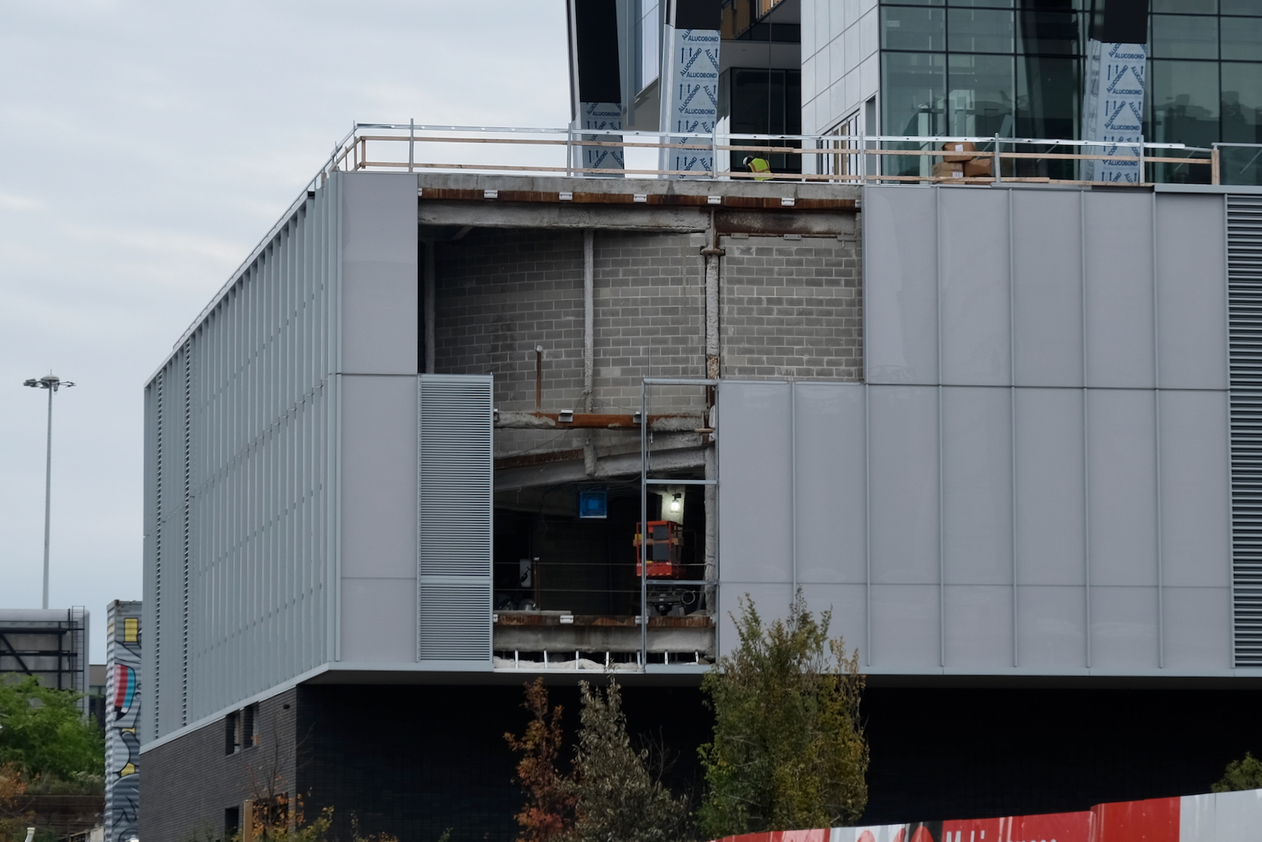
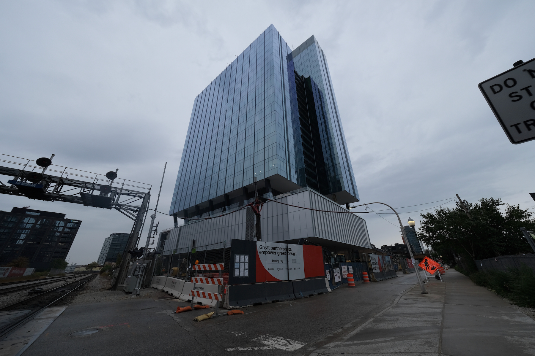
The 399-foot design by Gensler consists of a glass curtain wall facade with inlaid balconies. The main tower massing is made up of two offset rectangular volumes, which sit atop two rows of of V-shaped trusses integrated into the parking podium.
360 N Green Street. Photo by Jack Crawford
360 N Green Street. Photo by Jack Crawford
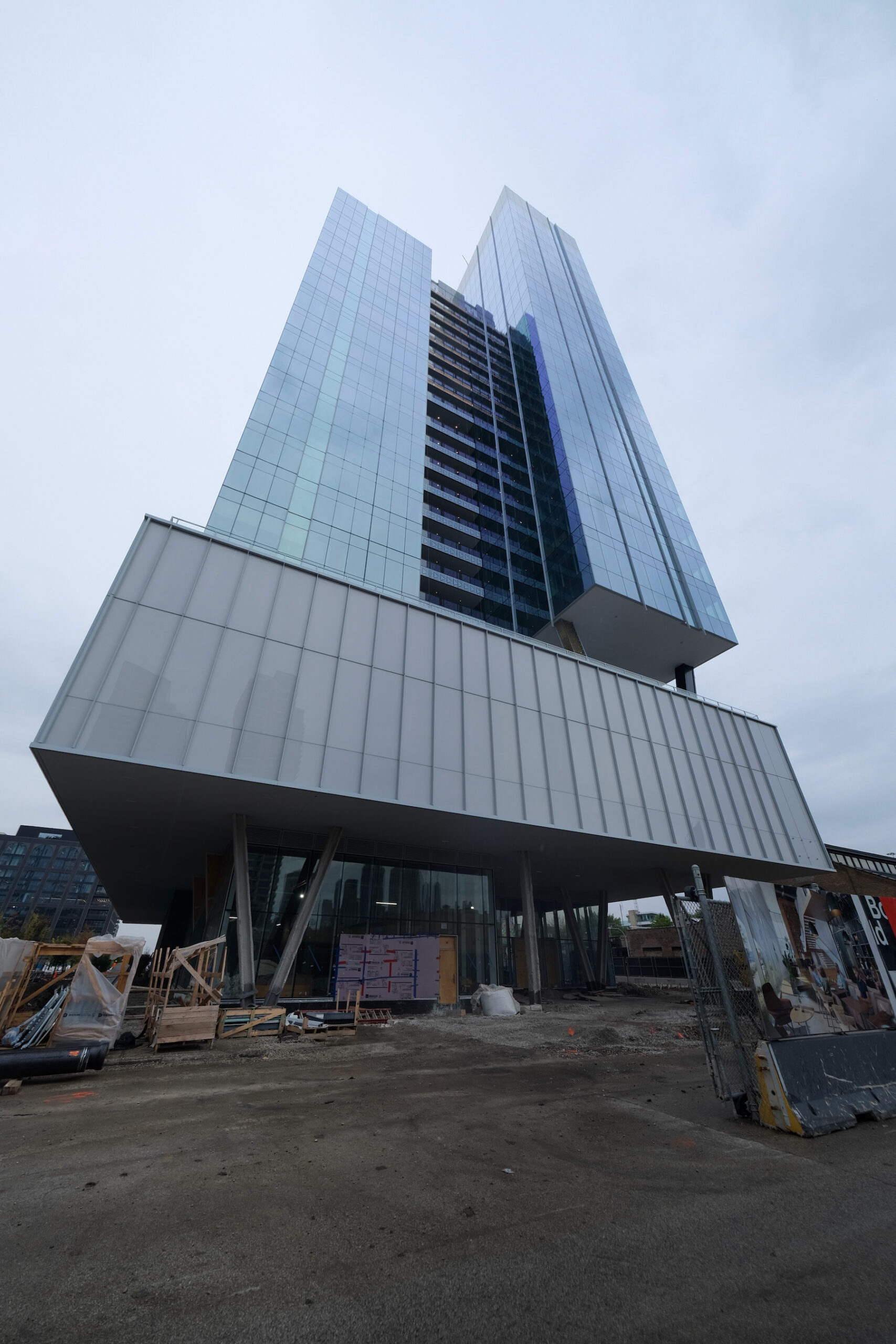
360 N Green Street. Photo by Jack Crawford
The podium garage will offer 90 parking spaces. Bus Routes 65, 8, and 56, are easily accessible within a short walking distance. Additionally, both the CTA Morgan station for the Green and Pink Lines and the Grand station for the Blue Line are within a 10-minute walk.
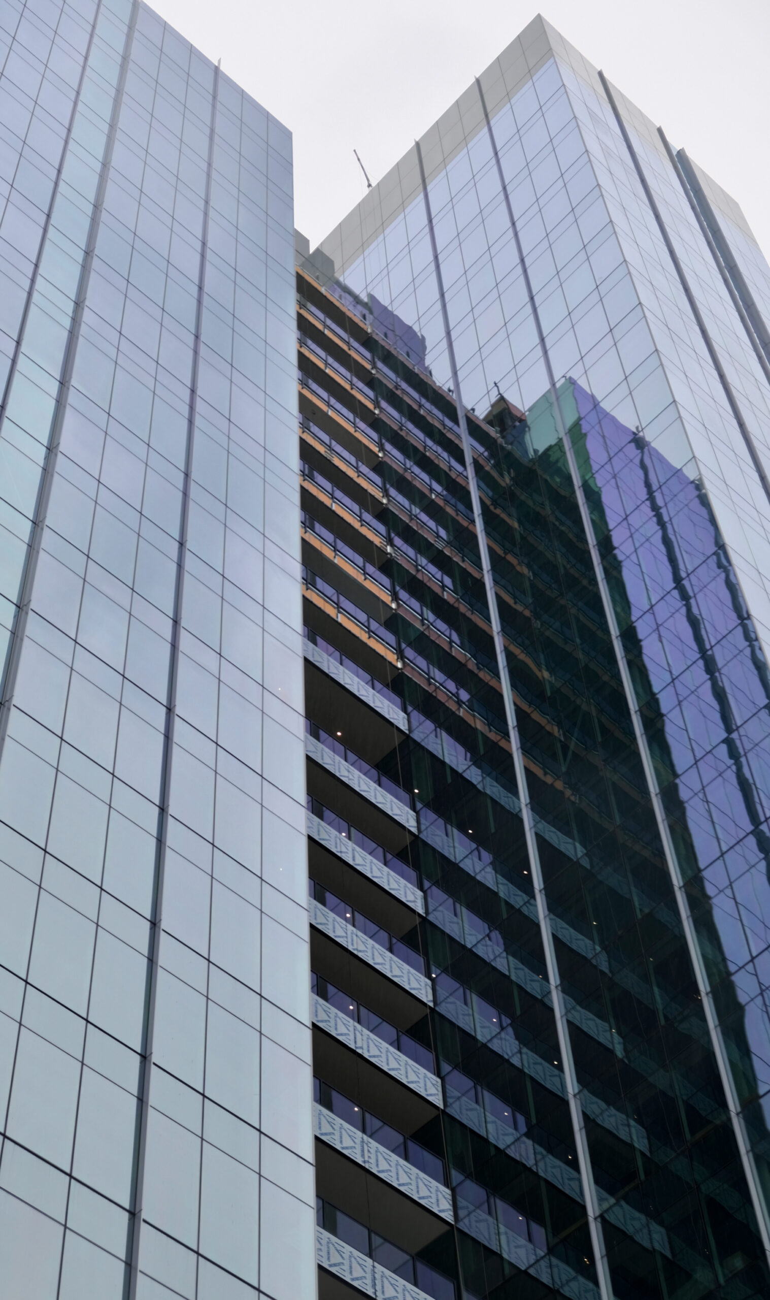
360 N Green Street. Photo by Jack Crawford

360 N Green Street. Photo by Jack Crawford
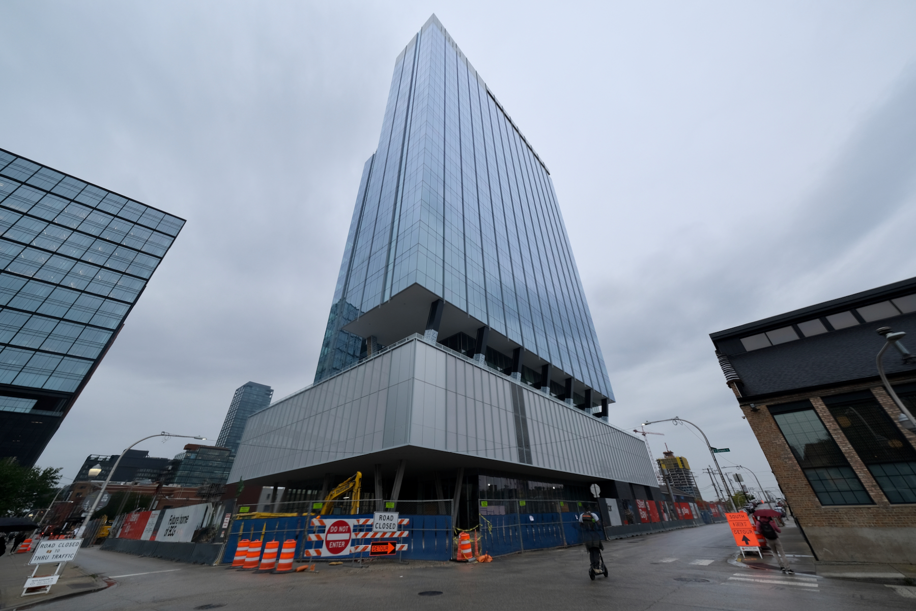
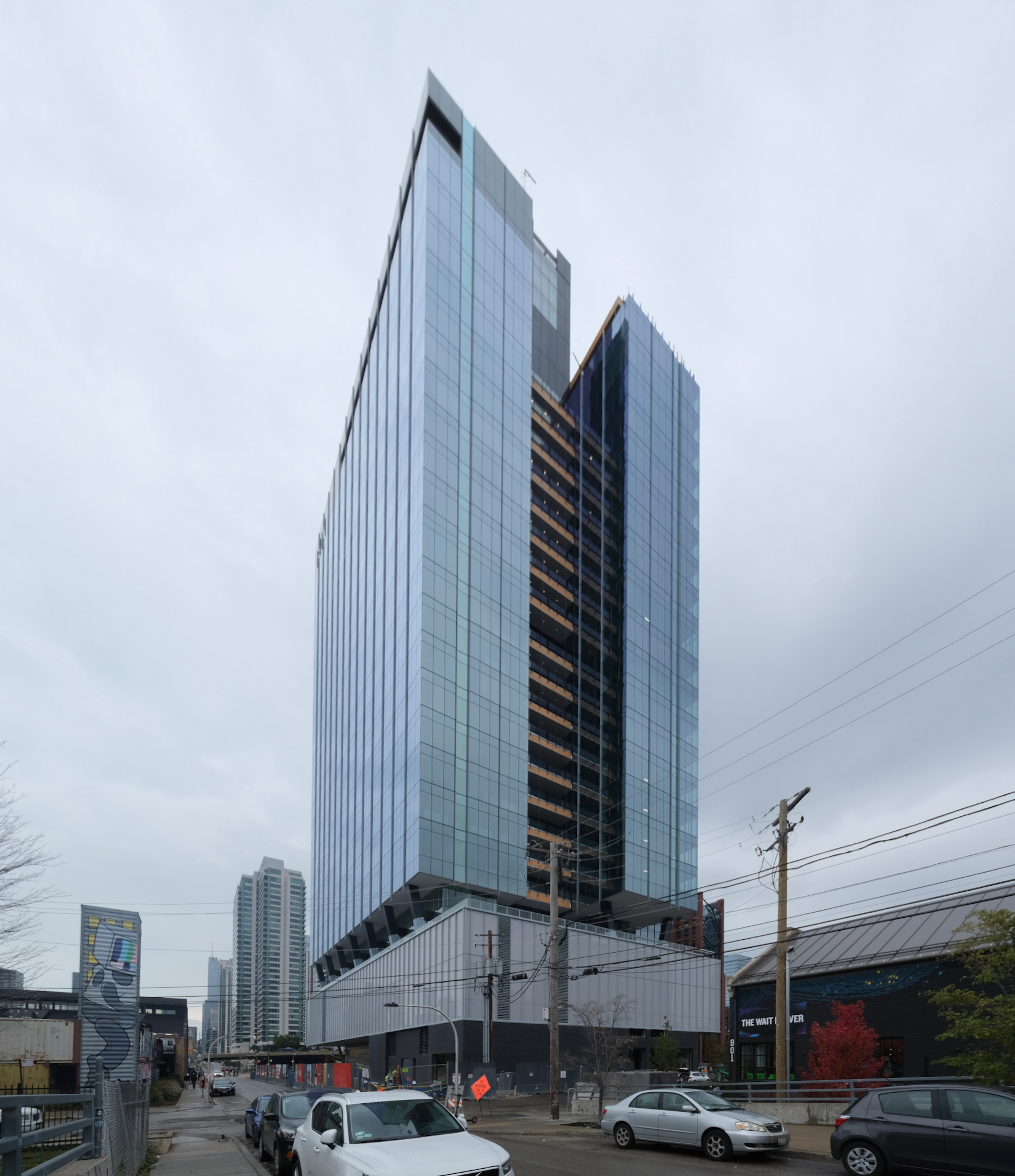
Power Construction is in charge of the construction. The building is set for completion in 2024, with the Boston Consulting Group expected to start its lease in 2025.
Subscribe to YIMBY’s daily e-mail
Follow YIMBYgram for real-time photo updates
Like YIMBY on Facebook
Follow YIMBY’s Twitter for the latest in YIMBYnews

Sterling Bay should get some artists to paint the podium walls on the sides that don’t face the train to make an attempt to save the design. Doing so would also be an opportunity to get some art back that was lost on the outside of the Guinness Brewery building.
Does this building have bird-friendly glass or other such element(s)? I’m wondering what measures these new developments are incorporating to prevent collisions.
The top / crown looks very ugly. Didn’t seem like they put effort in making sure it looks eastetically pleasing
Worst new building in FM.
A very confused design. A discordant selection and placement of materials, with no overriding concept or rigor. Far too many unresolved details and material transitions. What exactly is the structural or architectural rationale for the ‘V’ shaped columns? These transition through the parking podium, so what is the actual benefit or necessity? Are they simply a ‘cool’ design move? Also, the solitary vertical column on ground level along the east facade looks like an unresolved result, given the insistence upon the adjacent ‘V’ shaped structural expression.
more banality in the west loop
when will the third chicago school arrive?
If this is what Lincoln Yards will be like then I want out.