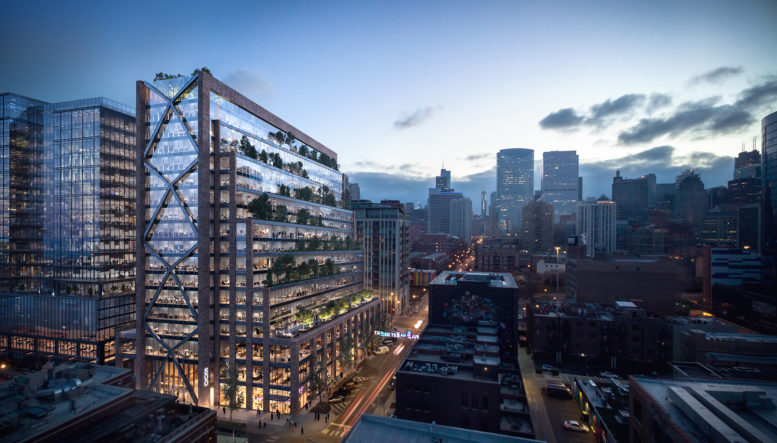
This week, Chicago YIMBY had the opportunity to tour the 19-story mixed-use development known as 800 Fulton, one of the largest and most recent additions to the growing West Loop skyline. Tour hosts Thor Equities, Stream Realty Partners, and project architect Skidmore Owings & Merrill (SOM) showcased the various common areas throughout the building’s 500,000 square feet. Having been co-planned by Thor Equities and Quadreal and built by Lendlease, the construction process for this $95 million development spanned between 2019 and 2021. Tenant build-outs are now underway, with multiple high-profile leases for companies like John Deere and Aspen Dental Management already locked in.
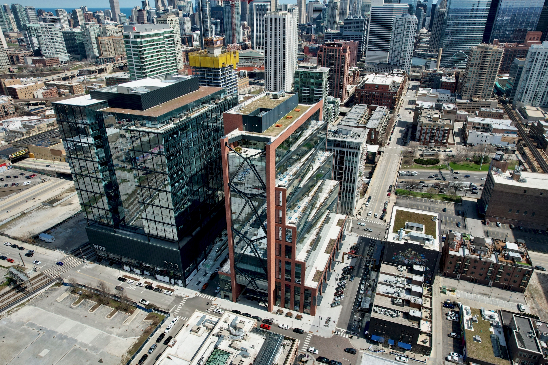
800 Fulton. Photo by Jack Crawford
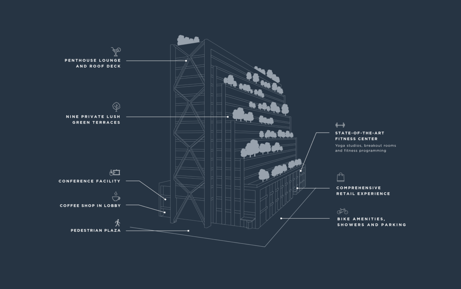
Amenities and features at 800 Fulton. Diagram by SOM
Looking from the outside, the building’s tapered massing melds to the existing datum of Fulton Market’s historic low-rises. This tapering effect also creates a series of stepped terraces, offering outdoor space on roughly every other floor. Standing at a pinnacle height of 326 feet, the building easily qualifies as one of the tallest brick-clad structures in the world, having drawn inspiration from West Loop’s industrial context.
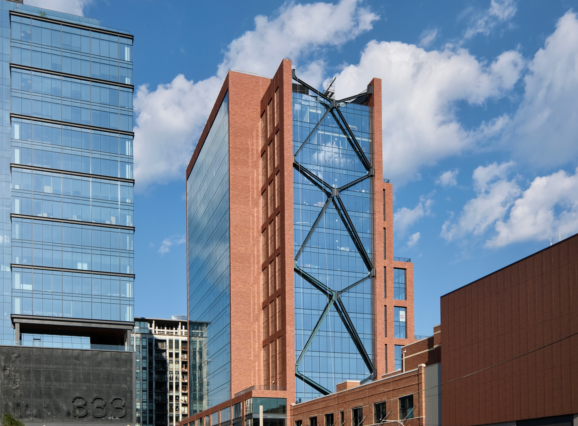
800 Fulton. Photo by Jack Crawford
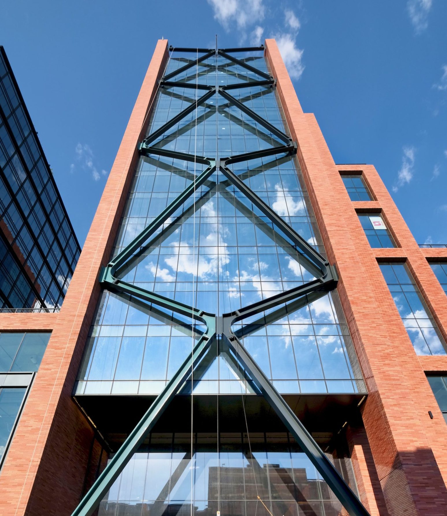
800 Fulton. Photo by Jack Crawford
Several other unique features also stand out in the design. On both the east and west exterior walls are columns of X-bracing similar to those utilized on iconic skyscrapers such as The John Hancock Center (now known as 875 N Michigan Avenue). The bracing on 800 Fulton leverages a “high-waisted” design, by which the intersection of the beams is closer to the top than a standard “X” shape. Able to flex more than a foot outward, these pieces are structurally significant in that they allow for large column-less floor plates and the inner core pushed to the northern edge.
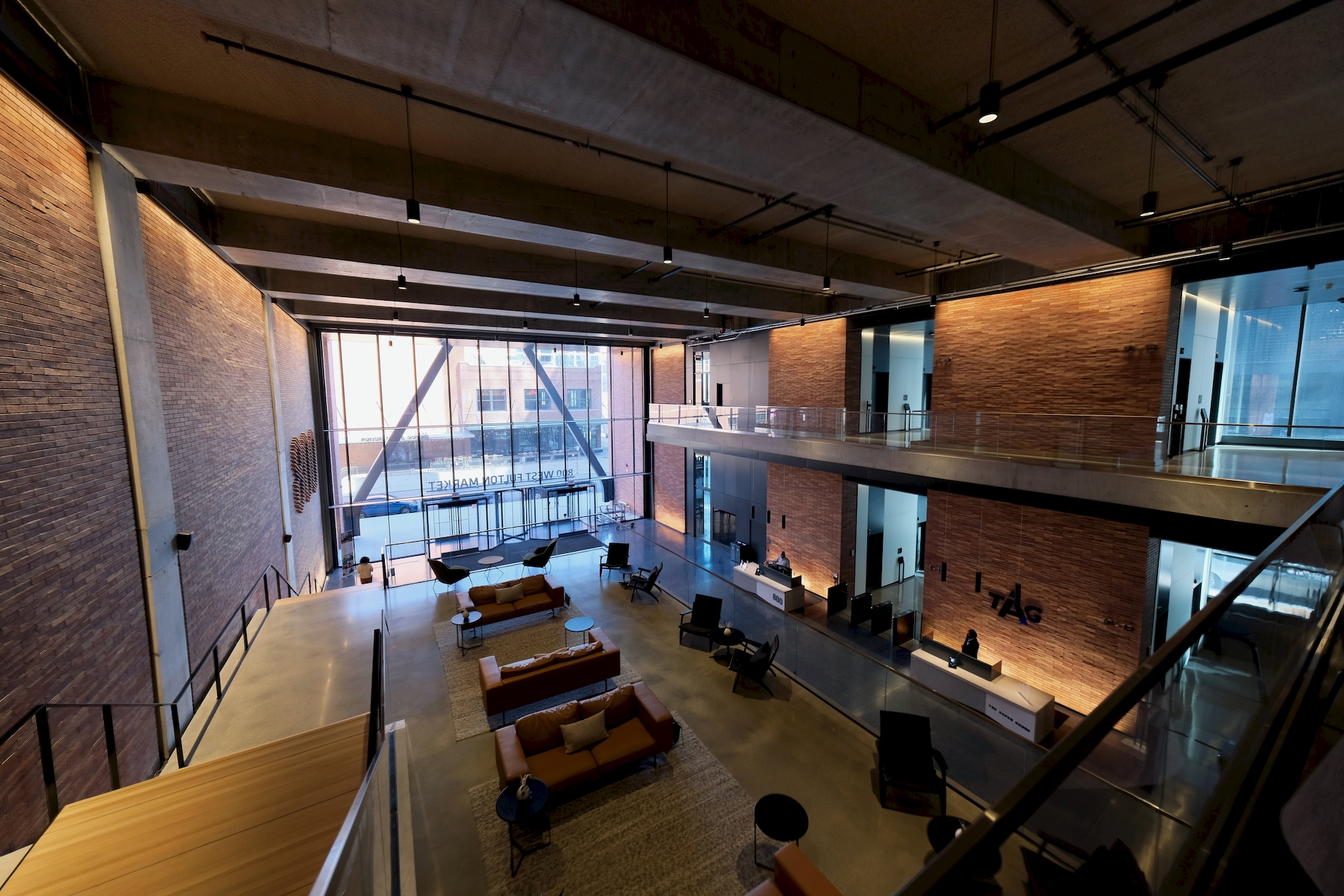
Main lobby. Photo by Jack Crawford
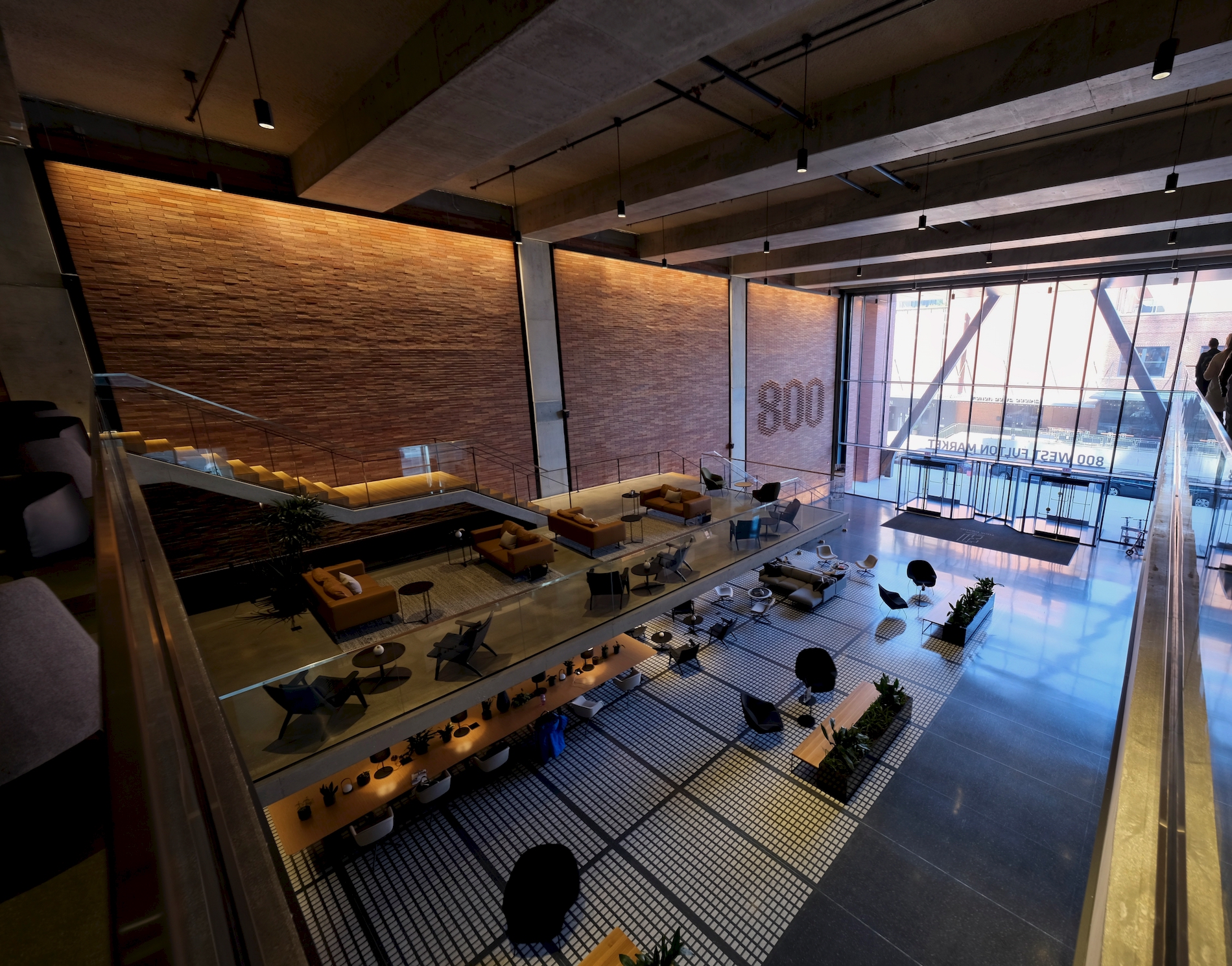
Main lobby. Photo by Jack Crawford
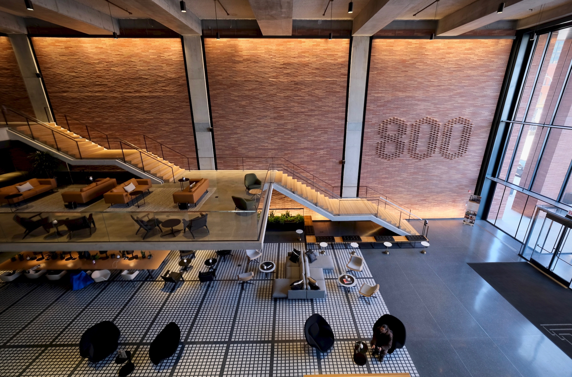
Main lobby. Photo by Jack Crawford
Upon passing through the main tenant entrance on Green Street, one is greeted by a double-height lobby, which uses brick and other elements like inlaid granite pieces to reflect the masonry exterior. Details like the “800” signage is made out of whole brick pieces, highlighting the artisanship of the interior architecture. Other components within the lobby include a 20-foot cantilevered platform that offers a resting spot as one climbs the stairs to the second floor.
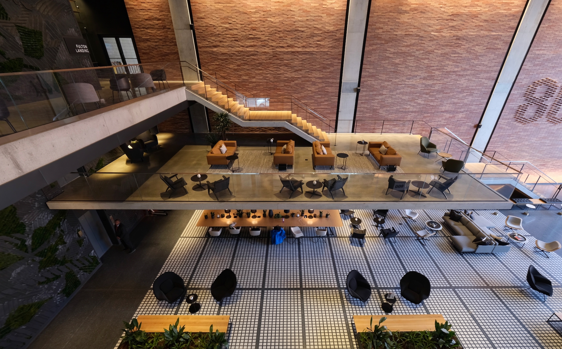
Main lobby. Photo by Jack Crawford
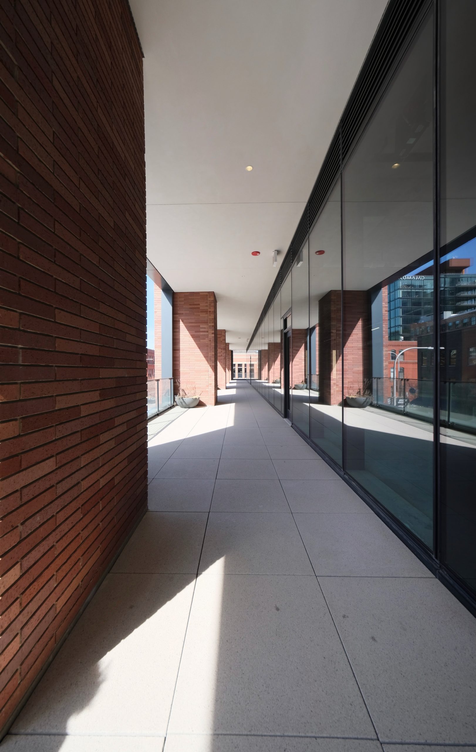
Second-level terrace. Photo by Jack Crawford
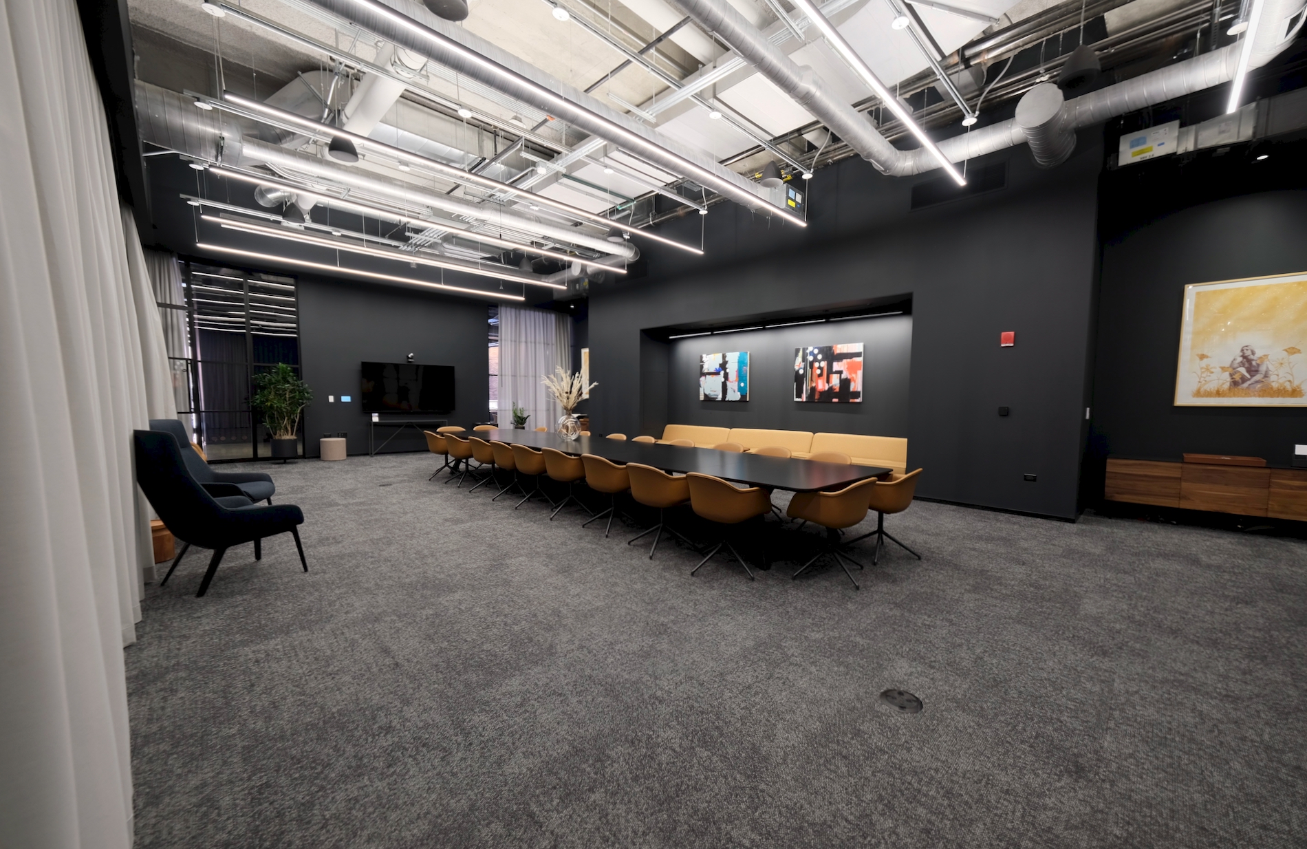
Smaller conference room. Photo by Jack Crawford
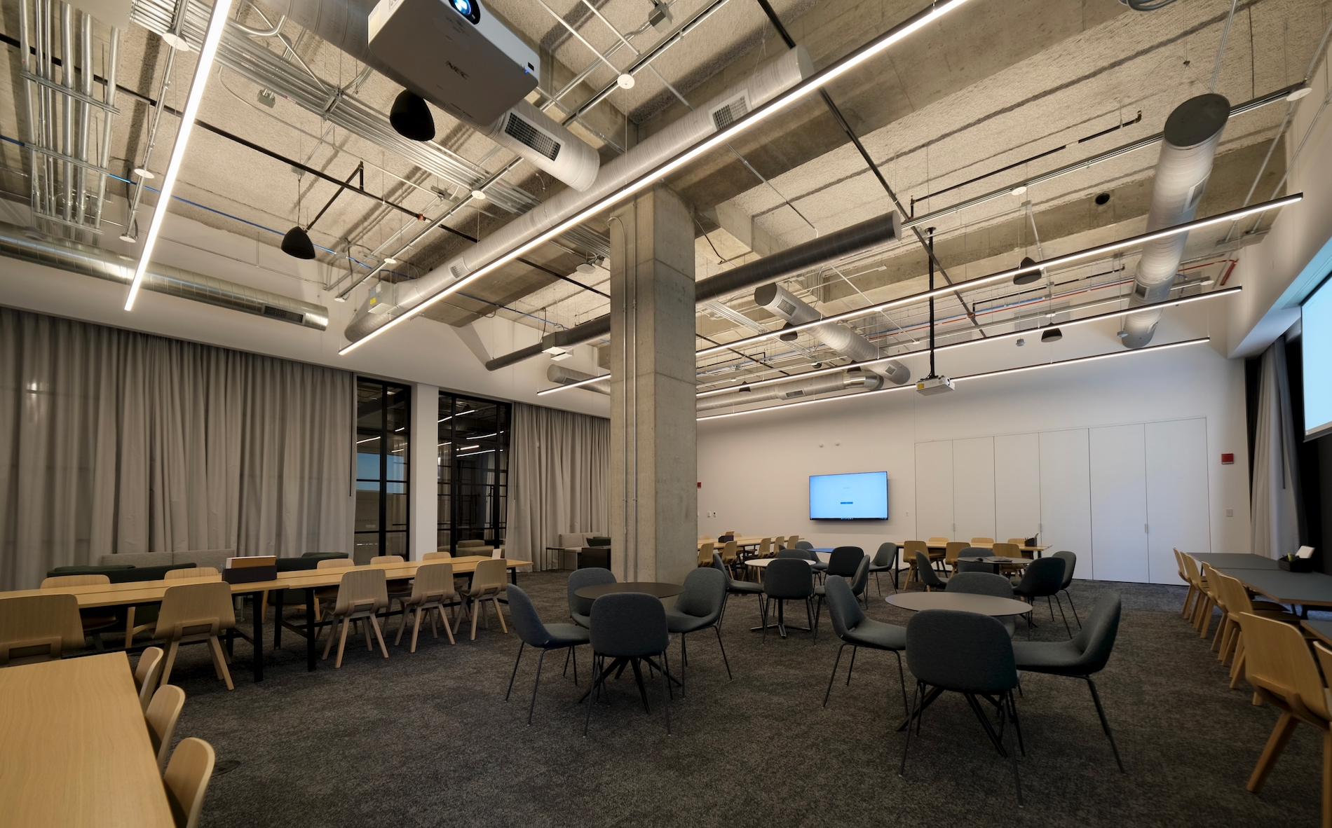
Larger conference room. Photo by Jack Crawford
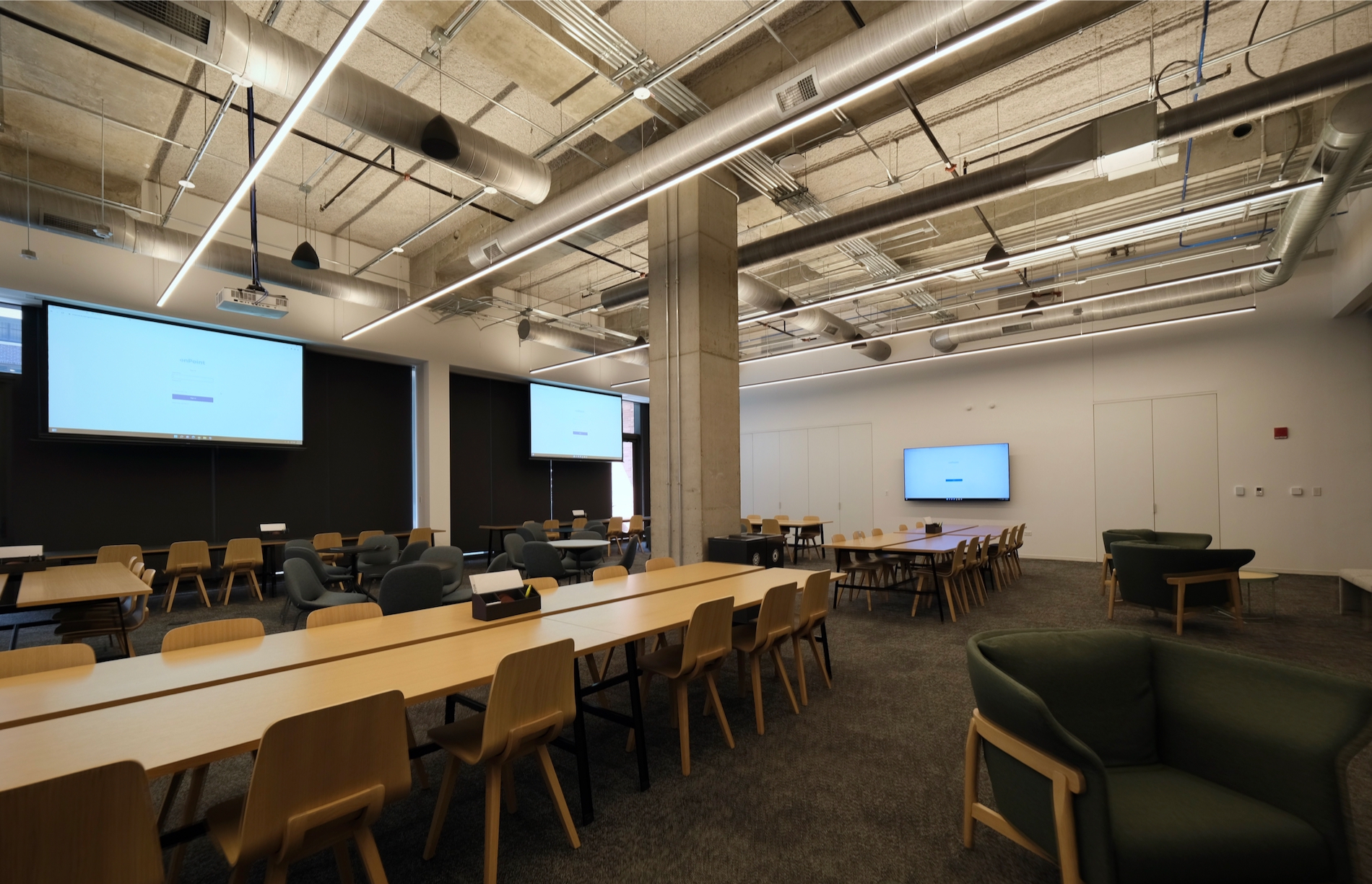
Larger conference room. Photo by Jack Crawford
The second floor contains a yet-to-open restaurant, as well as several amenity spaces. Near the southeast corner are two large conference rooms with boardroom-style table seating and also more relaxed lounge seating. Between these two rooms are various prefunction furnishings and work by local artists.
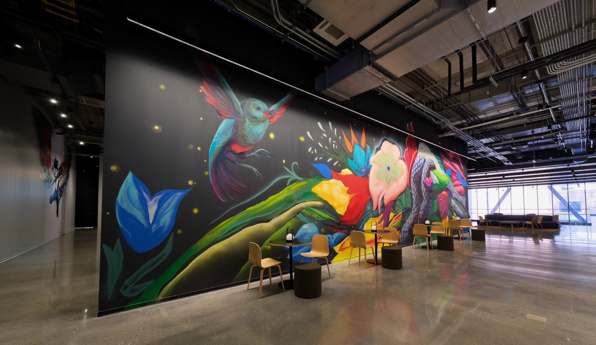
Prefunction area. Photo by Jack Crawford
800 Fulton equips a range of smart technologies as part of efforts to maximize comfort and efficiency. One of the most notable examples is a central software infrastructure called onPoint, which acts as the IOT brain of the building. As noted in an article by AiBots, the program links 12 interior systems via its data translation engine known as Jetstream, which monitors and adjusts these systems through 8,000 separate data points. Operators leverage reports by onPoint to resolve any issues or needed maintenance.
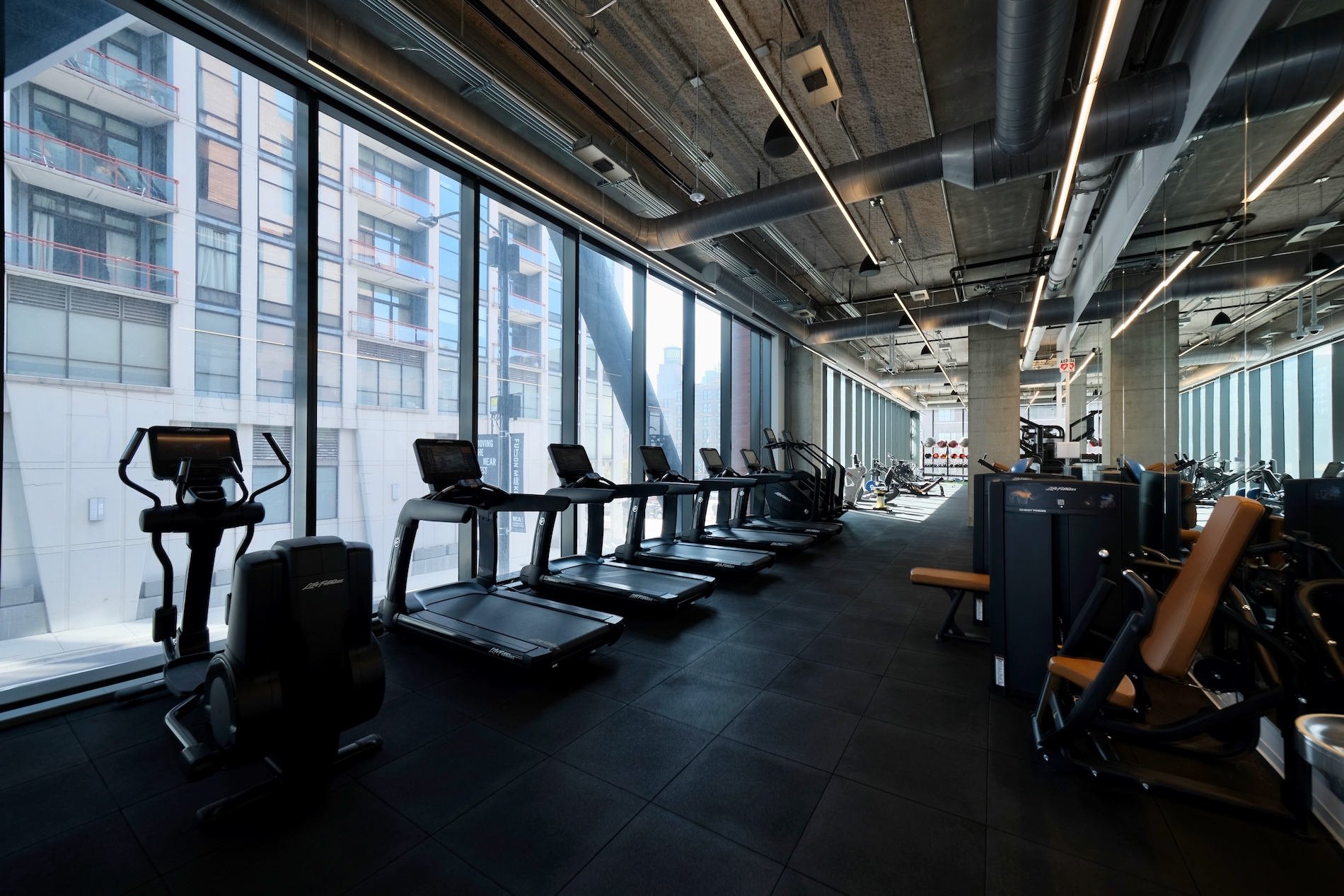
Fitness center. Photo by Jack Crawford
At the eastern edge of the second floor is a fully-equipped fitness space with an accessory yoga studios and breakout rooms. Along the two main wall spans are both floor-to-ceiling windows and mirrors on opposing sides, between which is a range of cardio and strength equipment.
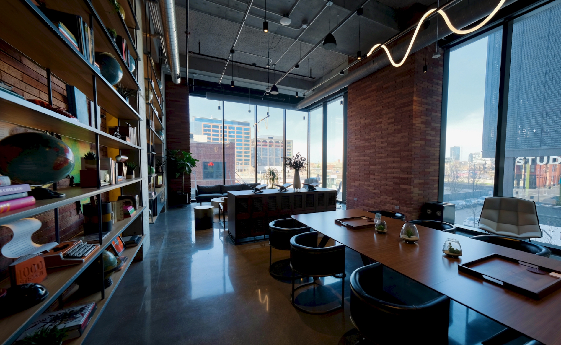
Whiskey room. Photo by Jack Crawford
The remaining second-floor destination was the whisky room overlooking the intersection of Green & Wayman to the northwest. This corner room comes with lounge and dining table seating, complemented by a wall of books and decorative relics.
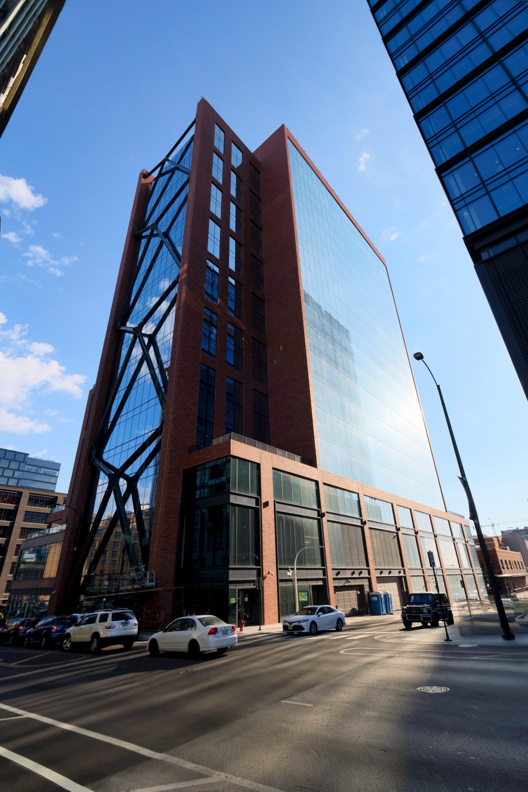
800 Fulton’s asymmetrical core along its northern face (right). Photo by Jack Crawford
A mobile app is required to proceed beyond the turnstiles and enter the elevators. These glass elevators are naturally lit by a curtain wall opening in the building’s core.
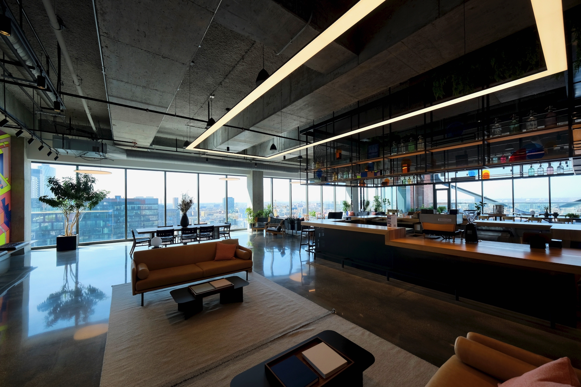
Penthouse lounge. Photo by Jack Crawford
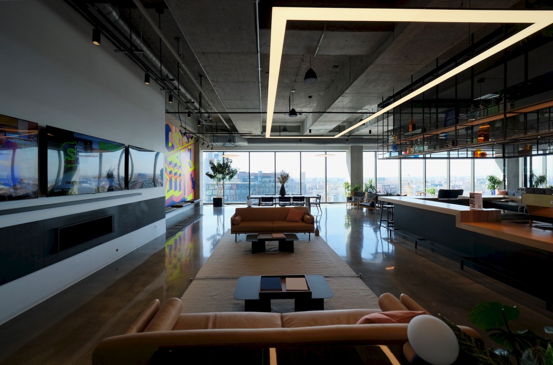
Penthouse lounge. Photo by Jack Crawford
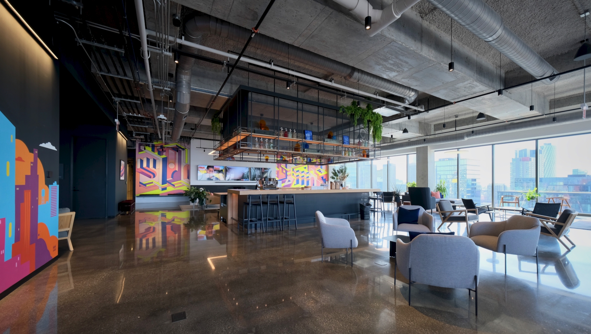
Penthouse lounge. Photo by Jack Crawford
Once on the 18th level, tenants are greeted by a penthouse lounge and attached rooftop deck. With a bar area being the focal point of the sprawling main room, the space was designed to mimic household areas, incorporating smaller furnished nooks throughout. Just to the north is a smaller, more secluded game room with activities like TV, pool, and ping pong.
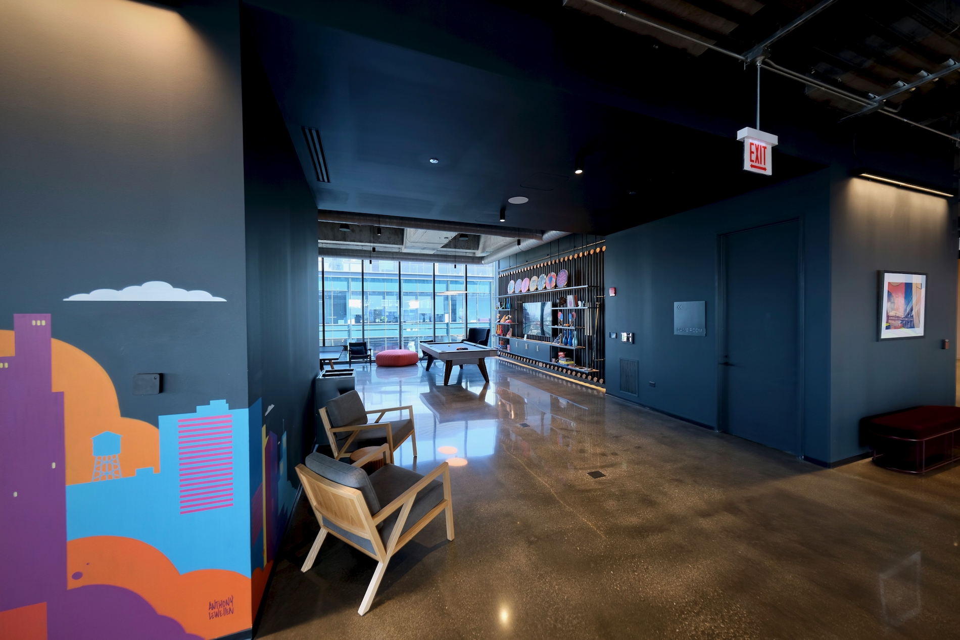
Penthouse game room. Photo by Jack Crawford
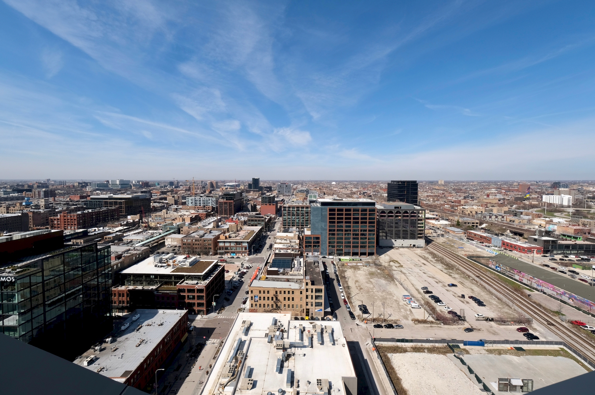
West-facing view from 800 Fulton. Photo by Jack Crawford
To the west, the 18th-floor rooftop deck overlooks a large swath of the Fulton Market district, a view that will see an unprecedented change over the next five years. The 19th level is primarily mechanical but also equipped with a grass rooftop terrace space that’s accessible to tenants.
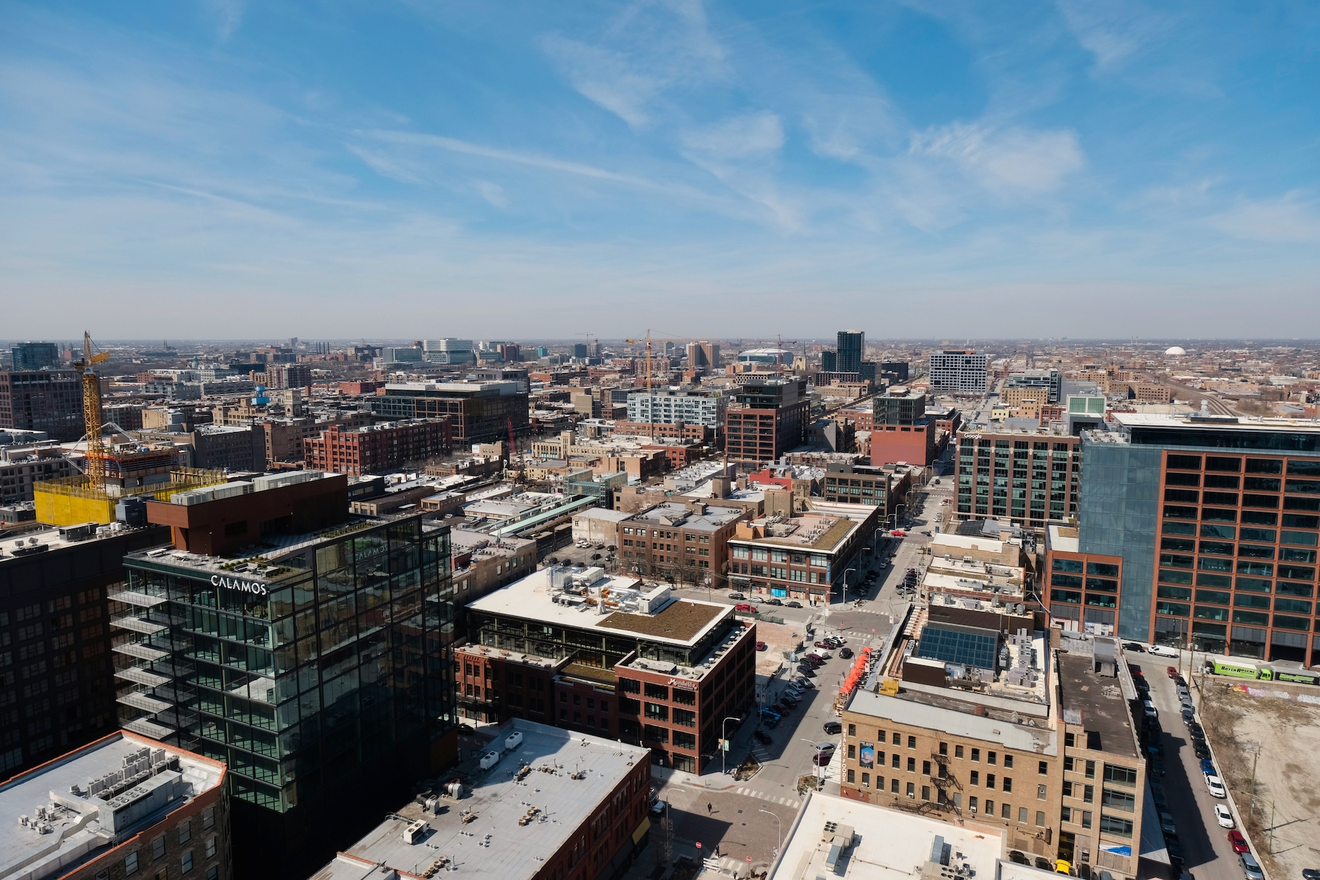
Southwest-facing view from 800 Fulton. Photo by Jack Crawford
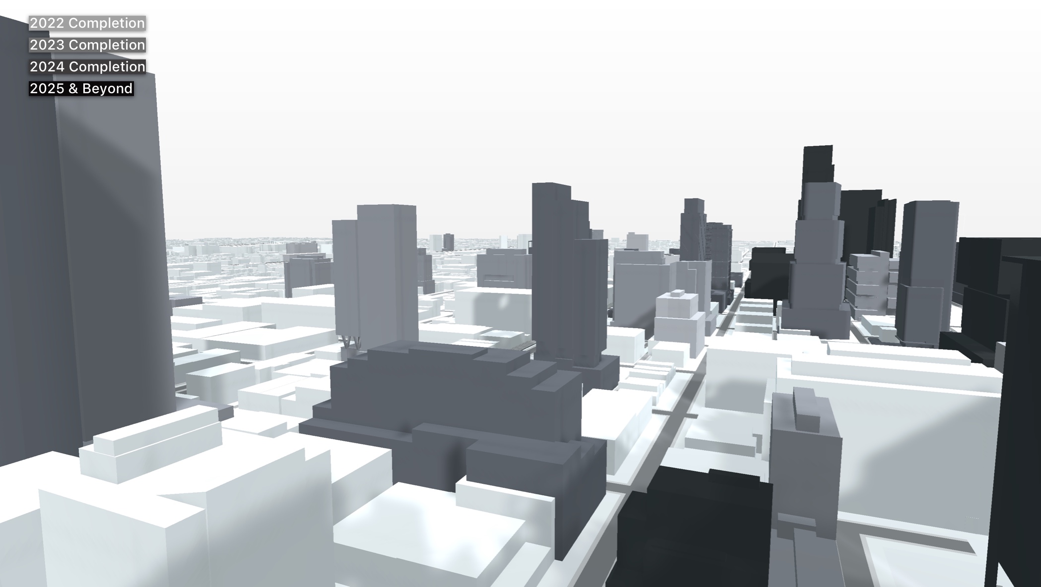
View from 800 Fulton after 2025. Model by Jack Crawford
Not part of the tour was the lower ground floor, which houses a 34-vehicle parking garage and 150 bike slots. Tenants and visitors looking to travel to and from the property also have access to bus Route 8 at the site’s southeast corner of Halsted & Fulton Market. Several other bus options can be found for Routes 20, 56, and 65 all within walking distance. The CTA L also offers nearby service for the Green and Pink Lines’ Morgan Station, less than a five-minute walk southwest.
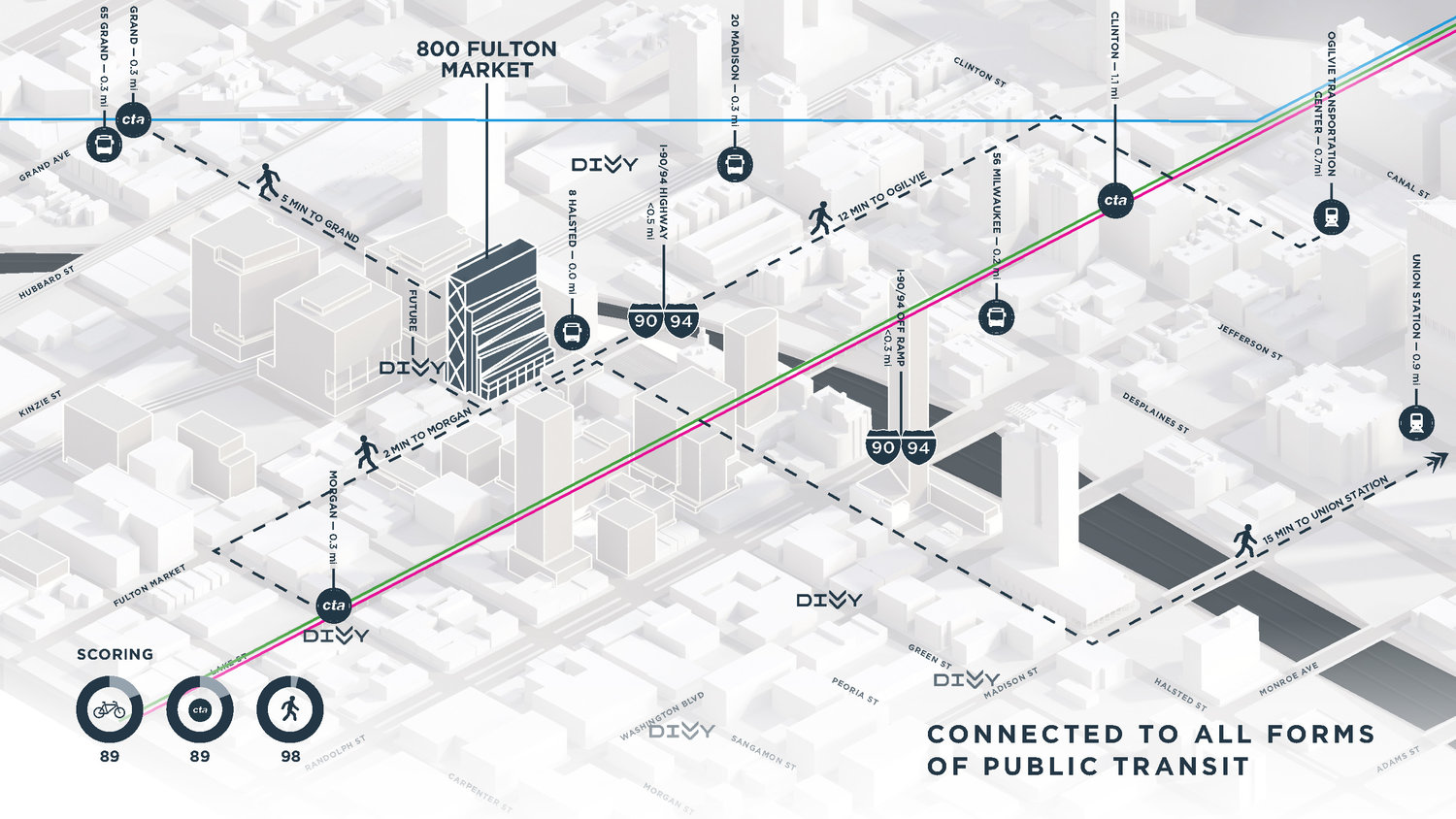
Public transit options to and from 800 Fulton. Image via Thor Equities
When concluding the tour, Brian Lee, a consulting design partner at SOM, underscored 800 Fulton’s impact amidst the rapidly evolving return-to-office market. “We’re always trying to push innovative ideas,” said Lee. “The really interesting thing is, when we showed this building to some of our clients globally, they all were interested in this building — because it represents a new philosophy, or even a new movement, that responds to how people are working today and how they want to work.”
Subscribe to YIMBY’s daily e-mail
Follow YIMBYgram for real-time photo updates
Like YIMBY on Facebook
Follow YIMBY’s Twitter for the latest in YIMBYnews

Seems to be a new trend to put the address numbers in the brick/concrete. Here, the union place down the street, and somewhere else i saw it. As an ex-delivery deriver make it more pronounced from the street as the maps most drivers use are terrible at exact locations in the city.
This was one of the harshest rendering VS reality projects in the Fulton Market Area. Really hard to believe it was done by SOM. I really like the X-bracing, but with the fit-and-finish being so mediocre on the rest of the build it come across as “chintzy.”
These pictures don’t remotely do justice to the interiors.
Hi Timecrisis, thanks for your comment and feedback — still experimenting with some techniques for interior shots, so will try to improve lighting for any future tours!
I don’t think it’s the quality of the photos they were referring to. There are some nice industrial elements but there too many gimmicky features and lack of authenticity to this design. Looks like AI went through Pinterest/Instagram and spat this out.
I unfortunately didn’t have too high of a bar after they switched to the red, lifeless brick. If they had stuck with solid masonry and made it look more like Chicago common brick, this would’ve turned out much better and likely a more meaningful stop on current/future architecture tours of West Loop. Interiors can get updated much easier.
Jack – huge fan of your photos and effort put into tying the viewpoint into the model. Top tier stuff… excited to see where it continues going!
Really appreciate that — thanks Jordan! Looking forward to incorporating some more ideas into the model