
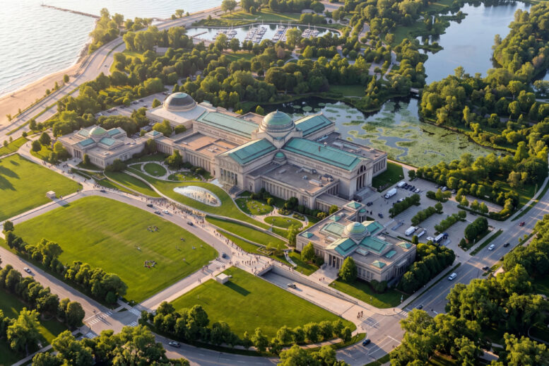
Additional renderings and details have been revealed for the potential new main entrance hall for the Griffin Museum of Science and Industry (MSI) within Jackson Park. Initial plans were revealed back in September for the one-story structure with sweeping rooflines that would replace the existing multi-story underground entry.
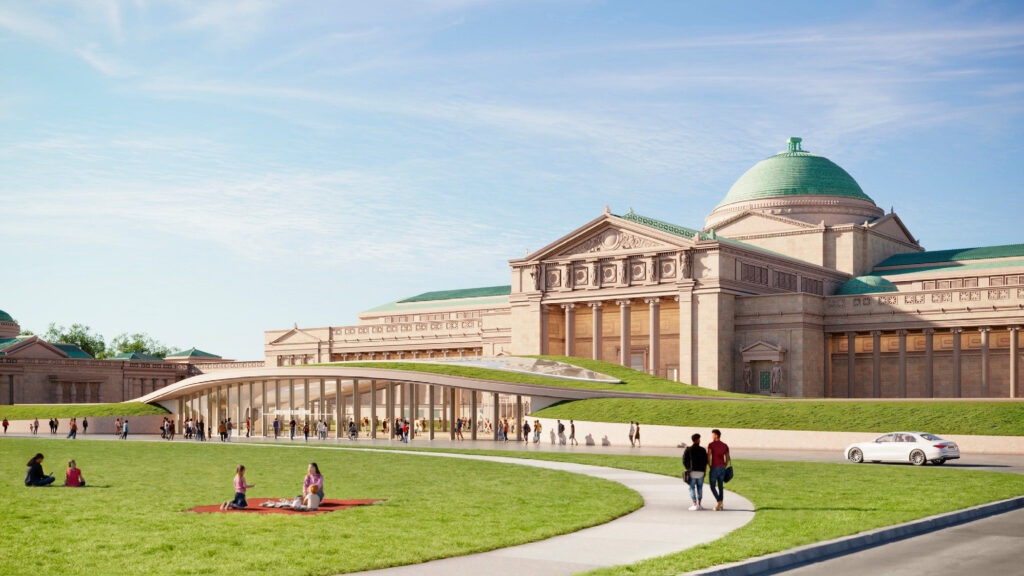
Rendering of MSI north pavilion by Robert A.M. Stern Architects
Led by the museum itself and designed by Robert A.M. Stern Architects (RAMSA), the new entrance looks to re-activate the building’s original entrance while adding public programmable space and simplifying the current multi-step entry process. However, the current plans have been met with plenty of pushback from locals and designers due to it blocking the structure.

Rendering of MSI north pavilion by Robert A.M. Stern Architects
According to a new interview by the Chicago Sun-Times, the team looked at various options but landed on the presented proposal due to its ease of potential approval given the building’s historic designation, while also blending with the existing landscape. The 28-foot-tall structure would span 458 feet wide from east to west wing, reaching its peak at the center.
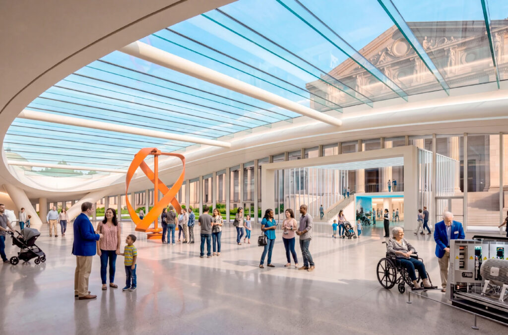
Rendering of MSI north pavilion corridor by Robert A.M. Stern Architects
This central peak is where visitors would enter into a central atrium with a glass skylight offering views of the historic structure. This would create a free exhibition space with ticketing, restrooms, and other facilities. The atrium would connect to a fully glass-enclosed hall leading up the historic front steps to the original doors, which would also be enclosed.

Rendering of MSI north pavilion corridor by Robert A.M. Stern Architects
For those with disabilities, part of the stairs will be cut open to allow for a pass-through into the current entry lobby on the ground level, with access to elevators. A similar technique is being used for the re-opening of the southern doors, which recently broke ground as well. The current massive underground entry hall would be converted into additional exhibition space.
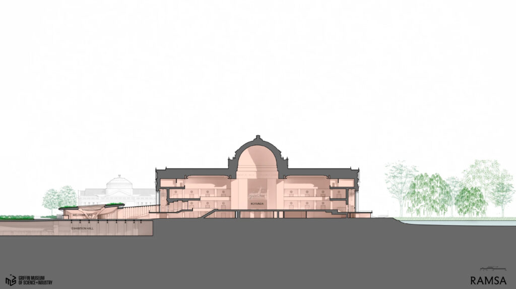
Section of MSI north pavilion corridor by Robert A.M. Stern Architects
The rest of the two extended grass-covered berms will hold some seating areas along with back-of-house spaces and connections to the underground parking garage. Connecting from those and flanking both sides of the central glass entry hall will be two science-focused gardens. These would allow visitors to get up close to the building and explore local flora.
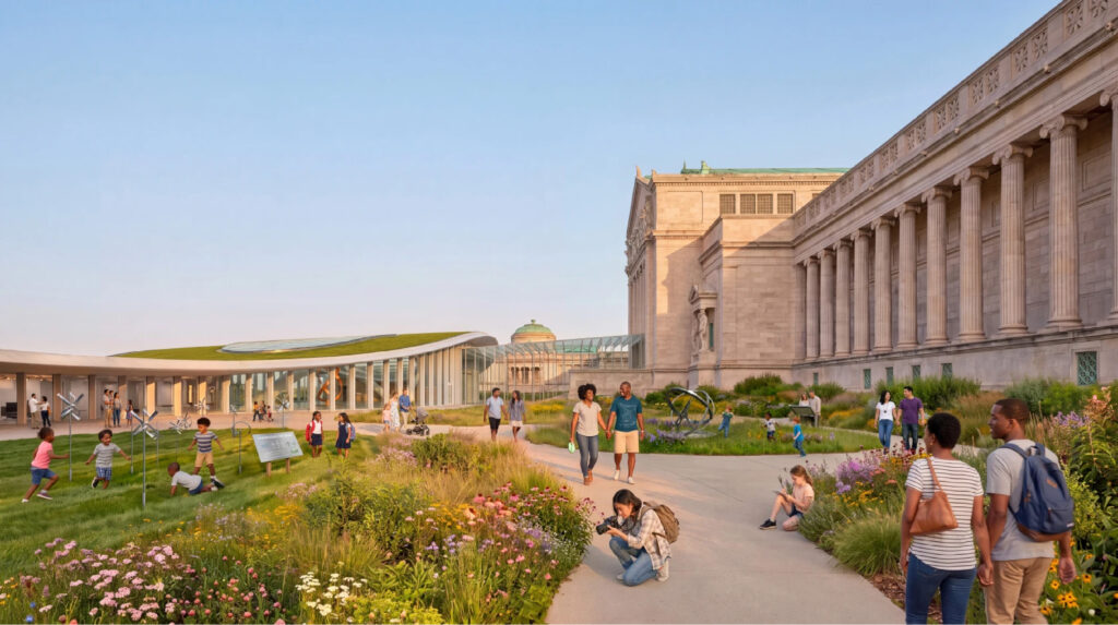
Rendering of MSI north pavilion corridor by Robert A.M. Stern Architects
All of this is being designed to handle over double the museum’s current annual visitors as it works on removing entry fees and becoming free to all as part of its 100th anniversary in 2033. The museum used to see 3.5 million visitors back in 1991 prior to establishing an entry fee. This lowered annual attendance to the 1.5 million it currently receives.

Rendering of MSI north pavilion by Robert A.M. Stern Architects
While sentiments remain generally negative around the building, plans are moving through various approval processes, including historic review. Even once fully approved, the museum will need to fundraise for its construction, complete the design drawings, and procure a contractor prior to moving forward. No timeline has been revealed.
Subscribe to YIMBY’s daily e-mail

Follow YIMBYgram for real-time photo updates
Like YIMBY on Facebook
Follow YIMBY’s Twitter for the latest in YIMBYnews
Is it me or the 3rd rendering almost blocking the view of the entrance… talking about “blending in with the environment” and that “glass cube” in between?
The Ai slop is strong on the cover render.
Just an fyi to those that wanna have confidence in the architects that will be attempting to merge blobitecture with a World’s Fair masterpiece.
What specifically is the issue with the rendering?
When using Ai, it’s not a promise of what can be delivered. We get all excited for false hope… which can be said about most projects that get approved and VE’d after. (I hate that personally)
But looking at some of the details, the people in the front green are taller than the structure next to them. Apply this to the design as a whole, we’re being shown a lie.
Reminds me of the redo of Soldier Field. Two entirely different styles that automatically produce a sense of discordance. I guess many would get used to it and appreciate the user-friendliness but it’s one of those things you look at and can’t look away because of its bizarreness.
Beautiful just Beautiful! So happy MSI revisited its entrance. So excited about Garfield Blvd and the public access to MSI.
I was skeptical in the past with some of the earlier outdoor renderings. Like, “WTF are they doing hiding that grand front entrance?!”
But now, after seeing more renderings, I am impressed. Really impressed. This glass canopy thingy in the front allowing for full view of everyone will be fantastic. It will give this museum a proper world class entry, which it should because it’s one of the great museums of the world.
Glass canopy thingy… gotta love it!
This will be a huge expense to build a huge open space that is essentially without program or purpose. The 100% exposed, minimally supported, ultra-clear glass looks sexy in the rendering but does not seem to understand the nature of a hot, humid Chicago summer or the gritty, snowy cold of a Chicago winter. Strange that the skylight has glass fins that will *attempt* to support the weight of the glass itself *and* the occasional heavy snow load, whereas the much wider span of the connecting glass corridor roof is going commando and has no support for roof or lateral loads whatsoever. Also curious as to how the corridor roof will support the weight of workers and equipment who will need to frequently clean it. The connecting corridor will be one of the hottest most stagnant spaces in the city, showing no integration of ventilation, cooling or heating, which – when designed – will inevitably creep in and muck up the clean, invisible design lines of the rendering. Further, the corridor walls and ceiling are unresolved where they terminate against the existing historic stair and hit the kneecaps of the historic colonnade. This proposal poses more questions than it resolves, and will cost many more dollars than it claims.
Stupefying that you think the architects and engineers at Robert A.M. Stern Architects don’t know how to build a building. By your telling they would have been sued out of existence by now. As for “…without program or purpose” – have you actually ever been to the museum? This isn’t for a slow trickle of visitors; it’s to address the need to accommodate large numbers of visitors showing up all at once.
This is such a mediocre and actually disrespectful solution. Have never been a fan of RAMSA’s’ work, but I think Robert Stern would be ashamed if still alive and leading the firm.
The scheme literally obscures and destroys the view of the main north entrance. There is nothing remotely respectful of the existing architecture and the formal entry sequence. It simply announces itself as a quasi landscape imposition, with multiple layers of discordant glass links and elevations, while severing and blocking views of the dignified main entrance.
The solution doesn’t need to be a classical response, nor a purely modern contrast or alternative.
It just requires some critical thinking and a serious design approach. Why does the new entry have to be frontal, while the landscape extends in meaningless gestures to the two east and west pavilions. While a purely new structure (completed in 1988), the Canberra Parliament House by Mitchell Giurgola Architects is an excellent example of how shaped landscape responds and informs the architecture. A similar approach for the new MSI entry, with circulation initially approaching the main entry obliquely, would address and resolve many issues – most notably, maintaining the primacy of the original historic structure.
Meld your take with the need for a large lobby, a holding area really – other than in the main hall of the museum for multiple bus loads of kids to both enter/assemble and to gather for departure. Couple that with the lane to bring multiple buses directly up to that entrance.
You either have to bump up the front above ground level like they did here or put it all underground with a bus ramp which would take up a very large portion of the underground parking lot.
An alternative could be a new entrance on the side of the building, probably the west side where access is local. There seems to be enough room to accommodate a hall and drop off point although this currently looks to be their delivery area (and perhaps bus parking also?).
You could still accommodate the volume of visitors expected with an alternate scheme. There could be east/west entries which funnel towards the primary north entrance, and not obscure the primacy of the historic original entrance.
I’m just mystified by the level of public and media interest in this.
Still an absolutely disastrous design. Only way to get a proper view of the biilding is to go inside the new structure. And then it is still an obstructed view. Whereas now it can be appreciated from any angle.
Disgusting
Very nice. Don’t pay attention to the haters
“Haters” suggests there’s no substance to the critique when there clearly is substance that has been noted in detail with improvements suggested. This term shouldn’t be used when there is thoughtful criticism.
This design is awful! And ugly. Here you have a gorgeous building with classic architecture and they want to cover it up with some weird grass covered hill-like entrance and then all glass? This doesn’t even match the building in the slightest! This is not incorporating anything, it’s just sticking some odd modern entrance right onto a historic, old building with unique character! Not to mention, what’s to stop some kids from climbing up onto that “grass roof” from way off on the sides, and then walking up onto the “roof” over the entrance and then potentially falling off the roof? There’s no guard rail or fence up there, and if you install one that will really make it look tacky! Such a poor design!
What if we took a beautiful facade designed to be beheld from afar and instead obstruct that view with a grass mound and some glass?
Would be great to convert some of the parking on the west and south east corners of the building back to park land or to open air exhibits.
There has to be a way to better way to add the entrance pavilion (even a modern one) that doesn’t appear to obstruct the historic building. You don’t even have to go to Europe for inspiration. Check out the new sunken entrance to the St. Louis Arch.