The Chicago Plan Commission has approved renovation plans for the Chicago History Museum in Lincoln Park. Located at 1601 N Clark Street on the corner of N Clark Street and W North Avenue, the museum sits in the southwest corner of the neighborhood. The site is currently zoned POS-1, Parks and Open Space District.
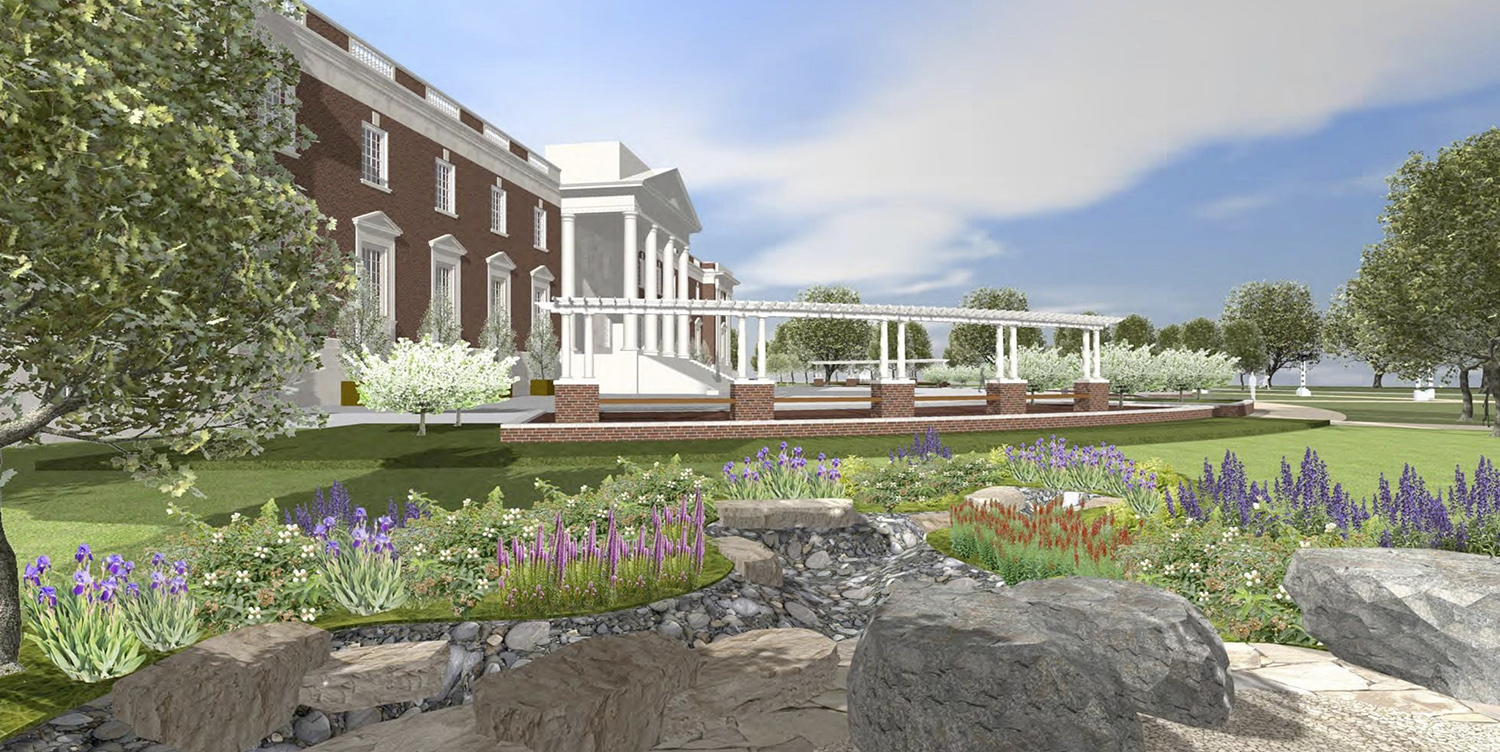
View of Renovated Plaza at Chicago History Museum. Rendering by Amaze Design
Designed by architect Amaze Design and landscape architect Scott Byron & Co., the scope of plans include the renovation of the rear outdoor plaza and the introduction of a new outdoor exhibit trail.
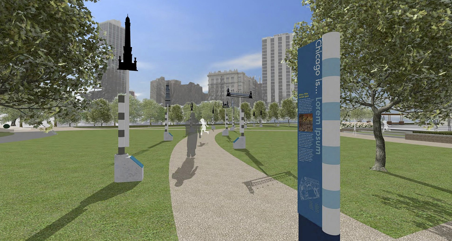
History Trail at Chicago History Museum. Rendering by Amaze Design
Located underground, the museum has 15,000 square feet of storage for their research collection. The rear outdoor plaza is the roof of this storage facility, which sits at basement level. Renovations of the waterproofing and plaza surface will be performed to protect the integrity of the collection from water penetration. The plaza will include new pergolas, turf steps, and new plantings and landscaping.
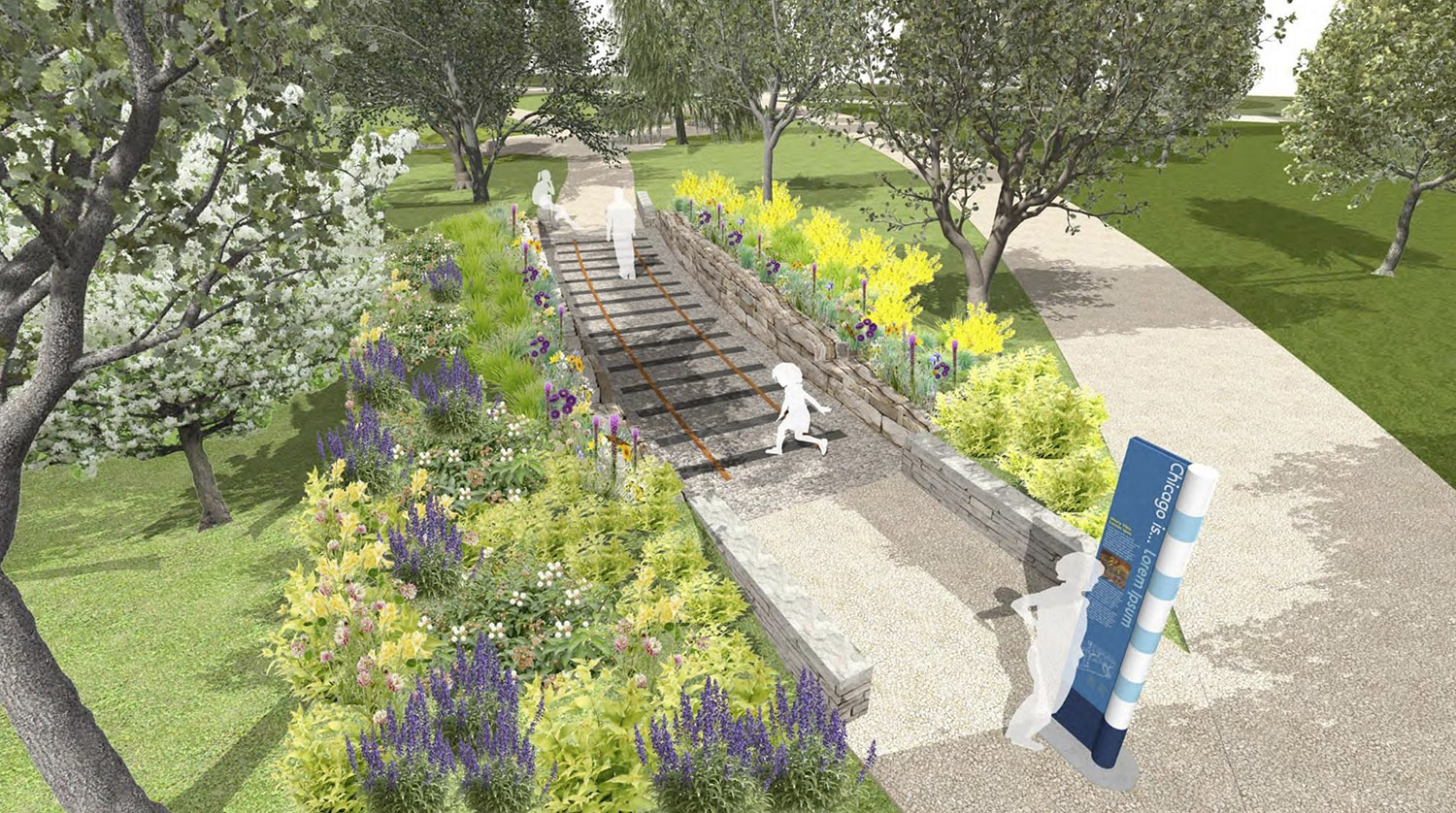
View of History Trail at Chicago History Museum. Rendering by Amaze Design
Beyond the plaza, a new outdoor interpretive experience will be introduced via the creation of a Chicago history trail. The path will encircle the rear of the museum and incorporate historical exhibits along the way, sharing Chicago history. Native tree and plant species will be planted to foster diversity and wildlife habitat on the site.
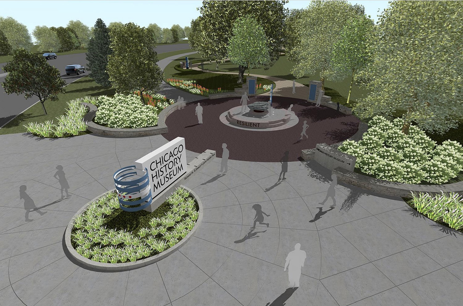
Entrance Plaza at Chicago History Museum. Rendering by Amaze Design
A new gateway to the museum site will be installed at the intersection of N LaSalle Drive and N Clark Street. This will increase pedestrian access to the park and to the museum, aimed to create a more welcoming and inviting pedestrian experience at this corner of the park. There will be a space for school children to learn about indigenous landscapes and history incorporated into the design. This space will allow for a place for school children to gather safely away from the street.
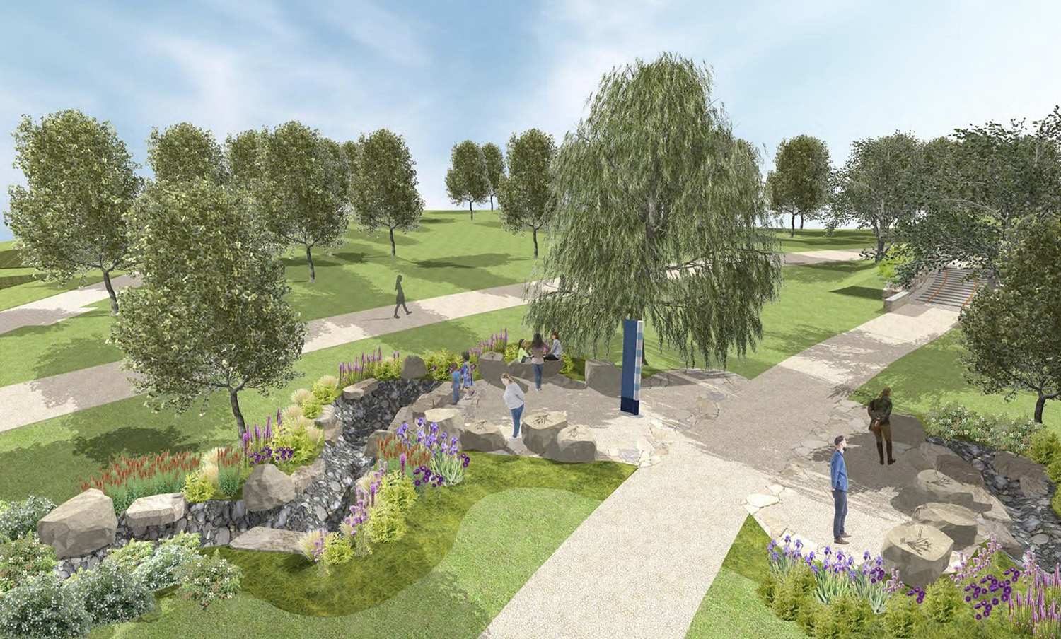
Native Planting Gardens at Chicago History Museum. Rendering by Amaze Design
The museum plans for an aggressive timeline, with construction starting by early spring 2021, and a final completion target of fall 2021.
Subscribe to YIMBY’s daily e-mail
![]()
Follow YIMBYgram for real-time photo updates
Like YIMBY on Facebook
Follow YIMBY’s Twitter for the latest in YIMBYnews

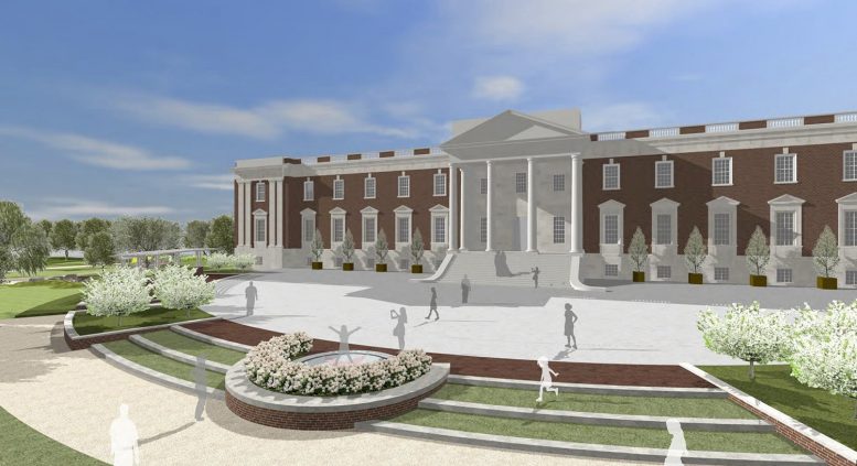
Amaze might be great at exhibitions, but, the front of the Building – Landscape design looks bland and under-cooked. The Architecture of the existing building is heroic. The upgrade might speak to the importance of the building and it’s collections….not look like a third-rate school.
the design looks too contrived and commercial to me.