The concrete core is now approaching its full height for 360 N Green Street, a 24-story mixed-use tower at the northeast corner of Fulton Market. The tower, located directly east of the to-be Guinness Brewery, will stand 399 feet tall.
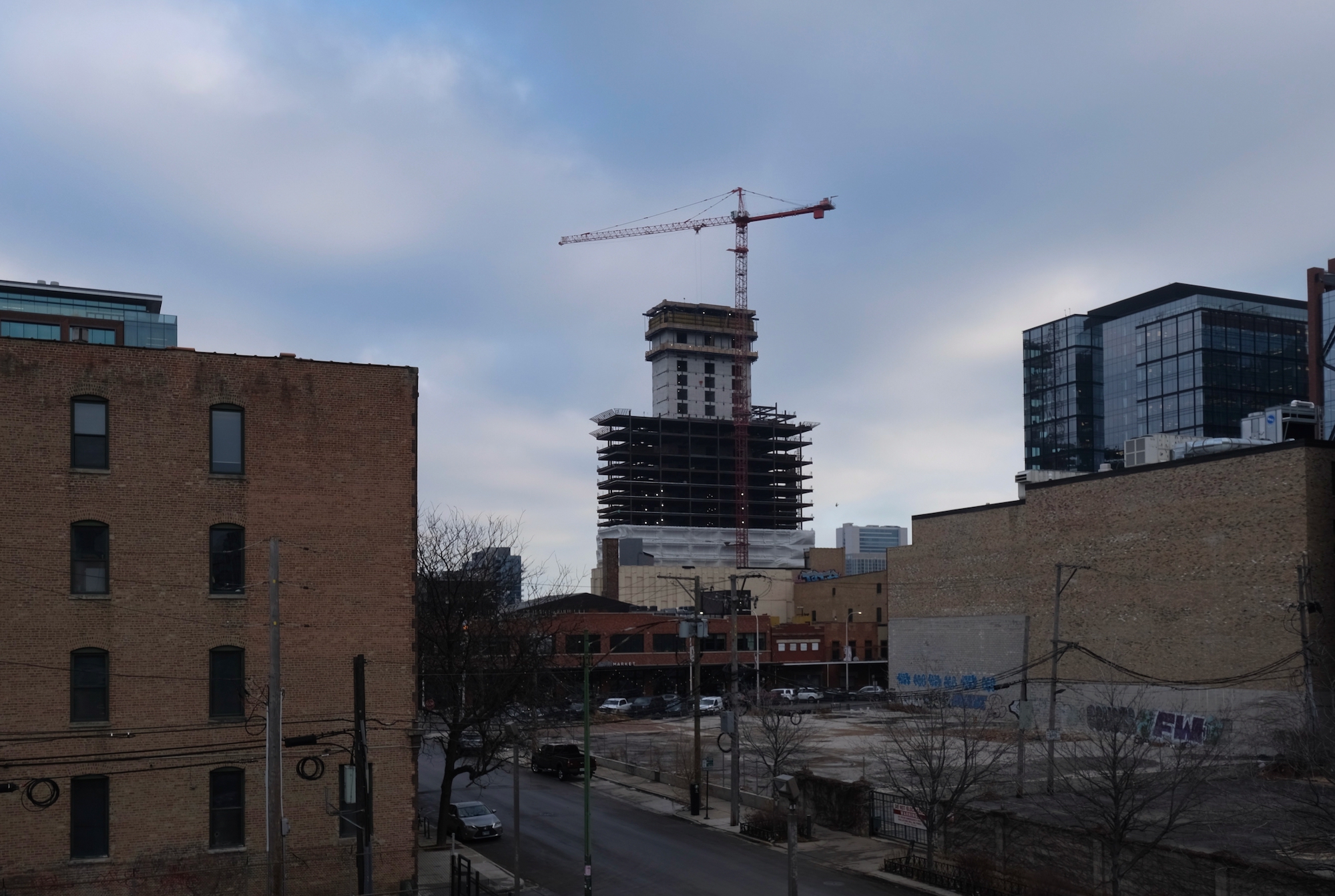
360 N Green Street. Photo by Jack Crawford
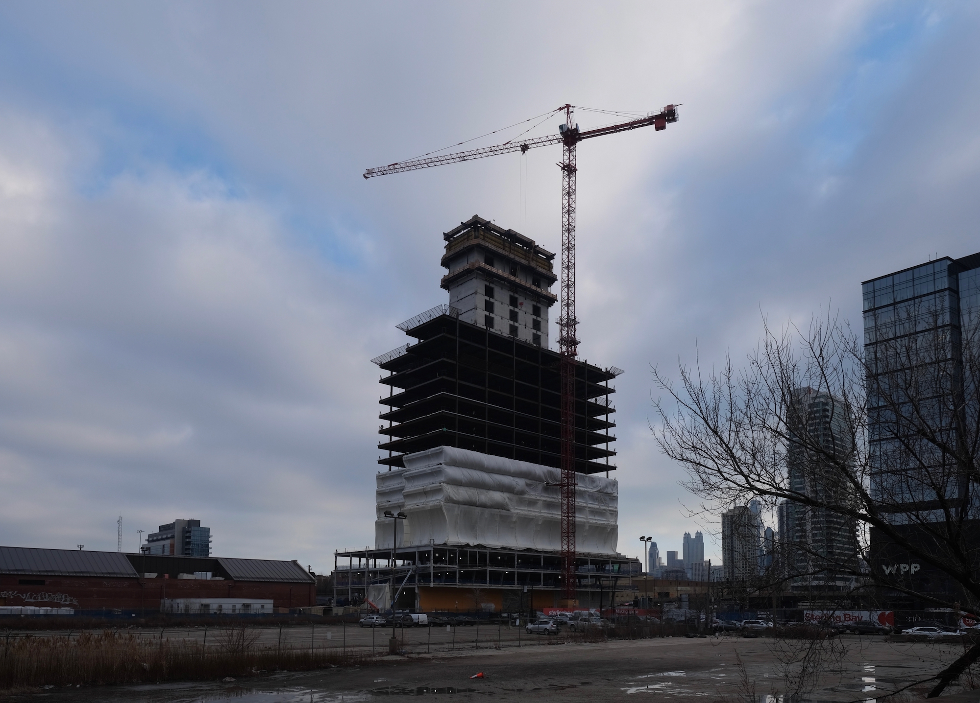
360 N Green Street. Photo by Jack Crawford
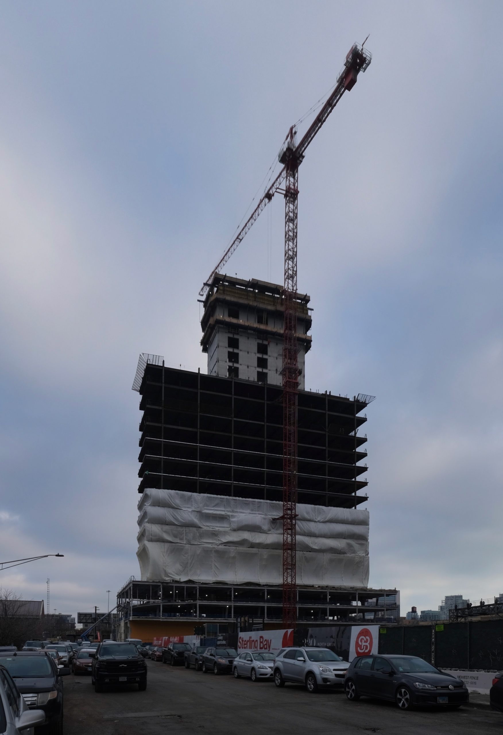
360 N Green Street. Photo by Jack Crawford
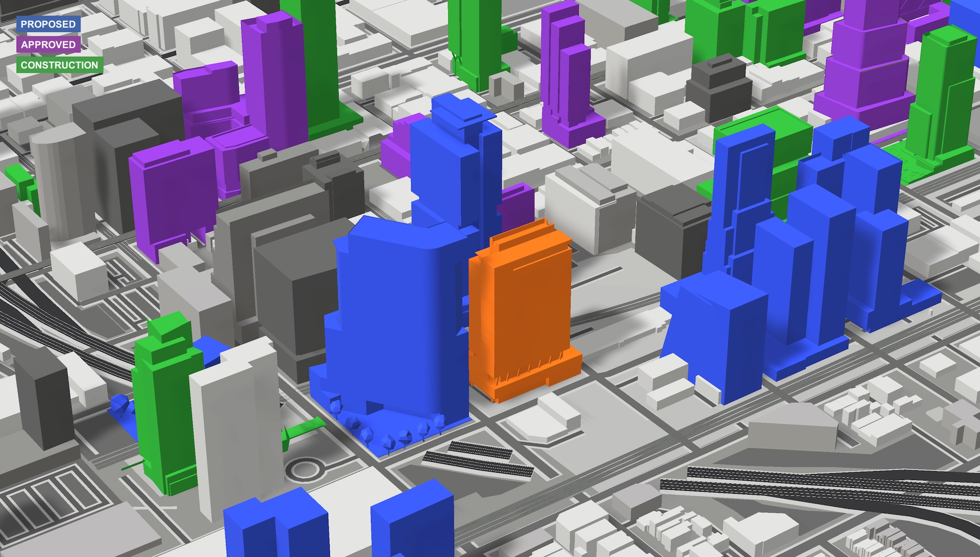
360 N Green Street (orange). Model by Jack Crawford / Rebar Radar
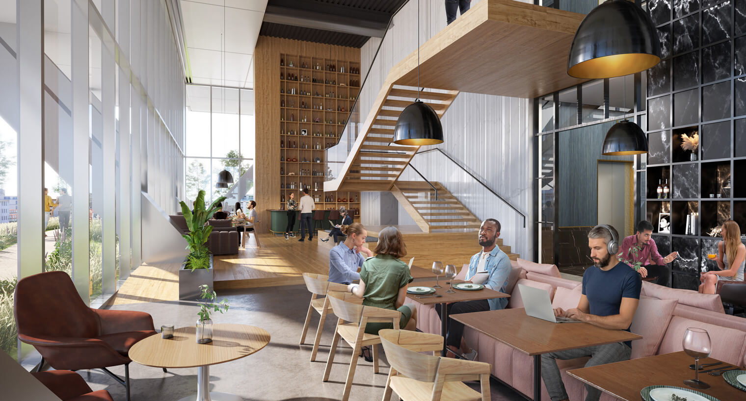
360 N Green Street amenity lounge. Rendering by Gensler
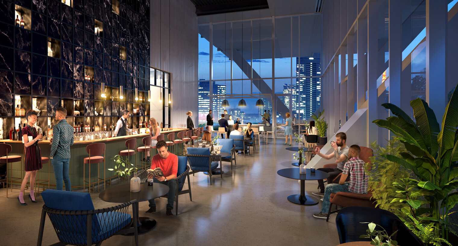
360 N Green Street amenity lounge. Rendering by Gensler
The tower will offer 5,400 square feet of retail space and nearly 500,000 square feet of Class A office space. The offices will feature high ceilings and flexible floor layouts, and tenants will have access to various amenities including a fourth fitness center, an indoor/outdoor lounge area, and a new urban park with seating, open grass space, and various flora.
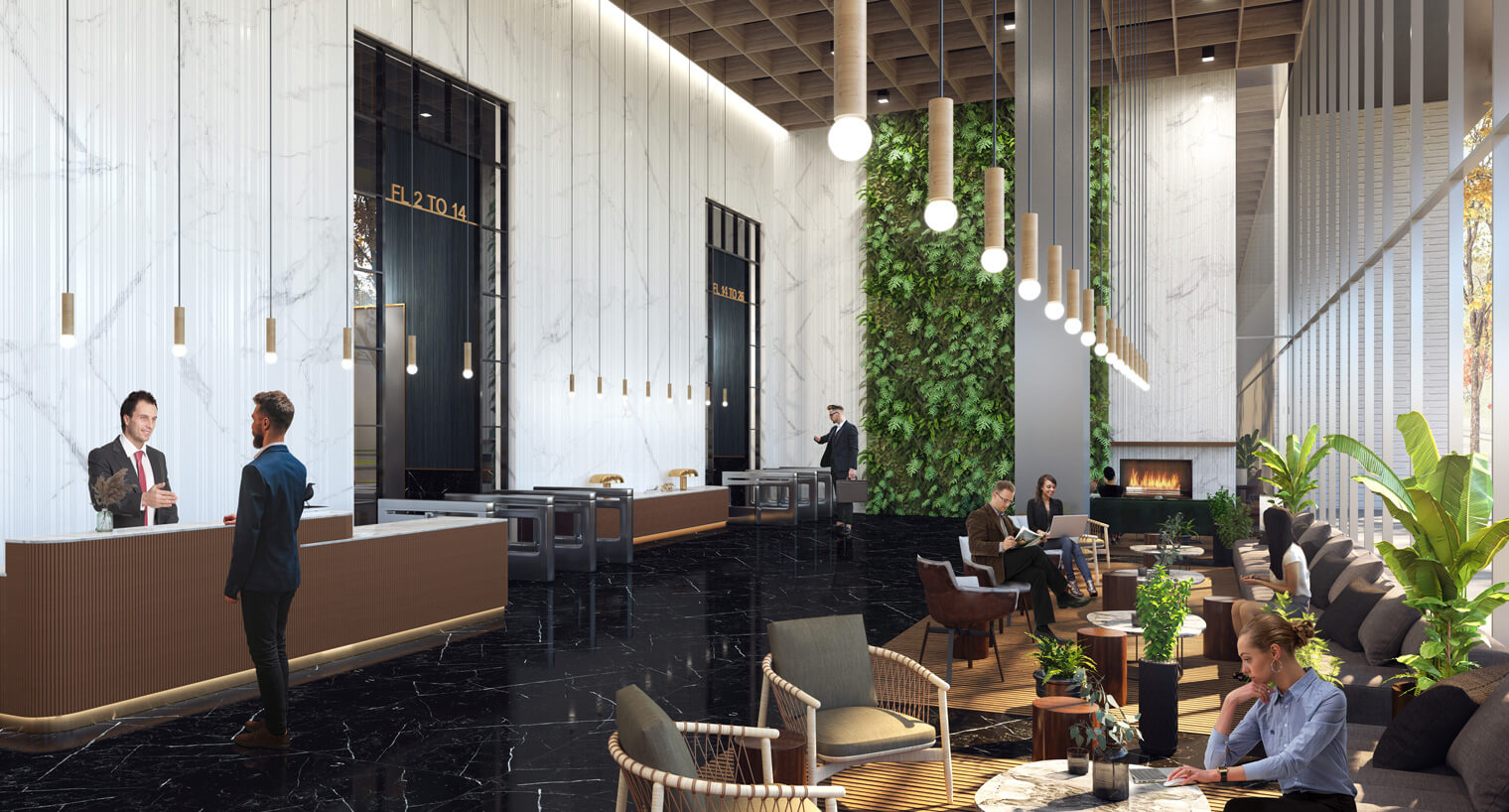
360 N Green Street lobby. Rendering by Gensler
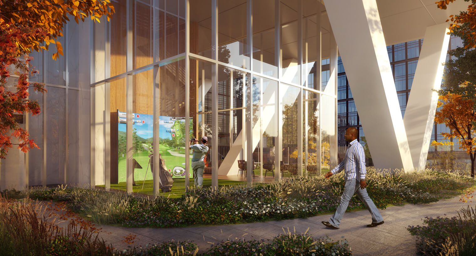
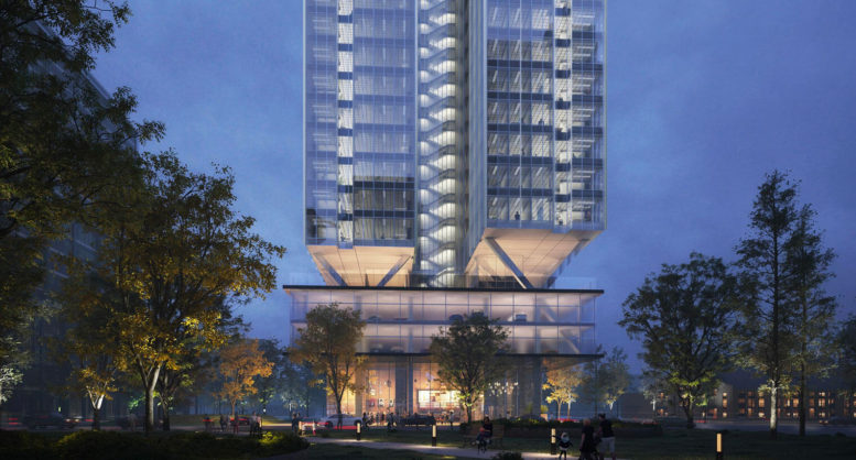
360 N Green Street. Rendering by Gensler
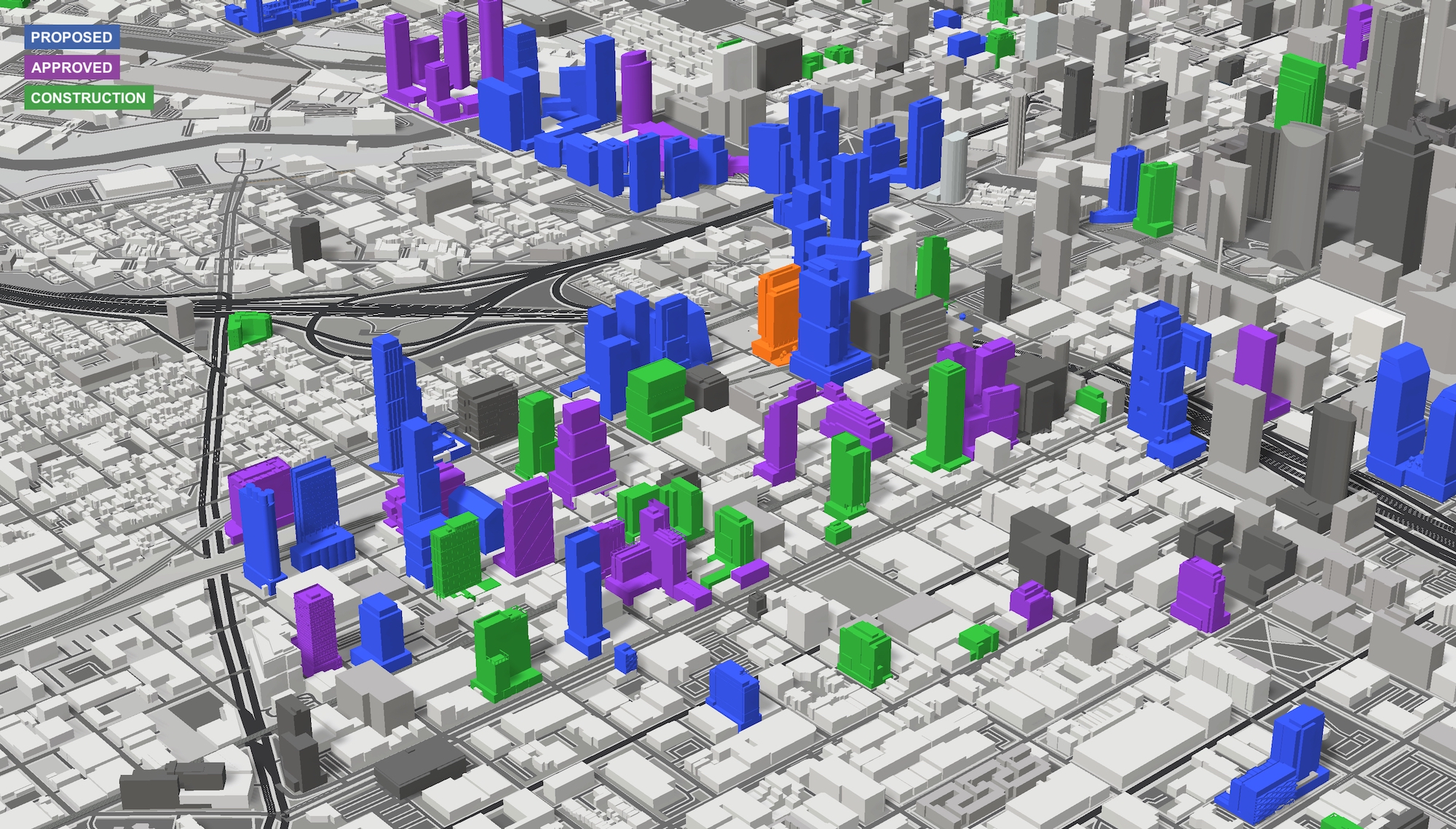
360 N Green Street (orange). Model by Jack Crawford / Rebar Radar
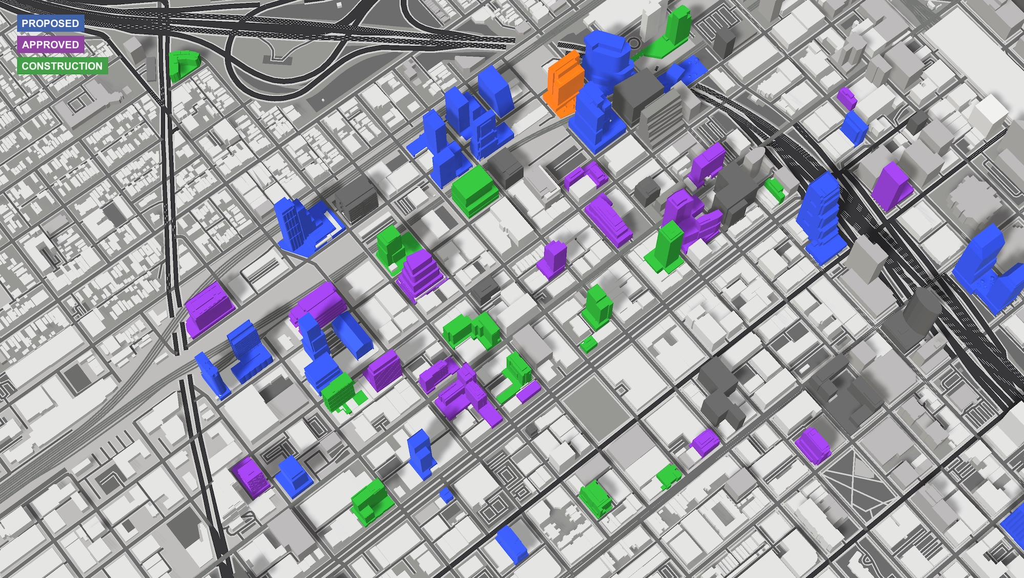
360 N Green Street (orange). Model by Jack Crawford / Rebar Radar
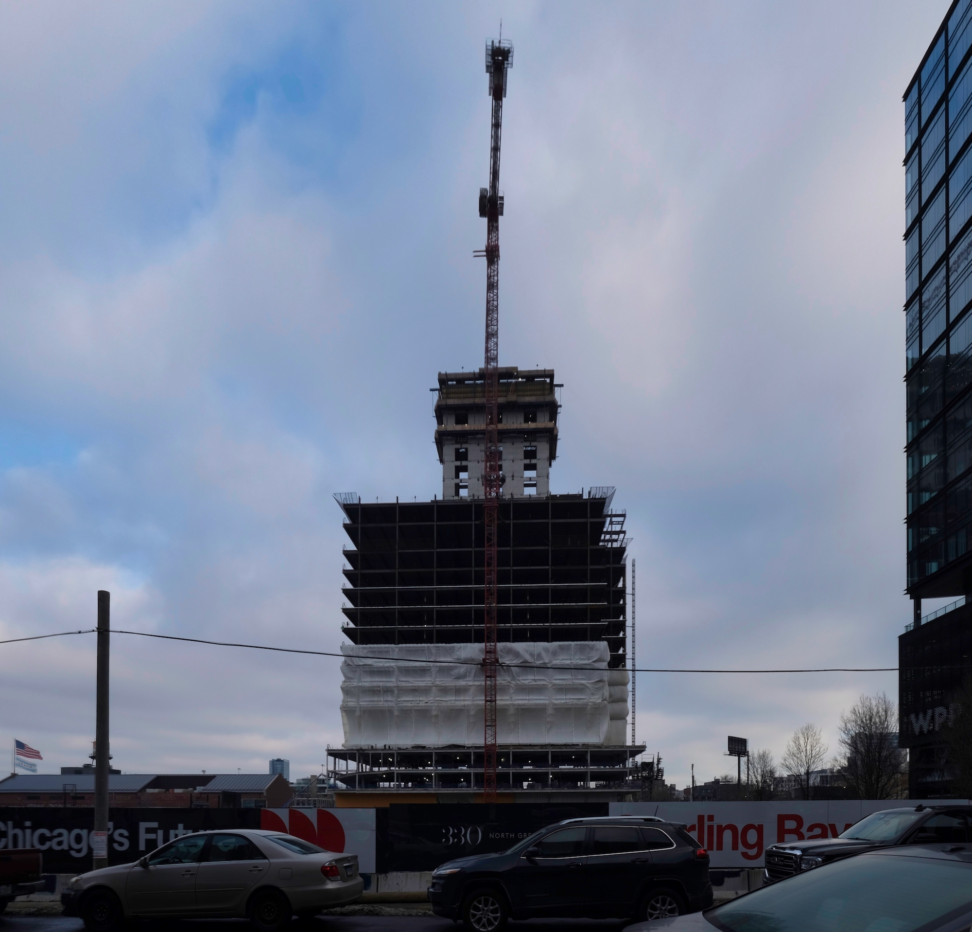
360 N Green Street. Photo by Jack Crawford
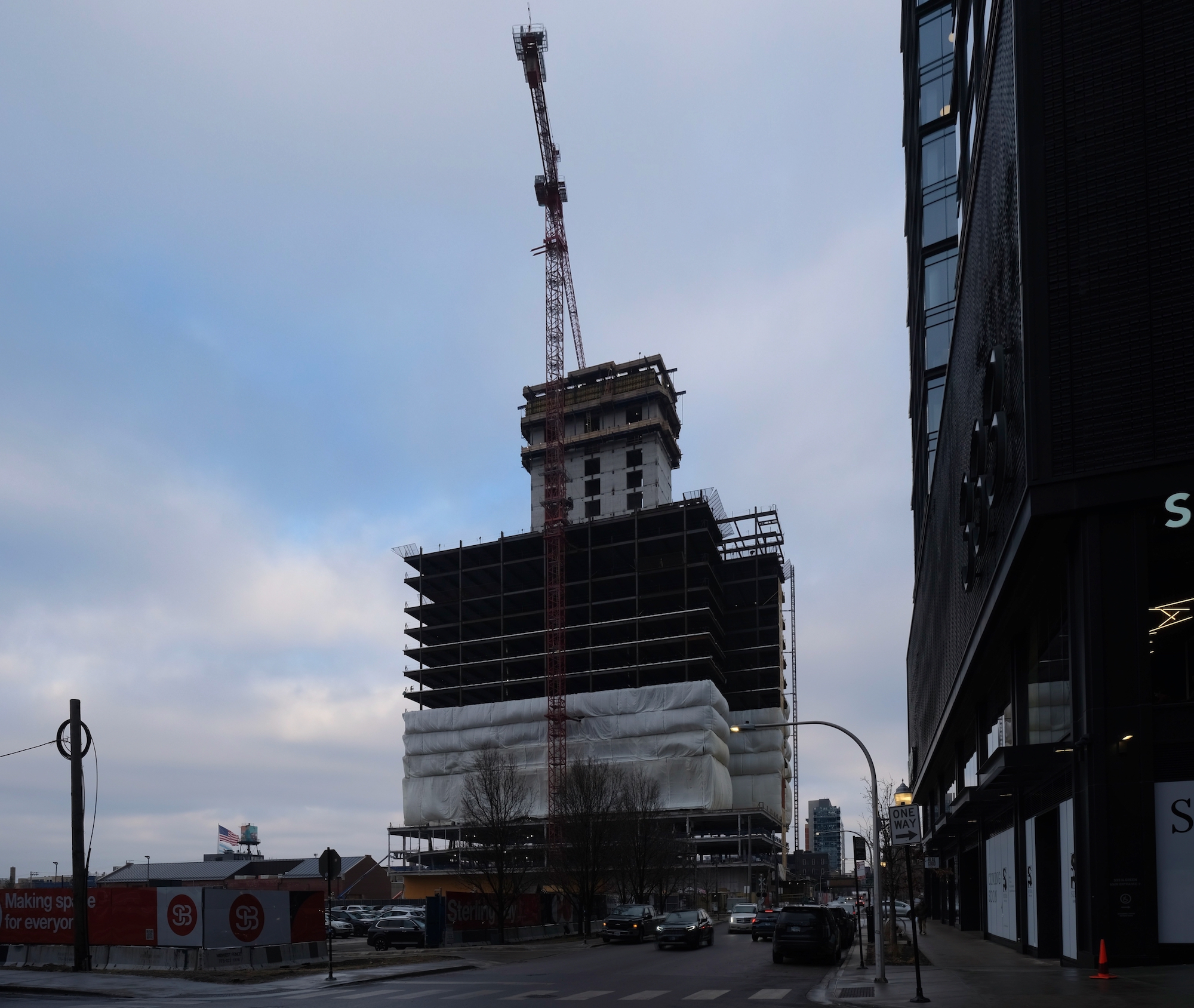
360 N Green Street. Photo by Jack Crawford
The tower’s design, created by Gensler, consists of multiple interlocking rectangular volumes anchored by truss supports and wrapped in a modern curtain wall facade made of floor-to-ceiling windows and dark metal accents.
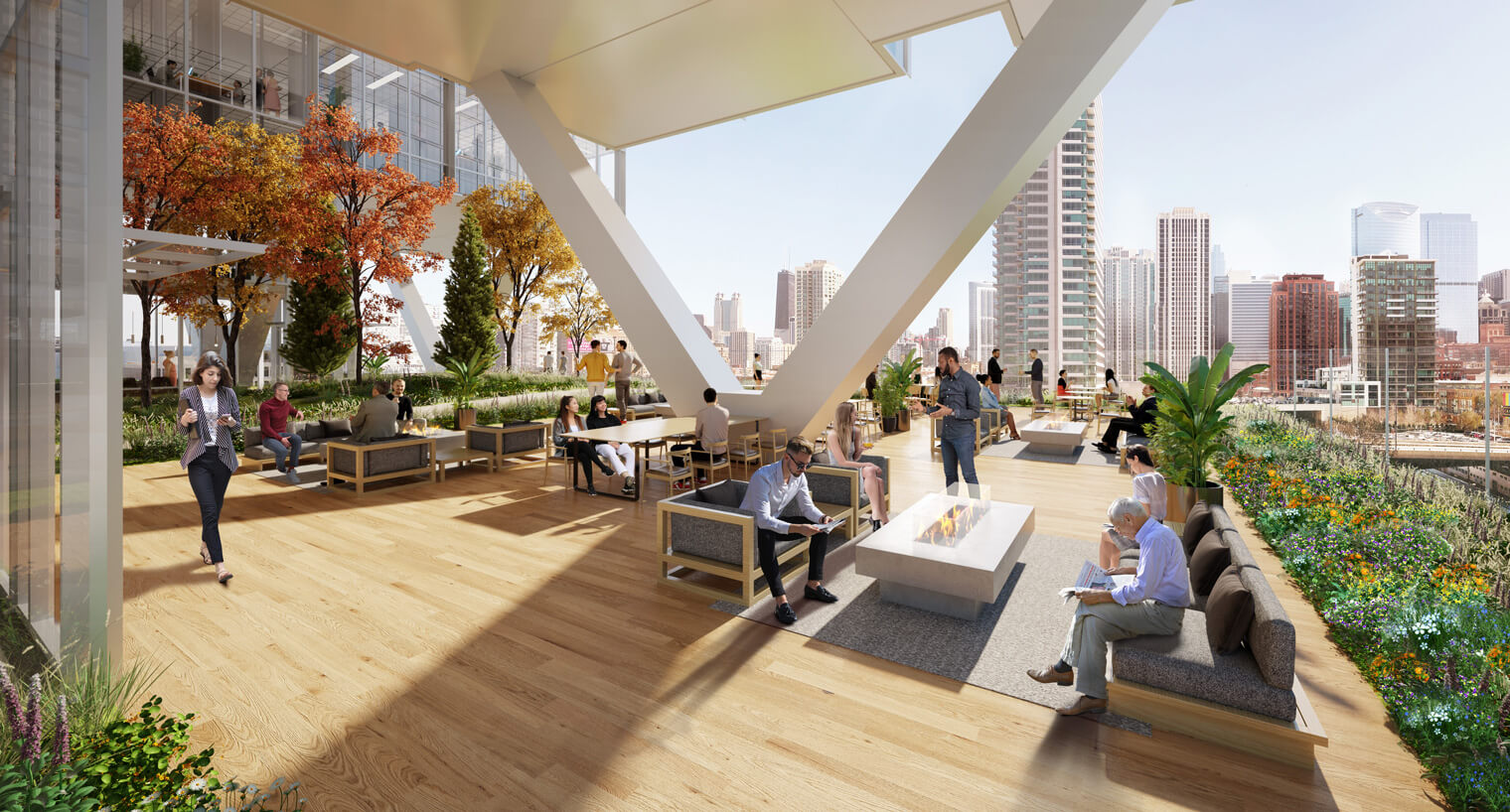
360 N Green Street amenity terrace. Rendering by Gensler
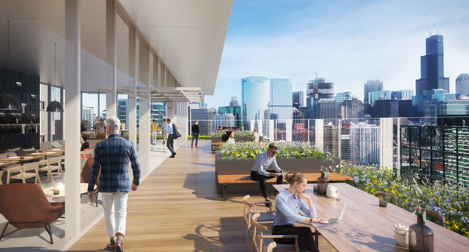
360 N Green Street amenity terrace. Rendering by Gensler
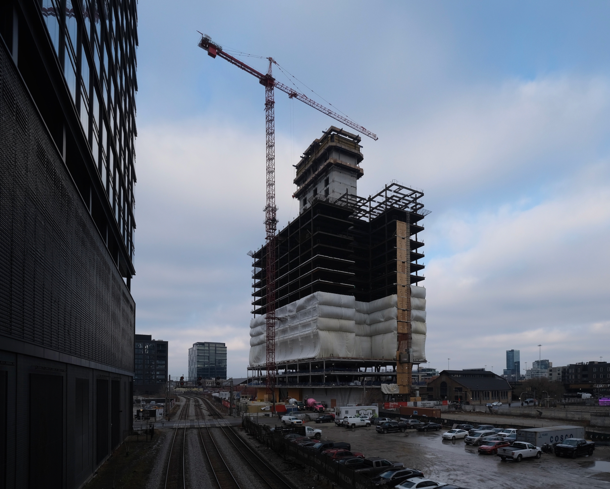
360 N Green Street. Photo by Jack Crawford
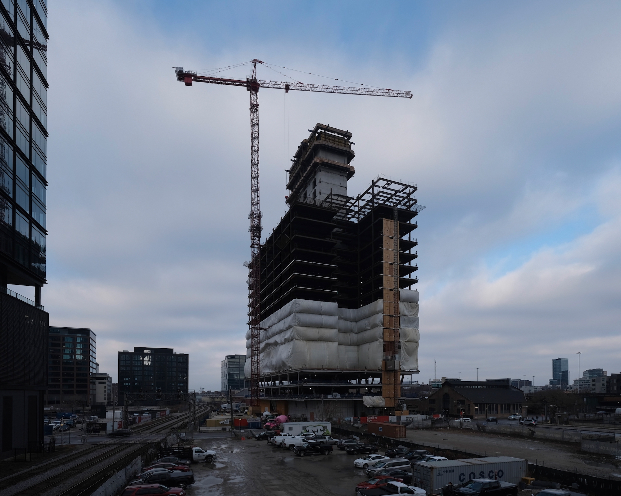
360 N Green Street. Photo by Jack Crawford
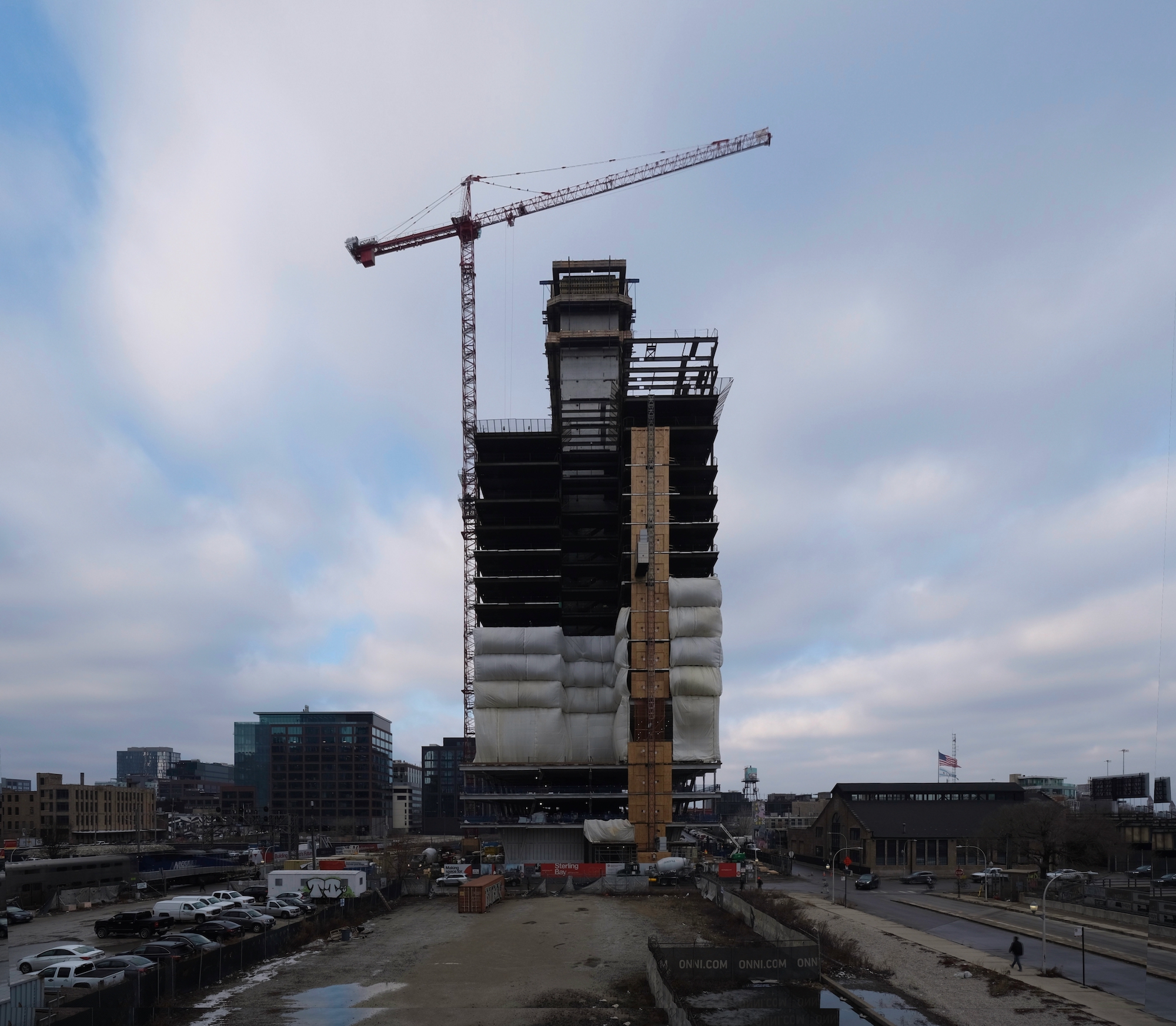
360 N Green Street. Photo by Jack Crawford
In terms of transportation, the tower offers 90 parking spaces in an integrated garage. The location is also accessible via various public transit options, including Divvy Bike stations and Route 8 bus stops along Halsted Street, as well as nearby service from Routes 56 and 65. The Grand station for the Blue Line CTA L is available via a four-minute walk to the north, and the Morgan station for the Green and Pink Lines is only seven minutes southwest.
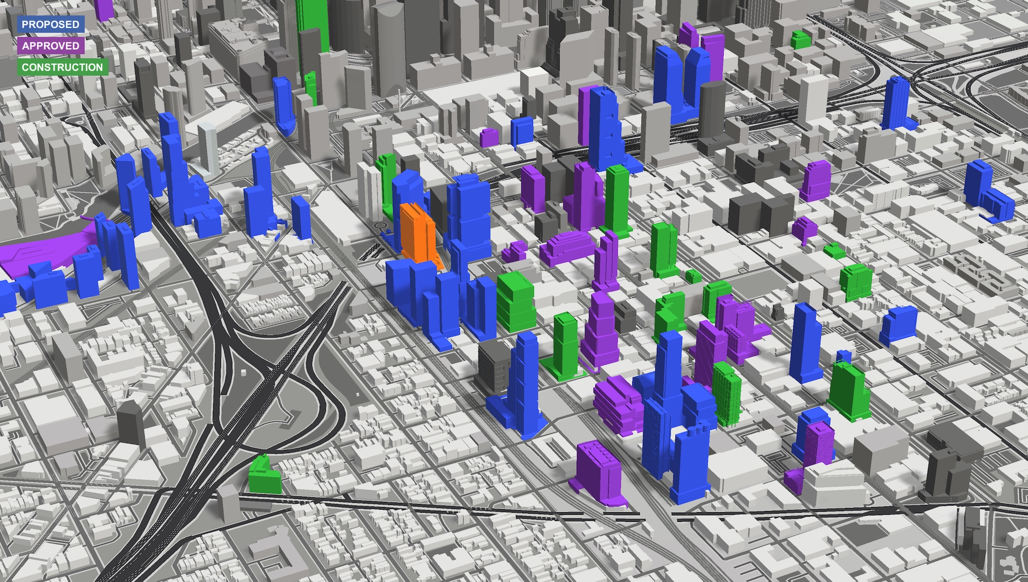
360 N Green Street (orange). Model by Jack Crawford / Rebar Radar
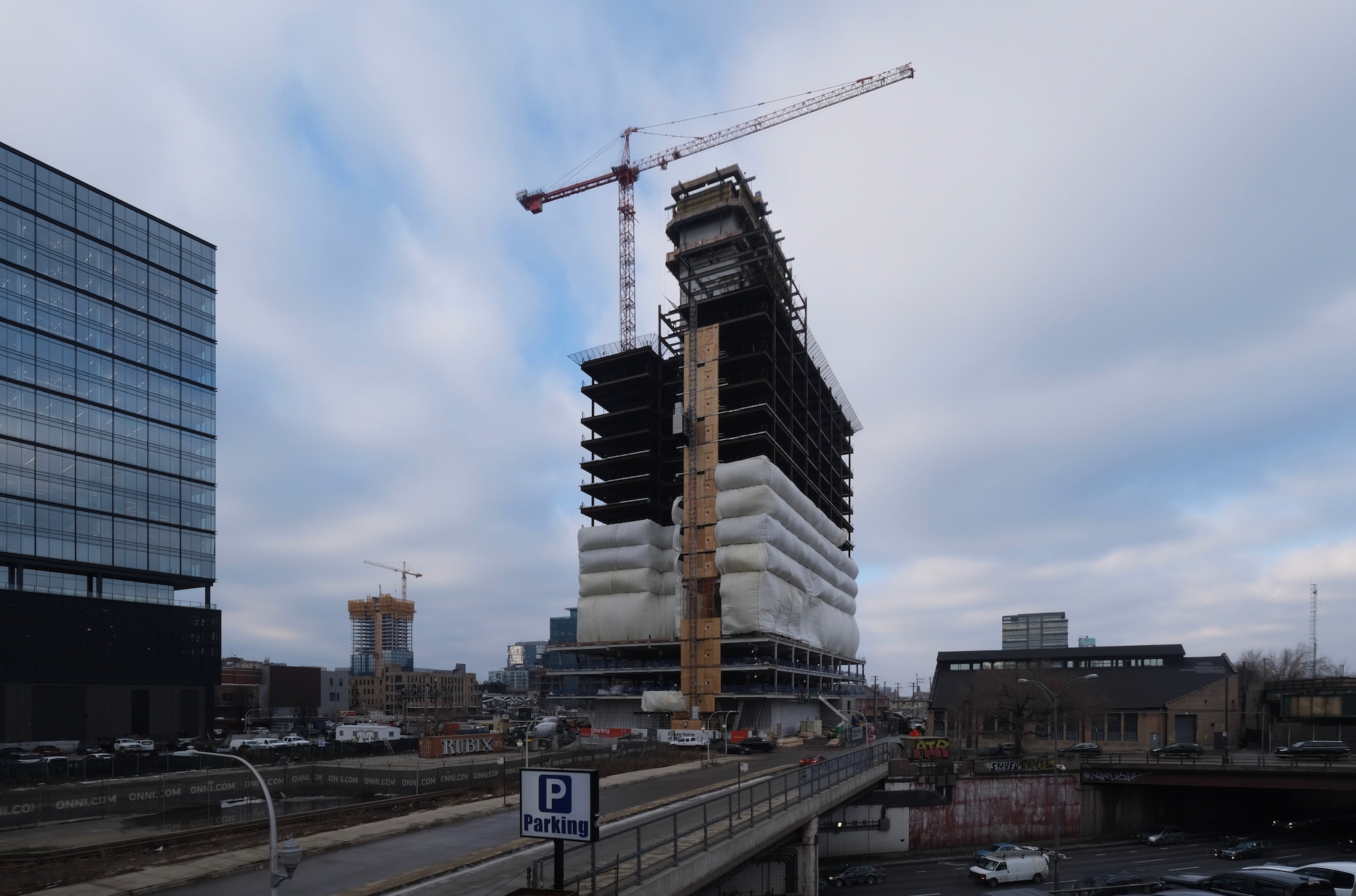
360 N Green Street. Photo by Jack Crawford
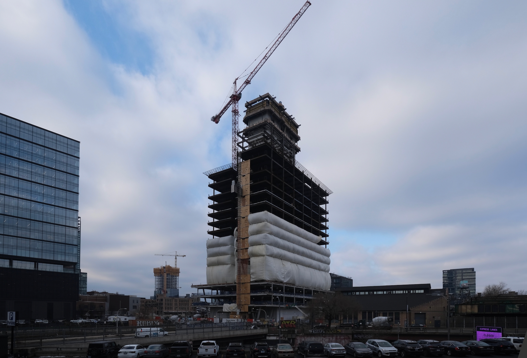
360 N Green Street. Photo by Jack Crawford
Power Construction is in charge of the $288 million build, which is expected to create 473 construction jobs and is projected to be completed by 2024. Sterling Bay is also contributing $4.4 million to the city’s neighborhood opportunity fund.
Subscribe to YIMBY’s daily e-mail
![]()
Follow YIMBYgram for real-time photo updates
Like YIMBY on Facebook
Follow YIMBY’s Twitter for the latest in YIMBYnews

Cool building but the podium takes it from an 8 to a 6
Let’s call it what it is ; it’s a garage .
It’s ugly .
The tower cladding should extend down to the street , which would get rid of those already not trendy angles supports.
The ‘podium’ on this tower actually has an interesting massing relationship with the upper tower and ground level public spaces. It appears to hover above the ground level and has a functional transition to the tower above, where it provides amenity interior/exterior space, and has a clear visual separation with the tower above. While it has similarities to the Lever House plinth (NYC), it does still contain parking, and doesn’t have Lever House’s porosity. The angled columns are gratuitous, as they appear to be not of structural necessity to facilitate parking or lobby functions. They seem to be an attempt to do something ‘cool’, rather than derived or supportive of the design. The renderings show promise, but need to wait for the realization.
Why does almost every new development have to be gigantic? Is YIMBYism equal to high rise fetish? Why can’t we build human scale, Haussmannian developments???