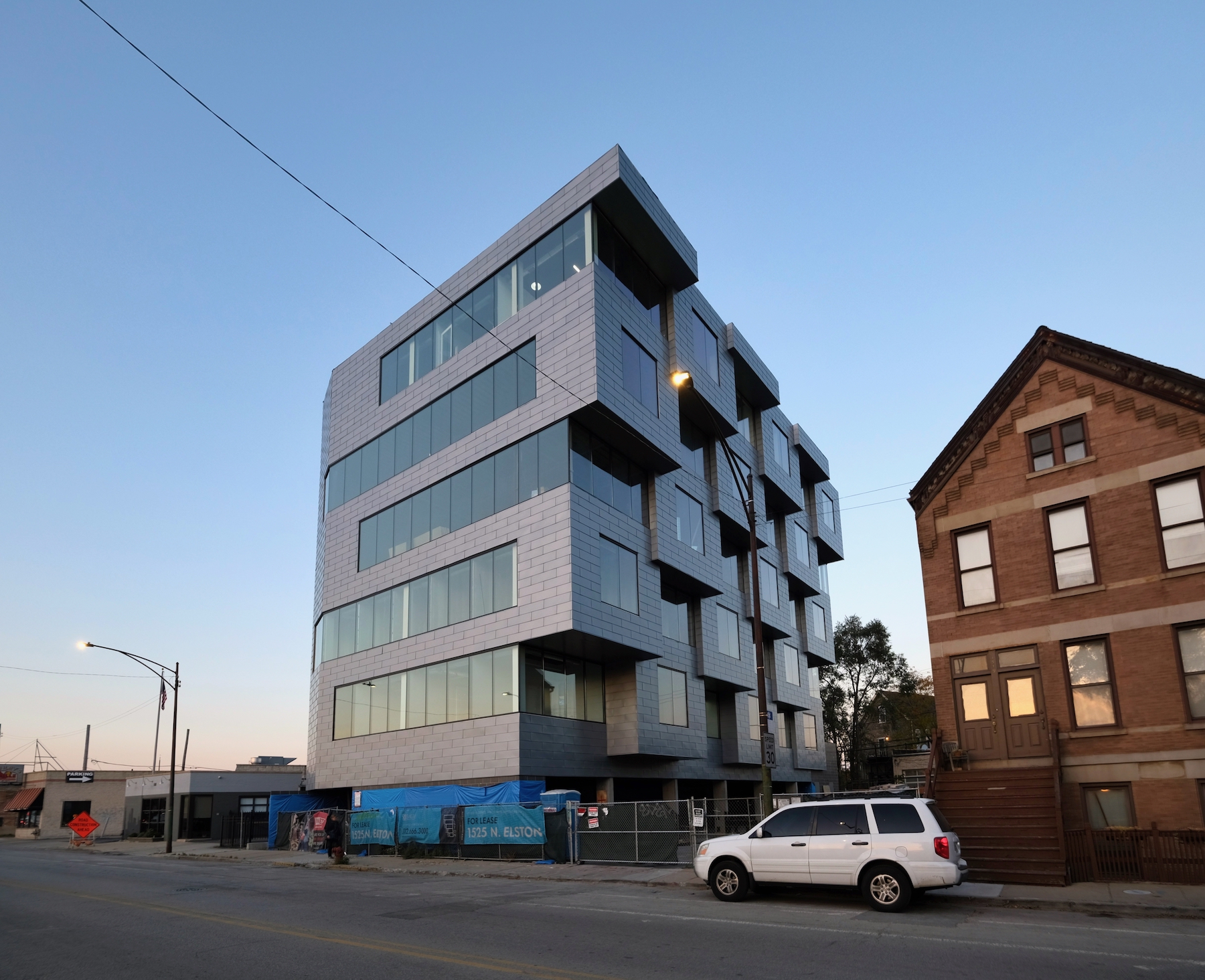
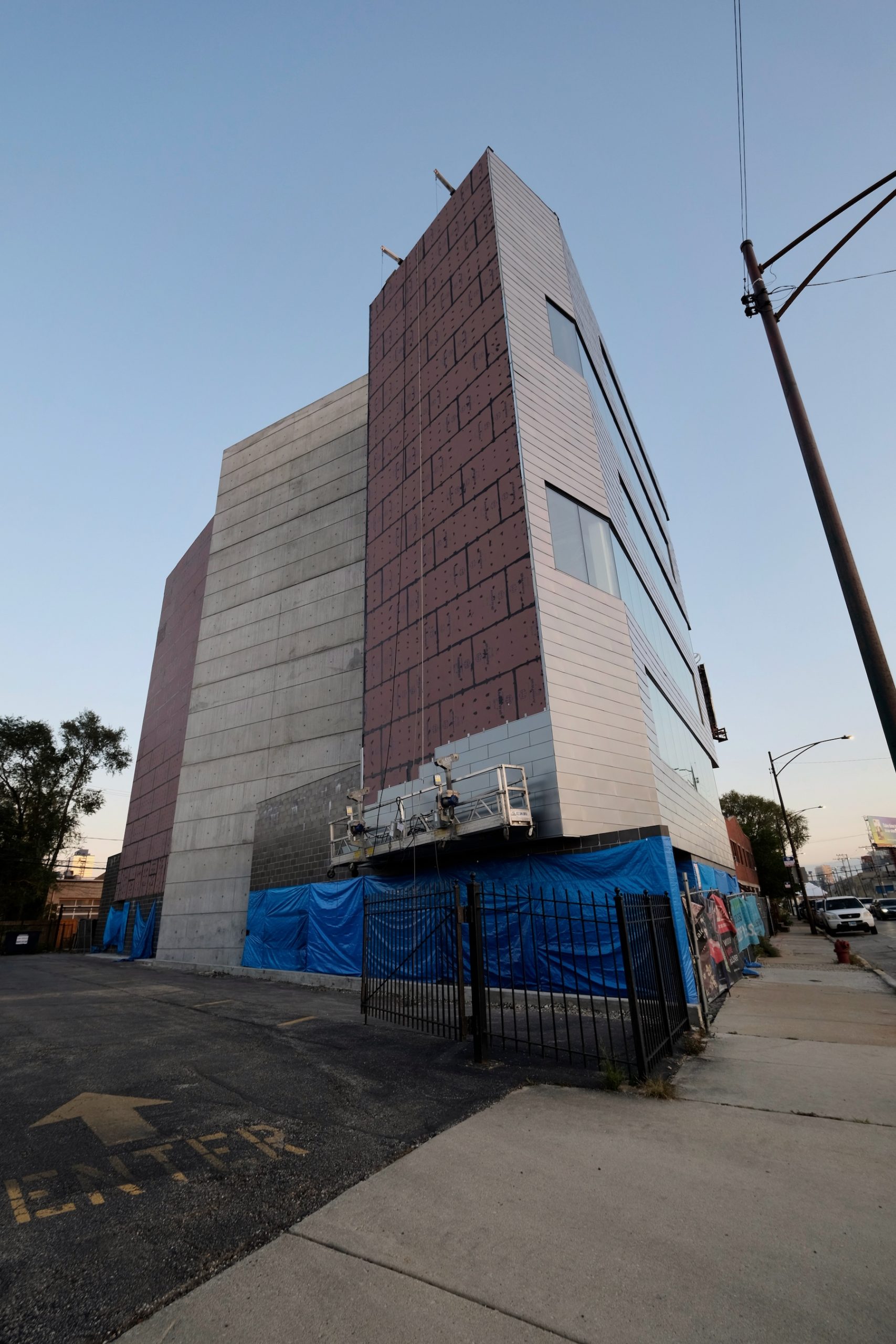
Metal paneling continues to enshroud the six-story office building at 1525 N Elston Avenue in West Town. Developed by Property Adventures Corp, the boutique project encompasses 18,000 square feet, with office space divided between five suites on the second through sixth floors.
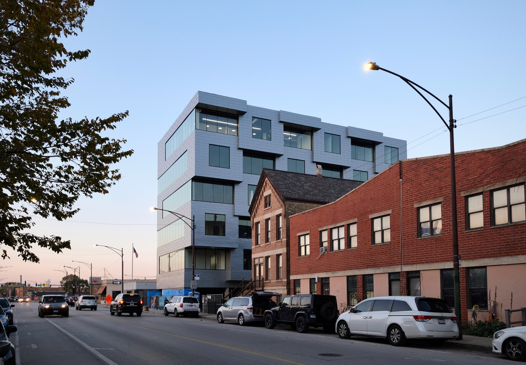
1525 N Elston Avenue. Photo by Jack Crawford
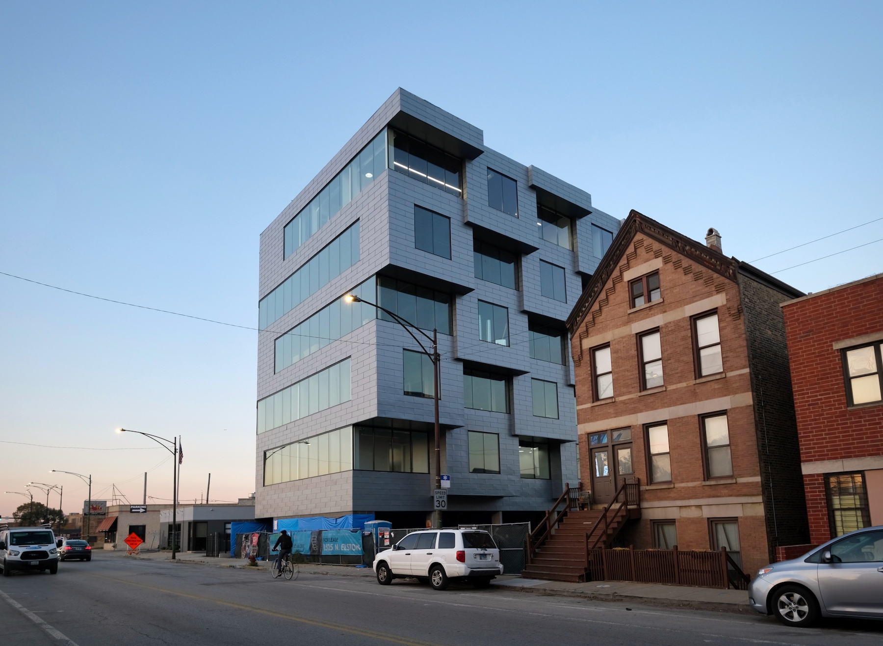
1525 N Elston Avenue. Photo by Jack Crawford
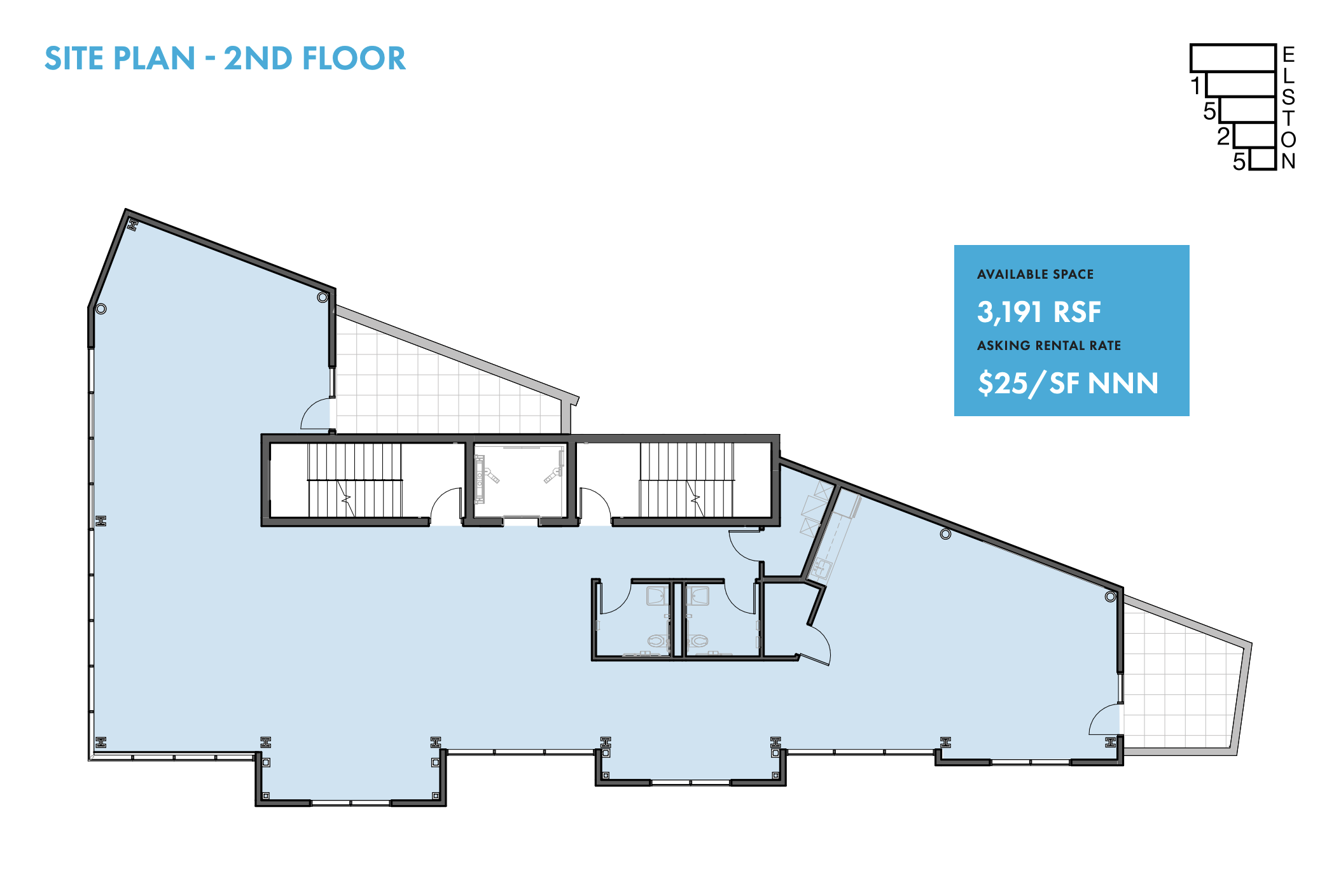
1525 N Elston Avenue second floor plan. Plan via Baum Realty
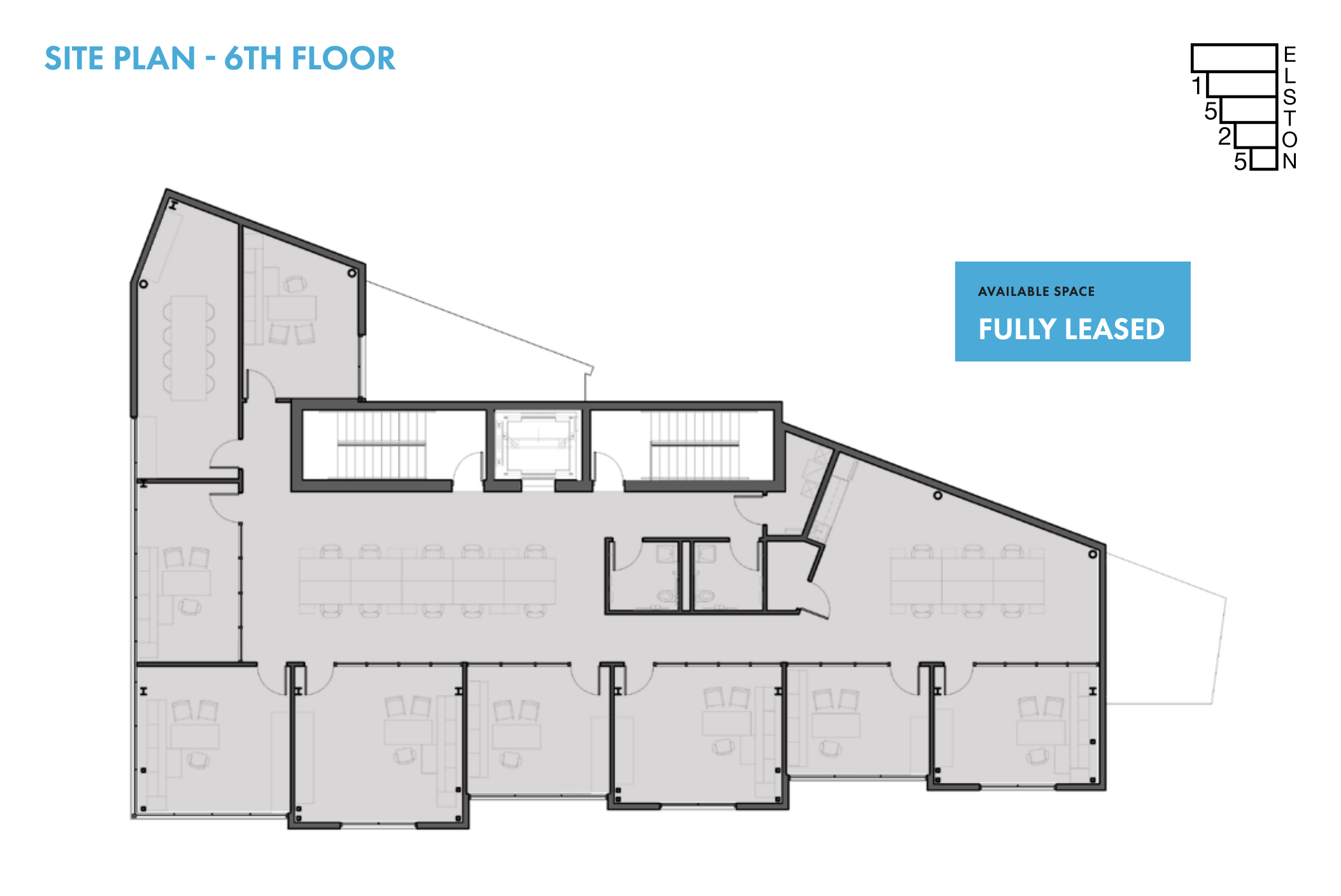
1525 N Elston Avenue sixth floor plan. Plan via Baum Realty
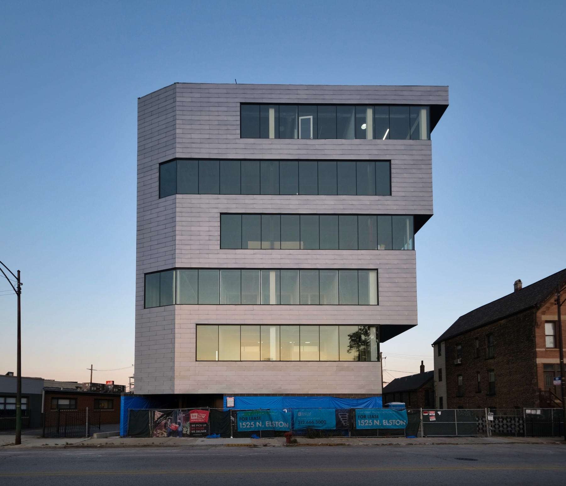
Suite sizes range from 3,191 to 3,706 square feet. Given the outward-tapering shape of the building, these square footages increase on the upper floors. On the ground floor will be a lobby space and parking for 21 cars.
1525 N Elston Avenue. Photo by Jack Crawford
1525 N Elston Avenue. Photo by Jack Crawford
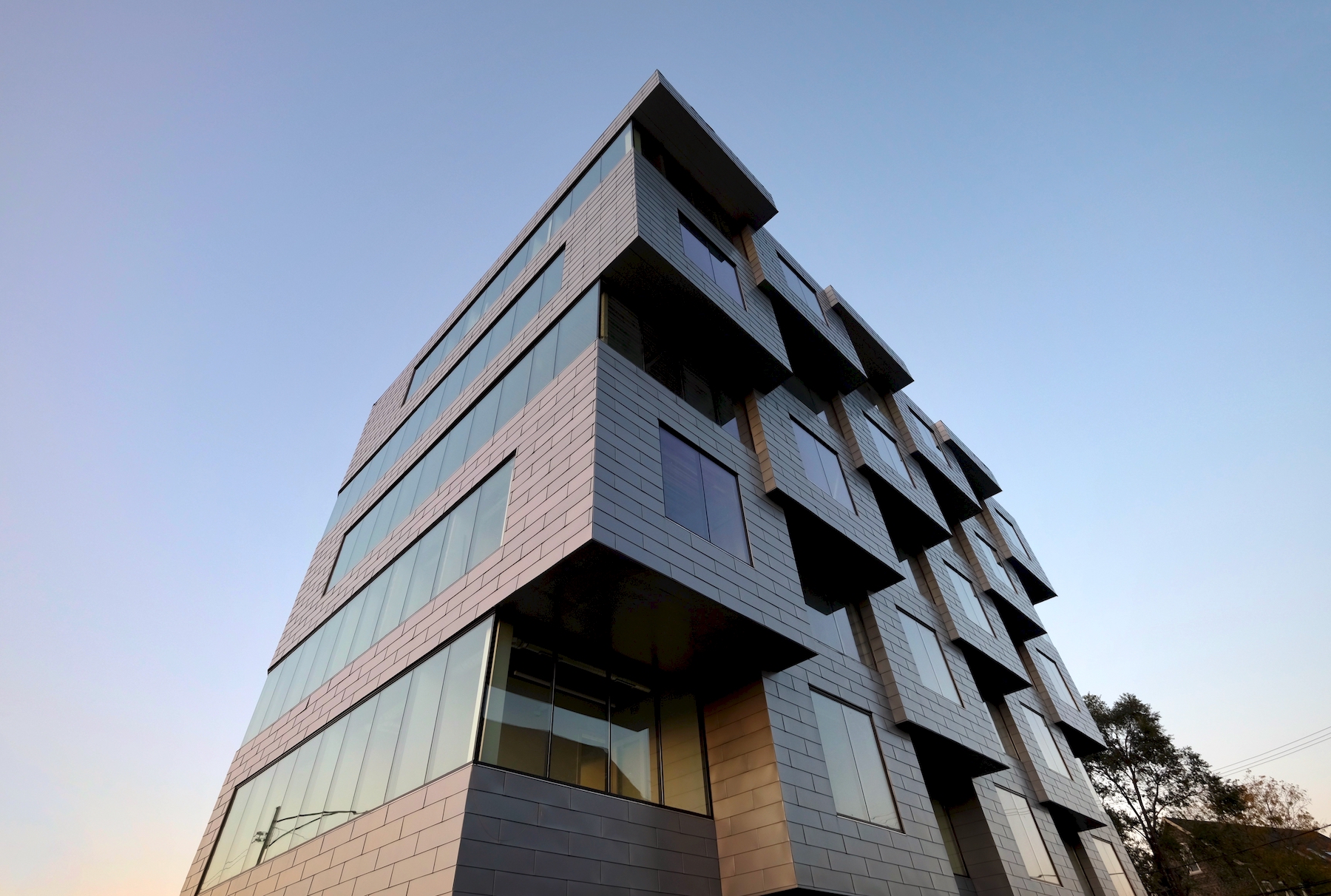
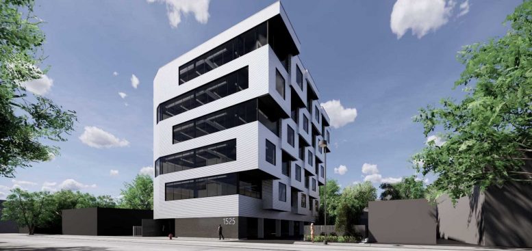
Filoramo Talsma is behind the unique design. The massing not only tapers outward, but involves a series of box-like protrusions on its south-facing wall. The building is also marked by a series of band-like windows and clad in a series of smaller semi-reflective metal panels. The modern appearance of the structure will adapt well to the surrounding context as high-profile projects like Lincoln Yards transform the formerly industrial neighborhood.
1525 N Elston Avenue. Photo by Jack Crawford
Bus transit options include stops for Routes 9 and 72, which can be found via a two-minute walk northwest to the intersection of North Avenue & Elston. Also nearby are additional bus stops for Route X9, which can be found via an eight-minute walk northwest to Ashland & North Avenue. Those looking to board the CTA L will find Red Line trains via a 15-minute walk east to North/Clybourn station, while Blue Line trains can be found via an 18-minute walk southwest to Division station. Additional access to the Metra can be found via Clybourn station via a 14-minute walk northwest.
1525 N Elston Avenue. Photo by Jack Crawford
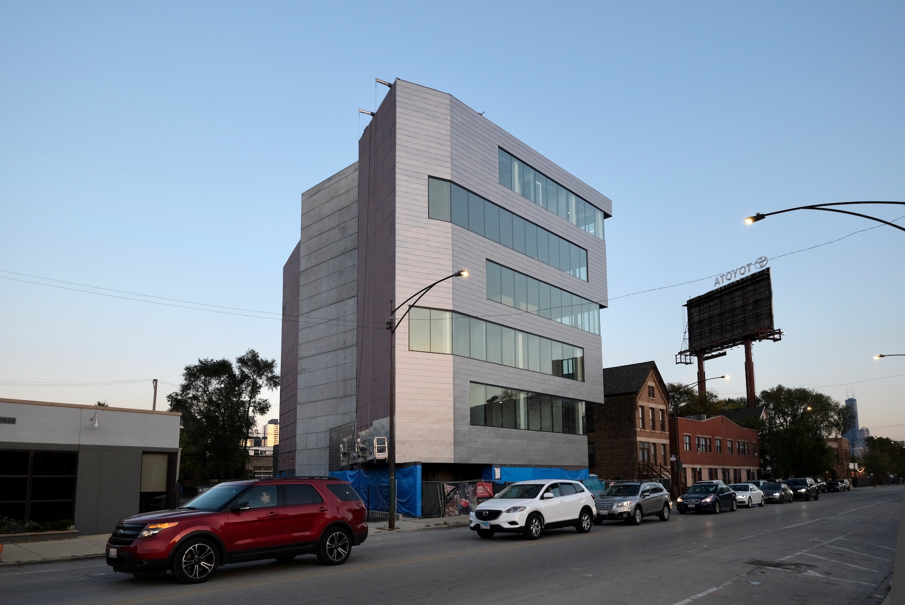
1525 N Elston Avenue. Photo by Jack Crawford
Property Adventures Corp is also serving as the general contractor for the current construction. While no updated completion date has officially been revealed, tenant move-ins appear likely for early next year.
Subscribe to YIMBY’s daily e-mail
Follow YIMBYgram for real-time photo updates
Like YIMBY on Facebook
Follow YIMBY’s Twitter for the latest in YIMBYnews

The western facade has the most charm…..and composition.
The building seems so over-wrought for what it is….and the design dated by next month….
If it was a corporate headquarters and the design was a brand identification, maybe….but it’s
just more debris on the roadside in a sort of bleak neighborhood….the house to the east has all the charm.
this should have been mixed use